Part 2 of the “Ethical UX Series.”
“Design creates culture. Culture shapes values. Values determine the future.” — Robert L. Peters
In the ever-evolving landscape of digital design, where every tap, swipe, and click has been meticulously engineered, lies a subtle yet alarming phenomenon — dark patterns. These are not merely design flaws or oversights; they are intentional manipulations, crafted to benefit businesses at the cost of user trust and autonomy.
From sneaky auto-enrolled subscriptions to deceptive “X” buttons that don’t really close pop-ups, dark patterns erode trust, exploit cognitive biases, and manipulate behavior. Their effects are not just irritating — they’re potentially dangerous, leading users to unknowingly share personal data, make unintended purchases, or agree to terms they don’t understand.
While some designers argue it’s all part of conversion optimization, the human cost — lost trust, damaged digital literacy, and user disempowerment — makes it a design crime, not cleverness. This article explores what dark patterns are, how to identify them, the legal landscape surrounding them, and, most importantly, how we, as UX professionals, can design ethically, responsibly, and transparently.
“Design is not just what it looks like and feels like. Design is how it works.” — Steve Jobs
In an ideal world, design empowers. It guides users toward their goals with clarity and intention. But not all designs are created with user benefit in mind. In the darker corners of the digital world, we encounter something far more insidious — dark patterns.
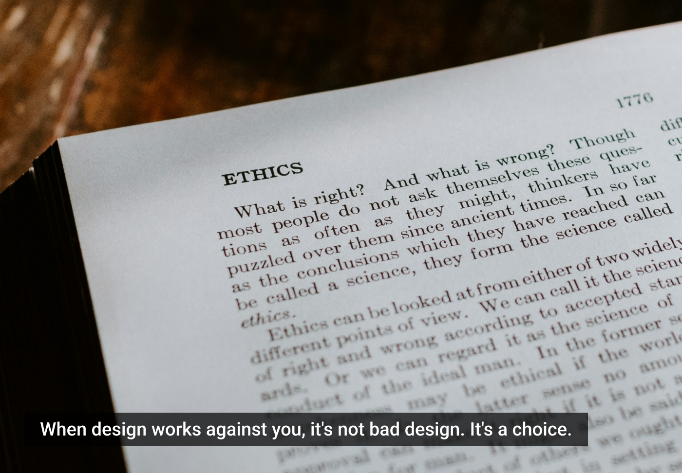
Dark patterns are design practices that intentionally mislead or manipulate users into taking actions they might not otherwise choose. Unlike bad design, which is unintentionally confusing or frustrating, dark patterns are deliberately crafted to exploit users’ cognitive biases, insecurities, or lack of information.
What are dark patterns?
“Good design is actually a lot harder to notice than poor design, in part because good designs fit our needs so well that the design is invisible.” — Donald A. Norman
Coined by UX designer Harry Brignull in 2010, the term “dark patterns” refers to interface designs that benefit the business — not the user — by tricking them into actions such as signing up for services, sharing personal data, making unintended purchases, or consenting to terms they don’t understand. Dark patterns refer to design interfaces that trick users into doing things they might not otherwise do — buying, signing up, sharing, clicking, or staying longer than intended. Unlike bugs or poor UX, dark patterns are deliberately designed to exploit user psychology for business gains.
These deceptive patterns are often subtle and disguised under beautiful UI, making them difficult to detect. But the consequences are real — lost money, violated privacy, unwanted subscriptions, and eroded trust.
Why should designers care?
Because we have a responsibility.
Designers are not just pixel pushers or flow mappers — we are architects of experience. When we knowingly implement dark patterns, we compromise not just user trust but also the integrity of our profession. Ethical UX is about respecting users’ autonomy, time, and intelligence.
Types of dark patterns (with explanations and use cases)
To understand how these deceptive tactics operate, let’s explore some of the most common types of dark patterns — including real-world examples and impact:
1. Bait and switch
- What it is: The user’s expected action leads to an entirely different outcome.
- Example: Clicking “Download” starts an installer for a different product or a malware bundle.
- Impact: Breaks user trust and can cause security risks.
2. Roach motel
- What it is: It’s easy to get in (like subscribing), but hard to get out (like cancelling).
- Example: A streaming platform allows one-click sign-up but requires multiple pages and emails to cancel.
- Impact: User frustration, potential legal consequences, and damage to brand reputation.
3. Forced continuity
- What it is: After a free trial ends, the service starts charging the user without warning.
- Example: Online course sites that begin billing without sending alerts as the trial ends.
- Impact: Financial loss and user backlash, leading to high churn rates.
4. Confirmshaming
- What it is: Making users feel guilty for opting out of something.
- Example: A newsletter pop-up that says: “No thanks, I hate learning about growth hacks.”
- Impact: Manipulates emotions, undermines user freedom.
5. Sneak into basket/hidden costs
- What it is: Adding items or services to a cart without user consent.
- Example: A travel site adds travel insurance unless manually removed.
- Impact: Unexpected charges, legal scrutiny, angry customers.
6. Trick questions
- What it is: Confusing language to mislead users into agreeing to things.
- Example: “Uncheck this box if you don’t want to receive non-promotional marketing messages.”
- Impact: Involuntary opt-ins, loss of privacy, reduced user trust.
7. Disguised ads
- What it is: Ads that appear like regular content or system notifications.
- Example: Ads styled as “Download” buttons or “System Update” alerts.
- Impact: Misleads users and risks malware downloads or harmful decisions.
8. Misdirection
- What it is: Steering users’ attention to one option while concealing others.
- Example: A bright green “Accept All” cookies button and a greyed-out “Reject” link.
- Impact: Coerces users into making non-preferred choices.
Real-world examples
- LinkedIn once used a dark pattern in its invitation process, where users inadvertently sent bulk invites to all contacts. It resulted in a lawsuit and a settlement.
- Amazon’s Prime cancellation process (before simplification) was a roach motel. It required several screens and confirmations to opt out.
- Ticket booking platforms often use “limited availability” or countdown timers to rush users, exploiting FOMO (Fear of Missing Out).
Examples of common dark patterns
“If you think good design is expensive, you should look at the cost of bad design.” — Dr. Ralf Speth
- Roach Motel: Easy to get in (like a free trial), nearly impossible to get out (like canceling a subscription).
- Hidden Costs: Adding surprise fees during checkout.
- Confirmshaming: Guilt-tripping users into compliance (“No, I hate saving money”).
- Forced Continuity: Auto-billing users after a free trial without reminders.
- Disguised Ads: Making sponsored content look like organic results.
- Trick Questions: Confusing double negatives in forms.
“Design is not just what it looks like and feels like. Design is how it works.” — Steve Jobs
The psychological basis: why they work
“Pay attention to what users do, not what they say.” — Jakob Nielsen
Dark patterns leverage behavioral economics and cognitive biases, such as:
- Loss Aversion: Framing outcomes to trigger fear of missing out.
- Anchoring Bias: Presenting fake discounts to influence perception of value.
- Decision Fatigue: Overloading users with options so they default to the designer’s choice.
- Default Bias: Pre-checked boxes that assume consent.
Legal and regulatory landscape
“Design is intelligence made visible.” — Alina Wheeler
Dark Patterns are now being legally recognized as deceptive practices globally:
- United States: The Federal Trade Commission (FTC) has issued clear warnings against dark patterns. In 2022, it penalized companies for deceptive interfaces.
- European Union: The Digital Services Act (2022) prohibits misleading interfaces and requires clearer user consent.
- India: The Ministry of Consumer Affairs released a draft policy in 2023 titled: Guidelines for Prevention and Regulation of Dark Patterns.
It explicitly outlines prohibited patterns, such as forced continuity, bait-and-switch, and deceptive nudging.
Additional academic insight is offered in this detailed legal research paper from the National Law School of India University.
Why this matters: impact on users and brands
“Your most unhappy customers are your greatest source of learning.” — Bill Gates
- Brand Trust: Once users spot manipulation, they are 90% less likely to return to a site (Baymard Institute).
- Churn Increases: Deceptive UX leads to uninstalls, bad reviews, and negative word-of-mouth.
- Long-Term Revenue Loss: While dark patterns may spike short-term metrics, they damage lifetime customer value.
How to avoid dark patterns: ethical design principles
“You cannot understand good design if you do not understand people.” — Dieter Rams
- Use Consent, Not Coercion: Be transparent in data collection, subscription models, and terms.
- Clarity Over Confusion: Avoid double negatives, hidden fees, or misleading toggles.
- Empower Users with Choice: Give real opt-in and opt-out options — no traps.
- Respect the User’s Time and Intent: Don’t bury cancellations behind 10 screens. Make exit paths clear.
- Design for Integrity: Audit your flows. Ask: “Would I want my parents or children to experience this interface?”
How to avoid dark patterns (practical tips for designers)
Designers can maintain ethical UX by following these practical principles:
1. Transparency over trickery
- Present all costs, terms, and consequences upfront.
- Show permission requests clearly and with user control.
2. Equal weight to choices
- Don’t highlight the “Accept” or “Subscribe” button disproportionately.
- Provide fair visual treatment to “Decline,” “No Thanks,” or “Reject All.”
3. Simplify exits
- Make it as easy to cancel a subscription as it is to sign up.
- Avoid requiring phone calls or extra documentation for cancellations.
4. Write for humans
- Use plain language, not legalese or double negatives.
- Avoid misleading microcopy in buttons or disclaimers.
5. Test for ethics
- Conduct usability testing focused on clarity and user understanding.
- Ask: “Would I feel comfortable if my family member interacted with this?”
6. Apply the LUCY UX process
Use the LUCY UX process I created to ensure ethical outcomes:
- L — Listen to user needs honestly.
- U — Understand their behavior without exploiting it.
- C — Conceptualize transparent, respectful interfaces.
- Y — Yield ethical and long-lasting design solutions.
Tools to test for ethical UX
“Good design, when it’s done well, becomes invisible. It’s only when it’s done poorly that we notice it.” — Jared Spool
- Deceptive Design Index (Brignull)
- Baymard UX Audits
- UXExpert’s Ethical UX Checklist — LUCY UX
- User Interviews and Session Replay Tools (to detect frustration)
“With great power comes great responsibility.” — Uncle Ben, “Spider-Man“
Up next in the “Ethical UX Series”: “Consent Theater: Are Users Really in Control?”
Suggested reading & references:
- Dark Patterns, H. Brignull (2010).
- Dark Patterns at Scale: Findings from a Crawl of 11K Shopping Websites, A. Mathur, Northeastern University (2019).
- FTC Statement on Dark Patterns, U.S. Federal Trade Commission (2022).
- Digital Services Act, European Commission (2022).
- Guidelines for Prevention and Regulation of Dark Patterns, Ministry of Consumer Affairs, India (2023).
- Additional Legal Analysis, NLSIU.
- Designing with Integrity, Tushar A. Deshmukh.
- Ethical UX Initiative, WorldUXForum.
- LUCY UX Process, Tushar A. Deshmukh.
The article originally appeared on LinkedIn.
Featured image courtesy: Kelly Sikkema.
The post Dark Patterns: When Design Crosses the Line appeared first on UX Magazine.
This post first appeared on Read More