Apple has made it easier than ever to make your devices feel like you, but also easier than ever to make them illegible — to yourself and everyone else.

Last week, I made a post on Threads voicing my own disapproval of iOS26’s readability issues, after trying the developer beta myself. I thought it would be just a private rant, but my post ignited a firestorm.
“Just change the color” has been the main response. “If you struggle reading, just go into accessibility settings”. While accessibility options are great to have, this misses the point entirely, and underlines a slow but steady shift in the philosophy of Apple’s design principles. It triggered my product designer brain, and I felt like an argument was due.
I’m not going to comment on the aesthetics of iOS26 and I’m just going to focus on what seems to be intended for the final release, not bugs of the developer beta.
Good defaults > Settings-diving
In my work as product designer at Appspace, we’ve wrestled with this countless times. Should we really give that feature to users, or are they going to abuse it? For example, in our editor for internal communications, customers had long been requesting colors for texts and highlights. Sounds reasonable, but if used improperly, this feature could have caused thousands of employees (the end-users) to be impacted by unreadable text, chosen by internal comms editors with a bad sense of accessibility and design. If you ask customers, most will probably ask for the more flexibility as possible. However, to ensure that our product looked good on any screen, we decided to give just a few color options tested for accessibility, use, and visual appeal.

Another classic example is when giving the user the possibility to add backgrounds. When thousands of users are involved, you cannot trust everyone to use a readable background, so you need to prepare for the worst possible user behavior. In our case, instead of giving the possibility to users to choose the text color, we just added an overlay that would make text legible in any case, with an option for power users to disable the overlay, stowed away under a settings menu.

This operation requires a deliberate choice to not fulfill every request coming from the customers, and instead lead them towards what we designers know it’s best for their users as a whole.
This is usually referred to as Opinionated Design, or with a slightly more negative connotation, Paternalistic Design — that is, limiting the user’s freedom for the user’s own good. The objective is to lift some cognitive load off the user. Often times, just the right amount of flexibility is needed, and few good choices are better than endless choices.
When done badly, it makes assumptions about what the user really wants. The opposite is Non-Opinionated or Libertarian Design, which means giving the user absolute freedom to choose, even though they might not have enough self-control, or expertise to make good decisions.
Apple used to get this
Over the years, Apple has been providing a role model: don’t let users make the product look ugly, unreadable, or unusable), while preserving their freedom to choose. Customization options have been limited to the bare minimum ever since iOS was born, with only well-designed defaults. I remember the feeling of excitement when jailbreaking my iPod in order to add a custom background and replace the classic black one. Over time, Apple has been incorporating more and more of these features, giving users options to customize the product, but always within very determined bounds. That was the guiding principle: good design means making hard choices so your users don’t have to.
iOS16 marked the beginning of a shift by introducing more customization options. Even though I liked some of the changes introduced by iOS16, being presented with a full-blown color selector for the color of the lock screen was very odd for me. It also didn’t feel very user-friendly. It’s too complex for the average person and unnecessary for the power user. It honestly felt very un-Apple.
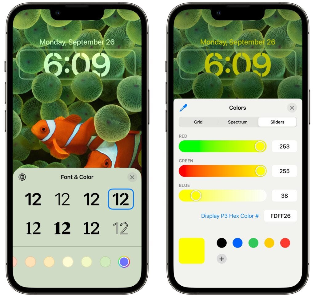
Now with iOS 26, users are now assumed to be their own designers. Inducing inaccessible and generally hard to read interfaces has become easier than ever, and there’s no guardrails for it, unlike what exists in web accessibility tooling (e.g., WCAG contrast warnings in Figma or Chrome DevTools). Even though some users claim “I can read mine fine”, they don’t have the expertise or sensitivity to know that, and other people around them might still struggle and be impacted by it.

When the response to accessibility concerns is “just change the color,” we’re basically implying that accessibility is the user’s problem to solve, not design’s job to prevent. This is worrying given that Apple’s design choices become trends. I think it’s critical to recognize this silent shift before it becomes the new default.
The people who get hurt by this aren’t the tech-savvy folks who know how to dig through settings menus. It’s people with disabilities, older adults, anyone who just wants their phone to work without becoming a UI designer first. When we tell these users to “just change the color,” we’re basically admitting we’ve failed at our job.
Our job as designers remains to build things that actually work well for everyone, even if that means disappointing some people who want more knobs to turn.
![]()
Liquid Glass’ aesthetic entropy: your interface, your problem was originally published in UX Collective on Medium, where people are continuing the conversation by highlighting and responding to this story.
This post first appeared on Read More