Design Critiques are essential to shipping high quality work and building a thriving design culture, yet many teams struggle to run them effectively. These resources can help.

If you’re struggling with critique, you’re not alone.
Ineffective critiques are extremely common. I’ve seen them at Fortune 25 companies. I’ve seen them at mid-size scale-up companies. I’ve seen them (or a complete lack of critique at all) at startups. In the last 15 years, I’ve never joined a UX team where critique was already running smoothly. In fact, I counted it a blessing if critique was running at all.
UXers are constantly inundated with requests to review their work. Their partners want to weigh in. Managers expect to stay up-to-date. Executives want a stake in the work. Designers often want feedback from other designers (or want to provide feedback to other designers). Etc.
There really is no other role quite like being a designer. (Imagine an engineer’s code being scrutinized to the same degree and by as wide a variety of audience as a UXer’s designs are. Crazy, right?)
If you can relate to these feelings, you’re not alone. It’s something nearly all designers and design teams struggle with.
The good news is that there is hope. There are some specific things I’ve seen work well to improve the effectiveness of “crit”.
Understand different design feedback meeting purposes
One of the first things I’ve observed with critique when joining a new team is that they often mix meeting purposes of the meeting they refer to as “Critique” or “Review”. I have found that the broader bucket of ‘provide design feedback’, can actually be broken down in to 4 sub-goals or problems to solve.
1. Level-up Craft and Product Experience over time.
We all need practice giving context, practicing storytelling, identifying business value and user outcomes as well as hearing others’ perspectives on if/how our ideas are solving the actual user problems you’re targeting. Exercising these muscles regularly without pressure to implement every piece of feedback levels each other up over time, helps us see out of the box, and builds trust / understanding.
2. Gain alignment with working team
At the same time, we need feedback to move the work forward. We need alignment with Product Managers and Engineers. These types of conversations often are more focused on which direction should we go, what is in scope and feasible to build right now vs later vs never. Gaining alignment is the main goal here.
3. Ensure design quality, craft, and consistency standards are met.
Teams also have a need to ensure design quality, craft, and consistency across different areas of the product. This need is similar to Peer Reviews (PRs) or Code Reviews (CRs) that are common for software engineers. For example, recently I saw a designer include a select component for a quantity field. After the Quality Review, we changed the component to an input. This is a small example. There are much larger and important quality and craft considerations as well. The key is getting another set of (designer) eyes on designs before they get shipped.
4. Keep stakeholders up-to-date & report out progress
Finally, we of course need to keep stakeholders up-to-date, democratize learnings, evangelize UX impact, and gather information on other company initiatives that might have some overlap with what we’re doing here. These are often more readouts and reaction gathering than a list of changes to go implement.
In fact, we can actually map each of these feedback types or purposes with unique feedback meetings: Design Critique, Design Review, Quality Review, and Design Shareout.
When we do, we actually find that the variance between them actually spans more than just “main purpose”. In fact, there are key differences in purpose, type of feedback, and approach that can make trying to mix them impossible and confusing.
Align on design meeting criteria
I have found there are 7 main factors that can help guide the scope and focus of each type of feedback meeting. They are:
- Main Purpose
- Type of Feedback (that should be solicited & given)
- Focus
- Who Should Be Invited
- Percentage of Work Completeness
- Required to Implement Feedback?
- Frequency
Mapping these out per meeting type has offered much needed clarity for many teams I’ve supported over the years.
In fact, the last 3 companies I’ve joined have all had the same problem. They were all mixing Design Critiques, Design Reviews, and Quality Reviews up in the same meeting. Often this resulted in variances in focus, the type of feedback that was offered, and left designers unsure if they needed to implement the feedback or not. Then they’d go and do a Design Review with their triad team and get another set of notes. This often left designers feeling like they were between a rock and a hard place.
The first thing I did was to help clarify the meeting purposes and ground us in what purpose we were solving in which context.

Design Critique

MAIN PURPOSE
The ultimate goal of a design critique is not to judge a design but support a designer in improving a design.
— Ben Maclaren,
The main purpose of Design Critique is to level each other up and level up the product experience over time. The main focus should be on Objectives. Does the design solve the objective / goal / or problem it set out to solve? If so, why? If not, why not?
FOCUS & TYPE OF FEEDBACK
As such, feedback should be focused on Questions to Consider, Unsolved Problems, and be laser focused on the objective. It’s not terrible to note inconsistencies if you see them, but that should not be the main focus of a critique.
In fact, in their book “Discussing Design: Improving Communication and Collaboration through Critique”, authors adam connor & Aaron “Ron” Irizarry detail 4 main questions that are at the heart of a well-done critique:

Notice how all of the questions are rooted in the objective? For more details, I’d highly encourage you to check out their book. It’s fantastic.
REQUIRED TO IMPLEMENT FEEDBACK?
Another extremely important characteristic of a well-done critique is that the presenter should not feel compelled to implement feedback. Again, the purpose is not on moving the work forward. It’s on leveling up craft and improving the user experience of the platform over time.
EXAMPLE
Jared M. Spool nailed these ideas home when he said:
“The seasoned critic knows the harsh truth: nothing they say will directly change the design in any way. The only way the design can change is if the design owner does it.
In the best critiques we’ve seen, the critics never made a single recommendation. Instead, they asked questions and guided discussion. They talked about the significance of design rationale as it pertained to a bigger philosophy and vision for the design.
For example, instead of saying, ‘While I think those flyout menus are slick, I recommend you nuke them and put the links in the center of the page,’ the critic might ask, ‘What alternatives did you consider for the flyout menus?’ By moving the conversation to talk about the bigger picture, everyone can discuss how this element (the flyout menus) is contributing to the total experience.
— Jared Spool, “What Goes Into a Well-Done Critique”
In Jared’s example, I might even go farther & suggest, “Can you help me understand your perspective on how flyout menus solve the objective of…?” Or, “we’re using flyout menus on this same page in a different place. Have you considered what the experience would be if they’re both open at the same time?”
WHO SHOULD BE INVITED?
Since a critique should be focused on UX craft, invitees should only include UXers. Product Designers, Content Designers, User Researchers, etc. While we very much value the perspectives of Product, Engineering, Marketing, and Sales partners, this should not be the venue for that feedback.
PERCENTAGE OF WORK COMPLETENESS
While the focus of critique is on leveling up craft, and implementing feedback is optional, there is a sweet spot of work completeness for a critique. It comes when you understand enough of the idea to be able to explain it to others, but it isn’t so far along that you don’t have time to implement any feedback you might find helpful. There is diminishing value of critiquing work that is already mostly baked and not maleable.
FREQUENCY OF CRITIQUE
It can vary, but the sweet spot I’ve landed on over the last 5 years or so is for each crit participant to present at least every other week. On my teams, that usually looks like critique groups of 4–6 with sessions held weekly and each participant presenting every other week. I’ve found that the power of critique magnifies when a designer brings the same project to crit multiple times along its lifecycle. That way the feedback and conversation can evolve with the project.
Design Review

Unlike with a Design Critique, the main purpose with a Design Review is to move the work forward. As such, this meeting should be cross-functional with a high focus on securing alignment and on implementation of the solutions. As such, the work should be a little farther along, and there is an expectation to either implement feedback or provide justification why not. The end of the conversation should result in alignment (different than consensus) and the feedback should be solution-oriented and be include considerations around business impact and technical feasibility.
If you’d like additional info on holding effective Design Reviews, I’d highly recommend checking out Tom Greever’s book “Articulating Design Decisions: Communicate with Stakeholders, Keep Your Sanity, and Deliver the Best User Experience”.
Quality Review

A Quality Review is also about moving the work forward, but its focus is more on design craft & quality over alignment and technical feasibility. Much like a engineering PR, the focus is on quality, standards, and consistency.
Just like you would never have a designer conduct an engineering PR, a Design Quality Review should only be conducted by an experienced (on my teams I require Lead or above) designer.
Different from Critique, the feedback given here is more direction than feedback. Often it’s rooted in design patterns, correct component usage, and UX best practices. While we should always respect the unique process, approach, and individuality of the designer, we also need to maintain craft standards and consistency. This could be done by a single designer asynchronously, or by a small group of designers within the domain. (If doing with a group, it should be clear who has the final say).
Design Shareout

Finally, we have Design Shareout. The main purpose here is more 1-directional than the others. Often this is keeping stakeholders up-to-date and a time for UX to demonstrate storytelling skills. It can be a time for a manager to showcase the great work of their team, or a time for IC designers to get exposure to executives or other leaders.
Considering the audience, this usually is the time to focus on business value of the work and how this improved someone’s life (along with results to back it up).
The feedback at Shareouts should be focused on clarifying questions & connections with broader initiatives or company strategies. If you find that Shareouts turn into Design Reviews, that may be a clue that you might need to involve certain stakeholders earlier in your actual reviews.
Often these meetings can get quite big. Involve not only Product, UX, and Tech stakeholders, but keep other functions informed as well such as Marketing, Sales, Operations, Customer Service, and Onboarding teams.
Pre-work to set critique up for success
Now that we are all clear on what critique is and isn’t, now let’s talk about preparations you can make to increase its effectiveness.
Group Size & Organization
In order to have meaningful discussions and allowing everyone to participate, group sizes should be limited. At my most recent company, we had ≈ 20 Critique attendees when I joined. That made it very difficult to have a meaningful critique session. So I set out to break that big group into 3 smaller groups, each led by a “Critique Captain”.
If your UX team is bigger than 4–6 designers, you will need more than 1 critique group. If that’s the case, there are a couple ways you can arrange the groups each with their own pros and cons.
EMBEDDED MODEL
The default way many managers think to organize critique groups is by domain. This makes sense. UXers who already work closely together or on inter-related projects don’t need as much context setting. They likely are already familiar with the problems at hand, report to the same manager, have rapport built up, and work closely together. The groups in this scenario resemble the org structure. For us, this would have meant creating critique groups for each of our 4 domains:

The down side to this way of organizing the groups is that group size doesn’t always load balance well and it maintains a semi-silo between teams. Which for our particular needs led us to explore other options.
CROSS-DOMAIN MODEL
With the Cross-Domain model, we sought to load balance group sizes while having as many domains represented as possible. We are a big enough team that it wasn’t possible to have all domains represented and still keep groups small, but it did work out for each group to only be missing 1 domain/function. We went with 3 groups.
In our case, the decision was to made to include researchers as participants but not as presenters. So that meant each group was comprised of 4–5 designers.

One other benefit of the Cross-Domain model is that it makes it possible to not be stuck in the same group for months or years. I like to switch up groups & critique captains every 6 months or so. This allows multiple people to gain experience running critique groups and allows group members to get to know the work of different designers and domains.
Critique Roles
It’s vital to clearly define the distinct roles in critique. For each session, identify who will fill what role. It’s not required (nor even advisable) for the same person to always fill the same role. In fact, everyone in a group should rotate filling each role. On my teams, I identify 5main roles:
- Critique Captain—the person responsible for overseeing critique, making sure it happens, managing the calendar invites, ensuring roles are rotated among the group, etc.
- Facilitator — moderate the process and keep everyone on track (within the session)
- Presenter—the one presenting work for critique
- Critics—those giving feedback
- Notetaker—someone responsible for documenting any conversation points not represented via sticky notes
Critique Captains rotate every 6 months. Facilitators & Note Takers rotate every week. Presenter and Critics rotate from slot to slot within a critique session.
Making sure the person who will be fulfilling each role is clearly documented can help align expectations and be a useful reference after the fact.
Presenter Schedule
Many teams run critique slots on a sign-up or opt-in basis. When I first started running critiques I did as well. I really wanted it to work. I value autonomy and trust. I loved the idea of letting people sign up when they needed feedback. My experience has been that sharing in-progress work doesn’t come naturally for the majority of designers. Critique can feel like judgement—especially after joining a new company or team. Most designers tend to want to wait until designs are polished before sharing work. This results in a lack of sign ups, or in the same 2 people presenting over and over.
In order to ensure that everyone presents regularly, I’ve found it necessary to create a rotation schedule. Each designer is required to present at least every other week. We meet each week for 60–90 minutes (depending on group size) and each slot is 30 minutes long. Designers are welcome to trade slots if they’d like.
Presenters send the Critique Captain their topic 24–48 hours prior to the critique session so the calendar invite instance can get updated. Each calendar invite instance includes the following in the description:
- Facilitator [Name]
- Presenter 1 [Name] — [Topic]
- Presenter 2 [Name]—[Topic]
- Notetaker [Name]
Create a template for consistency
Too much structure and formality can get in the way of effective critique conversations, but what I’ve found is that teams often go to the opposite extreme. It is extremely common for there to be little consistency in process for setting the stage, providing feedback, and what happens afterward. It’s left up to the individual. Even on the rare occasions there is consistency, there’s no record for later recollection. This inconsistency and variability often limit effectiveness. Finding a happy medium between rigidity and flexibility is vital to the success of critiques.
In order to help put some structure around the process, and keep all critique feedback in one place (separate from the working files that non-designers have access to), I created a template that serves as the basis for critique sessions. Presenters fill it out in Figma and then copy/paste to FigJam where we hold the actual critiques. Each presenter fills out their own template. (So there are 2 per session).
If you would like to download this template for your own use, you can find it (along with all the other resources described in this article) in the Figma Community Resources as a free download.
The template has 4 main sections:
- Title / Overview
- Set the Stage
- Work to be Critiqued
- During Critique
Title / Overview
The title / overview section keeps a record of:
- Domain
- Project
- Presenter
- Facilitator
- Note Taker
- Date
These are useful pieces of information when going back and reviewing the feedback after the fact. It keeps us grounded in where the work that we’re reviewing fits in.
Set the Stage
This section is filled out prior to critique starting. It documents the Objective and serves as the basis for the context setting the presenter does at the beginning of the session.
- BACKGROUND

In this section the presenter adds information needed to understand the objective, including what motivated the project, who the users are, what journey stage the project applies in, etc. In our case being a 2-sided manufacturing marketplace, background info included what stage of the order lifecycle it applied to.
2. PROBLEM / OBJECTIVE

This is maybe the most important pre-fill section. This is the objective or problem the project is trying to solve. This should form the basis of the critique, and all feedback should relate to it. What are the pain points? Why is this problem worth solving at this time?
3. LEVEL OF EFFORT (Optional)
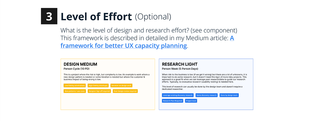
Here, presenters specify what the level of design and research effort are. This is helpful context to understand why the designer may have taken the approach they did. It’s intended to be a high-level t-shirt size of effort based on criteria such as Complexity and Risk (for design) and Problem Clarity and Risk (for research). The LoE identified could be a point of feedback in and of itself!
For more information, please see my Medium article A framework for better UX capacity planning.
Variants are set up in the Figma file so you can choose the appropriate level for Design effort and Research effort. This section is optional, but highly recommended.
4. PROJECT STAGE (Optional)

I’ve found it helpful when introducing work for critique to identify where you’re at in the process. Is this work early, mid, or late in the process? This info can help guide the kind of feedback given.
This section is optional but recommended. There is a component set up in the Figma file so you just choose which stage you’re at.
5. FEEDBACK REQUESTS

This section is 100% optional, but sometimes it’s helpful to call out if there are specific focus areas of feedback. (Remember to keep requests grounded in design elements related to the objective). It can also be helpful to call out here what is already decided.
Work to be Critiqued

Next, in the middle section titled “Work to be Critiqued”, the presenter places the work to be critiqued. The template has placeholder containers for mockup / prototype screens, but it could be anything. The important part is that this is the main section where the focus of the critique will be. Copy / Paste artboards, screenshots, text (such as a research plan), whatever it is you want to be critiqued.
Copy / Paste into FigJam

Once work has been added to the “Work to be Critiqued” section, copy & paste the entire template into FigJam, Miro, or whatever tool you plan to use for the actual critique. I created the template in Figma to speed up filling out certain sections, take advantage of auto layout, etc.
I typically create 1 page per critique group in the same Figma file and then lay out the pasted templates by date. (So you would have 2–3 templates per date depending on how many presenters you have per session). That way we have everything in one place.
Design a structured critique process
As I’ve mentioned a few times, adding some rigor and structure around how you run a critique session is vital to its success and keeping everyone on track. So, on the template I also have an outline to remind the team of the process we follow. The process that has worked well for me is explained below.
1. Give Background (2 min)
The presenter reviews Background Info, Problem / Objective, Level of Effort, and Project Stage briefly with the group. If you find that this is taking longer than just a couple minutes, the facilitator could consider having everyone read the Set the Stage content. I prefer to have the presenter summarize when possible, though, because setting the stage succinctly is a skill needed far beyond just critiques. (It’s a good excuse to practice).
2. Walk Through the Work (3 min)
The presenter then quickly tells the story of the work so far including challenges they have faced and decision points they have made so far.
3. Ask Clarifying Questions (2 min)
Critics ask any clarifying questions needed before offering feedback.
Tip for facilitators: watch out for feedback masked as a clarifying question. If it happens, ask the critic to capture it in the feedback. At this stage of the process, we just want questions that clarify what the objective is, who the intended users are, etc.
4. Silent Feedback (7–10 min)
Now it’s time for the actual feedback. I’ve found that adding feedback silently first ends up resulting in more feedback and allows everyone to share their thoughts. (Sometimes if you jump right into discussion, the loudest voices can take over the conversation).
Critics use sticky notes, markers, and stamps to comment. Notetaker uses “comments” to take notes on the conversation about specific pieces of feedback.
STICKY NOTES (S)
The default way for leaving feedback. Place them wherever. Leave as much feedback as possible. Keep feedback grounded in objectives.

MARKER (M)
Where needed, point to specific elements in the design, or draw a quick doodle. Hold shift to make a straight line. Good practice to also include a sticky note explaining misalignments, etc.

STAMP (E)
Use stamps to dot vote, leave a +1, or just show some love.

COMMENT (C)
Use comments to add additional perspectives or conversation on feedback given via Sticky Notes.

5. Conversation (10–13 min)
Feedback is then discussed on a round robin basis as called upon by the facilitator.
Each critic chooses 1 (and only 1) piece of written feedback to discuss. This is to ensure everyone gets a turn.
The order should be as follows:
- Designers in other domains (from the presenter)
- Designers in same domain.
- Leads / Managers
As a general rule, I try to always let lower level designers go first to ensure everyone gets to participate. Seniors, Leads, and Managers often have a wider variety of feedback and can discuss something no one else has mentioned.
6. Wrap Up & Reflection (3 min)
Presenter then summarizes their main takeaways and thanks the group for the feedback. They don’t need to summarize what everyone said (that’s what the documentation and notes are for), but it is helpful to reflect and communicate what were the most interesting and helpful pieces of feedback. This should be captured in the template by the note taker.
Set Clear Expectations
Even with all these resources & structure, sometimes it is a lot to take in for the team and over time expectations can start to fade. Having a clear, written set of instructions can be very helpful for reference and clarification later. Here are the written expectations we came up with at Xometry. Shout out to Jeremy Miler who wrote the initial draft, Addison Kavish whose brilliant content background helped us refine it, and Talia Malkin for her invaluable perspective as well. They are the best critique captains a manager could ask for.
1. Critique is not optional. It’s part of the work.
In the past, critique has sometimes felt like a drop-in. Going forward, it’s a core part of our design process. Tom and Jeremy Bird want to reinforce that showing up matters. Unless you’re on PTO or handling something critical, you’re expected to attend and engage.
2. We’re operating on a rotation. Everyone presents every other week.
Instead of a sign-up model, we’re running on a set rotation. That way, everyone gets equal time and knows when to prepare. You’ll be expected to present every other week, and knowing your scheduled week gives you time to pull together something thoughtful (not perfect).
3. Use the template — but don’t feel boxed in.
The critique template is a tool to help you frame your work, clarify what kind of feedback you’re looking for, and give the team context. It’s meant to support your thinking, not add red tape. Use it as a guide.
4. There should always be something to share.
We’re all working full-time, so there’s always something to bring, even if it’s rough. You might share early concepts, flows, IA, copy, or just something you’re stuck on. In a pinch, you can bring in outside inspiration (e.g., a competitor workflow or real-world UX moment) to spark discussion. That should be the exception, not the norm, but it’s better than canceling.
5. Presence matters.
This only works if we’re fully in it. Please show up with cameras on ready to engage, not just observe. Ask questions, offer feedback, and help your teammates push their thinking. Multitasking is tempting, but critique deserves your full attention. If you’re attending, be attending.
Tips & skills to level up design critique
Finally, to wrap it all together, I’d like to share some best practices I’ve compiled over the years that can help us all continually grow and become better at both presenting and critiquing work.
I’ve shared some specific examples and frameworks of how I have approached increasing the effectiveness of critiques. At it’s core, however, all the above tactics, frameworks, expectations and templates all roll up into a few key principles. If you take nothing else away from this article, look for ways you can apply these principles on your own team.
Tips for Facilitating Critique
- Ensure context is provided. Require presenters to frame their work: the challenge they’re solving, key insights, and measures of success.
- Promote equal participation. Don’t let the conversation get taken over by the vocal minority. Design a process that encourages all to participate and share their perspective.
- Keep it focused. Don’t let the group get lost in adjacent challenges or insignificant details. Keep track of time and ensure the group stays centered on the key objective.
- Pause brainstorming. It’s natural to start problem-solving, but brainstorming requires a different mindset at a different time. Let participants know that will come later.
- Capture notes and open questions. Ensure the critique is captured for the recipient to review & share with cross-functional teammates later.
Tips for Giving Critique
- Lead with questions. Don’t make any assumptions; expore what you don’t understand.
- Filter reactions. Write down your initial reactions as a filter to get more diliberate dialogue, rather than just chatter.
- Acknowledge what works. Critique is about strengths of the design decisions, too. By calling out things that are working well based on the objectives, we’re able to repeat our successes as a team and eventually inform our design systems.
- Speak from the objectives. Remove opinions by grounding your critique in the project goals and user’s perspective.
- Save feedback for later. If you have opinion-based feedback or ideas, make note of them, but don’t base the discussion around them. We want to take into account everyone’s ideas in our work, but critique should be rooted in the objective. (Remember, craft and consistency fall in the realm of Quality Reviews.)
Tips for Receiving Critique
- Frame your work. Use a written brief (such as a template) to define problem & success metrics. Every time.
- Set the focus. Come to critique with a specific objective in mind to help the group stay focused. If you want feedback on a particular aspect or the whole design, make it clear.
- Listen, then respond. Internalize the question or feedback before responding reactively. The team is critiquing the work, not your worth as a designer.
- Stay open. It’s not hard to react negatively to feedback. Capture the critique and reconsider it when you feel more comfortable.
- Participate in the critique of your own work. Participating in the critique of your own work and taking a look at it anew from someone else’s perspective inspires the switching from creative to analytical thinking. It separates us from the work, making it easier for others to engage without hurting feelings.
- Take careful notes on the discussion. Processing critique may take some time. Capture notes for later, or have someone do it on your behalf.
Additional Reading
- Discussing Design: Improving Communication and Collaboration through Critique” by Adam Connor & Aaron Irizarry.
- Articulating Design Decisions: Communicate with Stakeholders, Keep Your Sanity, and Deliver the Best User Experience by Tom Greever.
- A Framework for Better UX Capacity Planning by Jeremy Bird.
- What Goes into a Well-Done Critique by Jared Spool.
- Design Critique Culture by Boris Müller
- Why your design critique sucked by Ben Maclaren.
- Derailed Design Critiques: Tactics for Getting Back on Track by Rachel Krause
Got a question about this content? Need a UX, Product Design, or Research leader to help evolve your organization’s UX maturity? Looking for 1:1 mentoring services? Connect with me on LinkedIn, check out my portfolio, or send me an email.
![]()
Improving design critiques was originally published in UX Collective on Medium, where people are continuing the conversation by highlighting and responding to this story.
This post first appeared on Read More