User errors happen. Sometimes it’s a mistyped password. Other times it’s a poorly labeled button. But the good news? Many of these errors can be designed away.

Instead of blaming users for making mistakes, great UX designers focus on preventing those mistakes in the first place. That’s where error-prevention design comes in — an idea backed by Jakob Nielsen’s usability heuristics. Whether it’s simplifying an interface or adding just the right bit of guidance, the goal is always the same: help people succeed without tripping up.
In this article, I’ll walk you through 12 real-world UX design examples — from GitHub to Google Calendar — that show how thoughtful design can reduce user errors and improve overall UX. You’ll get practical takeaways you can apply to your own projects.
What counts as a user error?
A user error can happen when the user unintentionally does an action or chooses the wrong action by misunderstanding the UI, and a user error can be a slip or mistake as follows:
Slip
A slip is an unintentional action. A user may initiate a slip due to a lack of awareness, distraction, or being in a hurry. Here are some general examples of user slips:
- Accidentally clicking “Logout” instead of “Settings”
- Typing “m” instead of “n” when resetting a password
- Pressing “Escape” while trying to set your cup down
Mistake
A mistake happens when a user misunderstands what they should do. It often comes down to a mismatch between the user’s mental model and how the interface behaves. For example:
- Closing a pop-up to view something else and accidentally clearing a form.
- Entering a customer’s initials when the system expects a full name.
- Thinking “Delete” means gone forever when really it just sends a file to trash
Who is responsible for user errors?
Some designers argue that users are solely responsible for user errors, as they could act responsibly to avoid slips and understand the digital product to prevent mistakes. Meanwhile, some experienced designers may argue that UI/UX designers are solely responsible for user errors since a perfectly designed UI can prevent all user errors. Who is really responsible for user errors?
Considering practical design aspects, both users and designers are responsible for user errors. It’s not practical to make perfect designs by monitoring all user errors and designing a system to fit all unique user mental models. A design team should improve the UX of a digital product to prevent common user errors, and users should try to improve basic human-computer interaction (HCI) skills to interact properly with general digital products.
So, when a user error occurs, its responsibility gets fractioned and spreads in both the user and designer roles based on error prevention UX characteristics of the particular digital product. Improving UX with error prevention strategies drastically reduces designers’ responsibility for user errors.
Example UX designs that prevent user errors
Let’s explore some popular digital product designs and identify how they effectively implement error prevention to avoid user errors from happening:
GNOME Files app: Clear, simple, well-organized design
A user undoubtedly makes fewer errors when a specific UI becomes minimal and offers fewer actions in its initial state. A simpler design hides advanced actions within hierarchical layers, also helping everyone discover the UI more quickly.
The GNOME Files app, aka Nautilus, implements a clear, simple, well-organized view by only displaying required actions with lesser element complexity:
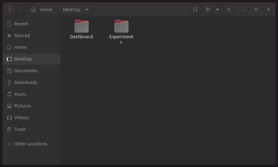
Here is how it uses simplicity and organized structure as an error prevention strategy:
- Offers only simple actions with basic user interaction events to avoid slips. i.e., there is no complex, fully-featured tree view, so users won’t accidentally move files
- Presents only basic features with suitable, self-explanatory icons and lets the users access advanced features from menus to help new users easily understand the interface, and also avoid slips
- Organizes menu items and toolbar items based on general usage to take instant actions without thinking twice, avoiding slips
GitHub repository settings: Less error-prone positioning
Designers never place dangerous or irreversible actions in the first hierarchical layer of a UI since users might press them unintentionally. That’s why we see all apps place the logout option inside a menu, and even at the end of it.
GitHub effectively uses this positioning strategy to put several risky and irreversible settings away from the other, less severe, frequent general settings:
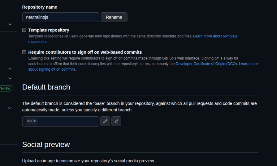
GitHub displays these dangerous actions with the following positioning techniques to avoid user slips:
- Groups the dangerous actions into a separate panel and orders each action based on severity and risk
- Places the dangerous action group at the end of the repository settings page, away from the other frequent action space
Medium account settings: Less error-prone styling
Placing big red buttons with all-capital-letter text labels to warn users about severe actions is an old-fashioned, less user-friendly approach — now designers use minimal styles or friendly confirmation flows to warn users about action consequences in a friendly way.
The Medium publishing platform employs minimalism as a core design principle and consistently strives to minimize UI clutter. Its account settings page highlights both severe and irreversible actions with a shaded red text color to prevent user mistakes caused by mindless clicks:
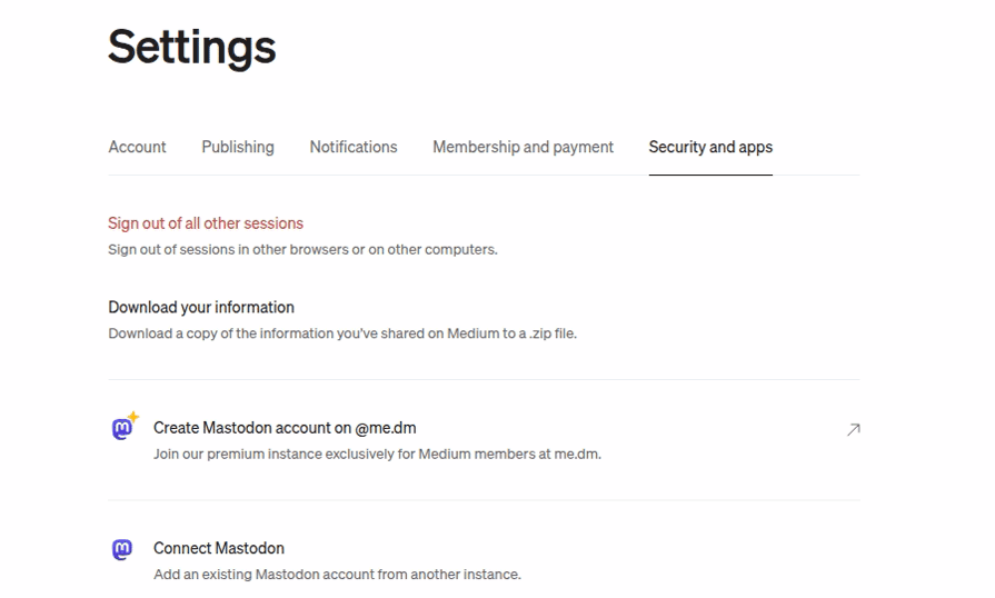
Here are some specific styling details behind this text coloring:
- Uses
#c94a4a, a faded red color variant, as the link text color, which is not too intrusive but highlights the severity of the action. The color selection prevents user errors without affecting user-friendliness - Manages consistency with other general, non-risky setting actions by not using other text styles like font-weight apart from text color to highlight danger
Walmart’s advanced filtering: Using a few optimal input elements
Using more traditional form inputs, such as text inputs and dropdowns, increases the error-proneness of the design. That’s why most designers stepped away from conventional, detailed form-based designs to futuristic forms that use a few, optimal input elements. For example, users won’t make any typing slips if you use social media sign-in buttons instead of limiting users to a traditional signup form.
The Walmart website’s advanced filtering section steps away from traditional text/number inputs and dropdowns and uses range selectors and checkboxes as follows:

Here is how Walmart’s advanced filtering section tries to eliminate user errors:
- Uses range sliders instead of number inputs, since number inputs are more error-prone as they require keyboard interaction
- Uses range sliders instead of dropdowns since dropdowns add a new UI layer hierarchy, and users can accidentally close the dropdown or select the wrong option
- Dynamically adjusts the price range selector’s start/end points and uses a dynamic, comfortable, and less error-prone range selector step based on the available products. Besides, uses guide text under each range slider, i.e., the price range slider displays, $0, the middle price, and the highest price
- Displays only four checkboxes based on the available product count for each filter and lets users see other options by clicking on the “Show More” option
Best Buy checkout page: Using input formatters
Using text inputs is inevitable in some form designs, as the text box is the standard, practical way to capture various text segments from the user. In some scenarios, text inputs are more productive and usable than date or time inputs. For example, almost all credit card expiry date inputs use a text input to capture the expiration month in the MM/YY format, rather than a month selector. Designers can drastically reduce user errors and boost user productivity in free-text inputs by implementing input formatters, which allow only specific keys and automatically format the text.
The checkout page of the Best Buy ecommerce website implements input formatters for first name, last name, postal code, and phone number inputs:
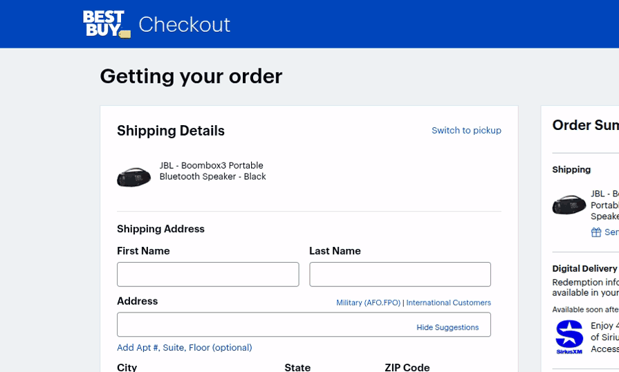
Here is how the checkout form implements input formatters, aka masked inputs, to reduce user errors:
- The first name and last name fields accept only letter keys, spaces, and basic special characters like
-,., etc, and block other entries like numbers and special characters that won’t be a part of a usual name to avoid slips - The postal code input accepts only five digits and rejects all other key inputs
- The phone number input accepts only ten digits and automatically adds spaces after the first three-digit chunks using the
xxx xxx xxxxinput mask to let the user avoid slips and scan the number faster
eBay product search: Reducing keystrokes with suggestions
We won’t be able to productively use search engines if they don’t display suggestions and require us to enter the complete search term. Every popular search engine displays suggestions, allowing users to easily search for something if they only know part of it or don’t know the exact spelling. Displaying relevant suggestions not only reduces user errors but also gives a feeling that expected results will be available on the results page.
The eBay website’s product search field implements a search-engine-like suggestion to prevent the user from entering invalid keywords:

The eBay search field reduces the required keystrokes to initiate a valid product search with the following design considerations:
- Initiates the suggestions list as soon as the user enters a single character within the input field
- Users can bring suggestions to the search field using the arrow keys and continue completing the search term, i.e., entering “ip”, selecting “iphone 14 pro max”, and then selecting “iphone 14 pro max leather case” by entering “le” is less error-prone than trying to enter the complete search term
Google Calendar event creation: Using reasonable defaults
Using reasonable defaults can reduce slips because users can often continue with the default value, and it can also reduce mistakes because the default value indicates the type of data that should be entered or selected.
Google Calendar, a popular time management and scheduling app, implements reasonable defaults to let users schedule a one-hour event for the nearest half hour just by typing the event title. The Google Calendar will apply reasonable defaults for all event-related fields as follows:
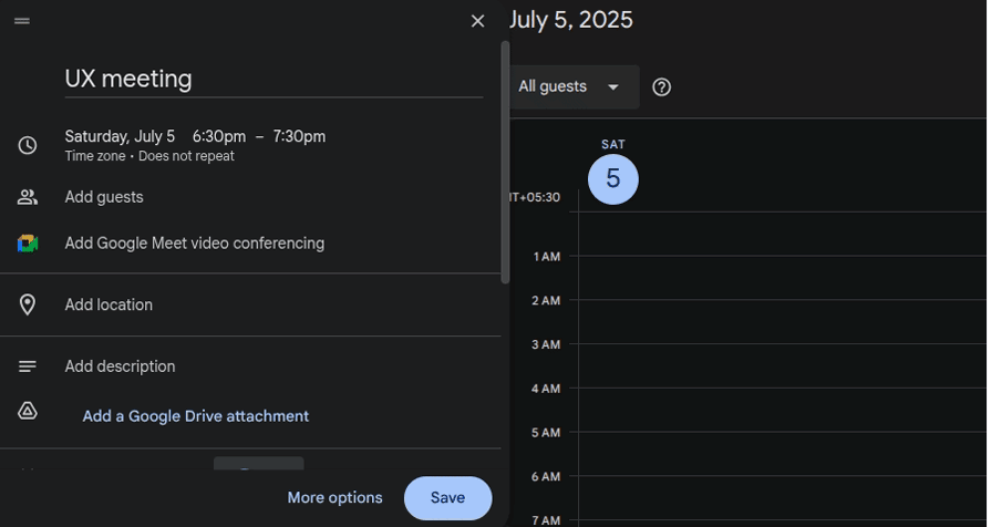
Google Calendar’s event creation form sets reasonable defaults as follows:
- Uses the nearest half-hour as the default event start time and sets the event end time by using the default event duration as one hour
- Creates a non-repeating event by default. The “Does not repeat” default selection describes the meaning of the dropdown even if it doesn’t have a traditional form label
- Sets two default reminders: 30 minutes before by email and by notification, even if the user creates an event in a hurry without even looking at the notifications field
GNOME Terminal app design: Using visual cues
UX affordances are fundamental digital product properties, such as buttons and scrollable elements, that indicate how a digital product can be used. Signifiers highlight these affordances by utilizing various visual cues, such as icons, labels, colors, and images. Designers can effectively use visual cues to prevent user errors by highlighting the consequences or meaning of a specific action.
The well-known GNOME Terminal app uses visual cues to prevent user errors:
Here are some highlights from its effective visual cues:
- Invents a new self-explanatory icon for the “Open a new tab” action and solves ambiguities between “open a new tab” and “open a new window” actions
- Displays the current directory in both the app window title and each command line, so users won’t execute commands in the wrong directory
- Shows a flashing block as the cursor always, so users are aware that a command is running or the computer is not stuck
GitHub signup form: Instant validations
Input validation has evolved with modern UI/UX design techniques. Earlier, most digital products validated user inputs after data submission and displayed alert messages to inform users. Later, the simple alert message turned into multiple individual form-field alerts. Now, most input forms do instant validations when they detect possible user errors before submission. GitHub implements a descriptive sign-up form by explaining input constraints and validates inputs instantly to avoid invalid data inputs:
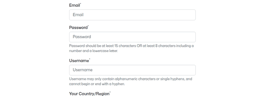
Here is how the GitHub sign-up form tries to prevent errors with instant and friendly validations:
- Doesn’t trigger real-time validation until the user types an invalid input and focuses on another UI element to prevent errors without annoying users who continue typing valid inputs
- When the given user name is not available, the form displays the error with some suggestions in a friendly, inviting way
- Gives a positive impression to the user when the user enters a valid input in each field by displaying a green tick icon
- Displays a specific error message for different invalid passwords, i.e., Password needs a number and a lowercase letter, to quickly enter a strong password
Booking.com search box: Blocking invalid flows with constraints
You cannot pull a well-designed drawer until it drops to the floor because it’s designed in a way that prevents it from being pulled beyond the safe region. That’s how well-designed products block invalid usage flows with constraints. Similarly, designers block invalid user flows with various constraints to prevent user errors.
The most popular hotel reservation website, Booking.com, implements effective constraints in the search box to prevent users from initiating invalid flows:
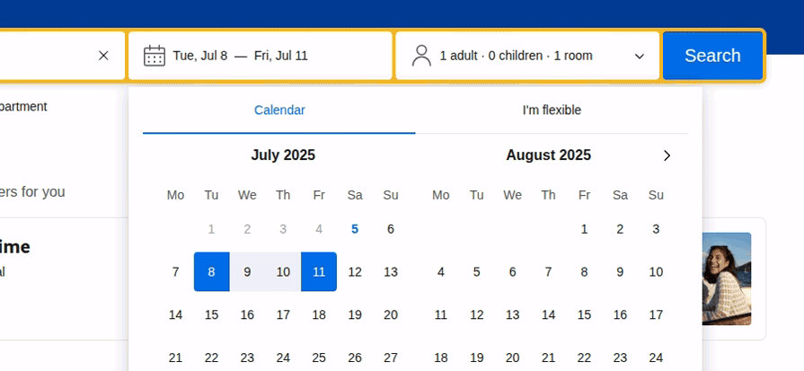
This search box implements the following constraints:
- The date range selector greys out past dates and doesn’t let users choose invalid ranges (i.e., the start date is greater than the end date), so users cannot accidentally or deliberately select invalid dates
- The adults, children, and rooms count number inputs use pre-defined constraints to prevent invalid inputs, i.e., users cannot enter a number less than 1 for the adults count and a number less than 1 for the rooms count
- Date range input and number inputs don’t support keyboard input, so keypress slips will never happen
Gmail, while sending an e-mail: Effective confirmation dialogs
Confirmation dialogs temporarily pause initiated user actions and request user confirmation to prevent user errors. A simple confirmation dialog can prevent user frustration that can even lead users to start disliking your digital product. So, designers include effective and friendly confirmations before executing irreversible actions.
Gmail displays a friendly and helpful confirmation dialog when the user includes the “attached file” phrase in the email draft but doesn’t attach a file, to remind users whether they actually forgot to attach a file:
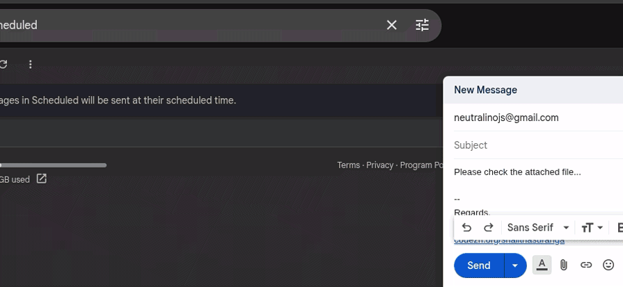
Here is how Gmail makes this confirmation dialog more effective:
- States users if they forgot to attach a file in a friendly way, and then describes how Gmail detected it using a concise sentence. Finally, the confirmation message asks the user whether sending without attaching a file is desirable
- Automatically focuses on the “OK” action and supports the return and escape keys to continue and cancel, allowing the user to quickly act
- The confirmation dialog gets rendered on top of a transparent backdrop layer that blocks interaction with other UI elements to gain attention
Google Drive file deletion: Using the quick undo option to reverse actions
Confirmation dialogs effectively prevent users from entering dangerous or irreversible actions, but they can sometimes overwhelm users, especially when they tend to complete tasks quickly. So, designers started implementing quick undo toast messages instead of confirmation messages for reversible actions, allowing users to act faster and offering a way to recover from user errors.
Google Drive displays a simple toast message with the undo action link after deleting a file:
Drive’s file deletion undo feature has the following notable characteristics:
- Displays the toast message for a few minutes to let users notice it if they deleted the file by mistake
- Supports the Ctrl + Z keyboard shortcut to recover the file even after the toast message has disappeared
- Acknowledges the user with another toast message if the user selects the undo operation
Best practices for implementing error prevention strategies
Error prevention strategies sometimes affect usability, user-friendliness, and overall UX, so designers should tune the design to optimally prevent errors without affecting UX, using the following best practices:
- Minimize two gulfs — Always try to reduce the gulf of execution and evaluation while implementing a simple, clean design that prevents user errors. Try to balance general usability factors and error-preventability optimally
- Don’t use distracting styles — Using noticeable colors and styles in error messages is effective, but avoid distracting users with excessive and distracting styles that can negatively impact their emotions. For example, earlier we discussed how the Medium settings page effectively uses a minimal, non-distractive style with a suitable color for irreversible actions
- Aim for relevant suggestions — Suggestions effectively reduce user typing errors, making them more relevant with better searching algorithms, which improves user productivity and user-friendliness further
- Aim for optimal defaults — Decide default values carefully by evaluating available data and user behavior. Personalizing default values is another approach to making defaults more effective
- Don’t overwhelm users with error messages — Error messages are a practical and effective way to prevent errors, but make sure not to overwhelm users with them. In some scenarios, designers can use input formatters to replace error messages, i.e., using a masked input for postal code rather than displaying validation errors, as the Best Buy checkout page does
- Don’t overwhelm users with confirmations — Frequent confirmation dialogs can be annoying for users who work faster with your digital product. So, make sure to avoid excessive confirmations by using less error-prone designs or undo operations
FAQs on error prevention design strategies
Let’s discuss some common questions that most designers start thinking about when they start implementing error prevention strategies in their designs:
How to test error prevention in digital product designs?
The effectiveness of error prevention strategies can be tested with specific UI test cases created based on user errors that designers need to test.
Should we always follow a minimalistic design to prevent errors?
The minimalistic design approach naturally reduces user errors due to optimal user interaction points. However, designers can reduce the gulf of execution and evaluation in any design non-minimalistic philosophy (i.e., maximalism) to effectively prevent errors.
Should all actions be reversible and facilitated with undo?
No, trying to implement undo support for many actions increases development complexity, so the recommended strategy is to implement undo for serious, frequent actions like deleting a file, broadcasting a message, etc.
Is real-time validation the best approach?
No, real-time validation may feel helpful, but it’s actually annoying for users who are confident about their inputs. Validation on focus out or activating real-time validation only after the user completes entering an invalid input are better options.
Conclusion
In this article, we discussed user errors, their responsibility, and practical, effective error prevention strategies by evaluating 12 popular digital product designs. Error prevention is a recommended strategy to improve overall UX, as described in the 10 usability heuristics that most UI/UX designers know.
Optimal, user-friendly error prevention occurs when you carefully implement error prevention without compromising general usability factors, such as discoverability, learnability, and efficiency. Aim to create effective and user-friendly error prevention designs by using the above 12 examples as inspiration.
The post 12 UX design examples that show how to stop user errors before they happen appeared first on LogRocket Blog.
This post first appeared on Read More