“Take your pleasure seriously”: why joy sustains serious work
Serious contexts deserve serious fun: how theory and design details make hard work feel lighter.

Recently, I was asked to work on a platform for an industry facing real headwinds. Layoffs and overwork have left many people drained, and the question from the client was simple but profound: can design ease some of that mental burden for the people using our platform? Not with gimmicks or forced fun, but with subtle sparks of relief.
When we talk about “ease,” two factors consistently emerge in both psychology and design research: how simple the task flow feels, and how approachable the interface looks. Together, they shape whether work feels exhausting or manageable.
These aren’t just opinions — there’s decades of evidence behind them. In fact, experiments from the late 1980s and 1990s remain some of the clearest demonstrations of how simplification and appearances directly influence how people experience work.
Designing for perception and workload
Hitachi ATM Study (1995): when beauty feels like ease
In the mid-1990s, Hitachi researchers Masaaki Kurosu and Kaori Kashimura tested 26 versions of an ATM interface. The layouts were functionally identical — same buttons, same screens — but varied slightly in appearance.
When 252 participants rated each version, the results were clear: screens that looked more attractive were consistently judged as easier to use. The correlation between beauty and perceived usability was strong (r = 0.589), while functional factors showed almost no link.
The researchers called this gap apparent usability versus inherent usability. Their conclusion: users don’t judge ease of use by logic alone — appearance biases perception. This became known as the aesthetic–usability effect: if it looks better, it feels better.

NASA Task Load Index (1988): measuring the invisible weight of work
Around the same time, NASA researchers Sandra Hart and Lowell Staveland were exploring a different angle: how to measure the mental burden of complex work. They developed the Task Load Index (NASA-TLX), a tool still widely used today in aviation, healthcare, and other high-stakes industries.
Unlike traditional metrics like speed or error rate, TLX captured how demanding a task felt across six dimensions: mental, physical, and temporal demand; performance; effort; and frustration. In simulator studies, pilots completing simplified workflows reported workload scores that were 20–30% lower than those using more fragmented procedures — even though both groups performed the same tasks.
The insight was profound: efficiency isn’t only about speed — it’s about lowering invisible cognitive strain. Every extra click, redundant field, or unclear step adds to workload. Strip those away, and you don’t just save time — you preserve attention and energy. If research shows us the why, design shows us the how.

Examples in design: digital and physical
The Hitachi and NASA studies highlight two essential truths: appearances shape our perception of ease, and simplification reduces the invisible burden of effort. But how do these lessons play out in design?
Asana: micro-animations that motivate

Asana’s celebrated “celebration creatures” bring unexpected delight into everyday work. Complete a task, and — occasionally — a unicorn, narwhal, yeti, phoenix, or otter will speed across your screen in a brief burst of color and motion, provided you’ve enabled the feature in your settings.
These aren’t just cosmetic flourishes — they’re crafted moments of deep delight, layered on top of a robust project management platform. Asana designers themselves distinguish between mere “surface delight” (flashy visuals on a weak foundation) and “deep delight,” the latter being joy built on top of genuinely useful design.
What makes these interactions especially effective is their unpredictability. The creatures appear occasionally — not every time — tapping into a variable-ratio reward schedule, a principle known in psychology and game design (like slot machines) for its motivation power. We keep going, hoping for just one more magical spark. (As I noted in an earlier piece, “Extra-gamified: why are some apps so satisfying?”, Harvard’s B.F. Skinner demonstrated this tendency back in 1948 with his famous pigeon experiments.)
To deepen that emotional connection, each creature also comes with a touch of personality: the unicorn is said to have studied pyrotechnics and equestrian arts, the narwhal codes in “Sea++” and “Ruby on Snails,” and the yeti enjoys mountain walks and even anti-fur protests. These quirky backstories turn them into more than just animations — they’re mini-narratives that humanize the experience and make Asana feel both thoughtful and playful.

Slack: why playfulness went mainstream

When Slack launched in 2013, team chat software already existed. Enterprises had used tools like Microsoft Lync, IBM Sametime, and HipChat for years. But those systems looked and felt like extensions of corporate IT: gray palettes, rigid layouts, and an email-like formality. They worked, but they felt transactional, more like infrastructure than conversation.
Slack flipped that expectation. Born inside a game studio — Stewart Butterfield’s Tiny Speck, while building the online multiplayer game Glitch — Slack carried a very different design DNA. Instead of approaching internal communication as enterprise software, the team designed it like a game interface: colorful, playful, rewarding, and alive. Channels resembled persistent “worlds” where context was always present, emoji reactions gave instant, expressive feedback, and micro-copy in loading or error states injected personality instead of scolding.
Color was central to this shift. Slack’s signature purple and accent hues felt closer to consumer apps than to corporate utilities, signaling friendliness and approachability rather than bureaucracy. This design choice mapped directly to the aesthetic–usability effect: when software looks inviting, users perceive it as easier to use — even before they’ve tested its functionality.
The emoji reaction system carried similar weight: what could have been dozens of repetitive “Thanks” or “Got it” replies instead became quick visual signals. These not only reduced cognitive load by replacing text with simple icons, but also added a touch of color and humor to work threads.
By 2015, Slack was adding 10,000 new daily active users every week, supported by 135,000 paying customers across 60,000 teams. Slack became mainstream not just because it solved a collaboration problem, but because it changed how work tools felt. Where its competitors looked corporate and cold, Slack felt closer to the consumer apps people used outside the office. It was professional, but playful; structured, but human. That contrast — rooted in game design and sharpened against corporate predecessors — is what let Slack redefine the category and scale so quickly.
This blending of seriousness and play isn’t limited to software. Designers have long wrestled with the same challenge in the physical world.
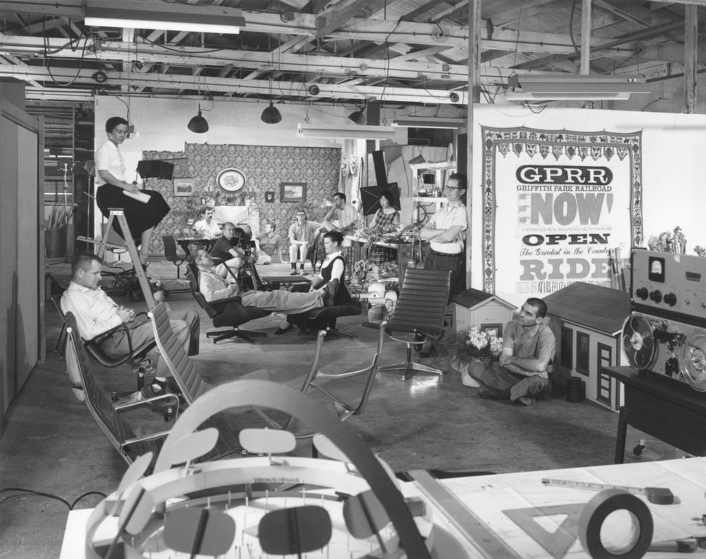
Eames’s “Serious Fun”: humanizing the corporate world

Long before digital products married efficiency with delight, Charles and Ray Eames were quietly designing playful seriousness into furniture. Their ethos — aptly named “serious fun” — affirmed that productivity tools (physical or digital) could be both functional and joy-giving.
The Eames Office didn’t just produce furniture — they crafted environments, toys, and even films that invited adults to experience creative freedom. From cardboard playhouses to innovative toy kits made from shipping materials, play wasn’t an afterthought — it was foundational. This philosophy undergirded all they did.
Eames Lounge Chair & Ottoman (1956)
This iconic chair wasn’t designed for aesthetics alone — it was engineered to comfort. As Charles Eames described, the goal was to evoke “the warm, receptive look of a well-used first baseman’s mitt.”
Here’s a nugget of storied design lore: an early prototype prompted the telling scene — film producer Julian Blaustein once fell asleep in the chair while Charles was away. Rather than embarrassed, he was delighted — this spontaneous test proved the chair’s ergonomic brilliance.

The chair’s molded plywood shell and check-’n-flex mechanics aren’t just elegant — they’re subtle feedback in physical form, micro-interactions. Upon launch, the chair offered an alternative to stiff corporate office seating — it started to grow the symbol of status, yet inviting. It softened office spaces the way smoother interfaces soften repetitive tasks.
Taking ease seriously
Across very different worlds — ATM interfaces in Japan, flight simulators at NASA, productivity platforms like Asana and Slack, or the furniture of Charles and Ray Eames — the lesson repeats itself. Efficiency isn’t just about shaving seconds off a task; it’s about lightening the invisible load of work. And delight isn’t a distraction; it’s what helps people persist through the repetitive and the difficult.
By simplifying flows, making interfaces approachable, and adding small sparks of joy, we can build tools that don’t just get the job done, but make the work itself feel a little more human.
“Take your pleasure seriously.” — Charles Eames
References:
Apparent Usability vs. Inherent Usability | CHI ’95 MOSAIC OF CREATIVITY
Asana’s celebration creatures are more than just a gimmick | Zapier Blog
![]()
“Take Your Pleasure Seriously”: Why Joy Sustains Serious Work was originally published in UX Collective on Medium, where people are continuing the conversation by highlighting and responding to this story.
This post first appeared on Read More