In UX, an empty state refers to moments when there’s little or no content to display, such as a new account with no data, zero search results, an empty dashboard, or cleared notifications. Too often, these states are treated as simple placeholders rather than strategic engagement opportunities.
Too often, empty states are missed opportunities for a meaningful touchpoint with users. We’ll go through four examples of brands that use empty states to educate, inspire, and convert users, and what you can learn from them to turn a blank screen into a moment of value. At the end, we’ll share a checklist you can use to design empty states in a more effective and meaningful way.
Why empty states matter in UX
Empty states have a distinct psychological impact on users. For first-time visitors, they can spark either anxiety or motivation, depending on how they’re presented. When results are “empty,” loss aversion can make users feel as though they’re missing out on something they should have. At the same time, well-crafted empty states can trigger curiosity and leverage perceived affordances, subtly inviting users to explore and take action.
Early-stage abandonment often occurs when users are met with an empty screen and no clear direction. An effective empty state guides them toward the next step, reducing confusion and encouraging engagement. By offering context, actionable suggestions, or even a touch of personality, empty states can transform a potential drop-off point into an opportunity for retention.
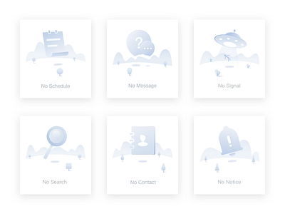
A common missed opportunity in UX is treating empty states as dead ends. Instead of simply displaying “No items found,” designers can use this moment to guide users with helpful suggestions, actions, or educational cues. Done well, an empty state becomes less of a void and more of a stepping stone toward meaningful interaction.
Case study 1: Slack’s playful onboarding empty state
Before Slack redesigned its onboarding, new workspaces opened to a blank screen with only minimal hints. While technically functional, this left new users without guidance or a sense of direction. For many, the absence of cues created hesitation: What should I do first? Is this tool right for me? That uncertainty often translated into early abandonment, as users failed to see immediate value.
Slack’s updated approach transformed that empty moment into an inviting experience. Playful illustrations set a welcoming tone, while embedded guides and lightweight prompts, like the suggestion to “say hi to yourself,” gave users something simple yet meaningful to do right away. Templates highlighted common use cases and suggested first actions, helping people imagine how Slack could fit into their workflow:
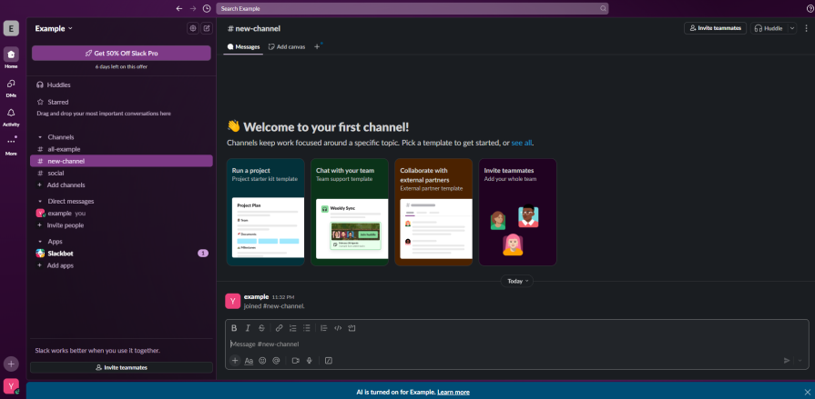
The impact was easy to see. Instead of staring at a blank screen, new users were welcomed with personality, clear direction, and small actions that built confidence. The playful prompts and ready-to-use templates helped people find their footing quickly, making the first experience feel inviting rather than confusing. By turning an empty moment into one filled with guidance and possibility, Slack transformed a potential drop-off point into a spark for deeper engagement.
Takeaways:
- Never leave users at a dead end — An empty state should always suggest what to do next. Even a simple prompt like “say hi to yourself” can lower the barrier to action
- Add personality to reduce friction — Playful illustrations and friendly copy make the experience feel welcoming, easing the hesitation that often comes with a blank start
- Guide with ready-made options — Embedded templates or pre-filled examples show users what’s possible and inspire them to take their first meaningful steps
- Onboarding is part of the product — Empty states are not filler screens; they’re crucial onboarding touchpoints that shape first impressions and influence retention
- Design for confidence, not just clarity — It’s not only about telling users what to do, but also about making them feel comfortable and capable in a new environment
Case study 2 – Pinterest’s curated inspiration boards
Before Pinterest refined its onboarding, new accounts opened to a blank board. Users had to manually search, pin, and organize content before seeing any real value. For many, the empty start created friction, as the platform’s purpose wasn’t immediately clear without content to engage with.
Pinterest flipped this experience by introducing a simple but powerful change: during signup, new users were asked about their interests. Based on those choices, Pinterest automatically populated its boards with relevant pins and suggested boards to follow. Instead of facing an empty canvas, users instantly saw a personalized space filled with content that felt like “their Pinterest.” Have a look:
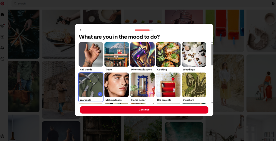
This approach created a sense of immediate value. New users weren’t just told what Pinterest could do – they experienced it firsthand within seconds. With personalized boards ready to explore, people had clear paths for engagement, from pinning to following communities aligned with their tastes. By transforming the first interaction into a moment of discovery rather than effort, Pinterest turned a blank start into an inviting launchpad for deeper engagement.
Takeaways:
- Don’t start with a blank slate — Give users something meaningful to interact with from the very beginning. A pre-populated experience reduces friction and sparks curiosity
- Personalize early — Asking about user interests during signup allows you to tailor the experience immediately, making it feel relevant and unique to each person
- Show value before asking for effort — Instead of requiring users to create content or search right away, let them see the product’s value instantly. This builds motivation to explore further
- Guide with ready-made pathways — Curated suggestions (like boards to follow) provide direction and help users discover features naturally, without overwhelming them
- Turn onboarding into a moment of delight — A personalized, content-rich start not only teaches users how the product works but also creates an emotional hook that encourages them to return
Case study 3 – Dropbox’s visual upload prompt
Before Dropbox refined its design, opening an empty folder meant staring at a stark white screen with a plain message: “This folder is empty.” While accurate, it did little to help users take the next step. The emptiness left people uncertain about how to get started, turning a critical moment of engagement into a flat experience.
Dropbox reimagined this state by making it both functional and inviting. A large, clearly marked drag-and-drop area encouraged interaction, while a friendly illustration softened the emptiness and added personality. Most importantly, a prominent “Upload your first file” button provided an immediate, low-effort action that nudged users forward:
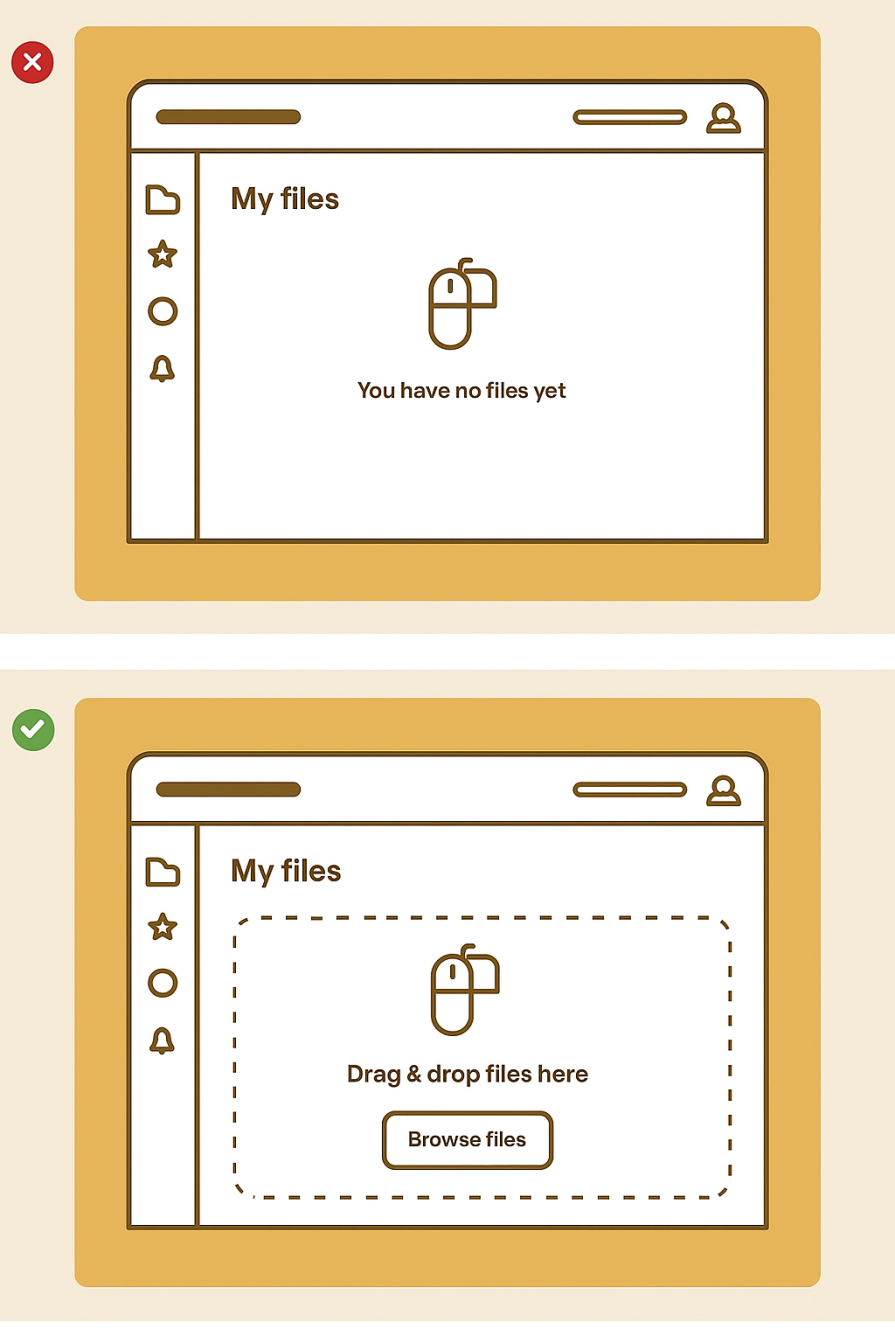
This shift turned a passive message into an active invitation. By combining clarity, encouragement, and a touch of playfulness, Dropbox gave users a clear first step and a reason to engage right away. What was once a dead end became a launch point, making it far easier for new users to start building value in their very first session.
Takeaways:
- Don’t just state the obvious — “This folder is empty” informs but doesn’t guide. Empty states should actively suggest the next step, not leave users hanging
- Turn emptiness into opportunity — Use empty screens as a chance to highlight the primary action users should take (e.g., uploading their first file)
- Make the next step effortless — A clear, one-click button or a visible drop zone reduces cognitive load and removes hesitation
- Use visuals to invite action — Illustrations or playful elements soften the blankness, making the experience feel approachable rather than intimidating
- Guide behavior at the right moment — The empty folder is the perfect context to introduce uploading, ensuring guidance feels natural rather than intrusive
Case study 4 – Duolingo’s progress-based encouragement
Before the Duolingo app refined its empty states, reaching the end of available lessons, or taking a short break, meant seeing a simple message: “No lessons right now.” While accurate, this left users without direction, creating a pause that could easily turn into disengagement. The moment of completion became a moment of uncertainty, rather than an opportunity to keep users motivated.
The redesign transformed these empty moments into engaging touchpoints. Motivational quotes celebrated progress, streak counts highlighted accomplishments, and bonus exercises offered immediate ways to continue learning:
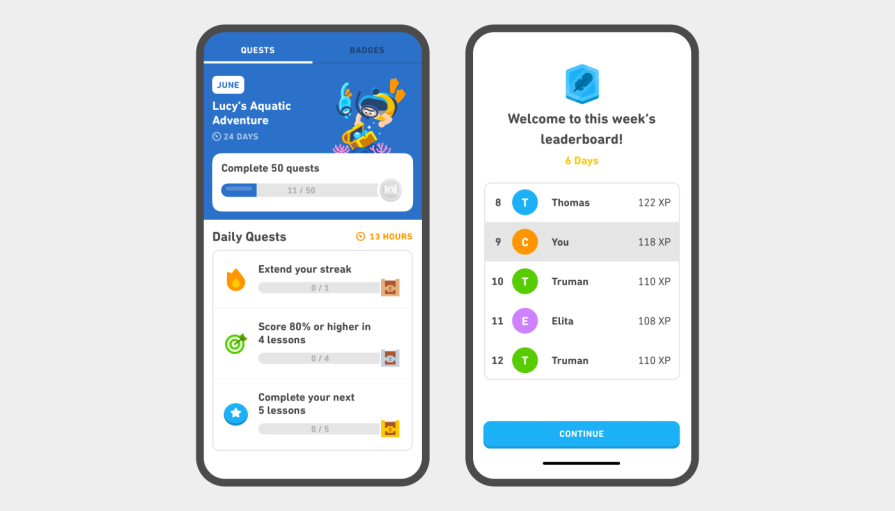
The introduction of “Daily Quests” provided structured, bite-sized goals to keep users returning even when new lessons weren’t available. By replacing a passive message with actionable and encouraging content, the app turned downtime into a chance for continued engagement:
Users were no longer left waiting. They had clear ways to interact, maintain their streaks, and feel a sense of progress, keeping the learning experience fluid and rewarding.
Takeaway:
- Empty states are opportunities, not dead ends — When users run out of content, the experience shouldn’t stop; it should offer ways to continue engagement
- Celebrate progress to motivate action — Highlighting streaks or achievements turns downtime into a reinforcing moment, encouraging users to keep going
- Provide optional but meaningful activities — Bonus exercises or alternative challenges give users ways to stay active without feeling forced
- Introduce micro-goals to maintain momentum — “Daily Quests” or small tasks help sustain engagement during content gaps, making the experience feel continuous and creating an engagement loop
- Use tone and copy strategically — Motivational messaging can make empty states feel encouraging rather than discouraging, keeping users emotionally invested
Key UX principles learned from these success stories
- Turn emptiness into opportunity — Blank or empty states shouldn’t feel like dead ends. Instead, they should guide users toward a meaningful next step, transforming moments of inactivity into engagement
- Personalize early — Introducing users to tailored content or experiences right from the start helps them feel immediately connected and invested in the product
- Show value instantly — Pre-filled examples, suggested items, or templates give users a sense of immediate utility, reducing hesitation and building momentum
- Make actions effortless — Clear, prominent actions, like one-click buttons or drag-and-drop areas, remove friction and make it easy for users to take the first step
- Celebrate progress — Highlight achievements, streaks, or completed tasks to motivate users to continue interacting, even when the primary content is paused or unavailable
- Offer alternative paths — When main content is exhausted or delayed, provide bonus exercises, suggested boards, or micro-goals so users can keep engaging without feeling stuck
- Infuse personality — Friendly visuals, playful illustrations, and motivational copy make empty states approachable, fostering a human connection and reducing anxiety or confusion
Checklist: Designing your own empty state for success
1. Identify empty states:
- [ ] List all points where users might see “nothing here.”
- [ ] Include onboarding, cleared data, search results, completed tasks, and inactive areas.
2. Classify each empty state:
- [ ] First-time experience
- [ ] Cleared or reset data
- [ ] No search results
- [ ] Completed content or tasks
3. Define the emotional goal:
- [ ] Motivate: Encourage users to take the next step.
- [ ] Reassure: Reduce anxiety or confusion.
- [ ] Celebrate: Highlight progress or achievements.
- [ ] Redirect: Guide users toward meaningful actions or content.
4. Design guidance:
- [ ] Use illustrations or visuals to make the state approachable.
- [ ] Craft microcopy that speaks in a friendly, human tone.
- [ ] Include clear CTAs or suggested actions.
- [ ] Consider templates or pre-filled content to reduce friction.
5. Test and iterate:
- [ ] Experiment with multiple variations (copy, visuals, CTAs).
- [ ] Use A/B testing, heatmaps, and funnel analysis to measure impact.
- [ ] Refine based on user behavior and engagement metrics.
6. Review and maintain:
- [ ] Regularly check for new empty states as the product evolves.
- [ ] Update visuals, copy, or actions to stay relevant and engaging.
Conclusion
Empty states aren’t “nothing” — they’re an underused opportunity to guide, delight, and connect with users at a critical moment. As Slack’s playful illustrations, Pinterest’s personalized suggestions, Dropbox’s friendly onboarding, and Duolingo’s gamified encouragement show, thoughtful design in these moments can boost engagement, reduce churn, and build loyalty.
The difference between a dead-end and a delightful step forward often comes down to a few well-crafted words, visuals, or interactions. Take a fresh look at your own product this week: pick one empty state, and redesign it with the same care you’d give a homepage or feature launch. The payoff might surprise you.
The post Empty states in UX done right: 4 inspiring examples appeared first on LogRocket Blog.
This post first appeared on Read More