
The writing is the design
AI can generate text, but only a designer can generate strategy, empathy, and safety.
Imagine a neighborhood with no sidewalks or ramps. Someone using a wheelchair or a parent pushing a stroller is immediately forced to drive or rely on others just to run simple errands.
This planning was intentional: it was designed for cars and against people who need help getting around. Every single choice, from storm drain placement to road approval, was a decision that left people out. Just as poor infrastructure creates physical barriers, unclear language creates digital barriers.

I’ve recently become responsible for most of the UX writing on my product team, handling everything from button labels to complex error flows, and I know I’m not alone. In countless organizations, product designers are often the ones filling in the final text. Because this is usually the last step, it’s easy to treat the content as a quick fill-in, something you automate or even turn to AI to quickly generate.
Over time, I’ve realized that this perspective misses the point. The writing is the design. The rise of AI tools only makes this clearer: AI can generate text, but only a designer can generate strategy, empathy, and safety. When you view every word as a key design element, you move past simple writing and actually create the user’s experience.
For any designer who feels writing is just an extra task, this article shares a framework. It treats language as a core design function and the essential tool for building products that are usable, useful, and responsible.
Writing vs. Designing
When approaching a piece of content, most people immediately ask: “How should those words be written?” This is a tough place to start. Before you write anything, you must first think about designing the experience you want your users to have.
This is the key difference between the two mindsets:
- Writing Mindset asks: How many words will fit here? How should I describe this action?
- Design Mindset asks: What problem are we solving? What terms are our users familiar with? What happens next?
Writing is about fitting words together. Designing is about solving problems for your users. You cannot have one without the other; they must work together.
As Nicole Fenton, coauthor of Nicely Said, puts it: “I use language to solve problems… I use words as material [1].”
Your words build digital experiences. You are designing interfaces that allow people to pay bills, send emails, or order food. Every word included in those experiences directly shapes the user’s understanding, feeling, and outcome.
The usable useful responsible (UUR) framework
Designing with words is more than just arranging letters into sentences. To be truly effective, you have to think of your work not as a writing task, but as a design mandate. It demands skills far beyond basic writing.

1. Usable words
When a product is usable, people can complete their tasks without needing help or instructions. For designers, creating usability means making sure your words act as a guide. The language itself must be clear so users can quickly finish their task.
This level of clarity is critical for everyone, but especially for those with cognitive disabilities, those who are stressed, or those using screen readers. As content design expert Sarah Richards says: “Accessibility is usability.” If your words aren’t easy for everyone to use, you’ve made a design choice that prevents some people from using your product [2].
Consider a simple login screen on a mobile app. The way the error message is written determines if the user can easily proceed:
- Unusable writing (Poor design)
Login failed (User is confused; they must guess if the email, password, or registration is the problem.) (User is offered no path forward.)
- Usable writing (Good design)
Email not registered. Sign up or check for typos. (User knows exactly what is wrong: their account doesn’t exist.) (User is offered a clear, actionable solution: register or correct their mistake.)

This demonstrates how usable writing guides the user by providing clarity (what went wrong) and actionability (what to do next).
2. Useful words
For your words to be useful, you need to understand and honor your users’ intent. Useful writing gives people control and prioritizes their needs, balancing them with business goals. When you respect users, they are motivated to keep giving you their time and attention.
For example, when a user intends to delete an account, useful writing must provide a clear path to complete that goal. A design that makes this process intentionally difficult through deceptive language is a classic example of making a product unuseful.
Unuseful writing (User-hostile design)
“Hold On! Are You Sure You Want to Deactivate Your Profile and Lose Your Benefits?”
Uses emotionally charged language, focusing on loss, to dissuade the user from their clear intent. Buttons: Cancel (Prominently styled, primary color) and Deactivate Later (Small, secondary color).
The issue here is it offers “Deactivate” instead of “Delete” to mislead the user into thinking the account is merely paused, retaining their data for marketing.)
Useful writing (User-first design)
“Permanently Delete Your Account?”
This is direct, unambiguous question honoring the user’s intent. Buttons: Yes, Delete Account (Clear, destructive) and Cancel (Neutral color).
It gives the user the necessary control and confirms the final, irreversible action.

Useful writing focuses on what people want from your product or service and asks how you can balance that with business goals, rather than focusing purely on what the business can get out of it.
3. Responsible words
As a designer, you are responsible for what you put into the world. To write responsibly, you have to consider how your words could be used and, crucially, misused.
Irresponsible writing often weaponizes language. A popular example is “confirm-shaming,” where an interface asks a user for something (like an email) and then forces them to say or think something negative about themselves to decline.

For instance, in a static footer that asks for an email:
- The headline creates anxiety: “Don’t be the last to know!”
- The subtext acts as the shaming mechanism: “If you’re okay with missing out on essential insider knowledge and paying more, just scroll on by.” This forces the user to internally validate that they are “okay with missing out” and “paying more” in order to ignore the field, making the act of declining feel like a financial or intellectual failure.
As a designer, it’s your responsibility to consider not just how your writing will be used, but also how it could be misused, whether by an algorithm, others in your company, or malicious people. You must ask: Are they true? Are they kind? Are they inclusive?
Aligning your team before you write
I’ve spent time with my team and stakeholders debating word choice. For example, should a button say “Buy” or “Purchase”? Stakeholders often look for a “best practice” answer: what does Amazon do? But asking this question is frustrating and distracts from the real issue.

The right answer isn’t about being right or wrong. It’s about what works for your users and what your team needs to achieve. Before you can choose “Buy” or “Purchase,” you need a clear strategy.
Strategy simply means getting everyone aligned on a shared focus. It tells the team what to do, and what to ignore.
A simple strategy statement connects four key elements:
- User Type
- User Need
- Value Provided
- Business Benefit
For example:
“We help budget-conscious buyers easily acquire high-quality audio gear so they can enjoy superior sound immediately, which supports AudioFlow’s goal of increasing first-time conversions and positive word-of-mouth.”
This statement immediately provides direction. Since the goal is easy acquisition for a wide, budget-conscious audience, choosing the clearest, most conversational word “Buy” over the more formal “Purchase” is the right strategic move.
A framework for writing with AI
The fundamentals of good writing are clarity, concision, and empathy, and they remain essential even with AI tools. While AI can draft text very quickly, its output often lacks soul. What makes UX writing truly effective is your ability to go beyond that basic text by understanding the user’s context, establishing a consistent brand voice, and skillfully modulating the tone.

To integrate AI responsibly without compromising your voice, ethics, or craft, adopt a mindset where AI is a co-pilot used for generating options, while you the designer remain the pilot responsible for strategy and empathy.
Use this three-step strategic filter to integrate AI outputs into your workflow:
1. Prompt with strategy
Your input to the AI must be dictated by your established voice and tone documentation, not just your immediate need. Instead of a simple request like “Write an error message,” let your prompt provide a clear strategy like:
“Write a toast notification message for a mobile app. The user just clicked an expired password reset link. Use a confident, empathetic, and direct tone. The message must tell them to request a new link, and it must be concise.”
This single prompt bundles the following elements:
- Voice & Tone: “confident, empathetic, and direct tone”
- Constraint: “toast notification message for a mobile app,” must “be concise,” and must tell them to “request a new link.”
The resulting AI output, “Your link has expired. Please request a new link to continue,” is a direct result of these layered instructions, showing how strategic input creates high-quality, on-brand UX copy right away.

2. Filter for empathy (Review)
The first and most critical step when reviewing AI output is to filter for the human element and inclusivity. AI outputs often rely on aggregated data that can perpetuate bias, use idioms, or assume an emotional state.
- Check for Exclusion: Does the output use any terminology (gendered, ableist, or overly colloquial) that might alienate a specific population?
- Check for Assumption: Does the message assume the user is happy, smart, or calm? (e.g., avoid “Great job!” or “Finally!”)
- Check for Idioms: Is the language literal and ready for translation, or does it rely on cultural shorthand that an international user or machine translator would miss?

3. Edit for core principles (Output)
After the output passes the empathy filter, focus on refining the language to ensure it is clear, concise, and authentically human.
- Clear: Edit for ambiguity. Ensure the language precisely describes the action and the object. For example, does the button label “Save” mean “Save All” or “Save this section”? This clarity is paramount.
- Concise: Cut out extra words. Look at what the AI wrote and remove anything you don’t need, like long, overly nice phrases or confusing descriptions. These just slow the user down. Your main goal is to get to the point quickly so the user can finish their task fast and easily.
- Human: Finally, edit for rhythm by reading the final output aloud to check for natural cadence. Does the writing sound like a robot, or does it flow naturally with appropriate contractions and pacing? The human ear is the ultimate tool for catching stilted or forced language, ensuring the final tone is authentic and engaging.

By following this three-step framework of strategic prompting, empathy filtering, and editing for clarity, concision, and human tone, you can use AI to create high-quality UX copy without losing your voice or affecting the user experience.
Designing error messages that help users
Error messages are often the most visible things we write, and they appear exactly when users are stressed and confused. While the best error is one that never happens, we must treat any error as a chance to help people finish their work.
When people use a product, they are focused on completing a task, not on figuring out how the app works. Running into an error is a hard stop to their goal. Instead of assuming the user is doing something “wrong,” your job is to design a better experience. As expert Kathy Sierra says, focus on helping your users become “more skillful, more powerful users [3].”
The problem with generic errors
Companies often blame the user for errors as a way to protect their own image. However, error messages that quietly point the finger at the user and make them feel bad actually harm the brand, causing people to stop using the product and decreasing loyalty.
When the real problem is a technology or design failure, you should be honest. For example, the email service Mailchimp uses its distinct brand voice to be apologetic, transparent, and helpful when an error occurs. This approach shows they’re committed to guiding the user forward, not blocking them.

If something goes wrong, do everything you can to make sure your users aren’t taking the blame. Focus on helping them achieve their goal.
The designer’s error framework
To guide users through or around failures, you must design your language using three principles:
- Avoid: The best error message is the one the user never sees. Use visual design and interaction (like autocomplete or automatic formatting) to prevent the error from happening in the first place.

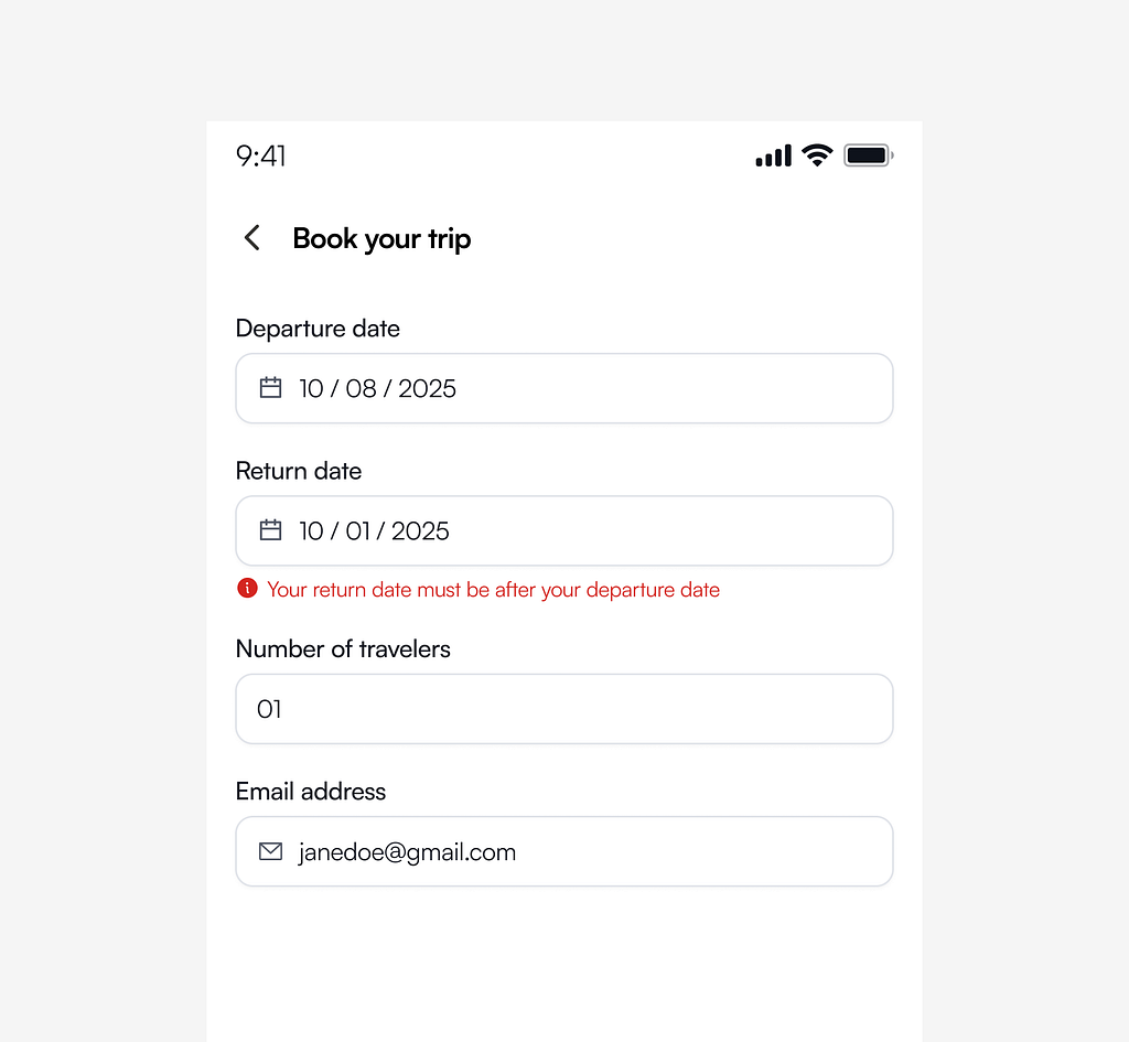
- Explain: When an error occurs, clearly and quickly tell the user what went wrong and why (e.g., “Your return date must be after your departure date”). Never leave the user guessing.
- Resolve: Easily the most critical component. Always provide a clear next step. Don’t just say “File too large”; say, “This file exceeds the 10MB limit. Try compressing the file or uploading a smaller version.”

Your final task is to ensure the user is supported, not stalled, as they move toward their goal.
You’re now equipped to expose product flaws, justify your language choices with data, and ensure your product is usable, useful, and responsible.
AI will generate text faster than you can, but it cannot deliver empathy, define your brand’s ethics, or apply the strategic filter needed to build user trust. That level of intention remains your non-negotiable human power.
Embrace the words, embrace the strategy, and own your role as the ultimate experience designer.
References
[1] https://www.nicolefenton.com/words-as-material/
[2] https://www.youtube.com/watch?v=1nle2HbYTJU
[3] https://medium.com/building-winning-products/kathy-sierra-on-designing-for-badass-ba92cd5fad96
![]()
The writing is the design was originally published in UX Collective on Medium, where people are continuing the conversation by highlighting and responding to this story.
This post first appeared on Read More