
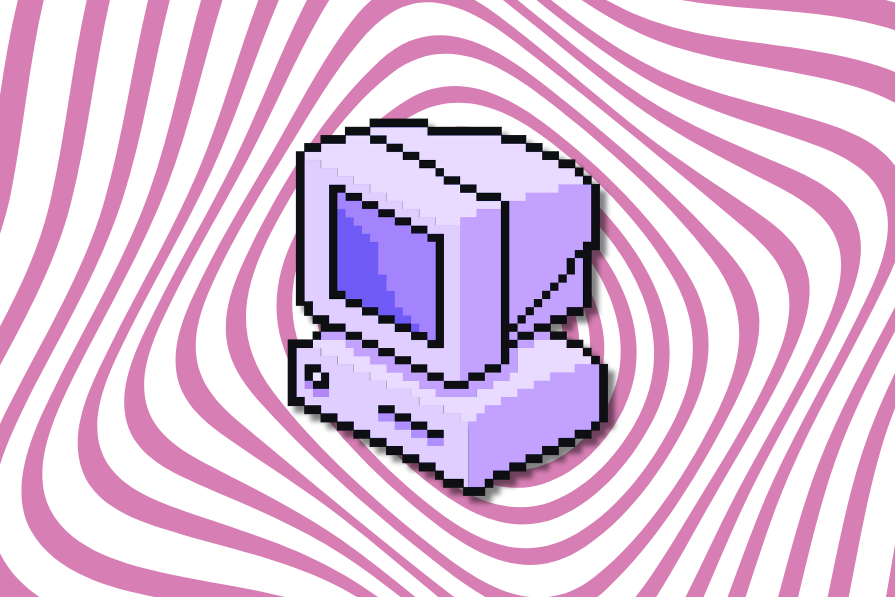
Is retro design making a comeback?
From pixel art to skeuomorphic buttons and neon palettes, especially across product categories like fashion, design, food, and computer games, designers are reviving vintage aesthetics to evoke familiarity and delight. After years of flat, minimalist design, reinterpreting nostalgia with modern UX principles (like clarity, accessibility, and responsiveness), designs can be created that represent authenticity, individuality, and emotional connection.
Why retro design is making a comeback
The prevalence of minimalist, uniform aesthetics has often made brands indistinguishable. In such a digital landscape, design techniques are required that help distinguish products:
- Nostalgia — Retro design evokes memories of simpler times, creating emotional connections that foster trust and user engagement
- Brand differentiation — As most large platforms and corporate sites have settled into a homogeneous minimalist aesthetic (clean lines, excessive white space, simple typography, and identical color palettes), using retro elements provides a potent tool for brand differentiation
- Anti-minimalism fatigue — Users are experiencing fatigue with the decade-long dominance of ultra-clean, highly polished flat design. While minimalist design is efficient, its ubiquity has rendered many digital experiences visually monotonous and impersonal
Where retro aesthetics appear today
Far from kitsch, retro design now serves as a strategic tool for emotional engagement, differentiation, and cultural storytelling. Some sector-based examples of application are:
- Marketing — Brands use retro visuals and type in advertising or landing pages to evoke nostalgia, create a distinctive, memorable aesthetic, and stand out in campaigns
- Gaming — As the gaming demographic matures, retro-style games, with pixel art, chiptune soundtracks, low-poly graphics, or chunky UI elements, are some of the most eagerly anticipated products. These games are often deliberately designed to evoke nostalgia for 90s console or PC gaming
- Fashion — Popular styles, like the “Y2K aesthetic” (late 90s/early 2000s), shape fashion brands’ digital campaigns, utilizing bold color palettes, neon gradients, early digital photography effects, and holographic textures to assert edgy, differentiated identities
- Indie web — Small developers and creators, especially independent craft food and beverage brands, often choose retro designs to signal authenticity, a DIY ethos, and a rejection of mainstream corporate web design
Benefits of retro design
When done thoughtfully, retro elements do more than look fun. They build emotional resonance, strengthen brand identity, and make experiences memorable, offering advantages that minimalist design sometimes struggles to deliver:
- Emotional resonance — Retro elements tap directly into user nostalgia and familiarity, creating an immediate, positive emotional connection with the brand that modern minimalism often lacks
- Brand differentiation — It serves as a powerful tool for standing out in a crowded digital landscape, offering a unique visual identity against homogeneous, sleek competitors
- Memorability — The distinctive, personality-driven aesthetic makes the interface more memorable and shareable, organically increasing buzz and reach
- Perceived authenticity — The lo-fi, less polished appearance can signal an independent ethos and sincerity, enhancing the brand’s perceived authenticity
Risks of overusing retro elements
Retro design can backfire if not carefully balanced. Too much clutter, poor contrast, or excessive animation can frustrate users, harm credibility, and alienate audiences unfamiliar with the nostalgic references:
- Usability degradation — Overuse of maximalist traits like low contrast, excessive GIF animation, and visual clutter directly replicates the flaws of 90s design, causing frustration and accessibility issues
- Credibility damage — If the retro style is executed poorly or sacrifices performance, it can make the site feel outdated, unprofessional, or broken, potentially damaging user trust
- Alienation of younger users — The nostalgia appeal is primarily effective for users who experienced the original era. It may fail to resonate or even actively confuse younger demographics who lack the reference point
Balancing nostalgia with function: Summary
The key to modern retro design is balance. By combining vintage aesthetics with contemporary UX principles like clarity, accessibility, and responsiveness, designers can evoke nostalgia without compromising usability:
| Effect/principle | Retro element | Functional consideration |
|---|---|---|
| Nostalgia | Taps into positive emotional memories | Design for the current technological moment, e.g., responsive design for multiple screen sizes |
| Differentiation | Counteracts visual monotony | Should not be entirely devoid of familiar product category norms |
| Anti-minimalism | Reintroduce texture, visual complexity, and humor stripped away by sleek design | Avoid maximalist clutter and confusing the user |
| Style/motion | Techniques like pixel art, subtle interactive elements, or neon gradients can suggest sophistication | Avoid low-contrast color clashes or textured backgrounds that reduce accessibility |
Retro design works best when it blends personality with purpose, giving users a sense of nostalgia, delight, and authenticity while keeping interfaces clear, accessible, and easy to use.
The post Is retro design making a comeback? appeared first on LogRocket Blog.
This post first appeared on Read More