
Which UI libraries/frameworks support the Linear aesthetic?
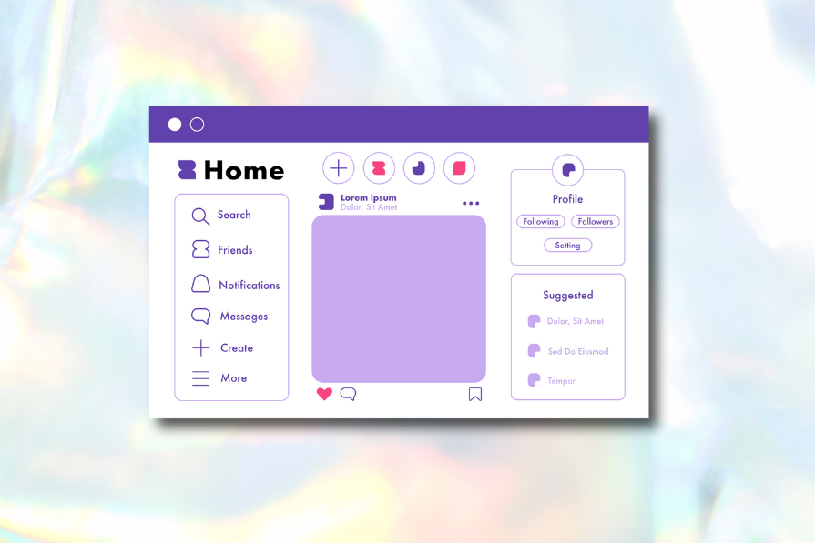
Linear Design is a minimalist visual design aesthetic commonly seen on the websites of SaaS products. It’s inspired by the SaaS product, Linear.
While there isn’t a UI library, framework, or design kit that clones Linear’s aesthetic (and keeps it up-to-date), several UI libraries/frameworks support it, and there are many design kits inspired by Linear’s style.
Radix UI-based libraries
Linear (the company) uses the Radix UI component library, so that’s likely the best choice of UI library for anybody wanting to design a website with the Linear Design aesthetic. Radix UI provides the unstyled components. On top of Radix UI, Linear uses its own custom-built design system called Orbiter, which styles the majority of its visual aesthetic. However, Orbiter isn’t a public design system that anybody can use, so here are some alternative Radix UI-based frameworks that you can use:
- shadcn/ui — Combines Radix UI primitives with Tailwind CSS
- Aceternity UI — Leverages shadcn/ui to offer more visual effects and animations (although Linear has moved away from these recently)
- Magic UI — Combines shadcn/ui with React, Typescript, and Motion, again to offer more visual effects and animations
If you’d like to build on shadcn/ui but don’t want the effects that come with Aceternity UI or Magic UI, making your own design customizations with Tailwind CSS and maybe your own effects with Motion can help you develop your own style based on Linear Design.
Alternatives to Radix UI-based libraries
- HeroUI — A React, TypeScript, and Tailwind CSS-based component library (with Figma files) with a style similar to Linear but a bit more opinionated, almost as if it’s an aesthetic in its own right, but not so much so that you can’t customize it to make it your own
- Untitled UI — As above, but seemingly less inspired by Linear compared to other options
- Saas UI — As above, but seemingly inspired by a slightly older, more gradient-centric version of Linear
Linear style design kits
- Linear UI – Free UI Kit — An exact replica of Linear’s design (including the app) built in Figma, but might not be up-to-date
- Linear App Style Landing Page Collection — As above, but focusing on the landing page elements
- SortUI — A premium UI kit for Figma and Framer, seemingly inspired by the Linear aesthetic, in particular HeroUI’s implementation of it
How do you create a linear design layout grid?
Linear doesn’t employ a traditional grid system. Instead, Linear’s design system maintains a large number of modular components, each designed to present a certain content format in the best way possible without being constrained by a traditional layout grid. As an added bonus, having such a wide variety of modular components is what makes linear design so visually interesting despite its design principles being fundamentally minimal.
For example, the Linear website currently uses a rather simple 8px-spacing scale (i.e., denominations of 8px, 16px, 32px, 64px, and so on when applying spacing), fostering visual consistency and creating familiar patterns so that all of these different modular components still look like they belong together.
Instead of focusing on which grid system to use, take a content-first approach and build the layout around it. Don’t worry about the reusability of the sections (it’s fine if they only get used once) because you’ll be fostering consistency and visual rhythm via your spacing scale, type scale, color scheme, and any other subsystems, which’ll be made up of design elements that are reusable.
The post Which UI libraries/frameworks support the Linear aesthetic? appeared first on LogRocket Blog.
This post first appeared on Read More