
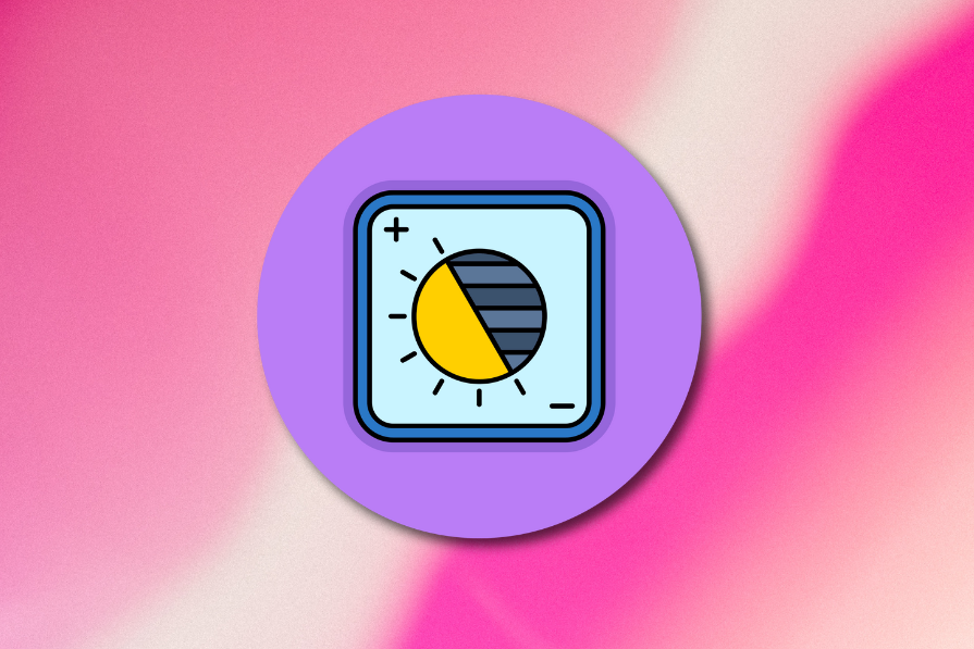
How do you implement accessible linear design across light and dark modes?
The Web Content Accessibility Guidelines (WCAG), which is the universal standard for the accessibility of digital content, doesn’t require websites or any digital content to offer a dark mode. However, WCAG 2.2, which has been the current version of WCAG since October 2023, requires optimal color contrast regardless of viewing mode.
What WCAG requires for contrast in light and dark mode
In WCAG 2.2, Success Criterion 1.4.3 Contrast (Minimum) states that the minimum contrast ratio for normal-sized text as well as images of text is 4.5:1, whereas large text (defined as 18pt or 14pt if bold, which is approximately 24px and 18.66px respectively) is only 3:1. There’s no contrast requirement for text that’s purely decorative, such as a logo. A minimum contrast ratio of 3:1 also applies to visual information that clarifies what user interface elements such as buttons and form controls do.
It’s believed that the next major version of WCAG, currently dubbed WCAG 3, will set specific rules for light and dark modes, whereas in WCAG 2.2, the aforementioned color contrast requirements apply to light mode, dark mode, high-contrast mode, and all other viewing modes.
Practical implementation in Linear-style systems
Most UI component libraries and design kits offer accessible light and dark mode elements/components right out of the box. In addition, most UI libraries (for example, Radix UI, which is the UI library that Linear themselves use) facilitate being able to switch between light and dark mode at will, rather than just detect user preference at the operating system or web browser level, which is suspected to be a consideration in the upcoming WCAG 3.
However, if you’re rolling a custom implementation of the linear design aesthetic, or using a Linear-style UI component library but changing the colors, you’ll want to stick to a strict subset of neutral colors that each have a light and dark variant. Having a brand color, typically used for CTAs (calls to action), is considered acceptable, but Linear itself has forgone this option in recent versions of its website, opting to stick with neutral colors almost exclusively.
While colors that are used together (e.g., a text color on top of a background color) should meet the minimum WCAG 2.2 criterion for color contrast (AA), additional color contrast (e.g., as defined by the AAA criterion) is recommended for both light and dark mode. In any case, the idea is that neutral colors don’t just offer simplicity, they’re also very easy to ‘flip’ when switching between light and dark mode. Brand colors should remain consistent across both modes, but always accessible too.
The post How do you implement accessible linear design across light and dark modes? appeared first on LogRocket Blog.
This post first appeared on Read More