
From Cafeteria Cliques to Graph Communities: Understanding the Louvain Algorithm

If you can navigate the complex social dynamics of a high school cafeteria, then you can understand how Louvain works.
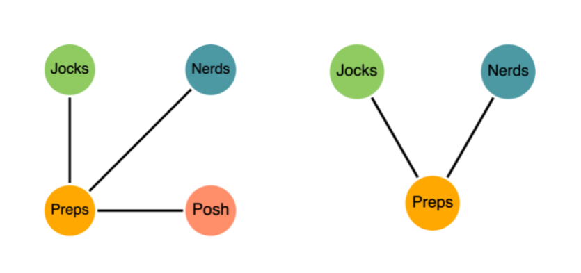
Imagine it’s your first day at a new high school. You’re walking through the cafeteria, trying to get the lay of the land. Who sits with whom? Who talks to whom? The popular students all sit at the same table and mostly talk among themselves. Although every once in a while, a popular kid will ask a chess club member to pass the napkins or save them a seat.
But because they mostly talk to each other, we can determine that each individual member belongs in their given group.
That’s how Louvain works.
Nodes that are more densely connected within a group than between groups are considered to be in the same group.
Now imagine suppliers in a microchip supply chain. If Big Wafer Inc. consistently sends materials to the same handful of manufacturers, and those manufacturers trade mostly among themselves, Louvain will cluster them into a single community. Sure, they might occasionally interact with external partners, but their strongest and most frequent connections remain within the group.
Just like a clique in the cafeteria.
Get the Free eBook!
Learn the math and intuition behind five of our most popular graph algorithms with “A Practical Introduction to Graph Algorithms”.
Enter Modularity
A core task in graph data science is finding communities or splitting your graph into clusters. But how do you know if your clustering is any good? That’s the real challenge, and where a new metric called modularity comes in.
Let’s consider the graph below. Sticking with our lunchroom example, each node represents a student, and each relationship represents whether they have eaten lunch together in the cafeteria. Looking at it, you’d probably guess there are three natural groups. But how do we formalize that hunch?

One way would be to say there should be more relationships within a cluster than between clusters. We could express that with a ratio:

Now we have a ratio we want to optimize. And smarter minds are really good at optimizing, so surely this will work. Right?
For our lunchroom graph, there are 14 edges in total: 12 within clusters and 2 between clusters. That gives us a score of ~86%. Pretty high!

But here’s the problem: if our goal is just to maximize that ratio, the best solution is always trivial—put every node in one giant cluster. Then all 14 edges are “inside”, and we score a perfect 100%.
Technically correct, but completely useless.
Building a Random Baseline
Real modularity fixes this by comparing your clustering to random chance.
“A good division of a network into communities is not merely one in which there are few edges between communities; it is one in which there are fewer than expected edges between communities.”
— Newman, M. E. J. (2006). Modularity and community structure in networks. Physical Review E, 69(2).
In other words, good communities aren’t defined by having few outside connections — they’re defined by having fewer than randomness would expect. Newman continues:
“The modularity is, up to a multiplicative constant, the number of edges falling within groups minus the expected number in an equivalent network with edges placed at random.”
That again raises another question: what’s “an equivalent network with edges placed at random”? Our random comparison graph must match a few things:
- Same number of nodes
- Same number of edges
- Same degree for each node (so we preserve each student’s “popularity”)
- Edges are rewired randomly
This gives us a version of the same graph where the structure is erased, but the constraints remain the same.

Modularity simply asks: “Do our clusters keep edges inside the group better than this random baseline?”
If yes, then your partitioning captures real community structure—not just a mathematical accident.
Modularity ranges from -0.5 to 1. Higher scores mean strong, meaningful communities. Lower scores mean your graph is basically one big undifferentiated soup.
Remember, modularity ≈ (edges within communities) – (expected random edges within communities).
Let’s walk through what that means:
- Only edges inside communities? Modularity = 1. Perfect structure: no randomness could do better.
- Only edges between communities? Modularity ≈ –0.5. Your graph is actively anti-community.
- Edges inside communities match what randomness predicts? Modularity = 0. Your “clusters” aren’t doing any better than a random rewiring of the graph.
And this is exactly why the “one giant community” trick fails. If you dump every node into a single cluster, the number of edges inside that cluster is exactly what random chance would produce.
So modularity correctly scores that as 0 — not a meaningful community at all.
Optimizing Modularity
Now that we know what modularity is, we need a smart way to maximize it. Enter Louvain. Think back to our original ungrouped graph. You can probably eyeball three natural groups—but Louvain gives us a repeatable, scalable way to formalize that intuition.
Louvain runs in two looping phases. First, local modularity optimization, followed by community aggregation. These repeat until modularity stops improving.
We start with the simplest setup, where every node sits in its own community called a “singleton community.”
Then, for each node, Louvain tries something clever. First, it removes the node from its current community and then tests dropping it into each neighbor’s community. Our algorithm will then select the move that yields the largest increase in modularity.
For example, Louvain will try dropping Max into whichever community Erin, Mona, Rob, or Lia currently belongs to. It only considers the communities of Max’s immediate neighbors, and then picks the move that gives the biggest boost in modularity — meaning, the biggest improvement over a random baseline.
Louvain is a greedy algorithm; it prioritizes the best immediate move at every step. This cycle continues until the network reaches a steady state where no node wants to move.
Next, Louvain compresses each community into a single mega-node. But what does that actually look like? Communities are then compressed into mega-nodes, where internal edges are preserved as self-loops. Edges between communities are merged, and their weights are combined.
There’s some elegant math behind the scenes that keeps the modularity score consistent during this transformation — we won’t dive into it here.
Let’s say our first round of Louvain yielded the communities shown below. Once the graph is compressed, Louvain repeats the optimization step on the new mega-nodes. In our example, this ends up merging two of the earlier communities.
This loop — optimize locally to compress communities and then repeat — continues until no move can improve modularity any further. And just like that, we arrive at a nicely optimized set of communities. Huge success!
Wanna See it in Action?
Learn how to group patients into meaningful communities using Louvain in our hands-on walkthrough. Care pathways naturally form “cliques,” and Louvain is great at revealing them—just like spotting friend groups in a cafeteria.
We’ll use Neo4j Aura Graph Analytics to load patient-journey data, project a graph, and run Louvain to surface clusters of patients with similar medical histories.
This article first appeared on Read More