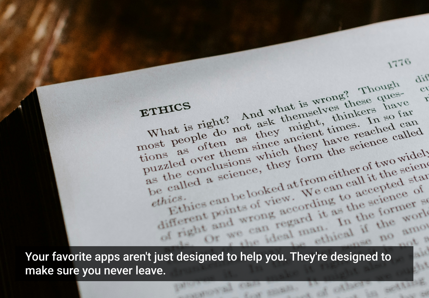
Designing for Dependence: When UX Turns Tools into Traps
Part 1 of the “Ethical UX Series.”
Designing for utility or addiction?
In today’s hyper-connected world, the lines between user empowerment and user entrapment are dangerously thin. What began as designing helpful experiences has quietly evolved into a race to own attention, manipulate habits, and maximize digital dependency.
With attention as currency, many interfaces are no longer neutral. They are crafted ecosystems of reinforcement, nudges, and psychological loops. The goal isn’t just to serve a need — it’s to keep users coming back, sometimes without them knowing why.
In this installment of the “Ethical UX Series,” we challenge this silent drift into manipulative design. We’ll expose how the architecture of frictionless design, endless scrolls, and addictive nudges are shaping user psychology — sometimes more than users shape their own behavior.
The architecture of habit: when design hijacks behavior
“Addiction is not about substance — you can be addicted to anything that gives you temporary relief.” — Gabor Maté
The Hook Model, made popular by Nir Eyal, has become the blueprint for countless digital products. It’s deceptively simple: Trigger → Action → Variable Reward → Investment.
It works because it mirrors how our brains form dopamine-driven loops. But when design focuses on habit for the sake of retention, it bypasses intention — and crosses into manipulation.
Real-world examples:
- Instagram: Variable rewards via unpredictable likes and follows.
- Duolingo: Emotional nudging via streaks and sad owl guilt trips.
- Snapchat: FOMO-driven streaks lock users into ritualized use.
Research insight:
A 2022 Journal of Behavioral Addictions study found variable rewards increase compulsive checking by 37%, even when users report no enjoyment.
“Design is not just what it looks like and feels like. Design is how it works — including on the mind.” — Steve Jobs
UX Tip for Designers & Researchers: Always assess whether the behavior loop serves the user’s goal — not just product stickiness. Evaluate this in usability testing and post-task interviews.
Frictionless ≠ harmless: the deceptive ease of use
“Convenience is the most underestimated force in modern UX — what’s easy becomes invisible, and what’s invisible becomes unquestioned.” — Tristan Harris
Ease of use is a core UX value. But when over-optimized, frictionless interactions remove moments of user reflection. Instant access can become mindless consumption.
Frictionless examples that mislead:
- YouTube Autoplay: Encourages 20–30% more passive viewing.
- Amazon One-Click Buy: Increases buyer regret by 19% (Statista 2023).
- TikTok Infinite Scroll: Users consume 200+ short videos daily, often without conscious intent.
“The goal of technology should be to amplify human intention, not replace it.” — Brett Victor
UX Research Tip: Incorporate friction mapping into usability studies. Ask: Where could a subtle pause reduce cognitive load or enable informed action?
Dependency by design: tools that refuse to let go
“If you’re not paying for the product, you are the product.” — Andrew Lewis
What began as tools meant to serve human intention has, in many cases, evolved into systems designed to capture and retain user behavior — even at the cost of user well-being.
Today’s most used apps don’t just help us complete tasks. They build emotional contracts — enticing users with reward systems, discouraging breaks, and creating psychological discomfort around disengagement. The experience becomes less about utility and more about loss avoidance, social signaling, and habit continuation.
Digital design that clings, not just connects
Most products are structured not around the user’s needs but around the business’s KPIs — with retention, engagement, and session duration acting as prime success metrics. The result? Dependency patterns that are framed as features, but behave like traps.
Common dependency patterns:
- “We miss you” notifications: Subtly guilt-trip users back into engagement.
- Streak mechanics: Users are punished emotionally for breaking usage streaks.
- Expiring daily rewards: Pressure users to log in even when there’s no real need.
- Personalized guilt nudges: Language like “Your progress is slipping” or “Don’t lose your edge.”
- Loyalty point systems: Designed to feel cumulative, activating the sunk cost fallacy.
- Social triggers: “Your friend just passed you!” style nudges that reignite competition.
- Progress bars with no real end: Endless ‘levels’ that always suggest more to achieve.
“Manipulation happens when nudges are optimized for business success — not user success.” — WorldUXForum EthicalUX Principle
Real-world case study: Calm & Headspace
Both Calm and Headspace promote mindfulness, but ironically, their mechanics sometimes increase anxiety.
Streak Dependency: They use streaks to build a “daily habit,” often celebrated through encouraging animations and push messages. However, breaking a streak triggers feelings of guilt or failure in many users, especially those prone to anxiety, negating the app’s original intention.
Insight from UX Collective (2023):
- 1 in 3 users reported feeling anxious or guilty when they broke a meditation streak.
- Some described the app as feeling more like “a responsibility” than “a support.”
This isn’t just anecdotal — it highlights a core tension in habit-forming UX: When reinforcement mechanisms overshadow emotional well-being, design fails ethically, even if engagement rises.
Psychological framing of dependency
Dependency design often exploits the following psychological biases:
- Sunk Cost Fallacy: Users stay to avoid “wasting” time already invested.
- FOMO: Fear of missing out on rewards, ranks, or content.
- Operant Conditioning: Positive reinforcement (streaks, levels) builds compulsive checking.
- Loss Aversion: The pain of losing progress is more powerful than the joy of gaining it.
- Guilt Looping: Reminders create discomfort that only the app can relieve.
- Social Proof: Notifications based on friends’ activities amplify usage pressure.
“Designing with awareness of these behaviors isn’t wrong. Designing to exploit them without reflection is.” — Tushar A. Deshmukh
UX research insight: design for freedom, not just retention
To truly understand whether your product creates dependence rather than delight, research must go beyond clicks and time on site. Here’s how:
Well-being tracking:
- Include emotional check-ins in your user interviews or post-task surveys.
- Ask: “How would you feel if you didn’t use this for a week?”
- Use longitudinal studies to track patterns of guilt, relief, and anxiety over time.
Metrics that matter:
- Engagement is not equal to satisfaction.
- Retention does not always mean value created.
- Session length should never substitute mental clarity.
“When we design exits, pauses, and limits with intention, we shift from dependency to trust-building.” — Tristan Harris, Center for Humane Technology
User psychology: understanding the trap mechanism
“Behavior is what a person does in response to what they perceive — not just what is true.” — B.F. Skinner
To design ethically, we must first understand how users interpret and emotionally respond to the experiences we create — not just how they behave on the surface.
Modern digital interfaces are no longer passive tools. They actively stimulate, guide, and condition behavior using well-documented psychological patterns. This shaping is often subtle, but its cumulative effect is significant.
Key psychological triggers exploited in dependency design
Dopamine loops (predictable unpredictability)
Dopamine doesn’t reward pleasure, but anticipation. Interfaces that deliver intermittent or unpredictable rewards (e.g., social likes, loot boxes, endless feeds) hijack this mechanism. Think: Slot machine mechanics in app form — scroll, swipe, win… maybe.
Example: Instagram and TikTok refresh content unpredictably, triggering microbursts of dopamine that reinforce repeated checking.
FOMO (Fear of Missing Out)
Social triggers and time-sensitive offers create a perceived urgency that pressures users to act — not because it’s useful, but because everyone else is doing it or it might disappear.
Example: Snapchat’s “Your friend just sent a snap” nudges. Flash sales in e-commerce are another typical use.
Sunk cost fallacy
Users feel compelled to continue using a product they’ve already invested time, energy, or even money in — even when it no longer serves their needs.
Example: Language-learning apps that make you restart a course if you miss days push users to stay “just because I’ve come so far.”
Loss aversion
Behavioral economics tells us the pain of loss is psychologically twice as powerful as the joy of gain. This is why users will go out of their way to preserve streaks or points — even if they no longer care about the content.
Example: Fitness apps like Apple Fitness close rings, and users often continue purely to avoid the loss of a streak, not to achieve health goals.
Choice overload
While frictionless design removes barriers, it can also flood users with decisions. Endless scrolls, product suggestions, and “you might like” menus create decision fatigue, leading users to default to familiar patterns — like staying longer than intended.
Example: Netflix auto-previewing and surfacing options often overwhelm rather than help, resulting in passive binging.
“When you’re aware of the psychology, design becomes responsibility.” — Susan Weinschenk
Design & research strategy
To ethically navigate these psychological influences, UX and research teams should focus on:
Empathy mapping in field testing
- Go beyond user goals: Map user emotions, fears, pressures, and insecurities.
- Ask: How does this experience feel after multiple uses — not just the first time?
Emotional evaluation, not just task success
- Use mood-based follow-ups (e.g., “How did this task make you feel?”)
- Test for emotional fatigue, regret, or compulsion.
Opt-out path testing
- Offer users a clear off-ramp: A way to pause, delete, or disengage.
- Then observe whether they feel confident doing so — or guilty, anxious, or penalized.
The goal is to measure freedom, not just flow.
Whose behavior are we changing, and why?
“The most dangerous design is the one that makes users believe they’re in control — when they’re not.” — Tushar A. Deshmukh
Design is always behavioral. Every button placement, icon animation, or push message has intent baked in. But the ethical question is: Are we designing for the user’s benefit, or the product’s success at the user’s expense?
In product discussions, we often use words like “delight,” “stickiness,” or “habit,” but these can mask a subtle truth: We are often guiding behavior far more than users realize.
When convenience becomes coercion, or choice becomes illusion, we are no longer designing tools — we’re designing traps.
Ask yourself (and your team):
- Are users freely choosing? Or are we guiding them through dark nudges, default paths, or emotional hooks that reduce their sense of control?
- Would this design still exist if it reduced our metrics? If something keeps users engaged but harms well-being, would we still stand by it?
- Is there a clear, respectful offboarding or pause mechanism? Can users take a break, unsubscribe, or opt out without guilt, difficulty, or confusion?
If you’re uncomfortable with the answers, it’s a red flag. That discomfort isn’t a blocker — it’s a signal that ethical reflection is overdue.
“Design is power. And with power comes responsibility — whether you claim it or not.” — WorldUXForum EthicalUX Principle
Ethical UX: building with responsibility, not just skill
Ethical design isn’t about rejecting persuasion — it’s about applying it transparently and responsibly.
Principles to avoid designing for dependence:
- Autonomy: Give users clear, respectful off-ramps.
- Transparency: Show why something is shown, recommended, or triggered.
- Well-being: Measure not just clicks but contentment.
- Metric sanity: KPIs shouldn’t reward unhealthy behaviors.
- Break the loop: Introduce natural stops, not infinite scrolls.
“The right question is not what users can do, but what they are being conditioned to do.” — WorldUXForum EthicalUX Principle
Researcher tips:
- Create Ethical UX journey maps.
- Run emotional resonance tests.
- Include ethics-focused prompts in stakeholder design reviews.
Up next in the “Ethical UX Series”: “Dark Patterns: When Design Crosses the Line.”
Suggested reading & references:
- Hooked: How to Build Habit-Forming Products, Nir Eyal.
- Tiny Habits, B.J. Fogg.
- Addiction by Design, Natasha Dow Schüll.
- In the Realm of Hungry Ghosts, Gabor Maté.
- 100 Things Every Designer Needs to Know About People, Susan Weinschenk.
- Wellness Gamified, UX Collective.
- EthicalUX Manifesto, WorldUXForum.
- Journal of Behavioral Addictions (2022).
- Persuasive Design Ethics, Nielsen Norman Group.
The article originally appeared on LinkedIn.
Featured image courtesy: Kelly Sikkema.
The post Designing for Dependence: When UX Turns Tools into Traps appeared first on UX Magazine.
This post first appeared on Read More