
How Slack Rebuilt Notifications 📣
Introduction 

At Slack, notifications are how teams stay in the loop, but they can also become overwhelming when not designed with intention. Our goal was to make staying informed feel effortless. We set out to rebuild one of Slack’s most complicated systems from the ground up by bringing calm, consistency, and clarity to the experience.
Diagnosing the Noise Problem

We knew perception of noise in Slack was a universal challenge affecting teams everywhere. Across workspaces, notification overload consistently ranks among the most common frustrations. Research showed that the more channels a person joins, the more likely they are to feel overwhelmed and confused about notification behavior.
Internally, the data told a clear story. Issues with notifications are one of the top three drivers of Customer Experience tickets, with users often unsure how to control or understand their settings.
The noise problem wasn’t just about volume—it was baked into the architecture itself. Our legacy notification system evolved over years, accumulating complexity that made it nearly impossible for users to understand or control.
 Four conflicting mental models: Desktop and mobile each had their own preference systems, with different options and behaviors. A “nothing” setting on mobile meant something entirely different from “Off” on desktop. Users couldn’t predict what would happen when they changed a setting.
 Hidden coupling between preferences: What users were notified about was tightly coupled with how they received notifications. Wanting fewer push notifications meant sacrificing in-app awareness entirely—there was no way to separate the two.
 Inconsistent state across clients: Settings didn’t reliably sync. Users would configure notifications on desktop only to find mobile behaving completely differently, leading to confusion and duplicate configuration work.
 Power users left behind: Advanced controls were scattered across multiple menus with no clear hierarchy. Features like “badge all unreads” on mobile were hidden, and there was no unified place to understand all your notification options.
These architectural problems directly contributed to the noise users experienced—not just because notifications were frequent, but because users couldn’t confidently control them.
Simplifying Notifications at Scale

We didn’t just refactor the notifications UI. We completely redesigned how notifications behave across Slack. This project supported a number of notifications improvements to comprehensively address user pain points and confusion:
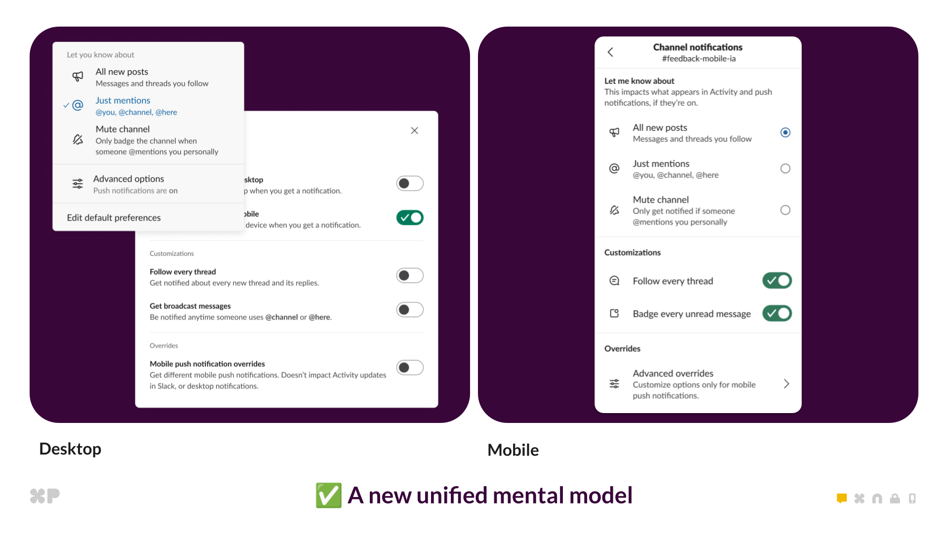
- Simpler choices: Channel notifications now have three clear options: All new posts, Mentions, or Mute.
- Push toggles: Unified on/off options for push notifications across desktop and mobile.
- Advanced controls: Redesigned settings for power users, including “badge all unreads” on mobile.
- Global preferences: Modernized desktop and mobile experiences with consistent structure and copy.
- Sync improvements: Consistent state across clients through simplified preference logic.


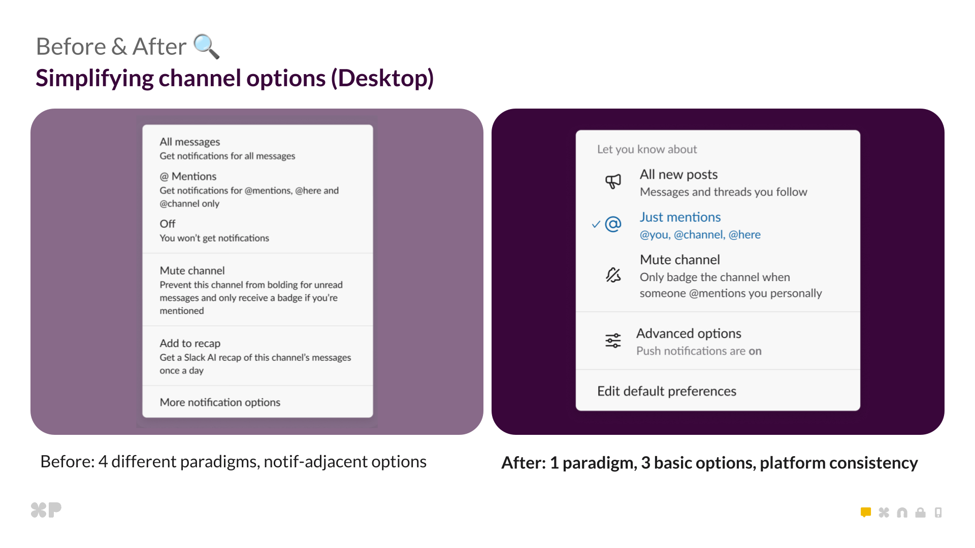
Before: four paradigms. After: one unified model with three options.
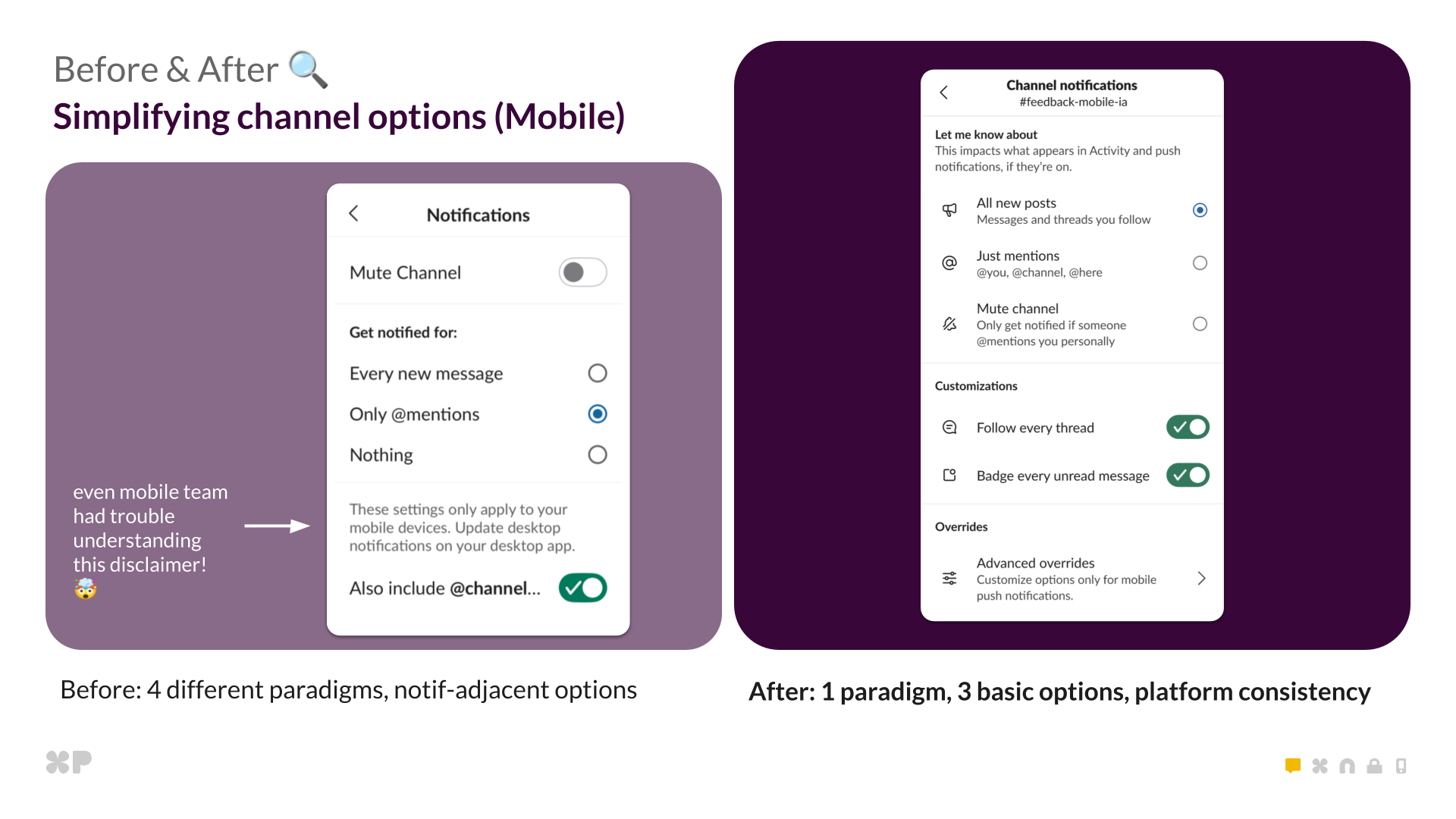
Mobile redesign: clearer settings and consistent cross-platform logic.
What “Simple” Really Looked Like

Dozens of deep technical threads, many with 100+ replies  , guided this project. These weren’t quick bug fixes but rather architecture decisions requiring tight alignment across product, design, frontend, backend, and mobile engineers. We tackled three major technical challenges:
- The Preference Refactor: Migrating millions of users from four conflicting preference systems to one unified model
- Modal Makeover and Global Preferences: Separating “what” from “how” with auto-save behavior and consistent cross-platform UI
- Cross-Platform Parity: Achieving true state consistency between mobile and desktop
The Preference Refactor
We rebuilt how Slack interprets notification preferences. The old “Off” setting now seamlessly migrates to “Mentions” with push disabled. It sounds simple, but this required deep backend and frontend coordination.
With backwards compatibility and the possibility of rollback in mind, we thought it too risky to move people from “off” to “mentions” at the database level. Instead, we used a read time strategy to ensure users had the same experience as before, but using the decoupled push logic. We introduced the new desktop_push_enabled pref which would be the only driver of enabling push notifications. Because this pref did not exist before, we were able to backfill all existing users based on whether they had it previously set to “off” with no interruptions to the current experience. We then did some read time magic to make “off” act as “mentions” but with pushes disabled in the new world (Because that is exactly how it functions today!). In-app notifications and activity are consistent across all clients, but push notifications are further customizable on desktop and mobile.
// Prefs before
'desktop': everything | mentions | nothing // Push on desktop
'mobile': everything | mentions |nothing // Push on mobile

// Prefs now
'desktop': everything | mentions // Activity on desktop and mobile
'desktop_push_enabled': true | false // Push on desktop
'mobile': everything | mentions | nothing // Push on mobile
Impact on noise: This refactor eliminated a major source of confusion. Users who thought they’d turned off all notifications were actually still getting in-app badges—they just didn’t know it. Now, “Mentions” means “notify me about mentions” and the push toggle explicitly controls interruptions.
Modal Makeover and Global Preferences

The old notification modal forced users to click “Save” after every change, making experimentation unreliable. Users would configure settings, forget to save, and wonder why nothing changed.
We introduced auto-save behavior—changes take effect immediately. We decoupled “what” from “how,” giving users independent control over activity and push. And we built cross-platform consistency through reusable React components, replacing legacy mobile-specific UI code.
Impact on noise: Users can now fine-tune their notification experience with confidence. Want to see all activity but only get pushed for mentions? Now it’s obvious how to do that. The clearer structure means less trial-and-error and fewer abandoned configuration attempts.
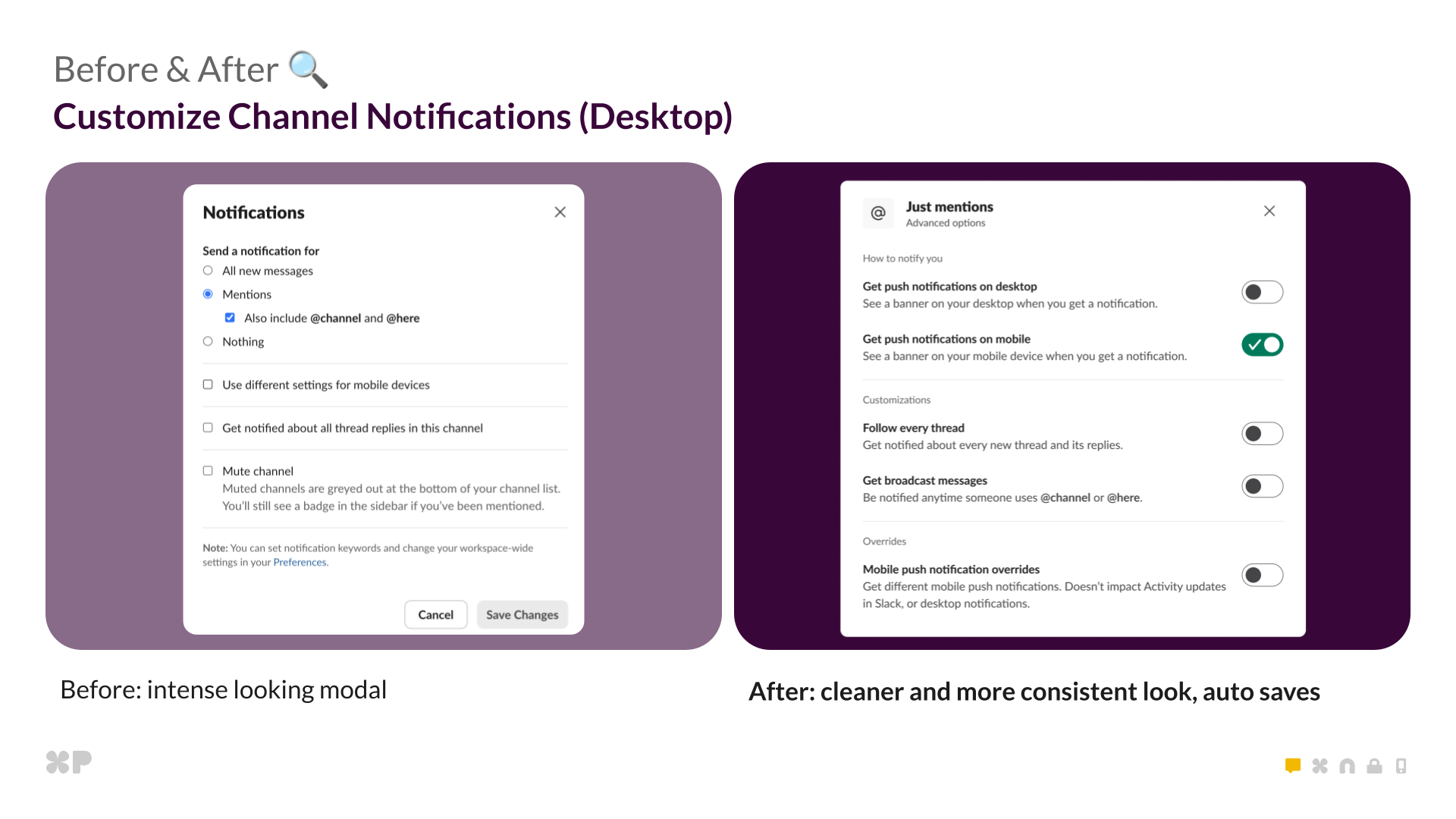
Cleaner, more consistent modal with auto-save behavior.
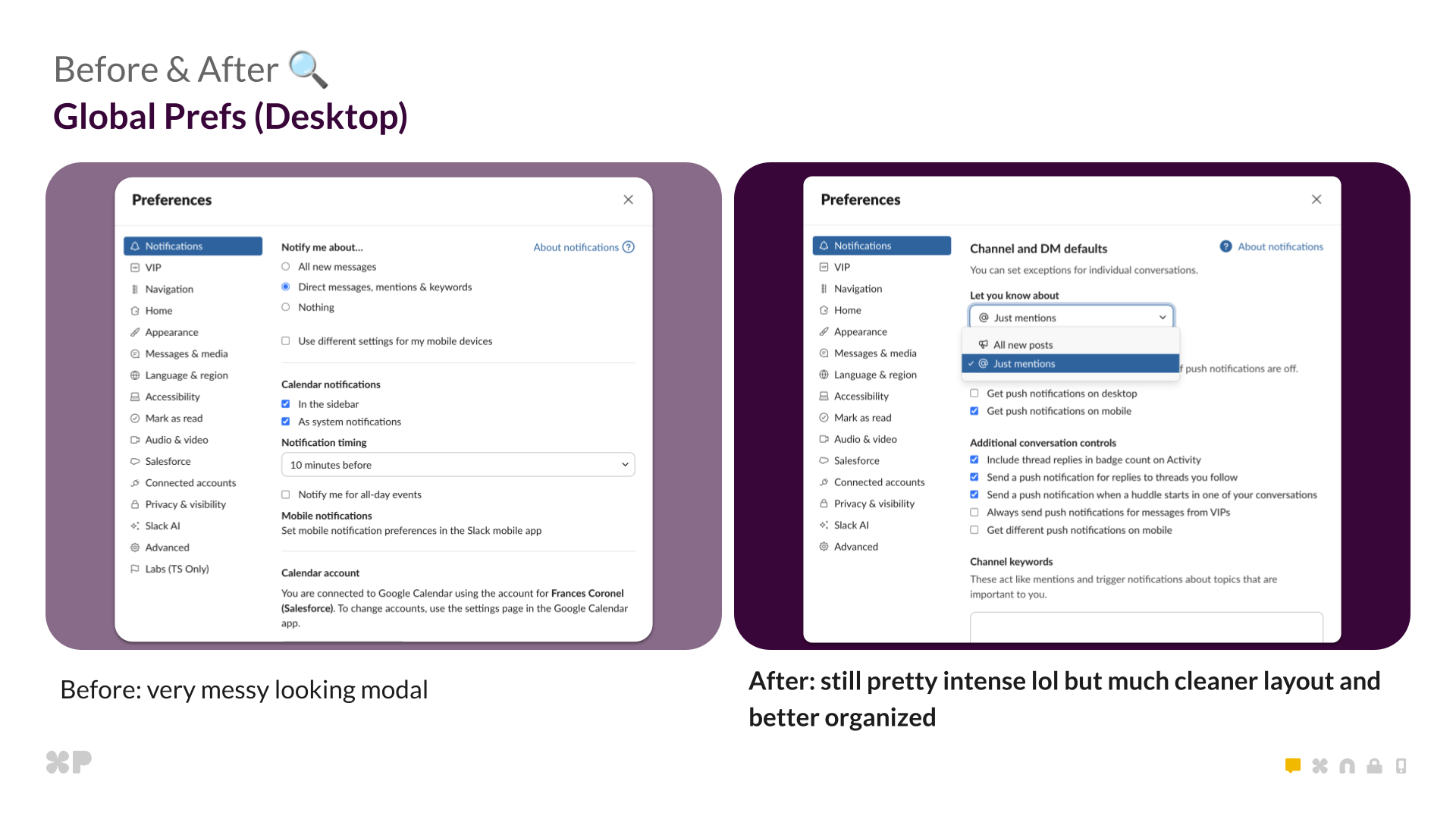
Still complex, but far more organized and readable.
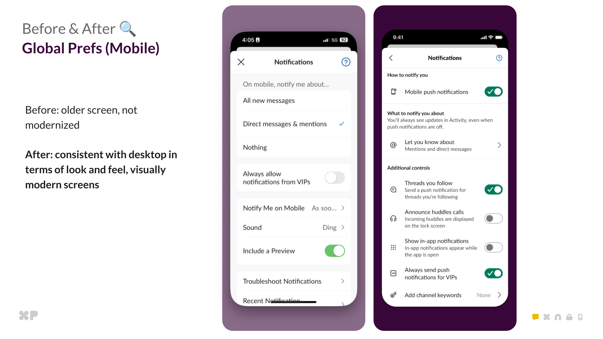
Mobile global preferences modernized to match desktop visually and structurally.
Cross-Platform Parity Challenge

Achieving true parity between mobile and desktop was one of the hardest tasks. The goal was simple: mobile should match desktop by default, with the option to override when needed.
The new preference model organizes every option into a clear hierarchy. This isn’t just design polish—it’s the conceptual model that powers how preferences work across all clients:
Unified hierarchy:
- What to notify you about: All new messages, Mentions and DMs (default), or Mute
- Push notifications: On desktop and mobile (default), desktop only, mobile only, or disabled
- Advanced: Mobile-specific customization and badge controls
This redesign required renaming fields and refactoring client logic for explicit state, eliminating ambiguity and making rollbacks safe. We also rewrote some of the oldest pages in Slack’s iOS app—built before our modern React architecture—to match desktop structure and visuals, ensuring consistency that builds trust across the entire experience.
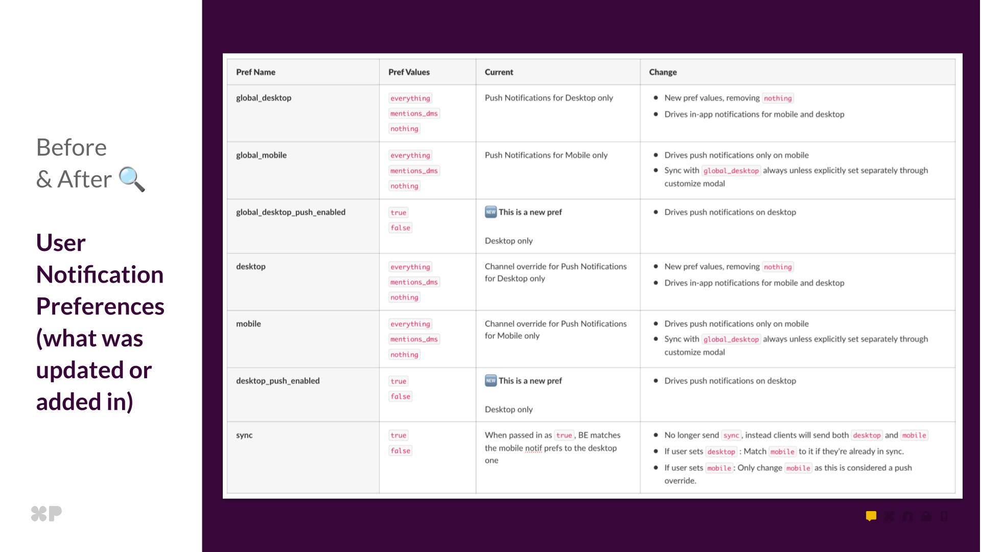
This table showcases all the different user preferences we ended adding/updating on the backend
Migration and Rollback Lessons

Migrating millions of users without disruption required careful mapping and fallbacks. Key lessons learned:
Trust must never break. We added read-time fallbacks so push_enabled: false always means “no push,” even during rollbacks.
Tiny schema issues can cause major UX bugs. A malformed field once reset preferences to Mentions until we cleaned data and flushed memcache.
Clarity beats cleverness. Removing the sync parameter and storing explicit desktop and mobile values made behavior predictable.
Closing Reflection

This project wasn’t just a refresh; it was a rebuild of trust. The legacy system created noise through confusion—users couldn’t predict what their settings would do, couldn’t reliably sync state across devices, and couldn’t find the controls they needed.
Why it matters
 Users now control noise with confidence. The unified model means when users set a preference, they know exactly what will happen. No more hidden surprises, no more settings that don’t sync, no more choosing between being uninformed or overwhelmed.
 Support burden decreased significantly. A unified model means fewer tickets asking “why am I getting notifications?” or “how do I turn off mobile push?” The architecture now matches users’ mental models, making behavior predictable.
 Teams stay informed without the overwhelm. By separating “what to notify you about” from “how to receive notifications,” users can stay aware of everything happening in a channel while only getting pushed for what truly matters. This is the difference between reactive firefighting and intentional awareness.
The data proves it: Tracking user engagement from pre-launch through post-launch reveals transformative adoption:
- Settings engagement increased 5x and sustained for weeks—not one-time curiosity, but active ongoing preference refinement
- Push notification toggles led to higher usage, with users immediately discovering the decoupled desktop/mobile controls. Advanced visibility options like “badge every unread message” saw significant engagement
- Better defaults meant fewer workarounds—the percentage of users needing per-channel overrides decreased post-launch
- Sustained engagement, not a spike—notification settings engagement remained elevated weeks after launch
- The new default works—the vast majority chose “Mentions and DMs” while “All new messages” and “Mute” served their niche use cases well
More importantly, users report feeling more in control of their notification experience—turning Slack from a source of interruption into a tool for intentional focus.
What made it work
- Close collaboration across design, frontend, backend, and mobile
- Courage to revisit legacy systems instead of patching them
- Shared alignment on clarity over speed
- Collective ownership across the Messaging pillar
We proved that deep technical simplification can create emotional calm for millions of users. When the system matches how people think, staying informed becomes effortless—and that’s when Slack becomes the calm, focused workspace teams deserve.
Acknowledgments

Frontend: Frances Coronel, Chris Montrois, Katya Egorova
Backend: Shilpa Kannan, Steven Thacher, Yi Chen Che
iOS: Evan Hughes, Steven Wu, Sarah Huffman
Android: Frank Ding, Matt Pflance
XFN Leads: Celia Hunko, Brenda Chang, Annie Lawn, Mala Neti, Tanya Gupta
Big shoutout to the cross-functional team that made this project possible.
Want to help millions of people work more intentionally? Join us at Slack.
This post first appeared on Read More