After 10+ years working in Agile marketing teams, I thought I understood Agile. Then I started studying UX and realized I’d been looking at it from the wrong angle.
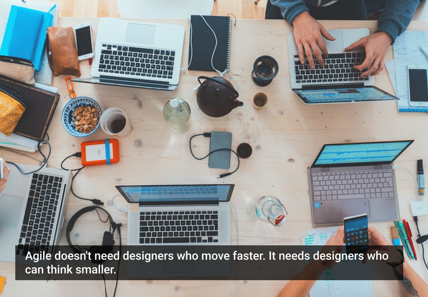
When people talk about working on agile teams, they often describe the challenge as a matter of speed. Everything moves faster. Sprints are short. Engineers are ready to build. Product managers are breaking big ideas into tickets that need to be tackled immediately.
The assumption is that designers simply need to keep up.
But one of the first things I learned in the course I’ve been taking with Laura Klein is that this framing is wrong. Agile teams don’t really ask designers to move faster.
They ask to design smaller, and for designers, that turns out to be surprisingly difficult.
The designer’s instinct: think holistically
Most designers are trained to think in systems. When we approach a problem, we naturally zoom out. We want to understand the full experience, the ecosystem of interactions, the long-term structure that will support everything that comes later.
That instinct is a strength. It’s what allows designers to prevent fragmented experiences and anticipate how a product might grow over time. But that same instinct can make agile work feel uncomfortable, because agile doesn’t usually start with the full system. It starts with a slice of it.
Instead of designing the entire solution, you might be asked to design just one small piece that can be built and released within a sprint or two. Even if that piece is part of a much larger vision, it has to stand on its own and deliver value right away.
That’s where the tension begins.
Designing the full experience is intellectually satisfying. It feels responsible and thorough. Designing only a small portion of that experience can feel incomplete, even risky. But that’s exactly where agile teams operate.
A thought experiment: building a job search
One example from the course can help to see this tension more clearly.
Imagine you’re designing a feature that allows job seekers to find and apply for jobs. At first glance, it sounds like a straightforward product feature, but once you start mapping it out, the scope expands quickly.
Job seekers will need a page where they can browse open job listings. They’ll likely want ways to search or filter those listings so they can find the most relevant roles. Each listing will need a detailed view with information about the job itself. And eventually, there will need to be an application process so users can actually apply.
Even that isn’t the whole story. People might want to bookmark jobs they’re interested in, compare listings, or discover similar roles. Before long, what looked like a single feature had become a large, interconnected system.
The instinct for many designers is to step back and design the whole experience at once. After all, the pieces affect each other. Search depends on what information exists in the listings. Applications depend on how listings are structured. It feels logical to design everything holistically. But on an agile team, that’s rarely practical.
No team is going to design and build that entire experience in a single sprint, and they probably shouldn’t even try.
The trap of horizontal slicing
One temptation when breaking a large feature into smaller pieces is to divide the work by technical layers. For example, a team might decide to build the search engine first. That means designing search fields, filters, and algorithms before anything else.
On the surface, this might sound like tackling the hardest technical problem early. But it doesn’t actually create value for users. If there are no job listings yet, there’s nothing to search. Even worse, it becomes difficult to test whether the search experience works well, because the core content, the jobs themselves, doesn’t exist in the product yet!
The system is technically impressive, but practically useless.
This is the problem with what Laura Klein describes as horizontal slicing. When you divide work by layers of functionality rather than by complete user value, you often end up building pieces that can’t stand on their own. And if a slice of work doesn’t deliver value to users, you learn almost nothing from releasing it.
Looking for the smallest useful slice
What should be built first?
In the job search example, the most valuable first slice might be surprisingly simple: a page that lists available jobs with just enough information for users to decide whether they’re interested.
Instead of building a complex application system, the “Apply” button could simply send an email or allow users to upload a CV through a basic form. Obviously, that is not the final experience, but it accomplishes something important. It lets users discover jobs and take the first step toward applying. More importantly, it allows the team to release something quickly and start learning.
Maybe users care about different job details than expected. Maybe employers aren’t providing enough information. Maybe people want to filter by criteria nobody anticipated.
Those insights are incredibly valuable, and they only appear once real people start interacting with the product. Designing smaller slices makes those learning loops possible.
The real challenge
What I’m realizing from this course is that designing small isn’t only about reducing scope. Instead of asking, “What would the full solution look like?” designers have to ask, “What is the smallest version of this idea that still delivers real value?”
There’s no universal rule for answering that question. It depends on the product, the users, the stage of the company, and the assumptions the team is trying to test.
But once you start thinking this way, something interesting happens. Sometimes you discover that the feature you imagined is much smaller than you thought. Sometimes you realize that what users actually need is something slightly different than what you originally planned to build.
In agile environments, you’re rarely asked to design the whole cathedral. You’re asked to design one brick.
The article originally appeared on Substack.
Featured image courtesy: Marvin Meyer.
The post Designing Small Is Harder than Designing Big appeared first on UX Magazine.
This post first appeared on Read More