Liquid glass, fragile UX, and why I wanted 2 weeks before writing about it
It’s glossy. It’s bold… and controversial. A calm, inclusive look at Apple’s most radical UI shift.

Apple made its boldest UI move since iOS 7 (presented in 2013), when the company abandoned skeuomorphism and buried textures in favor of flat design. Years have passed…
In this deep dive, we’ll unpack whether Liquid Glass is true innovation or just a shiny throwback. What lessons can designers take from this shift? Are there new, adoptable UI patterns beneath the gloss? Does this visual leap still serve inclusivity?
“We made the buttons on the screen look so good you’ll want to lick them.”
— Steve Jobs
That quote didn’t just pop up by accident. With iOS 26, Apple seems to be channeling its own old Aqua-era charm — and yes, I also once fell for those glossy, ‘lickable’ screen bubbles on MacOS. Now that homage is back — rebranded and refactored — meet Liquid Glass. Or should we say… Lick-quid Glass.

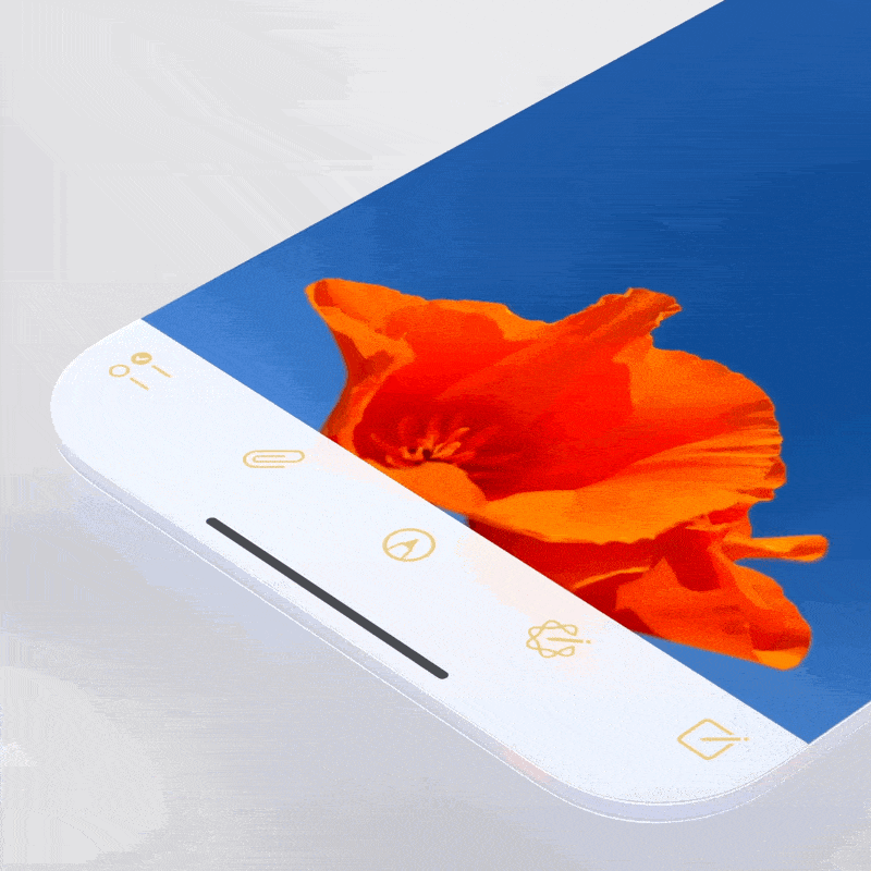
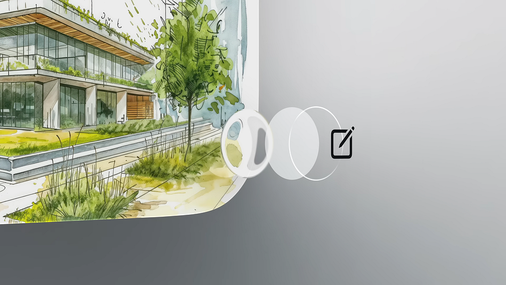
Liquid Glass — that’s what Apple calls its new digital meta-substance, setting the tone for an entirely new visual era… or at least for the next generations of iOS. But it’s more than just a shiny new style kit — it behaves like a material that lives, breathes, and responds alongside the system.
It bends light, deforms under your touch, and adapts fluidly to context. And yes, the screen feels delicious again. In general design, eye candy refers to visuals or objects that instantly grab attention and deliver aesthetic pleasure. But there’s a delicate balance behind the sweetness. The aesthetic–usability effect shows that we often perceive attractive interfaces as more usable — even if nothing about their functionality has changed. I wrote about visceral delight early on.
It’s All About Delight: “Aha moment” as a key factor in deepening user delight, engagement, and…
It’s obvious that Apple isn’t just decorating the interface — they’re weaving visual delight into the functional fabric, which is exactly what we expect from a modern operating system. But before we dive into details, let’s settle the matter of visual associations once and for all.

In sci-fi films like Minority Report, we’ve seen transparent interfaces floating mid-air — perhaps this is a step toward that augmented future. But while Apple’s Vision Pro may truly position interfaces as spatial layers, on other existing devices, this illusion doesn’t quite hold. Ok, smart glasses are still on the horizon, and when they arrive, translucent interfaces like this may finally find their true home.
That said, these glassy UI elements look stunning against dynamic video backdrops or scrolling pages — and that’s already a treat.
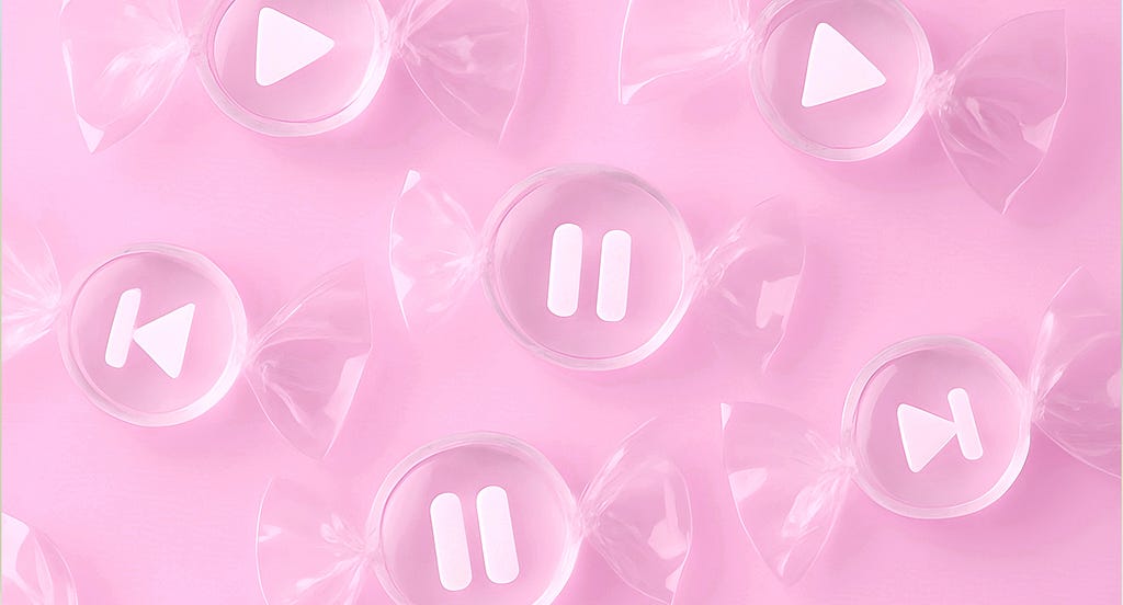
I decided to find associations that Liquid Glass elements evoke for users and heard: ‘glossy hard candy’, ‘jelly’, ‘soap droplets’, ‘translucent slimes’ or ‘shiny gummy blobs’. The rounded, sticky-fluid look brings strong associations with gooey materials.
For a while, I couldn’t quite define what this interface reminded me of, and then it clicked. It’s like that moment when a drop of melted (and still clear) candle wax hasn’t fully hardened yet, but is already starting to turn cloudy and semi-opaque. It’s still pliable, still warm, still slightly viscous — but it’s beginning to take shape. Liquid Glass in iOS 26 evokes a similar visual sensation: something between fluidity and fragile stability, constantly shifting its presence.
Meet Liquid Glass – WWDC25 – Videos – Apple Developer
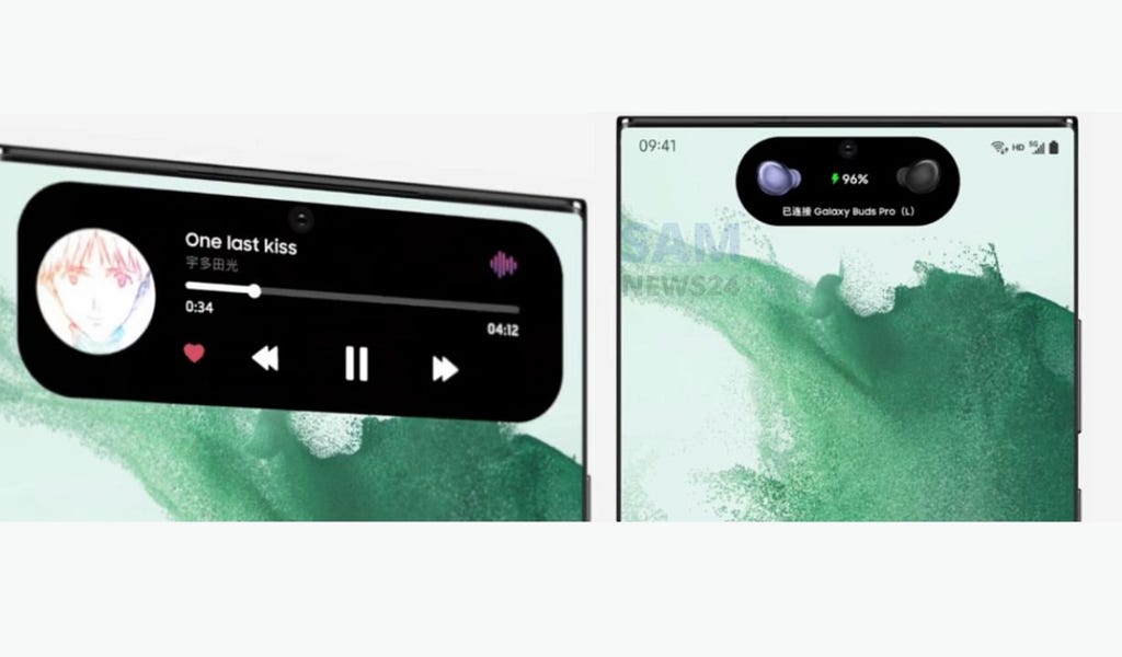
Apple emphasizes that Liquid Glass visually defines itself through a lensing effect — the way light bends, refracts, and concentrates as it passes through a material. According to Apple’s Design Team, this is something we intuitively recognize from the real world: like how a drop of water focuses sunlight, or how a magnifying glass pulls an object visually closer.

This same principle is now woven into the interface. Unlike the backdrop blur of iOS 7’s frosted panels (still visible today), Liquid Glass dynamically bends light, behaving like a translucent or semi-translucent material from the physical world. As a result, interface elements feel crisp in outline yet visually weightless. They appear to float above the content — present, but not distracting.
Apple advises against stacking such elements or applying the Liquid Glass effect everywhere, so the interface remains distinct from the flat content beneath. I’m working on a deep-dive article covering everything about the new Liquid Glass design system and guidelines — so stay tuned.
Get to know the new design system – WWDC25 – Videos – Apple Developer
According to Apple, this lensing effect helps separate layers of the interface, creating natural depth and hierarchy . It’s a subtler form of separation: not a shadow, but a shimmer. Shadows still exist, but they’ve become dynamic, imitating the rise and fall of interface droplets above the content as it moves or is being moved. Additionally, they become richer with the size of UI elements.
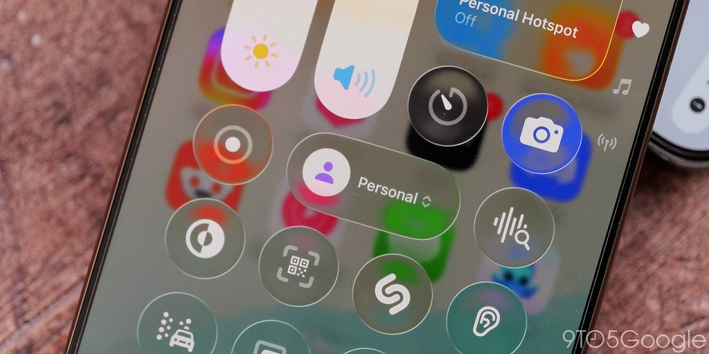
‘Islandy’ interface
Apple is clearly aiming to put more focus on content — and disolve interface that’s why we can see interface parts becoming more compact and airy.
A prominent example is Safari, where the navigation bar no longer presses down on the screen but instead floats above it. And in general we do see more floating buttons or groups of buttons instead of tight navigation bars. That’s definitely a visual win, but it adds more work for designers — now you have to think not only about static layouts, but also how those elements transform contextually across different states.

Glassy islands sometimes turn into decorative candy, and full transparency looks sleek, but it struggles against busy backgrounds: textures warp and blend in, causing readability and contrast issues.

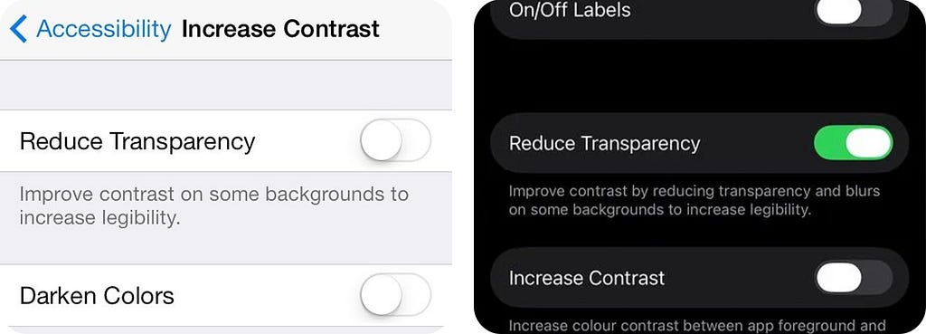
History has seen this before. With iOS 7, Apple went too far with transparency and thin fonts. The direction was bold, but by iOS 7.1 (March 2014), they started dialing it back: adding a “Reduce Transparency” toggle, improving contrast, and bringing back solid backgrounds to restore readability.
Yes, we can improve and customize the look to make it more usable and accessible, but does it truly serve the idea of inclusivity? We’ll come back to that later in this article.
The interface feels so fluid, organic, and in constant motion, that for some users, it borders on instability: buttons morph into contextual menus, elements stretch like slime under your touch, and all of this happens alongside rim lighting, optical distortions, and shimmering highlights. For many, it may look dynamic. But for others, it may feel overwhelming or disorienting, especially for people with motion sensitivity. That’s why system-level options like ‘Reduce Motion’ remain crucial.
Has Apple ever truly listened?
Historically, every Apple launch stirs up dust, especially when it marks a radical shift, whether visual or technical. As designers, we get especially fired up when those shifts impact the very design language of whole operating system.
I still remember the excitement of iOS 7: that visual overhaul made your iPhone feel brand new. Back then, if you wanted a fresh interface, you usually had to buy a new device or ditch the old one, but that specific update alone made your phone look up-to-date. Though it sparked significant outrage from the masses — after all, familiarity breeds comfort. Early operating releases of iOS tried to surround users with what’s familiar by mimicking the physical world — hence all the wood textures and real-life object imitations.
This time, I chose to wait. I watched the reactions pour in — more outrage, less praise, and a flood of memes. I gave it about two weeks. Not to bash it, nor to glorify it. Because design critique isn’t about destruction or devotion, right? It’s about balance. I wanted to see how Apple responded to the first wave of feedback (in beta 2 they already tuned blur and contrast), and of course, I wanted to hear from my design community, average the reaction, and then compare it with my own.
It was hard to find anyone willing to defend the glass approach, but particularly Darren Yeo’s article proved that it’s possible to analyze things with less emotion, something that reflects critical thinking more than reactive negativity.
I think Henry Ford once said, “If I’d ask customers what they wanted, they would’ve told me a faster horse.” People don’t know what they want until you show it to them.
—Steve Jobs
UI instead of AI? Investors and users are expressing disappointment — they were expecting AI, not just a polished or overhauled UI. As a result, the shareholders’ lawsuit (Tucker v. Apple Inc. et al.) is now making headlines, accusing the company of overstating the capabilities of Apple Intelligence unveiled at the previous WWDC. The suit claims Apple lacked a realistic plan for integrating AI, dismissing the design updates as ’empty gloss’ amid delays in delivering real AI features.
But let’s be fair — design is a form of innovation. If Apple has truly delivered a visual revolution, it could be considered a breakthrough in itself. From a designer’s point of view, it’s not just ‘gloss’ — it’s a shift in how digital surfaces feel and behave, both today and in the future.
Apple’s decisions (even the controversial ones) tend to ripple across the industry. Whether praised or criticized, they set a tone. Time and again, we’ve seen rivals eventually adopting similar patterns and overall style.
We know that Apple has withstood outrage more than once — and each time, they’ve proven the move was calculated, serving both their existing ecosystem and future products. If today they’re building seamless cross-device experiences and defining their unified design language, tomorrow we’ll see the bigger picture.
What others launched
Apple isn’t the only company trying to shape the future of design. Let’s take a look at how others are approaching it, focusing on Google’s Material Expressive and Airbnb’s refined design language.
Airbnb’s redesign has sparked a mix of admiration and skepticism within the design community. On one hand, professionals praise the new icons with motion, so called “Lava” 3D icon format, calling it “a bold shift in UI” and “a redefinition of icon behavior.” Presented as 3D micro-videos, the icons appear alive, fluid, animated and… dimensional. But when static, they feel like throwbacks to the CorelDRAW era, don’t they?
My first reaction was that the complexity of Airbnb’s new icons feels like a direct response to AI-generated iconography. Michal Malewicz proved my words: https://www.youtube.com/shorts/3k3V-0dbRe8
As tools now make it easier to enrich icons with detail and texture (and AI-animate afterwards), we as designers are almost being pushed to keep up , not just in creativity, but in intricacy with the help of Cinema 4D or Blender and non-AI tools. When visual abundance becomes effortless, minimalism suddenly feels… underdressed.
However, community feedback, especially on Reddit, highlights tensions in execution. One user noted, “Icons look like illustrations, not actionable menu items”.
https://medium.com/media/32de982711fbbf3948f91d39ce87e055/href
Ok, let’s also look at what Google has brought to the table. With Material 3 Expressive, Google introduced a motion‑physics system that goes beyond traditional easing curves. This approach uses spring-based, physics-driven motion, making interactions feel more natural, responsive, and alive. It’s still a vivid, flat design — but now rigged with fresh springs that shine in motion.
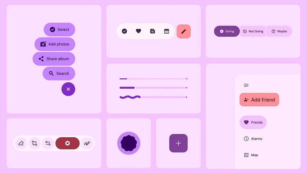
Once again, motion emerges as a defining force in visual language. For designers, this signals a major shift: motion is no longer just decoration — it’s a core design element. Whether through spring-based dynamics or fluid lensing, interfaces now “feel” alive, responding in ways that align with our physical expectations. Google uses 2D-motion to inject emotional depth into UI, while Apple leans toward immersive, 3D/spatial interaction.
The end of the flat era?
As screenshots of iOS 26 debuted, comparisons to Windows Vista began to spread: translucent panels, glossy reflections, soft shadows, and generous light play. It felt futuristic in 2007, but it also became infamous for draining battery life and overburdening underpowered hardware.

Designers coined the term Frutiger Aero — a retro-futuristic aesthetic known for gradients, lens flares, and hyper-polished glassy surfaces. It merged the Aero (not to be confused with Aqua) visual style with the typeface clarity of Frutiger, defining an entire era of mid-2000s UI culture.
It may seem that Liquid Glass shares same visual DNA, but the intent feels different. Vista dressed up a static UI with glassy chrome. iOS 26, on the other hand, turns the interface into a reactive surface. And this isn’t just visual styling — it’s a computational material, tuned to light, motion, and context. Where Vista UI just shimmered, Liquid Glass bends light. Where Aero just floated, this one flexes. So material in all its shine and glory — and ironically, Apple has made it feel even more “Material” than Google’s UI, despite the name.
Sure, iOS 26 inherits glassmorphism but pushes it forward. Glassmorphism itself can be seen as a subset of neumorphism, borrowing from it the idea of using depth to define interaction. Personally, I appreciate how the Z-axis is used to build layered, spatial interfaces.
At its core, glassmorphism seems to chase the goal of becoming invisible. But once you layer rim lights, background distortions, and frosted glass effects, the screen can quickly feel cluttered and distracting, tiring your eyes faster than expected.
In many places it’s a nightmare of cognitive overload and low readability. The glass refractions need a certain level of transparency to look the best and that level will crash and burn on half of the backgrounds.
This quote is from the ever-sarcastic Michal Malevitz (one of my favorite authors) who claims to have coined the term ‘glassmorphism.’
That said, Liquid Glass feels elegant. It really does. And, like with every bold design refresh, you’ll probably stop noticing it after a week. But if the visual “wow” fades, the clutter stays… We’ll need time to see how this plays out.

Are we witnessing just a new visual style or the slow sunset of flat design? Minimalism vs ‘a sense of substance’… unflattened minimalism? Light, depth, motion, transparency — all working together to make the interface feel more alive and more physical.
Liquid Glass doesn’t reject minimalism, but adds more visual… mmm, tactility? ‘Visual tactility’—can I put it that way?
Could flat design become obsolete so unexpectedly? No. But expectations are shifting and users who are getting used to this new interface will start to demand a more sensory-driven experience everywhere.
Android, your move?
Design becomes computational?
“Liquid Glass” signals a deeper shift for us, interface/UX/product designers and for developers as well. We’ve long treated design systems as collections of UI patterns, components, guidelines, fonts, and sometimes animations. But Apple shows that consistency isn’t just about alignment and spacing anymore.
It begins with consistency of the material itself — its responsiveness, its viscosity, its behavior under light and pressure. In Liquid Glass, material consistency becomes the basis for design consistency. The way the interface flexes, reacts, and adapts becomes part of the unified design language — not just how it looks, but how it behaves and responds.
This new digital meta-material doesn’t just look different — it acts like a responsive or even living substance. It conveys flexibility and tactile feedback through motion, not just appearance. It’s no longer just visual consistency — it’s computational consistency.
Speaking of, we used to hear a lot about computational photography from Apple, where a camera doesn’t just capture the world, but interprets and calculates it through layers, filters and algorithms. Now, it seems, computational design is emerging.
Liquid Glass isn’t just rendered once — it’s computed continuously. It dynamically adapts to light, content, and context. It’s live, real-time response to surroundings and user input. The material flexes, refracts, and reacts ; its every presence calculated across multiple layers: highlights, shadows, tint, luminance, and surface graphics.
This changes the game: interfaces are no longer just layouts. They’re behaviors. Designers and developers are no longer working on static interface elements— we’re shaping real-time, responsive matter.
https://medium.com/media/45aa0467eb9d5fb0d6a7b6a0c7e936d3/href
As a practical designer though, I don’t love the fact that building a high-fidelity prototype in Figma (or Framer) now means emulating the effect by layering styles and tweaking backdrop blurs. Flat design spared us from that kind of hassle. Sure, premade UI kits for Liquid Glass are already available (and more will follow), but to convincingly present a product in a realistic digital environment, we’ll now also have to deal with computationally heavy visuals, and this will inevitably burden our projects, not to mention the final interfaces.
Apple cautions designers not to overuse Liquid Glass. Yet we’ve already seen early concepts (like the all-glass Spotify or Instagram redesign) misuse and overdo these glass panels, turning elegance into ‘eye candy overload’.

Apple clearly wants the rollout to be fast and smooth. They’ve prepared us for a seamless transition to Liquid Glass. Designers already have guidelines and even tools like Icon Composer to help adapt apps to the new style. And for developes in SwiftUI, it’s as simple as .buttonStyle(.glass) — a single line to apply Liquid Glass to your interface. I’ll dive deeper into official guidelines in my upcoming article.
Can hardware keep up with Liquid Glass?
At first glance, the glassy interface might seem like just another visual layer. But try to replicate it and you’ll quickly realize the scale of the challenge. One Android developer who attempted to recreate the effect shared this:
“I honestly don’t know how Apple pulled it off. After trying to mimic it (using AGSL shaders — author’s note), I’ve gained a whole new respect for Liquid Glass. My guess is they’re using shaders too — just far more refined. Apple has spent years building a system that makes this possible. Android isn’t quite there yet. Maybe Xiaomi or another Chinese brand will figure out a workaround. But until we get an open-source solution, true glassmorphism on Android remains out of reach.”
This isn’t just eye-catching animation — it’s a coordinated system of material behaviors, lighting, touch feedback, and real-time shaders. Liquid Glass demands power, precision… and ideally a 120Hz ProMotion display to truly shine.

On Reddit, one such attempt (this time in a web environment) ran into severe restrictions:
“We discovered limited browser support, forcing us to use suboptimal workarounds. Over time, WebKit introduced the backdrop-filter CSS property, but it’s still a performance killer — browsers have to recalculate the blur on every scroll. Maybe Apple has optimized this across their devices, but I strongly advise anyone building a Liquid Glass design on platforms other than Apple to thoroughly test performance.”
It seems that once again, Apple’s tight integration of hardware and software is working in its favor.
Translucent or transparent? Let’s talk accessibility
Today, Apple often praised as a leader in inclusive design, but such reputation was earned over time. In the 80s and 90s, people with vision loss had almost no built-in accessibility. They had to rely on third-party screen readers like Echo II — and even those didn’t always work well. While Windows users benefited from more mature tools like JAWS and Window-Eyes, Apple lagged behind. Their first major attempt at accessibility — Universal Access in OS X 10.2 Jaguar — was buggy and unreliable.
Happy 40th Birthday to Apple: A Look Back at Apple’s Progress
It wasn’t until OS X 10.4 Tiger and the iPhone 3GS that a new era began: VoiceOver was integrated into the system, braille displays were supported, and zooming became native. In 2013, Tim Cook said, “When we work on making our devices accessible, the ROI is not the important thing. We do it because it’s just and right.”

At WWDC, Apple underscored its commitment to accessibility. They introduced features like Assistive Access for users with cognitive disabilities and showcased a suite of new tools: Eye Tracking, Vehicle Motion Cues, Personal Voice, Live Speech, Desktop Magnifier, Braille Access, and more. Additionally, the launch of Accessibility Nutrition Labels in the App Store demonstrates their shift toward greater transparency. Apple framed this as a major organizational priority: “accessibility is part of everything we do”, reinforced with dedicated WWDC sessions, hands-on labs, and ongoing evangelism.
I’ll be diving deeper into Apple’s accessibility updates from WWDC 2025 in one of my next articles.
In contrast to all concerns, there is a lot to explore of what was unveiled at WWDC 25, just one highlight: Apple now lets users control their iPhone or iPad using nothing but their eyes — no extra hardware needed, thanks to built-in Eye Tracking.
But looking at Liquid Glass, there’s an unsettling sense of déjà vu. Apple may be inching toward a critical zone again, where visual delight risks overshadowing the needs of users with limited vision, for example.

Apple has included options to adapt how Liquid Glass looks — reduce transparency, boost contrast, or calm down dynamic effects. And anyone can always fix it in the settings. That’s helpful. But it also points to a deeper issue.

In inclusive design, users shouldn’t have to tweak settings just to see the interface. Good design is inclusive by default, without requiring toggles, filters, or overlays. Liquid Glass gives users more control, which is welcome. But it also reminds us: accessibility isn’t an extra feature. It’s a baseline. And visual delight should never come at the cost of clarity, especially if we talk about visual impairments.
To the average user, Liquid Glass might seem like just a flashy design flourish. But the professional design community sees it differently. Those familiar with WCAG (Web Content Accessibility Guidelines) view interfaces like this through the lens of inclusivity.
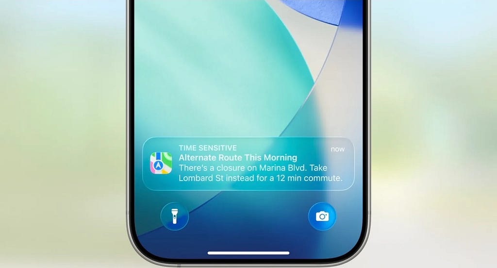
According to guideline, the minimum contrast ratio should be 4.5:1 for regular text, right? But what happens when the background itself is a constantly shifting, semi-transparent layer — blurring and bleeding through everything beneath it?
Apple provides dynamic color inversion of graphics to adapt button contrast based on the background. But in practice, it doesn’t always work in more static scenarios — for example, in notifications, where we’ve already seen not just extremely reduced contrast but full-on white-on-white situations.
“Good design is invisible.”
—Dieter Rams
But it’s not supposed to be unreadable, either. I’m confident we’ll see a fix.

Liquid Glass mimics real-world lensing — Apple Design Team themselves point to how a droplet bends light or how a lens pulls objects closer. But if this is truly lens-like behavior, why doesn’t it act like a real lens by fliping the image of distant objects? Ok, I guess I’m just overanalyzing.

In iOS 26, the buttons molded from Liquid Glass are behaving differently — and in an effort to create clearer states, the distortion warps the background in strange ways, drawing distracting patterns. It’s neither visually persuasive nor optically accurate. These distortions create visual noise, flooding the eye with patterns that carry no useful information. Over time, this strain adds up, making the interface feel more like visual clutter than a polished homage.
And finally — what if someone simply doesn’t like glassy surfaces? Be it full or partial transparency, monochrome or saturated, this new interface might feel like a visual “skin” they never asked to install. But there’s no toggle “back to flat”.
Did Apple just kill flat design? Maybe not entirely — but they’ve certainly made the interface feel alive and immersive. It’s product. It’s strategy. It’s design innovation… that sells.
References:
https://www.youtube.com/watch?v=IrGYUq1mklk
https://blog.google/products/android/material-3-expressive-android-wearos-launch/
https://medium.com/@waldobear002/airbnbs-new-lava-icon-format-a-technical-deep-dive-b2604626c7e0
https://www.afb.org/aw/17/6/15322
Liquid glass, fragile UX, and why I wanted 2 weeks before writing about it was originally published in UX Collective on Medium, where people are continuing the conversation by highlighting and responding to this story.
This post first appeared on Read More