
Guide to custom UI for Augmented Reality
How to design interfaces that get the most out of AR headsets
Race for Augmented Reality glasses is heating up. Meta presented Orion prototype, Apple is reportedly set on beating Orion to market with their own product. Then Google, all of the sudden, revealed Android XR and its own take on AR glasses.
Clearly there is a lot going on — I realized we might be developing 3D apps sooner than we thought. Since I refuse to be left behind, I had to figure it out.
Imagine my surprise when I discovered the flat interfaces are still the norm on all platforms. Familiarity and efficiency are often used as an explanation.
On the other hand, just a couple of minutes in AR makes you realize that interacting with 3D objects is way more immersive. Ignoring it for the sake of simplicity, well… it feels like a waste of the AR technology. This got me wondering…
Can we design 3D interfaces that fit Augmented Reality, and yet, feel familiar?
As it turns out, yes. Absolutely.
Getting the most out of 3D displays
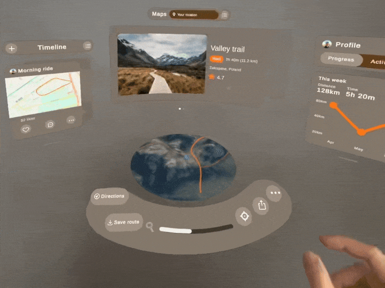
I knew I was on to something. To figure out the potential of custom interfaces I have developed an outdoor activity tracker, in Unity. I ran a moderated usability study to check how people interact with 3D interfaces. Here is what I learned:
- Make use of 3D screen — Focus on 3D content, build your interface around it.
- Apps can be used from multiple angles — Multitasking in AR means people will not always face UI directly.
- App as a place to work — Whole room can be a screen now, we are designing workspaces, not tools.
- Supporting long and short range interactions — People switch between touch and ray-casting, depending on context. We need to support both.
- Following AR Platform standards — Just because our UI is custom doesn’t mean we can ignore interface guidelines. Consistency is key.
Still have your attention? Great, let’s dive into details then.
1. Use that 3D screen
To illustrate the upsides of 3D interfaces I started with a flat app, typical for visionOS platform. Then I gradually made my way towards full 3D.
One thing that becomes immediately clear is that 3D content has to be front and center. Ability to view and interact with 3D objects is the major advantage of AR, after all.

Making it float in front of a 2D UI just makes it stand out, awkwardly. Makes it look like an afterthought.
2. Multiple Angles
While people are accustomed to flat UI, turns out 2D patterns can be easily translated into the 3D objects. Aesthetics aside, people expect spatial apps to behave like physical object you can grab, rotate, look at from the side:

Everything is visible and possible to use even if you are not facing it directly. This is especially important when you are working with multiple apps or windows at the same time.
If you are not convinced, take a look at the example below. Seeing it from the front, there is no difference between sliders. But! when you look at them from the side, suddenly the flat one is harder to interact with.

That might seem like a detail, but it’s called Spatial Computing for a reason, right? Giving people freedom to approach the app from any angle is what makes a difference here.
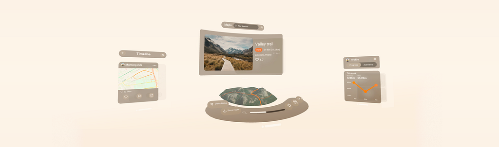
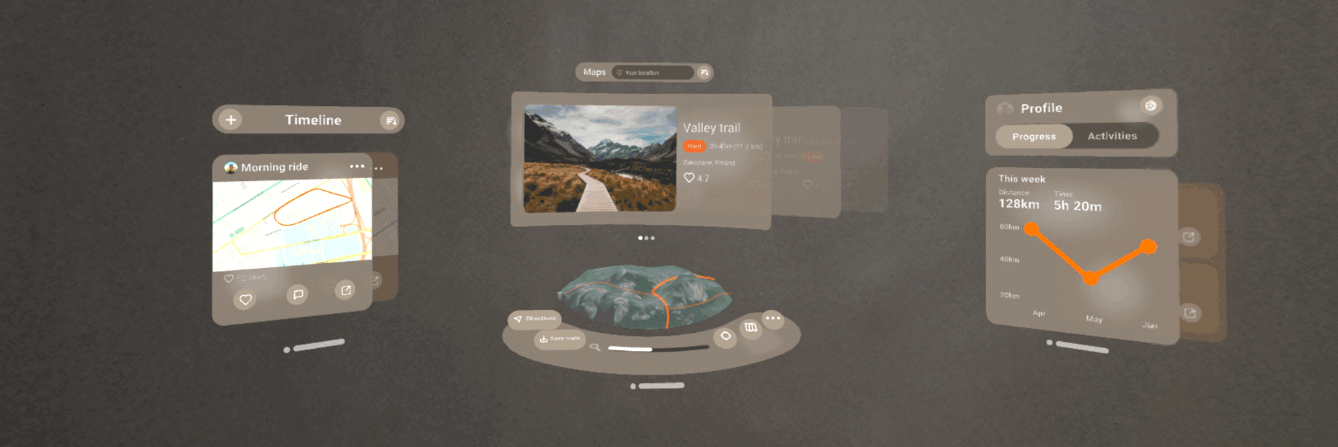
3. The whole room is your screen now
That’s kinda inspiring. We have A LOT of space available, use it. We don’t have to hide functionality under menus or tabs anymore. We can feature all essential content at the same time.
Keep in mind, though— there is a difference between limited screen space and prioritization. Some elements are tucked away for a reason.
We shouldn’t show everything just because we can, that would be overwhelming. But in AR, if it’s important — we have space for it.
That observation makes you think differently about AR. Take a look at the example below. Regular app would show you only one tab at a time. Here you can scroll through your past trips while planning the next one. It feels so natural.
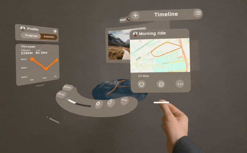
Aaand I’m using the app at an angle, for extra points.
AR apps can be so much more than a couple of iPads hanging in the air. When done right, the app feels like an organized desk, a place to work, not a tool you use.
Now that it’s a well organized workspace, let’s make sure everything is within reach.
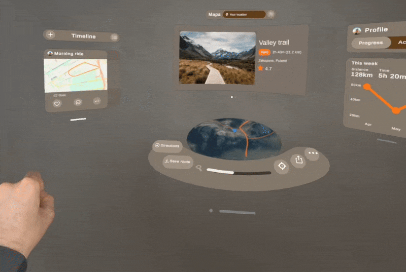
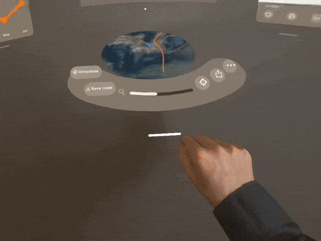
4. Long and short range interactions
For an app to feel natural in 3D we have to implement both direct manipulation and ray-casting.
People tend to switch between the two depending on circumstances. Lack of touch detection makes the UI feel clunky and unfinished, while the lack of ray cursor can make the experience uncomfortable.
Here are a couple of related observations I made during the usability study:
- People prefer direct manipulation when precision is required.
- Conflicts between gestures are a problem. When you grab a window, your index finger can point at something else accidentally. Detect the hand, interaction type, disable conflicting scripts.
- Tap targets are important. Hand tracking is far from perfect, so making the collision boxes bigger than actual buttons helps a lot. Seeing your pointer constantly slipping while aiming is beyond frustrating.
- Locking the Y-axis makes organizing windows easier. Dragging UI closer without having it jump up and down makes the experience much more pleasant.
5. Platform standards
One last thing to consider. Now that we’ve figured out how the app will look like we can tweak it to match our target platforms. Just as with mobile, each AR system has it’s own guidelines, look and feel.
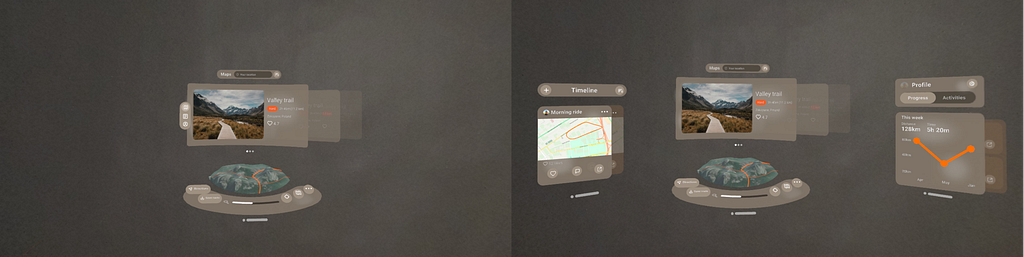
To illustrate those nuances I prepared a quick comparison of how my app would look like for Android XR, Microsoft’s MRTK3 and visionOS:
Summary
So, we’ve utilized the 3D display, turned our app into a workspace, support multitasking, long and short range interactions. We’ve made some major changes to our design.

Just take a look at how far we’ve come. Not bad, huh?
I know designing for devices that don’t exist yet is a little unconventional, but it helps us understand the nature of AR. Mixed reality headsets like Vision Pro or Meta Quest give us a chance to experience the future of personal computing.
AR glasses have the potential to be one of the most versatile devices. Let’s be ready when they arrive.
AR Platform Guidelines:
- AndroidXR: Design for XR
- Apple HIG: Human Interface Guidelines
- Meta MR Guidelines: Design Foundations
- Microsoft MRTK3: Mixed Reality Guidelines
Useful AR resources:
- NN group has a great article explaining the benefits of AR: Augmented Reality: What Does It Mean for UX?
- For more information be sure to check out “UX for XR”, by Cornel Hillmann and Tino Kuhn, great intro to spatial design.
Also, check out my portfolio for more AR design experiments!
https://kamilkolodziejczyk.pl
![]()
Guide to custom UI for Augmented Reality was originally published in UX Collective on Medium, where people are continuing the conversation by highlighting and responding to this story.
This post first appeared on Read More