
How to make sense of your product data with an evidence map
You’ve run countless interviews, launched prototypes, and maybe even shipped an MVP. As a well-trained, passionate PM, you’ve also conducted multiple tests for each of your riskiest assumptions. You’ve been collecting data, data, and more data. Now, your CEO strolls in and asks a valid question:
What have we learned, and what should we do next?

Product teams often drown in a sea of qualitative and quantitative data, struggling to make sense of months of assumptions tests. This blocks clear decision-making and wastes R&D resources. That’s where evidence maps come in.
Evidence maps are commonly used in academic research and public policy, but not (yet) in product management. This is an oversight, since they’re the logical next step after running tests and/or collecting data from various sources. Instead of keeping test results and data siloed, an evidence map brings everything together in one place.
For example, instead of separate documents that say, “The prototype test passed, and success metrics were met” or “We identified pain points X, Y, and Z in customer support tickets,” an evidence map consolidates all this information.
Already convinced that you need this? This article will deep-dive into how to use an evidence map to make sense of your riskiest assumptions.
Creating your (empty) evidence map for your riskiest assumptions
In the best case scenario, your team meticulously identified your number one customer opportunity, ideated solution ideas, and pinpointed the riskiest assumptions underpinning those solutions. Your tests are neatly associated with these assumptions, and you’ve run multiple tests per assumption.
In the less-optimal case, you skipped all that, and instantly built and launched your solution, and are now trying to reverse-engineer why it’s not gaining traction. You’re left with vague hypotheses like, “We didn’t achieve the user growth we wanted because:
- The problem isn’t big enough
- The solution isn’t polished enough
- We targeted the wrong people”
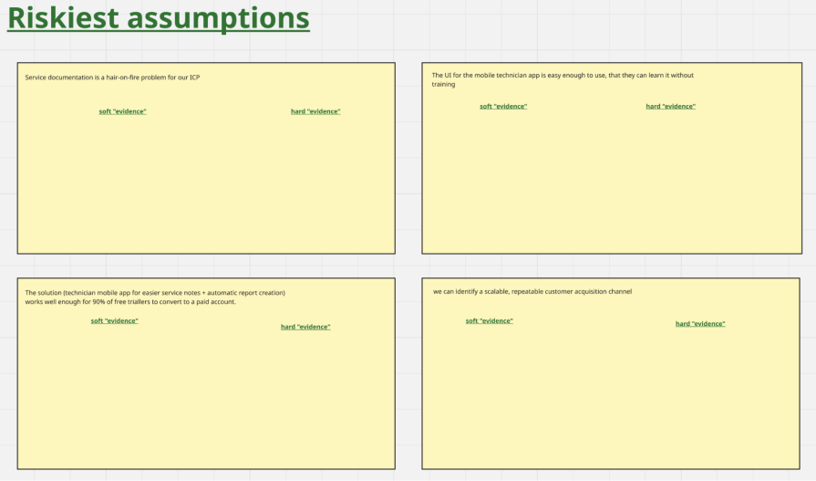
For each of your riskiest assumptions, create a dedicated space on your map. Divide this space into a left section for “soft evidence” and a right section for “hard evidence.”
Here’s an example map for an early-stage startup that’s building a mobile app for field service technicians (electricians, HVAC installers, etc.) to capture service notes and photos on the job. Its key assumptions to validate are:
- Service documentation is a hair-on-fire problem for our ideal customer profile (ICP)
- The UI for the mobile technician app is easy enough to use that they can learn it without training
- The solution (mobile app for easier service notes plus automatic report creation) works well enough for 90 percent of free trial users to convert to a paid account
- We can identify a scalable, repeatable customer acquisition channel
Populating your evidence map
Three ingredients make this step a success:
- Distinguish between soft and hard evidence
- Collect evidence from tests (in progress or completed) — For completed tests, mark whether they passed or failed based on your pre-defined success metrics
- Link hard evidence to measurable impact on your company’s key business and product metrics
Soft evidence
Soft evidence comes from interviews or qualitative tests like landing page tests or prototype tests. When “evidence” is based on what a potential user has said, but not on what you’ve seen them do, it’s considered soft. Self-reported data is inherently unreliable; people often don’t do what they say they will.
Here’s an example of soft evidence for the assumption: “The solution (technician mobile app for easier service notes plus automatic report creation) works well enough for 90 percent of free trial users to convert to a paid account:”
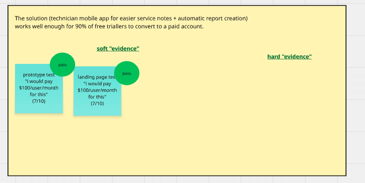
Assume you ran a moderated prototype test with 10 participants. You decided upfront that the test would pass if at least seven participants answered “Yes” to “Would you be willing to pay €100/user/month for this solution.”
The test passed. A similar landing page test also passed. Very promising, right?
Now, for the assumption: “The UI for the mobile technician app is easy enough to use, that they can learn it without training:”
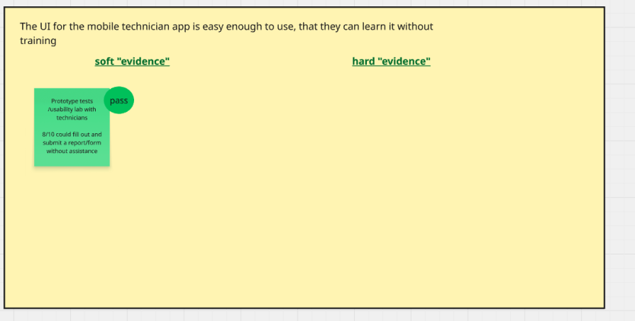
You ran a moderated prototype test with 10 participants, eight out of 10 participants succeeded in executing the task “fill out and submit a form” without guidance. Another pass!
Hard evidence
Hard evidence is what you’ve seen people do under real-world circumstances, without being led by you. Think statistically significant A/B test results, a large-scale MVP, or launch data.
Let’s add real product data measured since launch for the assumption: “The solution (technician mobile app for easier service notes plus automatic report creation) works well enough for 90 percent of free trial users to convert to a paid account:”
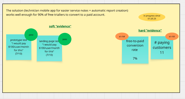
Things are starting to look less rosy.
Your prototype test users indicated that they would be willing to pay $100/user/month for the solution, but in reality, fewer than 10 percent of free trial users are converting to paid.
So what should you do next? Some example options:
- Do nothing. Keep the product as is, and collect more real-world evidence (“It’s too soon to tell, need more hard evidence”)
- Change the product (run an A/B test with a modified new user onboarding flow)
- Collect more data (an in-app survey to free trial users: “Is this product useful for you? Why (not)?”)
And for: “The UI for the mobile technician app is easy enough to use, that they can learn it without training:”
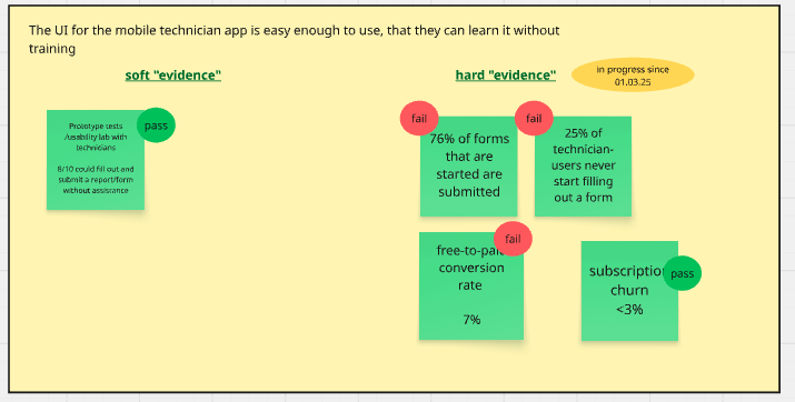
In response, you could:
- Do nothing. Keep the product as is, and collect more real-world evidence (“It’s too soon to tell, need more hard evidence”)
- Change the product (make buttons in forms bigger, simplify forms)
- Collect more data (interviews with mobile app users that started forms but didn’t submit them, churn interviews)
Adding key insights
Even with meticulous documentation, pulling out the real insights can feel like finding a needle in a haystack. To help with this, block dedicated thinking time to review all the evidence you’ve collected, whether it’s from learning cards, experiment docs, interview snapshots, or sales call transcripts.
Large language models (LLMs) can be very helpful here. Feed all test results and learnings into the LLM (remember, garbage in, garbage out, so clean up your notes!). Give it a strong background and a solid structure. Ask it questions to pull out insights, always double-checking that the LLM is looking at the correct input.
After that, plot the most important insights on your evidence map:
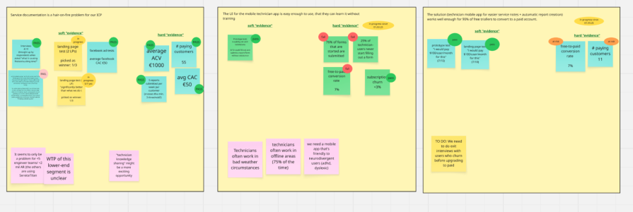
Your assumptions and insights might be something like:
1. Service documentation is a hair-on-fire problem for our ICP
- Insights:
- It seems to only be a problem for teams with less than five engineers or less than $2 million AR (others are using ServiceTitan)
- Willingness to pay from this lower-end segment is unclear
- “Technician knowledge sharing” might be an even more painful and exciting opportunity. While investigating “service documentation,” we might have stumbled across a bigger problem
2. The UI for the mobile technician app is easy enough to use, that they can learn it without training
- Insights:
- Technicians often work in bad weather
- Technicians often work in offline areas (75 percent of the time)
- We need a mobile app that’s friendly to neurodivergent users (ADHD, dyslexic)
3. The solution works well enough for 90 percent of free trial users to convert to a paid account
- Insights:
- The hard evidence showed us that only 7 percent of free trial users converted. We can’t figure out why yet
- To do: Organize exit interviews with users who churn before upgrading to paid
Final thoughts
Evidence mapping helps you make sense of the wealth of qualitative and quantitative data you collected to inform the decisions you set out to make.
At the end of day, it’s about honesty: Have you been spreading yourself too thin? Does your hard evidence paint a different picture from your soft evidence?
The map ultimately helps you see “what you know” versus “what’s still a gamble,” so that you can decide what steps to take next.
Featured image source: IconScout
The post How to make sense of your product data with an evidence map appeared first on LogRocket Blog.
This post first appeared on Read More