
“Data-driven” is dead
How the industry has shaped me to embrace data-driven design.

I’ve been working as an interaction designer and PM for years. When I first came to the US a decade ago, I wasn’t sure how I’d fit into the job market. I wasn’t from here and didn’t know the playbook. Through trial and error, I eventually found myself in the then-booming role of UX designer — a job that felt relatable, in demand, and easy to explain to others at the time.
Like many in the field, I leaned heavily into the mantra of “data-driven” design. Every choice had to be backed by numbers, validated by user tests, or confirmed by analytics. For a while, that approach was powerful. But I’ve come to believe it’s no longer the true advantage of a designer. In fact, it’s becoming obsolete.
Over the last decade, the digital product industry has centered itself on process: templates, frameworks, and ways to integrate design into business efficiently with data. But in doing so, designers, myself included, have slowly boxed ourselves in. Much of what designers produce today — structured iterations, data-driven optimizations — are exactly the kinds of tasks that AI can do faster, or lower-cost labor can do cheaper.
My observations with data-driven design
- Data-driven design is easily replicable, especially with AI. It’s a great tool for an operator, but that has risked some design jobs.
- It flattens experiences. Optimizing for numbers alone converges toward sameness: endless scroll feeds, grid layouts, the same funnels.
- It’s reactive. Most available data reflects only the past. Leading indicators are often hard to identify or measure. As a result, we tend to focus on lagging data, making iterations reactive rather than inventive or preventive. When KPIs miss badly, debates over what to tweak can become paralyzing.
The uncomfortable truth is this: by clinging to the data-driven process as our identity, we’ve made ourselves replaceable. You can see it in the job market — roles shrinking, tasks offloaded, design increasingly treated as a commodity.
But I’ve also noticed recent signs of a shift. After the euphoric rush of AI, some teams are realizing the limits of automation. AI improves productivity, yes — but when it comes to fine-tuning, to the subtle judgment calls that make an experience feel right — it falls flat. And that’s exactly where design lives.
Looking back at history, the pattern is clear: many of the most important products weren’t born from data at all, but from ambiguous, even “irrational” design choices.
Creative Ambiguity
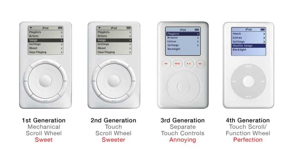
Feels right! — iPod’s click wheel
The click wheel was born less from data and more from a designer’s hunch about rhythm. Controlling thousands of songs with a tiny screen seemed impossible — until someone spun their thumb around a wheel and realized it could feel like scratching vinyl, a gesture with cadence and playfulness.
“Sometimes stupid things only seem stupid at first, but if you break through, it actually becomes smart.” — Tony Fadell
Satisfying to see it working! — Dyson’s transparent vacuum
When James Dyson proposed a clear canister that displayed all the dirt being sucked up, designers told him: nobody wants to see their dust. Dyson flipped the logic: the visibility wasn’t disgusting, it was satisfying.
“I persisted, because I found it really fascinating that you could see exactly what was happening… I wouldn’t have got that from research — I’d have gotten the exact opposite.” — James Dyson

More living, more fluid! — Snapchat’s ephemeral messages
One of the defining traits of digital products is the effortless access to past content. Snapchat inverted that logic. Instead of permanence as the source of value, what if the value was in disappearance? Evan Spiegel described it as removing “the pressure associated with permanence.” The result was messaging that felt playful, intimate, and alive — less like an archive, more like a conversation. Most importantly, ephemerality nudged users to return frequently, knowing messages and stories would vanish if they didn’t.
“Snapchat isn’t about capturing the traditional Kodak moment. It’s about communicating with the full range of human emotion — not just what appears to be pretty or perfect.” — Spiegel

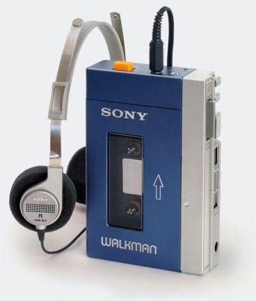
The Emergence of the Walkman Effect — Sony Walkman
Sony’s market research was clear: nobody wanted a tape player without a record button. Akio Morita, Sony’s co-founder, ignored the data and pushed ahead with the Walkman (1979). He believed people didn’t yet realize they wanted private, mobile music. He was right. The Walkman redefined how people consumed music, introducing the Walkman Effect — giving listeners control over their environment.
“The public does not know what is possible, but we do. Instead of doing a lot of market research, we refine our thinking on a product and its use and try to create a market for it by educating and communicating with the public.” — Akio Morita
Iconic and Abstract: Absolut Vodka Campaign (1980s–)
In the 1980s, Absolut Vodka took a bold approach to advertising. Instead of describing the vodka’s taste or craftsmanship, the team fixated on the bottle itself and treated its silhouette as a cultural canvas. No focus group or market data suggested this would work — it looked risky, even puzzling. Yet the playful, surreal representations of the bottle — as a halo, a snow globe, a stage — resonated, and more importantly, made people curious about this mysterious foreign-born vodka. The campaign became one of the longest-running and most recognizable in advertising history, proving that imagination and ambiguity could break through traditional advertising templates.
“Creativity is allowing yourself to make mistakes. Art is knowing which ones to keep.” — Scott Adams

It’s about the positioning
I apologize for titling the article “Data-driven is dead” — I admit I wanted it to sound a little more controversial. In fact, I love working with data, and the examples I mentioned above also evolved based on consumer reactions. More importantly, they were fundamentally functional. But I’ve also found that relying on it too much can narrow the scope of the conversation and doesn’t always help steer the direction when we’re far off course. I simply think it’s somewhat outdated to present “data-driven design” as your core role. Yes, as a professional, you should pay attention to business performance and client behavior. However, we should also feel confident talking about feeling, intuition, and creative ambiguity. That positioning makes me feel more optimistic as a product designer today.
References:
Tony Fadell tells us the story of the iPod-based iPhone prototype | The Verge
A Conversation with… James Dyson In Three Parts… | The Core77
SNAPCHAT’S FAILED EPHEMERALITY | AMODERN
Case — The Sony Walkman | Commoncog Case Library
![]()
“Data-driven” is dead was originally published in UX Collective on Medium, where people are continuing the conversation by highlighting and responding to this story.
This post first appeared on Read More