
Task switching slowed my users down. Here’s how I fixed it
Task switching is one of the most underestimated productivity killers in digital experiences. Every time a user is forced to jump between different screens, tabs, or workflows, they lose momentum, context, and focus.

A Stanford University study famously debunked the myth of multitasking. It found that when people attempt to juggle multiple tasks, they don’t actually split their attention. Instead, the brain switches focus back and forth rapidly, meaning that only one task gets full attention at a time. The cost of this switching is higher error rates, slower task completion, and greater mental fatigue.
In UX, that translates to a frustrating experience: users must hold information in their working memory, reorient themselves repeatedly, and waste valuable time. For products where efficiency is critical, like finance, healthcare, or trading platforms, this friction can make or break the experience.
Real project example: A forex trading platform redesign
On one project, our team worked on designing a trading platform interface. Trading platforms are naturally complex. They need to support real-time charting, watchlists, order placement, open trade management, and chat or news feeds.
A typical trading platform usually brings together four critical components:
- Chart — where traders analyze price movements in real time
- Quotes/watchlist — a quick view of current market prices for favorite instruments
- Trade panel — the interface to buy or sell, set order details, and execute trades
- Open trades/history — a record of current positions and past transactions
In the initial version of our design, each of these components lived in its own tab. At first, this seemed like a clean and modular approach. But in practice, it forced users to jump across multiple screens just to complete a single task. Here’s what that looked like:
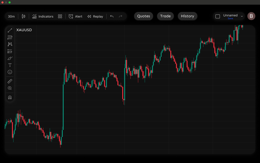
- Chart screen — Users started on the main chart screen. This was where they could view price movements, but they couldn’t take action beyond observing:
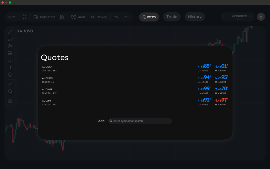
- Quotes pop-up — If they needed to check the latest quotes, they had to click the “Quotes” tab. This opened a pop-up over the chart, already forcing them to switch contexts
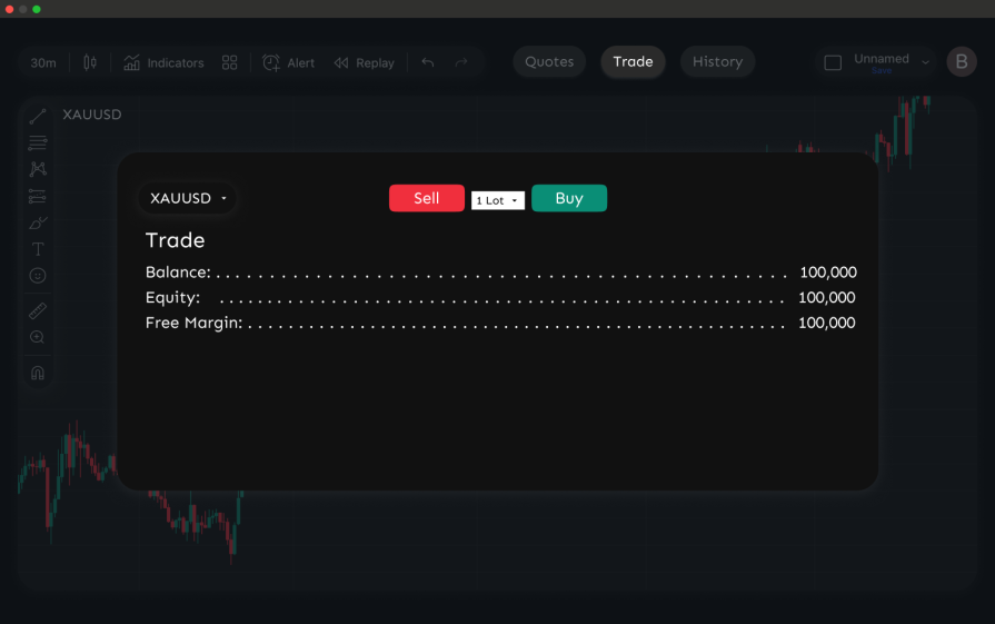
- Trade panel — To place a trade, users had to move to a separate “Trade” tab. This took them away from the chart entirely, breaking the flow between analysis and execution:
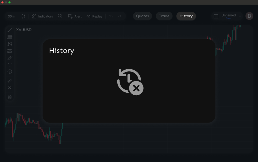
- Trade history — Finally, if they wanted to review their open or past trades, they had to switch once more to the “History” tab, again leaving both the chart and the trade panel behind:
Why this was a problem
What should have been a single task, like analyzing the chart, placing a trade, and confirming it, was broken into four different screens.
In usability testing, traders expressed clear frustration:
- Too many steps to act quickly — They had to check the chart on one screen, switch to the trading panel to enter details, and switch again to confirm trades
- No ability to trade in context — Many wanted to place trades while watching the chart, but the design forced them to leave the chart to do so
- Memory strain — Even cross-checking something simple like quotes against the chart required tab-switching and recall
This fragmented flow led to slower reactions, more errors, and wasted mental effort, serious problems in trading, where seconds can determine profit or loss.
The redesign
To solve these issues, we consolidated the core components into a single unified trading screen. Instead of spreading the workflow across four tabs, traders could now analyze, trade, and review without leaving the main interface.
Here’s how the redesigned screen was structured:
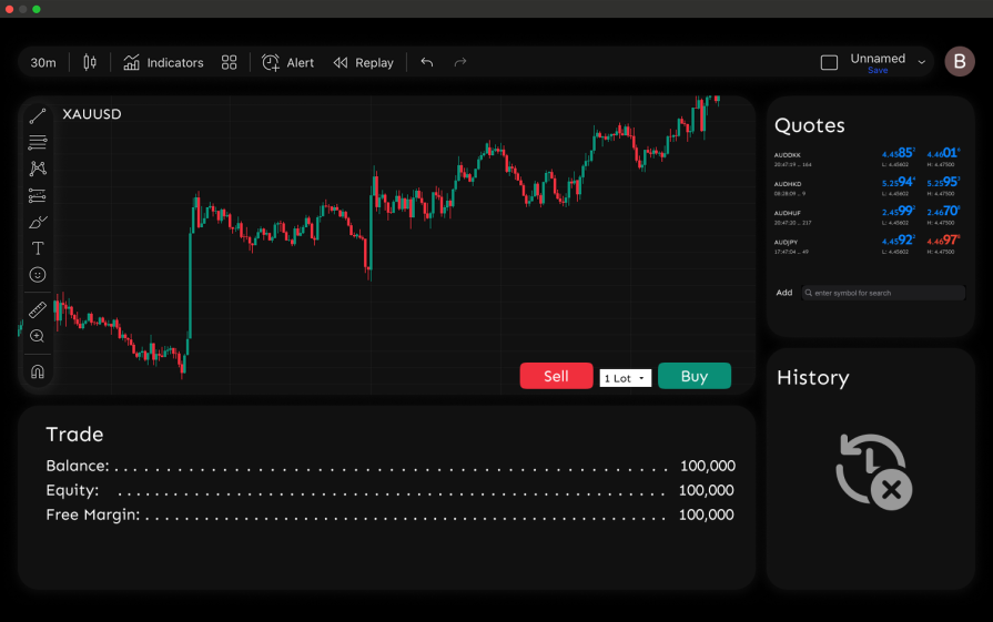
- Chart at the center — The chart remained the anchor of the experience, always visible and interactive for real-time analysis
- Quotes on the right sidebar — A persistent panel displayed favorite instruments, allowing traders to switch instantly without leaving the chart
- Quick order panel below the chart — Buy and Sell buttons were placed directly under the chart, alongside options for lot size, stop loss, and take profit. This allowed traders to place an order in context, without breaking focus
- Open trades and account summary at the bottom — A persistent panel displayed balance, equity, free margin, and active positions. Traders no longer needed to navigate away to confirm execution
Why this worked (impact on users)
By merging everything into one screen, we reduced the steps needed to complete a trade from four separate tabs to a single flow. Traders could:
- Place trades while still watching the chart
- Monitor open positions without switching screens
- Quickly toggle instruments from the watchlist with no context loss
In usability testing, this translated into clear improvements:
- Faster task completion — Our users (traders) executed orders in roughly half the time compared to the old tabbed design
- Fewer errors — We observed a drop in mis-entered trade details, since traders no longer had to rely on their memory when placing a trade
- Higher satisfaction — Post-test surveys showed traders rating the new workflow nearly a full point higher on “ease of trading” (from 3.2 to 4.1 on a 5-point scale)
The result was a faster, smoother, and more efficient experience that cut down on cognitive load and supported quicker reactions, critical in a high-stakes trading environment.
UX decisions that reduced task switching
When we redesigned the trading platform, the improvements didn’t happen by accident. They were guided by a set of UX principles that map directly to Nielsen’s usability heuristics and are grounded in what we know about working memory and human factors.
These are the same principles we leaned on, and they’re worth keeping in mind when you’re auditing your own designs:
- Proximity — This follows Nielsen’s heuristic of recognition rather than recall. In our redesign, traders could view charts, place trades, and check open positions in the same space. Bringing connected elements together reduces context switching and keeps users in flow. Why does this matter? Because users tend to believe that items positioned near one another are related. When related functions are spread apart, they require extra navigation and memory load to bridge the gap. The more times a user has to pause, reorient, and recall information, the more friction you add to their experience
- Progressive disclosure — Reveal complexity only when needed, show only what users need for the task at hand, and let them dive deeper when necessary
- Visibility of system status —This is actually a direct application of Nielsen’s heuristic of visibility of system status. Keep users informed at all times. Traders could see their account balance, equity, and open positions without leaving the main screen. In other products, this might mean showing progress, confirmations, or real-time updates without forcing users to hunt for them
Where it got complicated
Our biggest hurdle was making sure the screen didn’t get “too busy.” Putting everything traders needed on one screen sounded like the perfect solution, but it quickly risked turning the interface into information overload.
Progressive disclosure helped, but honestly, figuring out what deserved to stay visible and what could be tucked away was the tricky part. We leaned heavily on usability testing during auditing sessions to get this right. Seeing how traders actually worked helped us spot which data points were must-haves versus nice-to-haves. The feedback we got made it easier to deliver a clean, focused UI that also gave users enough context to make fast decisions.
How to audit your design for unnecessary task-switching
If you’re designing or auditing products for task-switching issues, remember that task switching often hides in plain sight. As designers, our job is to notice when users are being forced to juggle too many screens or workflows for what should be a single task.
Here are a few ways to identify and go about it:
Pay attention during usability testing
Users may not explicitly mention “task switching,” but their feedback often reveals it. Listen for cues such as:
- “I keep forgetting the number I just saw.”
- “I wish I could do this right here instead of opening another page.”
These are strong signals that the design is forcing unnecessary context shifts.
Observe their behavior
Even if users don’t say it out loud, watch for the patterns:
- Switching tabs or screens multiple times to finish one action.
- Taking notes or screenshots to remember information.
- Pausing often, as if mentally “resetting” before continuing.
Audit your product systematically
Run through your own workflows and ask:
- Does this task require me to leave my current screen?
- Do I need to memorize or re-enter information elsewhere?
- Am I repeating the same filter, setting, or input across multiple places?
If the answer is “yes,” you’re likely looking at a task switching issue.
Redesign with proximity and flow in mind
Once you’ve identified the pain points, apply principles like proximity, progressive disclosure, consistency, and visibility of system status to reduce the number of steps and keep users in context.
Conclusion
Users don’t truly multitask; they pay a heavy cost every time they’re forced to switch contexts. By thoughtfully grouping related features, reducing unnecessary navigation, and supporting visibility, we can design experiences that keep users focused and effective.
The post Task switching slowed my users down. Here’s how I fixed it appeared first on LogRocket Blog.
This post first appeared on Read More