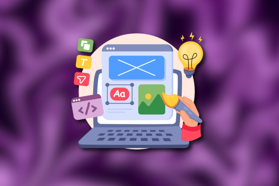
A hero section appears as the first UI block of a website or any digital product and takes the user’s attention with visually prominent features. It welcomes users, guides them to continue with primary actions, and makes the first impression memorable. It has become a standard component in modern digital product design, especially in web design. However, the hero section is beneficial for some products, and some don’t require it at all.
A hero section is a mandatory, marketing-friendly, and user-friendly segment for design scenarios where product storytelling has priority. In other scenarios, a hero section isn’t a necessary element and can increase visual clutter, ultimately affecting usability, user engagement, and product quality.
When a hero section supports the UX goal
Using a hero section improves UX and boosts conversion rates for the following situations:
- Single, clear primary action — If your product front page can offer a single, clear primary action that supports user and business goals like signing up or downloading software, creating a hero section with an effective CTA guarantees a better conversion rate
- Product storytelling — If your product design delivers a landing page where you should prioritize product storytelling, adding a hero section is the only modern marketing approach that the user is familiar with
- Emotional onboarding — The hero section is a necessary component for fixing the user’s mood, motivating them, and building trust before onboarding them to the digital product’s primary task, e.g., a motivational hero section in a job search platform
When a hero section disrupts the flow
Adding a hero section for the following design scenarios isn’t suitable; if you do so, the users will find it unclear and annoying, and the overall user engagement and design quality will be affected:
- Browse-first products — Products that offer item browsing as the primary user task and engagement strategy don’t require a hero section since the browsing interaction should have priority for better user engagement
- Multiple key actions — Adding multiple primary CTAs in a single hero section confuses users, biases features, and affects the visibility of the other elements in the above-the-fold area
- Simple task-oriented products — For products with simple, clear, direct tasks, onboarding the user to the product instantly is undoubtedly productive than bringing them through a hero section
- Limited spaces — Squeezing a hero section under tight screen constraints affects primary navigation and overall accessibility
- Returning users — If the user is a long-term customer of your product, a product-storytelling hero section isn’t needed
Conditional benefits
The hero section goes beyond creating a general good first impression and gives several powerful benefits based on several product design conditions, as follows:
| Benefits | Design scenario conditions | Visual design conditions |
|---|---|---|
| Speeds recognition of purpose | Product storytelling is prioritized over the product’s immediate use | Concise, self-explanatory hero section elements are used |
| Sets emotional tone and trust | The product theme requires an emotional tone to fix the user mood and build the user trust | An effective motivational theme is used |
| Directs attention to one clear action | The primary action is what the user and business expect | Clear, concise CTA labels with better hero element positioning |
Alternatives that support the same intent
If you find that you can’t create a clear, effective hero section for a specific scenario, you can use the following UI elements to support the user’s initial intention:
- Intro grid — Lists multiple grid tiles with a navigation action. Suitable for scenarios where you shouldn’t prioritize product storytelling and should display multiple key actions
- Heading with a features list — Displays a hero-heading-like powerful heading, but lists a features list after. This may use the hero section’s visual enhancements, like background layers. An effective solution when you need a hero section, but you should display multiple key actions
- Multi-hero layout — Uses multiple static hero sections in a grid—a maximalist version of a carousel hero section type. Suitable for advertising multiple items
- Contextual banners — Displays a message with optional CTAs dynamically based on a specific product state. Suitable for grabbing the user’s attention when another UI block has visual priority
Decision checklist for UX teams
You can easily determine whether you should use a hero section or not by answering the following three simple questions:
- Is there a single dominant action? A primary action is mandatory for an effective hero section
- Will it guide the user by not lengthening the primary user flow? Unnecessary hero sections annoy users since they lengthen the primary user flow. Make sure it supports product storytelling and won’t disrupt user intentions
- Does the hero section clarify, not compete with navigation? Make sure the hero section won’t deliver the purpose of the existing navigation
If you responded “Yes” to all the above questions, a hero section is necessary. Otherwise, you should select an alternative element.
Examples for choosing hero sections
The following table lists some examples for deciding whether or not to use hero sections:
| Example | Is using the hero section recommended? | Reason | Alternative elements |
|---|---|---|---|
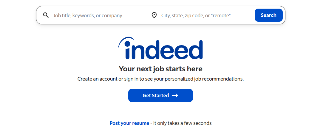
| A large SaaS product landing page | Yes | Product storytelling should be prioritized | |
| A public landing page of a content publication website | Yes | The user is not onboarded yet | |
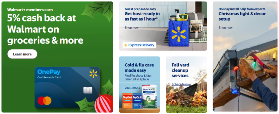
| Ecommerce homepage | No | Product browsing should be encouraged | Multi-hero, intro grid, or heading + features element |
| News website | No | The user is interested in content | Multi-hero or intro grid with trending articles, |
| Internal SaaS dashboard | No | The user is already onboarded | An intro grid-based widget |
Conclusion
The hero section is the standard element to create a good first impression for users in modern UX. It guarantees success if you can support the primary user intent with clarity; otherwise, it becomes an unnecessary element and can negatively affect user engagement, product quality, and accessibility.
The post Is a hero section necessary? appeared first on LogRocket Blog.
This post first appeared on Read More