AI has had a significant impact on UX in recent years, allowing designers to automate parts of the design process. This has resulted in an increase in efficiency, allowing designers to go through many more iterations on the road to the perfect design. An example of this can be found in the rise of AI wireframe generator tools, which have become a staple in UX design.
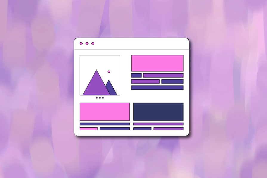
Wireframes function as the blueprint of the final product, establishing the best layout and user flow before diving into the details, and AI has only made this easier. Rather than manually drawing out layouts screen by screen, designers and even non-designers can write a prompt, upload a diagram or an image, and instantly get completed wireframes to work from. This will free up designers to instead focus on user needs and creating intuitive user experiences. While there are many such AI tools with many design industry leaders like Figma developing them in droves, one software that stands out is Visily. To keep this comparison practical and balanced each tool was evaluated using the following criteria:
- Fidelity: The quality of generated wireframes (low vs. high fidelity).
- Re-editability: How easy it is to refine, adjust, or iterate on AI-generated outputs without starting over.
- Learning curve: How quickly non-designers and designers can become productive.
- Pricing & accessibility: Value for money and what functionality is locked behind paid plans.
- Export & handoff quality: Ease of exporting to tools like Figma or handing off to developers.
The observations below are based on hands-on testing, of each platform using similar prompts and workflows, with their strengths and limitations noted based on their intended audience. Using these criteria, the summary below highlights where each tool stands out and where it falls short.
Editor’s note: This article was updated in December 2025 by LogRocket author Neil Nkoyock to include a side-by-side comparison of Visily with other leading AI wireframe generators, along with updated feature coverage and real-world usage insights. New sections highlight where each tool excels, where it falls short, and how Visily fits into today’s broader AI wireframing landscape.
TL;DR: Key takeaways at a glance
- Cleanest and most editable output — Figma Make offers the strongest structure, layout, and controls, making it best for polishing and iteration
- Best for non-designers — Visily stands out for ease of use, guided workflows, and templates that lower the barrier to entry. Uizard is a close second due to its familiar, drag-and-drop interface
- Fastest from idea to wireframe — UX Pilot generates full screens and flows the quickest thanks to its prompt-first, AI-centric workflow. Visily performs well for quick early concepts
- Least layout and alignment errors — Figma Make produces the most consistent layouts. Uizard benefits from stronger manual controls to correct AI imperfections. UX Pilot may require export for fine-tuning
- Most cost-effective for teams — Visily provides the best balance of pricing, collaboration features, and AI functionality for small to mid-sized teams. Mokkup AI is the most cost-effective option for teams specifically focused on BI dashboard wireframing
Visily’s AI Features
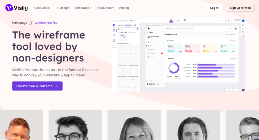
Visily is an all-purpose AI-powered UI design tool that has been dominating the market in recent years. Its popularity stems from its intuitive interface and advanced AI features, resulting in it being marketed as the UI design tool for non-designers. It offers four different pricing plans, factoring in a wide variety of needs and financial means.
It offers four different pricing plans depending on project needs:
- Starter Plan
- Free, but limited
- Designed for individuals trying things out
- Pro Plan – $14/month
- For professionals and small teams
- Unlimited boards and elements
- 5 custom fonts
- Basic workspace library
- Figma export
- Additional features
- Business Plan – $29/month
- For growing and large businesses
- Includes everything in the Pro plan
- Unlimited templates and fonts
- Full workspace library
- Priority support
- Enterprise Plan
- Custom solution tailored to specific business needs
Visily has use cases in four key design areas, and each use case offers its own AI-powered solutions for a streamlined design process:
- Brainstorming
- Smart brainstorming software with flowchart workflow and digital sticky notes
- AI-supported flow-mapping to visualize rough ideas
- Brainstorming templates available:
- User Journey Map
- Product Roadmap
- Retrospective
- SWOT Analysis
- Impact vs. Effort Matrix
- Heart Framework
- Helps users get organized quickly
- Wireframing
- Designed for non-designers with big ideas
- Drag-and-drop UI for ease of use
- Access to a library of UI elements and components
- Enables creation of complete wireframes from screenshots, text prompts, or flowcharts
- Balances speed and quality for high-quality design
- Prototyping
- AI-powered Auto-Prototype feature creates interactive flows instantly
- Smart Components: buttons, tags, sliders
- Dynamic Elements: pop-up windows, parallax scrolling, typing effects
- Turns wireframes into hyper-realistic, interactive prototypes in seconds
- Collaboration
- Supports large team projects from brainstorming to prototyping
- Multiple workspaces for organized teamwork
- Seamless permissions management
- Unlimited commenters and viewers for feedback
- Simplifies developer handoff with Tailwind-supported code generation
My experience with Visily
Layout and features
After a couple of days with Visily, I can see its potential, but parts of the interface may confuse the non-designers it targets. The layout felt unclear at first, though it became easier to navigate after a few minutes:
Left-hand menu of Visily:
- Contains the main tools: adding frames, templates, AI generation, wireframing, and brainstorming
- Includes a save button whose purpose wasn’t immediately clear
- Has a drawing tool that feels unnecessary, especially for non-designers who likely won’t use it beyond basic annotations (which are already covered by brainstorming tools)
- Overall: a mix of helpful features and extras that may overwhelm beginners
Right-hand panel of Visily:
- More straightforward, with layout properties, layers, and comments easy to access
- Missing key design essentials like auto-layout, forcing users to manually align or group elements — tedious for designers and even harder for non-designers
- This limitation makes Visily feel less capable compared to general-purpose tools like Figma
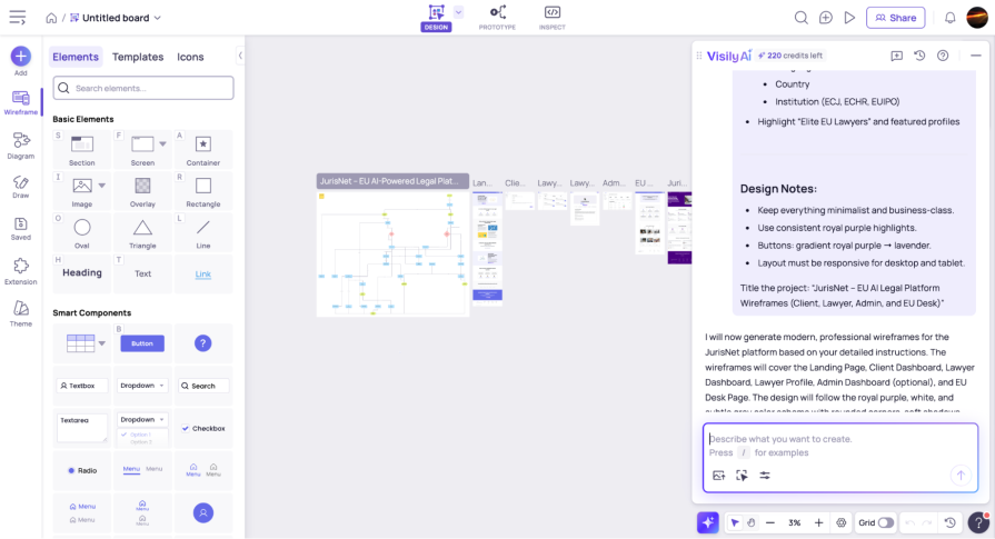
Visily’s AI features are still its strongest advantage. You can access them through the “Add” button on the left-hand menu, a small AI button at the bottom of the frame, or the V shortcut. Once you get comfortable with the shortcuts, the overall experience becomes much more intuitive.
Generative AI
Visily’s AI prompting UI works like most others: it opens on the right side, lets you describe what you want to create, and provides prompt examples to guide you. It can generate flowcharts, landing pages, and full dashboards quickly, but the quality of these outputs depends heavily on how specific your prompts are.
Where Visily’s AI works and where it falls short:
- You need very clear and specific prompts to get good results. If you only have a vague idea, the output can become confusing or unusable. I experienced this when generating a flowchart for a legal platform; because my idea wasn’t fully formed, the results didn’t help, and manually creating it would have saved time and AI credits
- Minor edits can lead to major unintended changes. When I asked Visily to add my logo and adjust colors for a legal app, it regenerated an entirely new landing page and dashboards. The new version looked worse, with text touching screen edges and misaligned elements
Where Visily still adds value:
- Provides useful tools for non-designers and a reasonable starting point for junior UX designers
- Offers a helpful library of wireframing and brainstorming templates, even though the selection is limited compared to platforms like Figma
- Works well for quick brainstorming and early wireframing, but lacks the advanced features needed for more precise design work
UX Pilot
UX Pilot is an AI-powered UI generator, built to help UX specialists, product teams, and founders turn ideas into editable wireframes and user flows at the click of a button. It can generate high-fidelity wireframes, streamline the UX design process, and save an average of 15 hours per project with its AI tools.

It offers four different pricing plans depending on project needs:
- Free Plan
- 45 one-time use design credits
- Create up to 7 screens
- Standard Plan – €19/month
- For regular users
- Export to Figma
- Export code
- 5 screen flows
- Pro Plan – €29/month
- For larger projects
- Unlimited screen flows
- Import Figma components
- Turn images into editable designs
- Teams Plan – €39/user/month
- For teams up to 15 members
- Custom integration and onboarding
- Priority support
- Team collaboration feature coming soon
My experience with UX Pilot
Layout and features
I was impressed with UX Pilot’s UI generation capabilities while testing it out. Unlike Visily and some other tools on this list, UX Pilot is more of an AI creation workspace than a traditional design tool. Rather than providing basic tools for manual design, it focuses on AI-generated content creation through prompting. You start with the typical AI layout: a prompt input box in the middle and a functional menu on the left. Once the first prompt is created, the center turns into a canvas where your wireframe appears, while the left-hand menu becomes the control hub for all the app’s AI features.

Here’s what the layout offers:
- Switch between low and high fidelity wireframes
- Toggle between mobile and desktop layouts
- Create single screens or entire flows
- Import custom themes as JSON files
- Generate up to four variations per prompt
- Use the mini menu at the bottom of the canvas to select frames and components, move elements, add sticky notes, and import images
Generative AI
The overall layout is intuitive and easy to understand within the first few minutes of using it, and it is very much AI-first. Unlike Visily, which includes the design and layout controls you’d expect from a traditional design tool, UX Pilot relies on prompting for almost everything. Editing is possible in only two ways: selection edits, which let you prompt changes to a chosen component, and manual edits, which allow simple adjustments like text changes, sizing, margins, and other very basic tweaks. Anything more in-depth requires exporting your wireframe into a more robust tool like Figma, which UX Pilot does support, but only on a paid plan.
Overall, the AI outputs were impressive and noticeably stronger than what I got using the same prompt in Visily. This makes UX Pilot great for creating multiple iterations and quickly cycling through different ideas. For beginners, it’s an excellent tool for visualizing concepts without needing design skills. For experienced designers, its prompt-centered structure may feel limited because manual control is minimal. Its pricing model also puts many advanced AI tools, including image-to-design generation, behind a paywall, making it less accessible for some. Ultimately, UX Pilot works well as a tool for fast iteration and visualization, and serves as a strong companion to a standard design tool.
Pros:
- Very intuitive and beginner-friendly UI
- Strong AI generations produce clear wireframes from prompts
- Great for exploring multiple design variations quickly
- Supports custom design themes through JSON imports
- Easy to export to Figma or other tools for refinement
Cons:
- Primarily a prompt-based tool with limited manual design capabilities
- Advanced AI features are locked behind paid tiers
- Not suitable for detailed or high-precision design work
- Heavy reliance on prompting may be limiting for complex UI logic
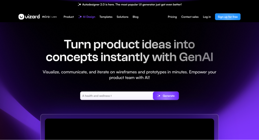
Uizard
Uizard is a UI/UX design tool that uses AI to generate wireframes and mockups from both text and image prompts. This includes being able to generate wireframes from screenshots of other UI, or even hand-drawn wireframe sketches. Additionally, includes traditional prototyping and collaboration features while doing away with vector-based product design and instead focusing on a drag-and-drop editing style.
It offers four different pricing plans depending on project needs:
- Free Plan
- For students and hobbyists
- 3 AI generations per month
- 2 projects
- 10 free templates
- Pro Plan – $19/user/month
- For startups and organizations
- 500 AI generations per month
- More sophisticated AI engine
- Developer React CSS handoff
- Business Plan – $39/user/month (billed annually)
- For large organizations
- Includes everything in Pro
- 5000 AI generations per month
- Custom brand kit
- Unlimited projects
- Enterprise Plan
- Custom solution tailored to specific organizational needs
My experience with Uizard
Layout and features
The platform has a pretty familiar UI, looking like many of the web-based design tools you’ve probably encountered, and reminded me a bit of Canva.
On the left-hand side:
- Core functions include an Add Screens button to create blank, prompt-generated, or AI-created screens using wireframe and screenshot scanning features
- Import screens from Figma, Sketch, and Adobe XD for flexible workflows
- Templates, text, shapes, icons, and image buttons that are familiar from other design tools
- Magic button containing all AI-generation features with explanations for the user
In the center and bottom:
- Canvas in the center, where wireframes appear after a prompt is created
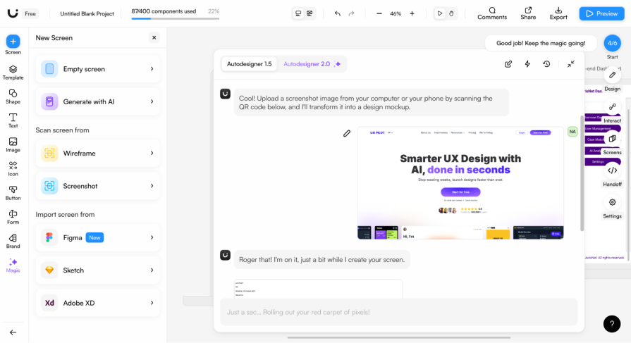
- Prompt input bar at the bottom that works like a conversational chat interface. The AI asks questions, provides choices, and responds interactively. This back-and-forth style feels immersive, designed like a texting interface, so it feels like talking to a design colleague rather than just instructing AI
On the right-hand panel:
- Manual design tools, including layout, style, color, grouping, interaction, and screen overview controls
- Developer handoff button to export designs as React and CSS code
- High and low fidelity toggle buttons in the top menu bar, allowing users to instantly switch between views. This is useful for working on visual hierarchy and comparing how designs look in high and low-fidelity wireframes
Generative AI
Although Uizard’s AI outputs (at least with Autodesigner 1.5) were less sophisticated than those from UX Pilot or even Visily, that doesn’t hold it back too much. Its manual design tools are stronger than the other two, allowing you to refine the outputs with greater precision. The only issue would be how well you refine the AI output, which depends on the user’s design skills, which, as a non-designer, aren’t very high.
The highlight of this platform, though, is AI tools like the screenshot and wireframe to design tools, which impressed me when I used them. I tested them by first uploading a low-fidelity wireframe sketch, which the AI then turned into a high-fidelity mockup. It wasn’t perfect, but it would be more than enough to suit my needs and quicken my design process. I also uploaded the UX Pilot landing page to see how it would reproduce it, and it was nearly perfect, which is great for users trying to base their designs on other platforms they’ve seen.
Then there’s the AI design review tool, which has two main features:
- The AI-driven design feedback, which I found to be generic at least from the standpoint of a seasoned designer, but would be quite useful for non-designers
- The focused predictor feature, which provided AI-generated heatmaps, which was also nice to have as a tool to provide behavioral insights
Overall, Uizard strikes a decent balance between design flexibility and AI-aided design, but many of its more powerful AI tools, like Autodesigner 2.0, sit behind a pay wall, which would require significant investment for design teams. With stronger AI outputs, Uizard could become better for non-designer use, but as of now, its robust manual design capabilities make it a good all-purpose AI-based UI/UX design tool.
Pros:
- Very familiar and intuitive interface (similar to Canva/Figma)
- Strong manual design tools compared to other AI wireframe generators
- Conversational prompting makes AI generation feel interactive and guided
- Excellent AI utilities like Screenshot-to-Design and Wireframe Scanner
- High-fidelity/wireframe toggle is great for analyzing layouts
- Good prototyping support (interactions, simple animations)
- Easy import from Figma, Sketch, and Adobe XD
- Developer handoff available (React + CSS export)
Cons:
- AI-generated outputs (Autodesigner 1.5) are less sophisticated than UX Pilot or Visily
- Some AI feedback tools produce generic or obvious insights
- Manual design capabilities, while solid, still don’t match Figma’s depth
- Strongest features locked behind the newer Autodesigner 2.0 engine (which you have to pay for)
- Beginners could have to manually refine AI outputs more than expected
Mokkup AI
Mokkup AI is a business intelligence (BI) dashboard wireframe generator. The platform focuses on a very specific but very important area of product design: BI dashboard wireframing. These dashboards are essential across all applications and platforms, as they use charts, graphs, and maps to display key performance indicators (KPIs). These KPIs drive business decisions and help them grow, so how they are displayed and how easy they are to understand are super important.
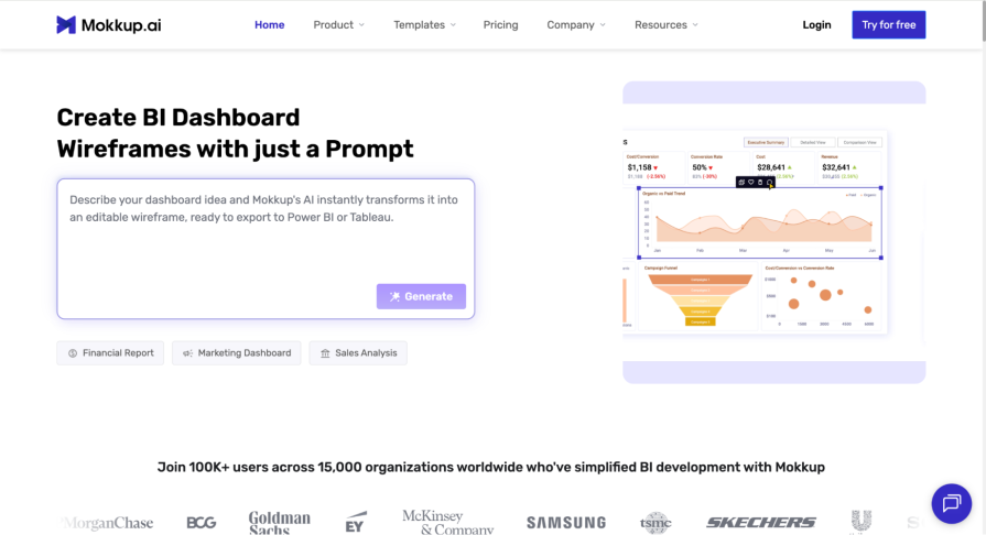
Mokkup uses AI to generate financial reports, marketing dashboards, sales analysis metrics, and other BI dashboards from natural language prompts. These wireframes can then be exported to BI data visualization tools, such as Power BI and Tableau. The platform offers 500+ templates across 9 categories, such as marketing, sales, finance, and more.
It offers three different pricing plans depending on project needs:
- Free Plan
- For personal use by individuals starting out with Mokkup
- 3 projects, screens, and pre-built themes
- Pro Plan – $8/month (billed annually)
- For freelancers and individual creators (personal and commercial use)
- Unlimited projects and screens
- 5 exports to BI
- Custom theme creation
- Teams Plan – $12/user/month (billed annually)
- For collaborating teams and businesses
- Includes everything in the Pro plan
- Live collaboration and editing
- License management
My experience with Mokkup
Layout and features
Mokkup AI is designed to help users create a usable dashboard quickly and efficiently. Its interface reflects this focus, with a simple left-hand menu for all major functions and a large canvas that takes up the rest of the screen. The platform is straightforward to pick up, with minimal learning curve, making it easy for beginners and experienced users alike to start building dashboards:
Left-hand menu:
- Three main tabs: elements, screens, and designs
- Elements tab lets users drag and drop dashboard components such as charts, graphs, menus, buttons, and other basic elements
- Generate with AI button opens a text box for AI prompts, producing complete dashboards that can be iterated on with some understanding of KPIs and business metrics
- Templates available for beginners, though many sit behind a paywall
Center canvas:
- Takes up the rest of the screen for building and editing dashboards
Screens tab:
- Customize screen layouts with multiple frame options, including desktop, MacBook, and iPad
Design tab:
- Basic customization features for design color palette, corner radius, shadows, strokes, and backgrounds
The interface is simple and easy to use, providing a fast way to build dashboards despite some limitations in advanced functionality.
Generative AI
The AI outputs themselves were very clean and usable, but not particularly modern or innovative, focusing more on functionality and sticking to traditional BI dashboard design conventions. This isn’t necessarily an issue, though, since for many businesses, dashboards don’t need to look amazing as long as they’re clear, well-structured, and readable, and Mokkup does a great job of that.
For designers who want more modern outputs or creative freedom, however, this tool would be limiting, as it has only a limited number of manual design features. The platform makes up for it with its standout feature: the ability to export wireframes as fully functional files for BI tools such as Power BI and Tableau. This makes it very easy to go from idea to a working dashboard, which then greatly speeds up development. Designers who want to modernize the outputs do lose this advantage, though, as they would have to export this design to other design tools like Figma to make the changes they want.
Overall, Mokkup AI is a powerful tool within its specific niche, and with more modern layout options and design features, it could dominate the market.
Pros:
- Extremely focused on BI dashboard wireframing
- Intuitive and easy to learn UI
- Clean, structured outputs that follow BI dashboard conventions
- Wireframes can be exported as functional BI tool files
- Offers templates to guide beginners (though many are paid)
Cons:
- AI outputs are not very modern or visually innovative
- Manual design customization options are basic and limited
- Templates and advanced features are locked behind a paywall
- Less suitable for designers wanting very creative or modern dashboard layouts
Figma (Figma AI/Figma Make)
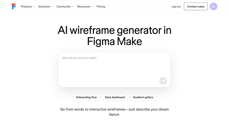
Figma needs no introduction, but what many people might not know is that the platform has its own AI wireframe generation tool called Figma Make. The platform makes it possible to create an interactive prototype using either a pre-existing design or from scratch with a simple natural language prompt. It offers a point-and-prompt feature that lets you select an item and directly prompt the changes you want. Additionally, you can upload image and design files to work from to create fully functional prototypes.
Figma Make is offered at all paid plan levels, with differences only in the number of AI credits provided per plan:
- Professional Plan
- 3,000 AI credits/month (≈50–70 prompts)
- Organizational Plan
- 3,500 AI credits/month (≈60–80 prompts)
- Enterprise Plan
- 4,250 AI credits/month (≈80–100 prompts)
My experience with Figma Make
Layout and features
Figma Make has impressed me as an avid Figma user, especially with what it has achieved using AI. The platform keeps a simple, familiar layout while integrating AI tools that enhance the design workflow.
Left-hand panel:
- AI prompting box with two main features: an add button to include files and images, and a point-and-prompt to click on specific elements and make changes
Center canvas:
- Main workspace for designing and editing
Header:
- Built-in design-to-code feature accessible via the code button
The interface is straightforward and intuitive, combining the familiar Figma layout with powerful AI features that make design faster and more interactive.
Generative AI
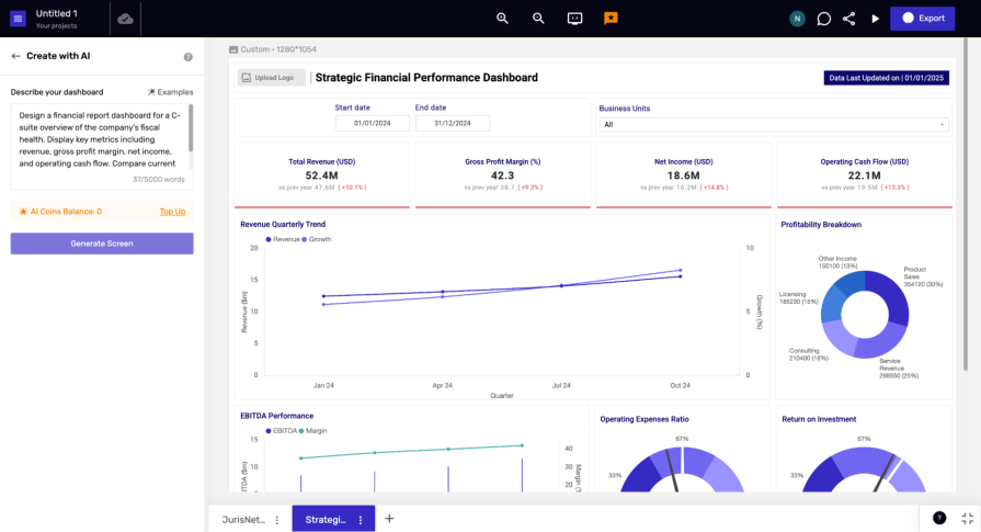
To really put the platform to the test, I uploaded the BI wireframe created in Mokkup and asked it to modernize it and switch to a purple color scheme. This was done almost instantly, incorporating all the KPIs and data visualizations from the original design while modernizing it. It was even added in interactive animations, which I didn’t ask for.
The AI outputs were on par with those of UX Pilot, and it can be argued that they went a step further by creating an interactive prototype rather than just a static wireframe. Additionally, the design-to-code feature makes developer hand-off really smooth and clearly shows why Figma is the industry leader it is.
Overall, Figma Make is a great tool, as one of many in the Figma tool belt. It’s a well-thought-out, intuitive product that integrates the powerful Claude 3.7 Sonnet AI model to generate a great prototype and code. However, if you’re just a casual user looking to create some basic wireframes to visualize your ideas, then investing in the platform wouldn’t really be necessary, and you would instead be better served using some of the other tools on this list.
On the other hand, if you’re a user who can accommodate Figma’s pricing ecosystem or a multi-functional design team, then this would be the tool for you. Ultimately, Figma Make would be a great tool for senior designers working on big projects or non-designers willing to put in the money, time, and effort to use it as effectively as possible.
Pros:
- AI wireframe outputs are high-quality and comparable to UX Pilot
- Design-to-code feature developer handoff is seamless
- Ideal for teams, senior designers, and cross-functional workflows
- AI integrates smoothly into an already mature design platform
Cons:
- Cost can be significant for solo users or beginners who only need simple wireframe generation
- Many advanced features sit behind paid plans
- Overkill for those who don’t need full-scale design/prototyping capabilities
- AI outputs, while good, still require design knowledge to refine properly
Visily vs. others
| Visily | Brainstorming templates (journey maps, SWOT, etc.) Drag & drop wireframing Generate wireframes from prompts/screenshots Team collaboration & developer handoff | Starter: Free Pro: $14/month Business: $29/month Enterprise: Custom | Best for individuals or junior designers who want an easy entry into wireframing without needing advanced design skills |
|---|---|---|---|
| UX Pilot | Prompt-first AI workspace Generates low/high fidelity wireframes Mobile & desktop layouts Import custom themes (JSON) Export to Figma/code Multiple variations per prompt | Free: 45 credits Standard: €19/month Pro: €29/month Teams: €39/user/month | Best for founders, product teams, or beginners who want to quickly test multiple ideas without needing design skills |
| Uizard | Generate wireframes from text, screenshots, sketches Drag & drop editing Conversational prompting interface Screenshot-to-Design & Wireframe Scanner High/low fidelity toggle Developer handoff (React + CSS) | Free: 3 AI generations/month Pro: $19/user/month Business: $39/user/month Enterprise: Custom | Best for startups or teams that want a balance of AI generation and design tools, with strong collaboration features |
| Mokkup AI | Specialized BI dashboard generator Drag & drop charts, graphs, KPIs AI prompt-based dashboard creation 500+ templates across 9 categories Export to BI tools (Power BI, Tableau) Basic customization (colors, shadows, etc.) | Free: 3 projects Pro: $8/month (annual billing) Teams: $12/user/month (annual billing) | Best for business analysts and teams who need quick, functional BI dashboards that can be exported directly into tools like Power BI or Tableau |
Conclusion
AI wireframe generators have already started changing the way designers and product teams approach the early stages of the design process. From brainstorming to iteration, these AI tools make it possible to instantly create layouts, dashboards, and even prototypes by using a simple natural language prompt. They also make it easier for non-designers to take part in the design process, which used to require a specialized skill set. These changes are important because while these tools won’t replace human creativity and the experience of seasoned UXers, they will speed up the time it takes to go from concept to finished product.
Visily and the other tools on this list are prime examples of that. While they vary in AI sophistication and design feature integration, all of these tools share one thing in common. They use AI to speed up repetitive tasks, generate multiple versions, and provide a good basis from which a seasoned designer or casual user can start.
Ultimately, AI tools can have varying results and different targets. Tools like UX Pilot and Figma Make stood out for their amazing AI outputs, while other tools like Visily and Uizard stood out for their AI-aided design elements useful for non-designers. Regardless of their type, AI tools should ultimately be used as design partners rather than design solutions.
Incorporating them into your workflow as a tool for ideation, visualization, and prototyping, rather than using them to replace the design process in its entirety, will help design teams strike a balance between speed and quality. Thereby making sure that the final product still reflects human creativity and innovation.
The post AI wireframe generators compared: Visily, UX Pilot, Uizard, and Figma Make appeared first on LogRocket Blog.
This post first appeared on Read More