Hi, my name is Oleksandr, I’m a Senior UX/UI Designer at Ubisoft, in my previous article, I talked about why every person on a team has an impact on UX. In this one, I want to dive deeper into usability and heuristics.
Usability
According to the Nielsen Norman Group, usability is about how easily and pleasantly users can achieve their goals when interacting with a product.
It is an important factor for a product’s success and popularity. In some cases, usability can be one of the key or a unique selling point: Apple’s “It just works”.
I’ve never seen a game that people play just because it has a pleasant UI. However, audiences get used to a certain level of interaction quality from other domains: mobile apps, web products, automotive infotainment systems.
When a game’s UI does not meet these expectations, it negatively affects usability and, as a result, the overall game experience. Сompetition drives progress (or burnout).

Competition
Today, there is intense competition for people’s time and attention. The number of platforms and content options has multiplied. One moment players are fighting a boss in a game, and the next moment they have already spent four hours watching AI-generated cats cheating with panthers.
We can divide competitors into three categories. For example, I am thinking about playing S.T.A.L.K.E.R. 2: Heart of Chornobyl on PS5.
Direct competitors
Games from a similar AAA subset within the same genre: open-world, survival horror, post-apocalyptic shooters, …
Indirect competitors
Other games that provide a similar emotion, feeling — competitors for experience rather than genre: Ori, Cuphead, Cocoon, Alan Wake 2, The Last of Us, God of War, Red Dead Redemption 2.
Replacement/substitute competitors
In this case, competitors for time and attention. Some examples:
- Media and streaming (Netflix, Prime, Apple TV, Disney+, HBO Max, YouTube, Twitch)
- Mobile applications (e-commerce, dating)
- Social media (TikTok, Instagram)
- Offline activities (sports, board games, travelling)
A large number of options can trigger choice paralysis or lead people to choose the simplest one — scrolling through a social media feed. Many of these replacement competitors didn’t exist in the 2000s, so my choice as a child was simpler: play Crash Bandicoot and watch Nickelodeon cartoons.
Today, the market offers hybrid solutions. For example, Netflix has been adding games to its library for several years, aiming to capture even more of users’ time and attention.
Heuristics
Let’s return to usability and heuristics. Of course, this alone will not win a game the Game of the Year award at The Game Awards — perhaps, a chance to compete in the Innovation in Accessibility category. However, a well-developed usability layer can reduce the risk of users leaving for competitors, and as we can see, there are plenty of them today.
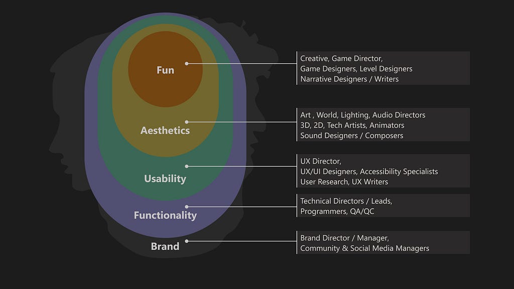
Usability heuristics are general principles that help evaluate and improve the ease of use of a system. They are not limited to digital interfaces and are effective across many domains and products. These heuristics are often based on observation and practical experience rather than mathematical formulas or psychological terminology. The most well-known set is Jakob Nielsen’s 10 heuristics.
I used these 10 as a foundation, along with the work of Celia Hodent (Developing UX Practices at Epic Games), and consolidated them into an updated set of eight.
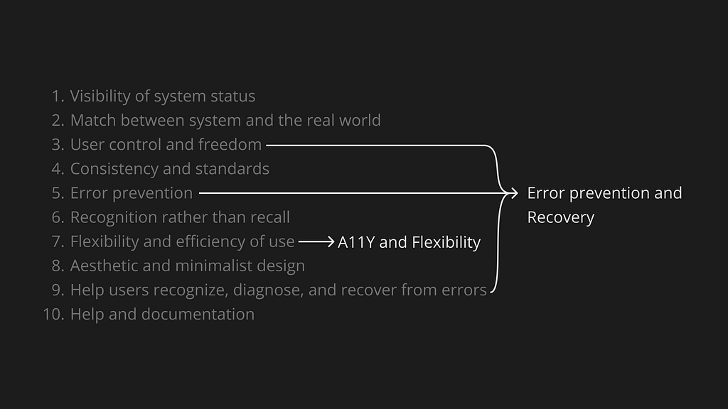
- Visibility of system status
- Match between the system and the real world
- Consistency and standards
- Error prevention and recovery
- Recognition rather than recall
- Accessibility (A11Y) and flexibility
- Aesthetic and minimalist design
- Help and documentation
Next, I will take a closer look at each heuristic and share a few examples that came to mind. There are countless examples and solutions around us, developing this awareness is extremely valuable for designers.
1. Visibility of System Status
Design should always communicate what is happening in a clear and timely manner for the user. Use visual, auditory, and tactile channels to inform players about game events (informative signs), encourage them to perform certain actions (inviting signs), and provide clear feedback on their interactions (feedback). All game features and possible interactions should have clear signs and appropriate feedback.
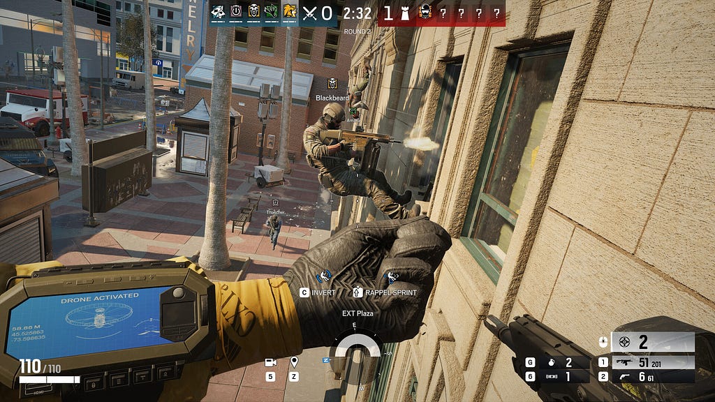
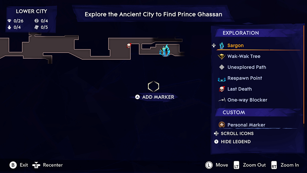
The main role of the HUD interface is to inform the player about game states and events — for example, health, available character actions, position on the map. Which information should be shown or hidden depends on the game and its context.
In game menus, this may include stats, character balance, available actions, or messages explaining why certain options are unavailable.
An example from industrial design that comes to mind is an elevator: when we approach, we can see the system status — which floors the elevators are on, whether they are moving, and if they are operational. Based on this information, we decide which elevator to call. We press a button and receive feedback — the button lights up until the elevator arrives, and the floor number changes.
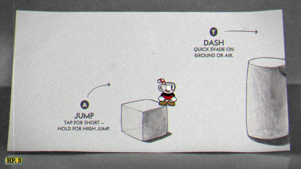
2. Match Between the System and the Real World
Design should communicate in the users’ language: words, phrases, models, and concepts. Follow real-world conventions so that information is presented in a natural and logical order.
This is especially important for UI text, often called UX copy. It makes up a significant part of the interface and can make the user experience delightful — or, conversely, frustrating.
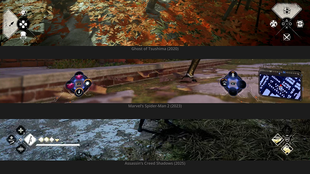
The screenshots below show examples of HUD widgets: they mirror the layout of buttons on the input device (gamepad, keyboard, Nintendo Switch, etc.). This helps players quickly understand what to do and which button(s) to press.

This approach makes interactions feel more natural, as it aligns with our mental and physical models. A consistent pattern or standard can be seen across the three game examples.
3. Consistency and Standards
Interface elements should be consistent and adhere to accepted standards.
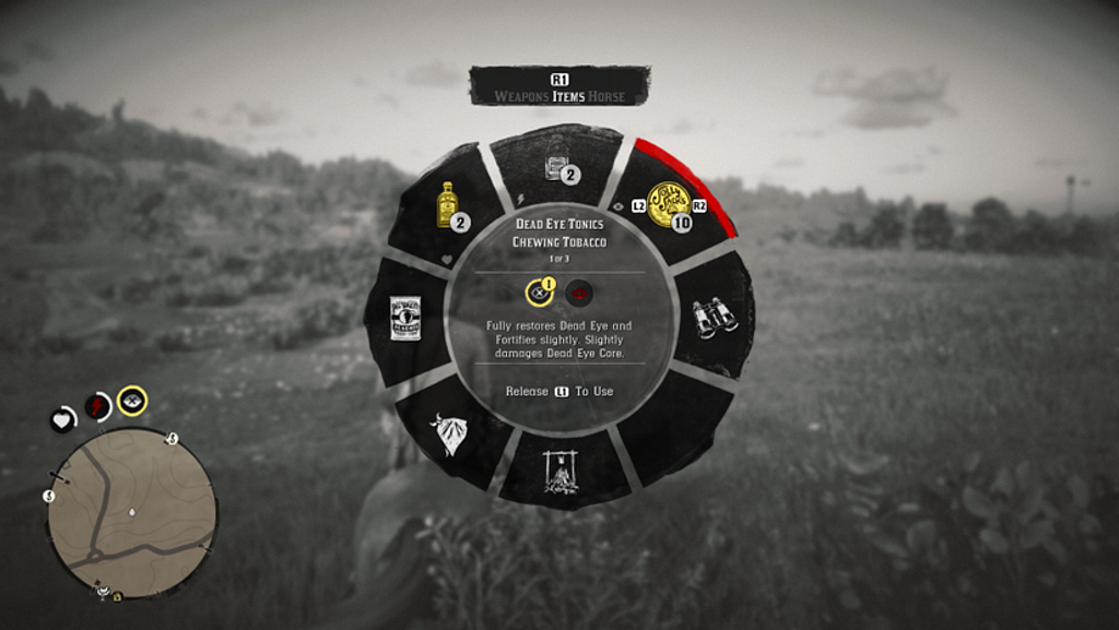
Why reinvent the wheel when you can steal like an artist? The radial weapon selection menu (Weapon Wheel) is used in games to provide quick access to weapons or items.

Navigation in Horizon Forbidden West (2022) is similar to YouTube or other TV apps. Overall, it’s a common practice to borrow and get inspired by solutions from other domains: familiar standards, structures, and patterns.

Level design follows the same rules: climbable ledges look similar across games; red barrels are likely to explode when shot; yellow elements draw attention to important objects, just as in urban design.

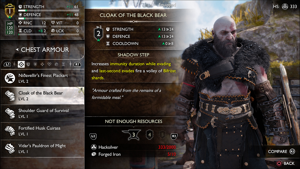
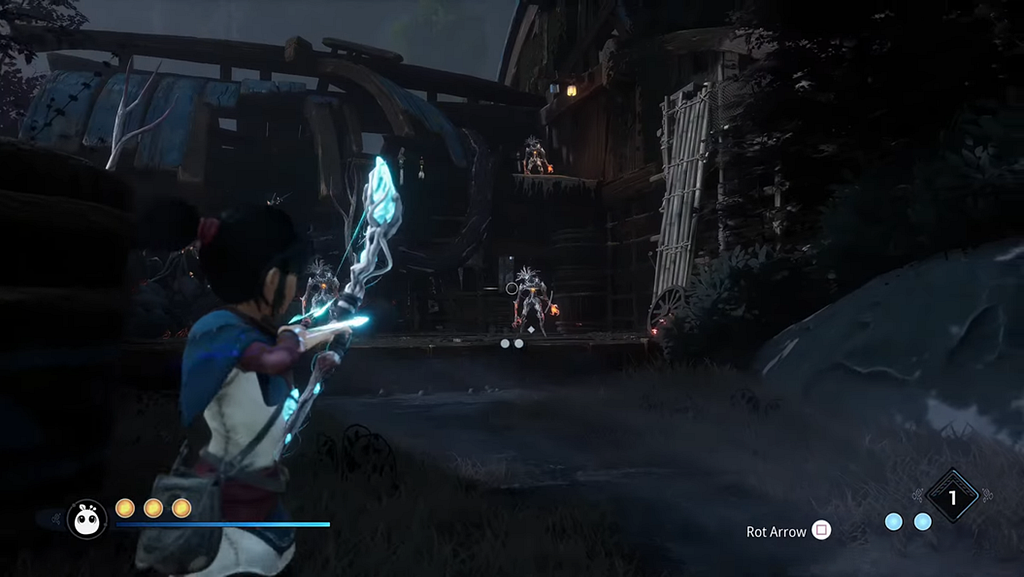
4. Recognition Rather Than Recall
Information needed for interaction should be visible or easily accessible when required. This reduces memory load by keeping objects, actions, and parameters clearly visible.
For example, a list of available actions or controls in a specific game context:


The option to open a map legend and recall the meaning of icons is another example:
Another cool implementation can be seen in God of War: Ragnarök. On the left is diegetic UI — the character points to world tiles on the doors — while on the right, a non-diegetic panel provides the player with information about this location, quests, and collectibles. This reduces the amount of information the player needs to remember or search for.

In many applications, a Recent Files function serves the same purpose: it shows the last opened documents or projects. Users don’t need to recall the exact file path or name — they simply recognize and select the item they need.
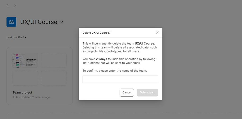
5. Error Prevention and Recovery
Try to prevent errors that are not part of the core experience, where challenges and obstacles are intentionally designed. If an error does occur, help players recover quickly and understand its cause.
The first examples that come to mind are confirmation pop-ups — an extra step in interaction, but designed to prevent mistakes.
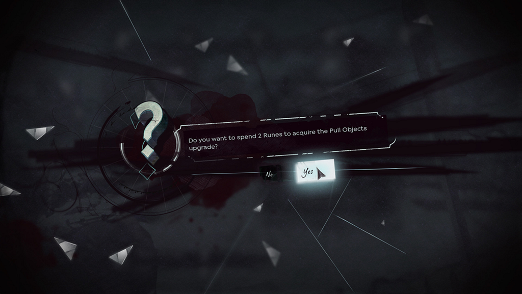
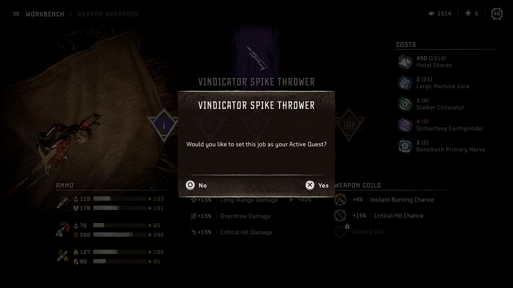
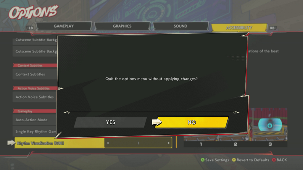

Notice the button order in the pop-ups: in the first case, No–Yes; in the second, Yes–No. It seems the world has not yet standardized it. Currently, I lean toward clearly labeling actions. Instead of generic Yes/No, use explicit labels like Exit, Delete, Buy, and Back, Cancel, etc. This way, users can understand and anticipate the outcome of their actions just by reading the buttons. I’ve seen this approach across platforms such as TV, iOS, and PlayStation.
Interestingly, for confirming critical actions, World of Warcraft and Figma use similar design solutions. In WoW, deleting a character requires typing the word “DELETE”, and in Figma, deleting a team requires typing the team’s name to confirm the action.

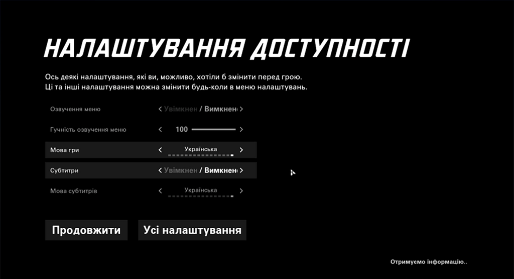
6. Accessibility and Flexibility
Accessibility refers to the qualities that make an experience open to all, according to the Inclusive 101 Guidebook, Microsoft Inclusive Design.
The more customization options a game provides, the more accessible it can be for players. However, it’s not necessary to anchor on creating hundreds of options and categories. It’s better to explore new, more refined UI solutions — perhaps some automatic synchronization of game and platform settings or even AI: intent-based UI paradigm. Still, if there are many settings, a search function in the game can be helpful, similar to those in iOS, Android, Windows, or Call of Duty.
Flexibility ensures effective interaction for both new and experienced users. For example, hotkeys, shortcuts, macros, and personalized settings. In Resident Evil 4, players can switch weapons either through the overlay menu or using shortcuts. The menu shows the assigned keyboard keys (1, 2, 3…) as a reminder of this interaction method.

It is also important to consider “Accessibility by Design” — an approach where accessibility is incorporated from the start, rather than added later as an option. By tackling root causes instead of consequences, this saves dev time and resources. Standards and guidelines like the Web Content Accessibility Guidelines and Xbox Accessibility Guidelines are helpful references.
7. Aesthetic and Minimalist Design
Design should not include information that is irrelevant or rarely used. The system should have a simple, uncluttered design that focuses on the core elements of interaction.
This is especially important when designing HUD elements due to limited screen space and the player’s attention resources. The team must define priorities and the display order of HUD widgets. The HUD is often the most critical part of a game’s UI, as players interact with it directly during gameplay, strongly influencing the overall game experience.
If an element can be hidden, this should be considered. In Kena: Bridge of Spirits, the HUD is absent: widgets only appear in context, for example during combat. This helps preserve player attention and enhances immersion in the game world.
It’s worth mentioning diegetic UI — interfaces that exist directly in the game world and have a logical explanation within the lore.
In Dead Space, the health level is shown on the character’s suit spine, and ammo count is directly on the weapon. In Far Cry 2, the map and GPS device serve as the interface, in Firewatch — the map and compass.
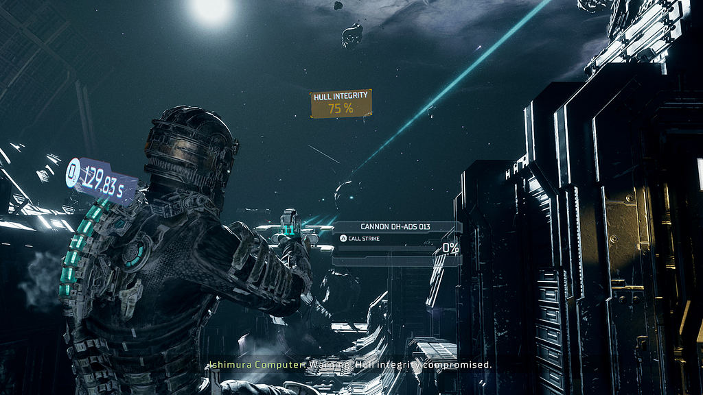

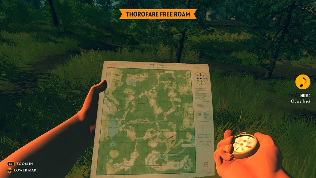
Such interfaces enhance immersion, help convey creative direction, and can become part of a brand-marketing strategy. However, they are more expensive to develop, harder to iterate on, and have limitations in presenting information.
8. Help and Documentation
Design should provide contextual information and documentation to help users in learning and using the system. Even if the system can be used without documentation, it may be necessary to provide it to help users understand how to complete their tasks.
Depending on the game, this can be implemented through gradual, step-by-step in-game tutorials, where context (learning by doing) and meaning (relevant to life, mission, or character goals) are provided.
The tutorial level in Cuphead is a good aesthetic solution, and it remains accessible throughout the entire game.
Many games include a dedicated page with information about the world, rules, and other elements. This has become something of a standard, often called Codex, Database, or Tutorials. They allow players to recall important information, especially after a long break between play sessions.

An interesting solution in Hi-Fi Rush allows players to practice available combos in a safe environment without risk.

Summary
Heuristics provide a foundation, a mindset that allows to evaluate and improve usability during development and in finished products. They can be used to assess engine tools, company services, identify areas and ideas for improvement, and significantly increase team efficiency.
Across different products and domains, I see a balance between practicality, utility and aesthetics, hedonism.
Practicality reminds me of the phrase and the book by Golden Krishna: “The Best Interface is No Interface”. Take the automotive industry as an example:
- Don’t want to manually switch headlights or wipers? Automatic lights and rain sensors handle it.
- Tired of pressing a button on your key fob to unlock the car? Keyless entry is the solution.
- Fatigued from holding the gas pedal? Use cruise control.
- Attractive options? Then take your money, and we’ll add them.
Minimal interactions, minimal UI —so nothing distracts from the core experience — driving. And if even that isn’t enough — there’s autopilot.
When interactions cannot be avoided, the focus shifts to aesthetics: doors, handles, switches, buttons, knobs… All designed to feel pleasant to the touch, visually, and audibly. Similarly, in game UI, art, motion, and sound design enhance the interaction experience, using the aesthetic-usability effect (Nielsen Norman Group).
Thank you!
Usability heuristics and competition in games was originally published in UX Collective on Medium, where people are continuing the conversation by highlighting and responding to this story.
This post first appeared on Read More