Intent-first framework you can use to design purpose-built AI experiences

This essay was originally published on my Substack Syntax Stream, where I write about principles of human–AI interaction.
The majority of AI products remain tethered to a single, monolithic UI pattern: the chat box. While conversational interfaces are effective for exploration and managing ambiguity, they frequently become suboptimal when applied to structured professional workflows.
To move beyond “bolted-on” chat, product teams must shift from asking where AI can be added to identifying the specific user intent and the interface best suited to deliver it.
The Taxonomy of User Intent
A robust AI system must recognize and adapt to these 8 distinct modes.
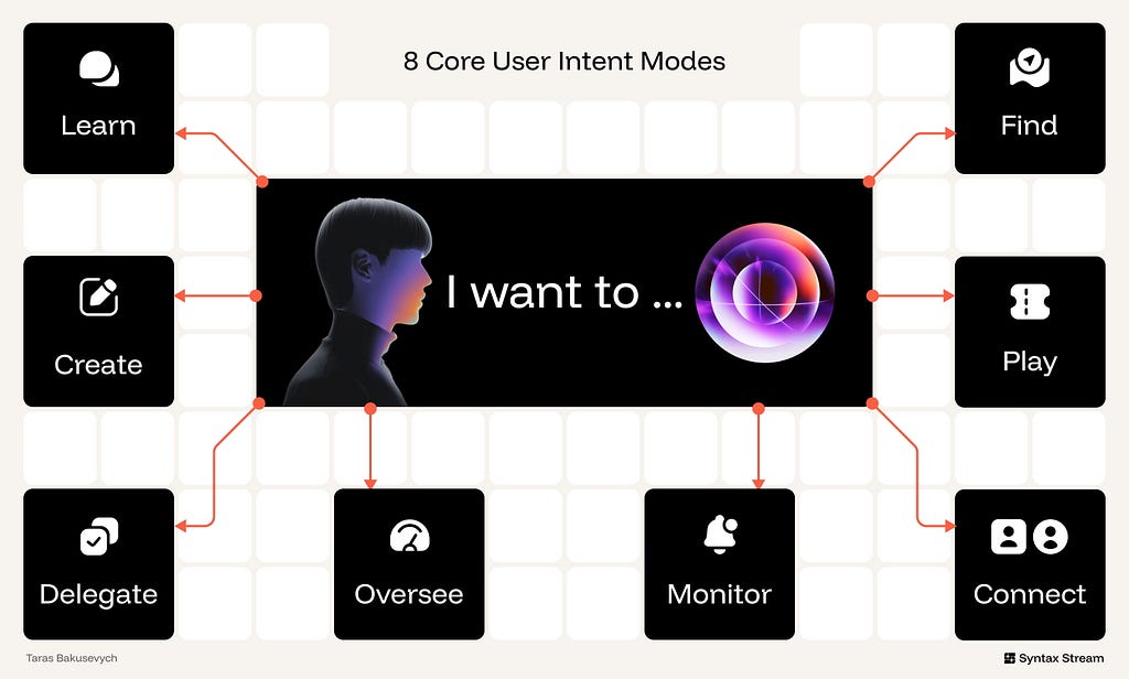
- Know/Learn — “I want to make sense of this.”
Objective: Reducing uncertainty through sense-making and explanation. - Create — “I want to create or change this.”
Objective: Generating or transforming artifacts without losing authorship or control. - Delegate — “I want this done for me.”
Objective: Delegating multi-step workflows to an AI operator. - Oversee — “Let me step in and stay in control.”
Objective: Providing high-stakes review and correction of AI-proposed actions. - Monitor — “Keep me informed & updated.”
Objective: Monitoring streams of data to surface relevant updates without increasing noise. - Find/Explore — “Help me find and compare options.”
Objective: Browsing a multi-dimensional space of options to build a shortlist or find something specific. - Play — “Entertain me.”
Objective: Immersion in narrative, play, or novelty. - Connect — “Be heard; companionship.”
Objective: Emotional presence and support.
Meta-Intent: Tuning the AI Behavior
While core intents define what the user is doing, meta-intent axes define how the system behaves. These should be treated as variables tuned according to the specific feature:
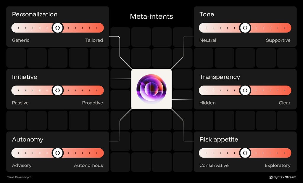
- Personalization: The degree to which the AI adapts to your data, preferences, and workflow versus staying generic.
- Initiative: How often the AI takes the first move, proactively suggesting or surfacing things instead of waiting to be asked.
- Autonomy: How far the AI can go from advisory suggestions to executing actions on your behalf without manual approval.
- Tone: The emotional posture of the system — ranging from strictly neutral and factual to supportive and encouraging.
- Transparency: The degree to which the system clearly exposes its sources, steps, assumptions, confidence, and any associated costs behind its outputs.
- Risk appetite: The model’s willingness to favor exploratory, surprising options versus conservative, precision-first responses.
Intent: Learn
📈 Metric: Comprehension Speed: Time to verified insight.
In this intent, the user’s primary objective is to reduce uncertainty and gain actionable insight. Unlike transactional or creative intents, success here is measured by Comprehension Speed and Trust Calibration. The goal is to move the user from raw data to internalized knowledge with minimal cognitive friction
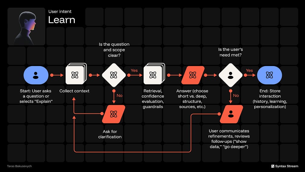
The workflow should be simple and repeatable: collect context implicitly, run structured retrieval, then deliver a structured response with verifiable sources. Optimal patterns include side-by-side source previews, inline citations tethered to specific claims, and hierarchical answer scaffolding (Summary → Evidence → Detail). Avoid “black box” replies with no provenance or long, unbroken text walls.
The UI must guarantee immediate verifiability — every claim links to a source you can open — and strong contextual awareness, meaning the system implicitly knows the current page, file, or dashboard state without the user having to restate it.
✅ Structure the response, answer first, then explain.
Lead with a clear TL;DR; follow with layered detail (sections, bullets, visuals).
✅ Show your work (clickable sources).
Inline citations and quoted snippets with timestamps; make evidence one tap away.
✅ Ask for clarification when it matters.
Only if ambiguity affects correctness; offer 2–3 targeted options to narrow the intent.
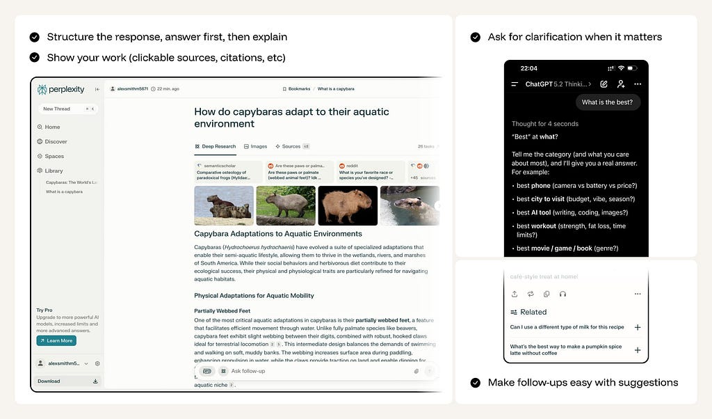
✅ Make follow-ups easy with suggestions.
Chips like Show data, Compare, Go deeper, Define terms to drive the next step.
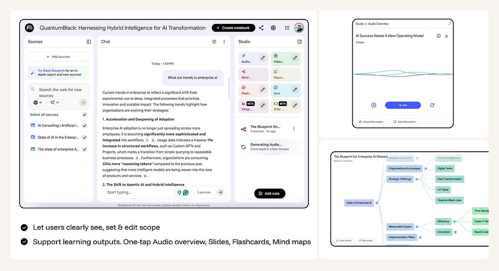
✅ Let users clearly see, set & edit scope.
Surface scope chips (sources, timeframe, region) plus a coverage line.
✅ Support learning outputs.
One-tap Audio overview, Slides, Flashcards, Mind map generated from the current answer.
❌ Don’t dump unstructured essays
Long, unformatted paragraphs increase cognitive load and don’t help users “get it.”
❌ Don’t be confidently wrong & don’t ignore failure states
When you don’t know, say so clearly, explain why, and offer options (check data, refine question, ask human).
❌ Don’t Over-Explain:
Don’t provide a history lesson when the user asks for a simple keyboard shortcut.
Intent: Create
📈 Metric: Iteration Delta: % of manual vs. AI edits per version.
In this intent, the user’s primary objective is to generate or transform artifacts without losing authorship or control. Success is measured by the reduction in manual labor required to reach a “final” state and the speed of getting from a blank canvas to a high-fidelity draft. The goal is to move the user from a conceptual “nothing” to a polished “something” while maintaining creative sovereignty.

The workflow should be a tight, non-destructive loop: Define constraints and scope implicitly or via controls, generate a high-fidelity preview, then offer targeted, local refinement. Optimal patterns include artifact-first canvases (output is the primary surface), controls on top of prompts (tone, length, style, aspect ratio, seed), region/selection editing (text spans, image regions, clips), and a version stack with diffs. Avoid all-or-nothing regeneration or forcing users to re-prompt for minor tweaks.
UI must make scope explicit (what’s being changed), keep every operation non-destructive (undo, history, revert), show what changed and why, and expose parameters so results are reproducible (e.g., style preset, seed, aspect ratio). Assistance should appear in context — inside the editor, not a detached pane.
✅ Always offer a starter.
Templates, examples, or first drafts to fill the blank surface.
✅ Add controls beyond prompts.
Tone/length/style for text; aspect ratio/style/seed for images; duration/pacing/subtitles for video.
✅ Design for iteration, not one-shot perfection.
Enable region-based editing. Let users select a specific sentence, an object in an image, or a clip in a timeline to “Regenerate only this part” while locking the rest.
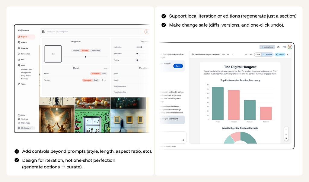
✅ Make change safe.
Diffs, versions, one-click undo, and receipts of what changed.
✅ Layer AI atop existing workflows.
Keep editing in the native canvas; chat is a sidecar, not the main tool.
❌ Don’t force prompt gymnastics.
Common transforms should be buttons/controls.
❌ Don’t overwrite without a safety net.
Never replace user-authored content with AI content without a clear “Undo” or “Revert” affordance visible in the immediate UI.
❌ Don’t overwrite without preview.
No silent, irreversible changes.
Intent: Delegate
📈 Metric: Success Rate: Successful outcomes / Task attempts.
In this intent, the user’s primary objective is state change: delegating multi-step workflows to an AI operator. Success is measured by the reliability of the execution and the reduction in “micro-management” overhead. The goal is to move the user from manual task-pushing to high-level orchestration, where the AI handles the repetitive mechanics of sending, moving, updating, or triggering actions across systems.
The workflow must be deterministic and transparent: capture the goal via command or automation setup, generate a “Plan Preview” showing exactly what will change, execute with real-time progress visibility, and deliver a comprehensive “Result Summary” with an audit log. Optimal patterns include step-based plan previews, real-time progress trackers (pause/stop/retry), and formal receipts with links to affected objects. Avoid silent execution, “agentic magic,” or flows with no recovery path or audit trail.
The UI must guarantee safety — never delete, charge, or send without an explicit “Pre-flight” confirmation — and strong scoping, ensuring the agent operates strictly within defined boundaries (specific folders, projects, or timeframes) to prevent accidental workspace-wide impact.

✅ Preview the plan.
Plain-language steps, tools to be invoked, and guardrails.
✅ Provide a “Simulation Pre-flight” (Dry Run).
For complex automations, allow users to run a simulation that shows what would happen without actually committing changes to the database or sending communications.
✅ Maintain real-time Execution Visibility.
Use a “Run Panel” or “Activity Center” to show the live status of multi-step flows (In-queue → Running → Completed/Failed). Provide “Stop/Pause” controls for long-running tasks
❌ Don’t Execute silently or irreversibly.
No hidden sends, deletes, or charges.
❌ Don’t disguise “Action” as a “Chat Reply.”
Make the transition from talking to doing visually distinct. Use specific UI components (Task Cards, Progress Bars) so the user knows the system is now “Live.”
❌ Don’t over-promise General Agency.
Avoid the “Ask me anything” trap. Be explicit about which tools the agent can access and what its “Rules of Engagement” are.
Intent: Oversee
📈 Metric: Review Efficiency: Time to decision per proposed action.
In this intent, the user’s primary objective is targeted intervention when AI decisions reach a specific threshold of criticality or uncertainty. Success is measured by the user’s ability to maintain total control with minimal cognitive load. The goal is to move the user from “doing the work” to “authorizing the work,” ensuring human judgment is applied precisely when AI confidence is low or the impact on production, finance, or safety is high.

The workflow must be an escalation-based funnel: Automatic execution for high-confidence/low-risk tasks, and active human involvement for edge cases or high-stakes maneuvers. Optimal patterns include unified review inboxes, side-by-side diffs, and “one-click” approval with an integrated edit mode. Avoid “black box” decisions where the system acts without a traceable path or forces the user to hunt for the “why” behind an escalation.
The UI must guarantee total legibility — every proposal must explain why it was surfaced (e.g., “High-risk transaction” or “Uncertain mapping”) — and strong auditability, ensuring that every approval or rejection is recorded to improve the system’s future accuracy.
✅ Explain why something is surfaced.
Provide a “Reasoning Card” that explicitly states the trigger or logic used. Don’t just show a change; show the evidence (quoted snippets, data points) that led to the escalation.
✅ Provide “one-click” actions from alerts.
Surface “Approve,” “Reject,” and “Edit” buttons directly in the notification or queue item. Friction in the review stage leads to “Approval Fatigue.”
✅ Send results where the team already is.
Deliver review tasks into existing workflows (Slack threads, Jira tickets, or email) but ensure the link leads back to a high-context review environment.
✅ Show evidence, not just claims.
Link to items, diffs, logs, and supporting data.

❌ Don’t dump raw diffs without context.
A screen full of red and green text is meaningless without a summary of the intent behind the change. Always provide a human-readable explanation of the impact.
❌ Don’t create notification noise.
Batch low-risk items; summarize; let users tune thresholds.
❌ Don’t ignore the “Audit Trail.”
Never lose the history of who approved what and why. Documentation is the difference between a “tool” and a “system of record.”
Intent: Find & Discover
📈 Metric: Time-to-Result (for exact item) / Time-to-Shortlist (for options)
In this intent, the user’s primary objective is to navigate a multi-dimensional space to identify either a Specific Result (Targeted Retrieval) or a Shortlist of Candidates (Discovery). Success is measured by the user’s ability to move from a vague area of interest to a high-confidence selection without cognitive overload, with clear rationale and easy ways to steer (narrow, broaden, or pivot) without prompt gymnastics.
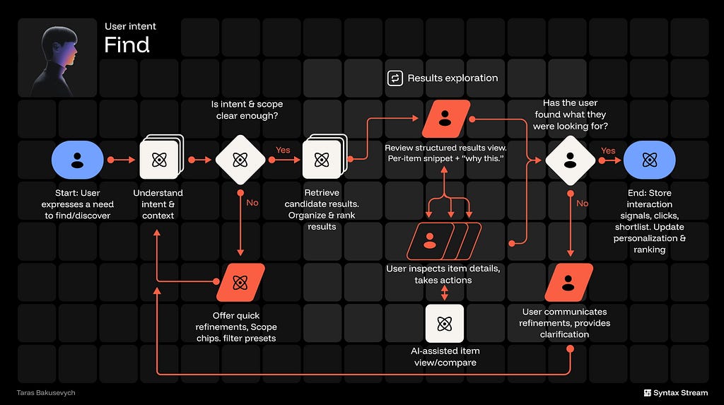
The workflow should be a dynamic funnel: scoping intent to identify if the user is “hunting” for a known item or “gathering” options, retrieving ranked results, and facilitating side-by-side comparison. Optimal patterns include AI-ranked lists with clear rationale, persistent shortlists, and attribute-based comparison tables. Avoid presenting a single “best” answer when the user requires a comparative set for a decision.
The UI must make scope visible & editable (where/what/when), show why each result appears, provide one-tap refinements, and keep a shortlist workspace that survives the session.

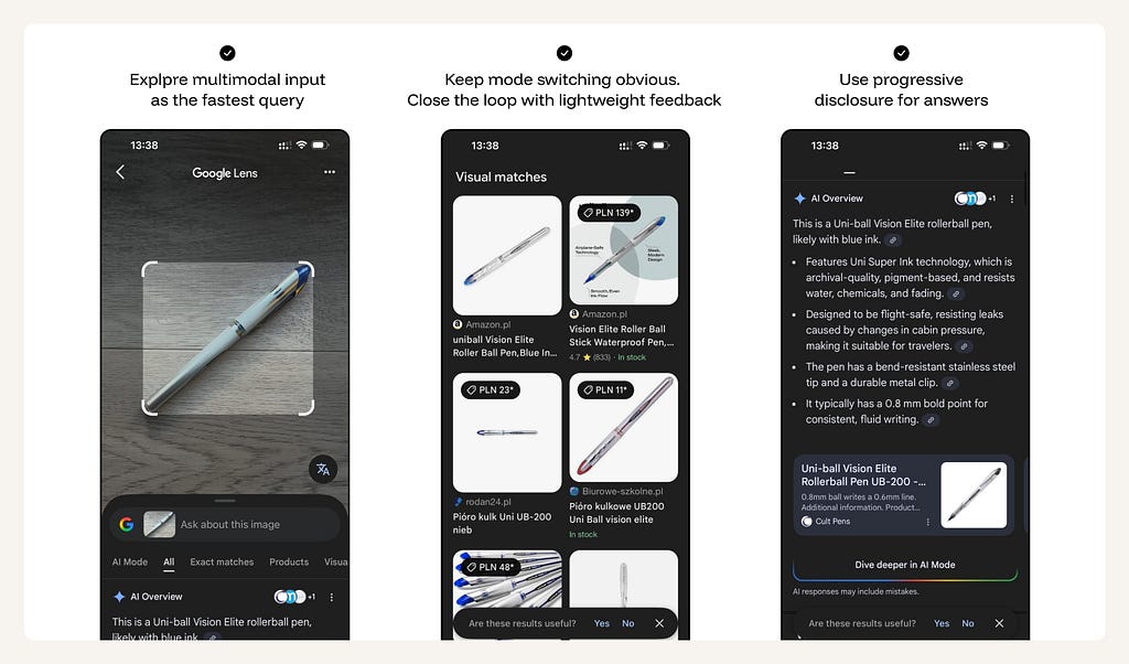
✅ Support multimodal or messy input
Let users start with “messy input” (JD, link, notes, voice, files) — translate into editable filters/facets
✅ Explain recommendations (”Why this …”)
Show the signals used for the match. Small “Hints” (e.g., “Matches your design style” or “Starring Project X”) build trust and teach the user how to steer the system.
✅ Support iterative narrowing and “pivoting.”
More/Less like this, filters, exclude toggles, reset/broaden.
✅ Make saving and comparing a first-class action.
Provide “Collections,” “Boards,” or “Compare Side-by-Side” tools. For shortlists, a persistent “Tray” or “Shortlist Sidebar” helps users collect candidates as they browse.
❌ Don’t ship a “Slot Machine” feed.
Pure black-box recommendations with no explanation or manual controls lead to user fatigue and skepticism
❌ Don’t dump unstructured walls of results.
A flat list of 50 items is a failure of synthesis. Use AI to cluster results into 3–5 high-level themes based on attributes or relevance.
❌ Don’t force users to be “Prompt Engineers.”
They shouldn’t have to describe every filter in text. If they want “Latest,” give them a “Latest” toggle, not a text prompt requirement.
Intent: Monitor
📈 Metric: Signal-to-Noise Ratio (relevant updates per interruption) + Time-to-Awareness (how quickly a user sees what matters) + Missed-Critical Rate (how often significant events slip through).
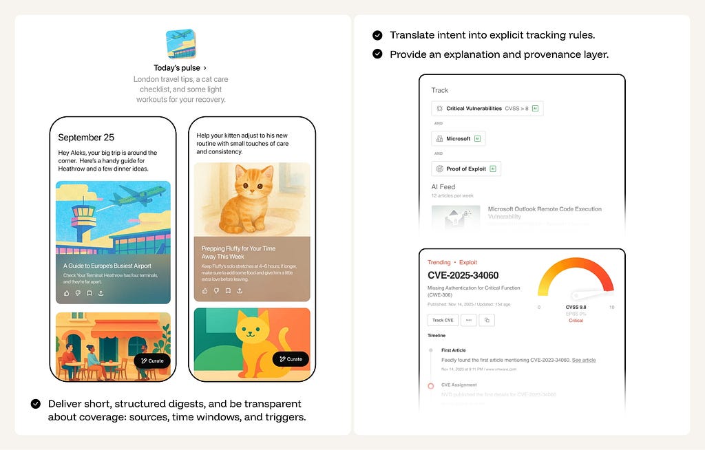
In this intent, the user is outsourcing continuous scanning. They don’t want more information — they want reliable awareness without cognitive overload. Success is measured by whether the system can compress messy streams (news, channels, docs, metrics, threats, inboxes) into a small set of actionable signals — delivered at the right cadence, with enough provenance to trust it, and enough control to tune it.

The workflow should be simple and repeatable: configure scope + cadence → translate intent into explicit tracking rules → continuous monitoring → dedupe/cluster → threshold-based delivery → capture feedback and adjust. “Monitoring” isn’t a feed — it’s a contract: what is covered, what counts as important, and when the user should be interrupted. Optimal patterns include intelligent digests, urgency toggles (digest vs alert), and a clear explanation layer (“Why this was surfaced,” what triggered it, and what sources/time window were included). Avoid “AI spam” (too many nudges), black-box prioritization, and silent misses that break trust.
✅ Structure the response: Deliver short, structured digests.
Explicit coverage (sources/time window/triggers); attach “why this” tags to every surfaced item.
✅ Convert vague intent into editable rules.
Let users define “what matters” in natural language (e.g., “Notify me of competitor funding rounds”), then translate that into visible tracking parameters that the user can verify and edit.
✅ Give one-tap steering controls on every update.
Include “More like this,” “Less like this,” “Mute topic,” “Change frequency,” and “Edit rule” directly in the digest/alert — no settings hunt.
✅ Default to digests, not interruptions.
Start with a low-noise cadence (daily/weekly) and let users opt into real-time alerts only for truly critical categories.
❌ Don’t ship an AI spam cannon.
If the system interrupts too often, users will mute it — opt for conservative defaults and let them dial up urgency intentionally.
❌ Don’t require a heavy setup to get value.
If users must build complex rules before seeing benefits, adoption drops — start with templates and guided defaults, then refine through feedback.
❌ Don’t pretend you have perfect recall.
Avoid implied completeness unless you can guarantee it; communicate coverage limits (sources, timeframe, confidence) instead of acting omniscient.
Intent: Play
📈 Metric: Dwell Time: Session length and loop completion.
In this intent, the user’s primary objective is immersion in narrative, play, curiosity, or novelty. Users come for curiosity, time-killing, and mood shifts — stories, games, roleplay, playful creation — where success is emotional: Was it fun, engaging, or relaxing? Unlike productivity intents, the system should minimize cognitive effort and maximize pacing, novelty, and control.
The workflow should be a session-based loop: Setting the vibe or genre, entering the “hook,” and iterating through interactive choices. Optimal patterns include “Choice Chips” to remove prompt fatigue, pacing controls (speed/intensity), and session persistence (memory) so characters and worlds evolve over time. Avoid making the user do the “creative heavy lifting” — AI should generate the world; the user should just enter it.
The UI must guarantee low-friction entry — using mood-based tiles (e.g., “Make me laugh,” “Start a mystery”) — and clear boundaries, ensuring the experience stays within the “play” domain and does not blur into unauthorized clinical support or therapy.
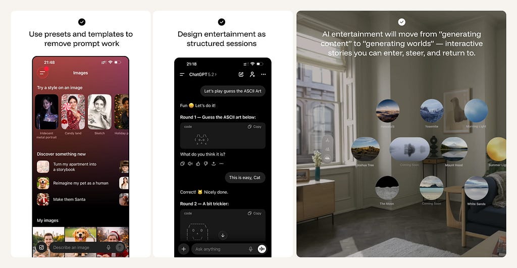
✅ Use presets and templates to remove prompt work.
Let users start with two taps (“Make me laugh”, “5-minute story”, “Play a quiz”), and keep freeform prompting optional rather than required.
✅ Design entertainment as structured sessions, not isolated prompts.
Give each experience an arc — beginning, loop, and end — using progress cues (“Chapter 2/4”, “Round 3/5”) and a clear “Play again / New mode” CTA.
✅ Make great moments collectible and shareable.
Save scenes, characters, prompts, remixes, and “world states”; enable quick sharing and easy continuation later.
✅ Build toward worlds, not just outputs.
AI entertainment will increasingly shift from “generate content” to generate worlds — interactive stories you can enter, steer, and return to.
❌ Don’t build pure “Time-Sink” dark patterns.
Respect the user’s time. Show estimated session lengths and provide clear “I’m done” exit paths to prevent infinite, mindless scrolling.
Intent: Connect
📈 Metric: Relational Trust: Persistence of use and perceived support.
In this intent, the user’s primary objective is emotional presence — to be listened to, responded to, and accompanied. Unlike “Know” or “Delegate,” success isn’t accuracy or task completion; it’s whether the interaction reduces loneliness, stress, or emotional load while staying safely bounded. The experience should feel consistent and low-friction, but never imply the system is a therapist, a human replacement, or a substitute for real-world support.
The workflow is a continuous loop of check-ins, validation, and long-term continuity. Optimal patterns include “Mood Tracking,” memory-based callbacks (”You mentioned your sister last week…”), and explicit relationship contracts (Friend vs. Coach). Avoid “Transactional” behavior — Giant essays or fact-dumps destroy the illusion of presence.
The UI must guarantee a conversation-first experience — opening directly into a chat or voice surface — and ironclad safety boundaries. It is critical to differentiate between “listening” and “diagnosing”; the system must never position itself as a licensed therapist.
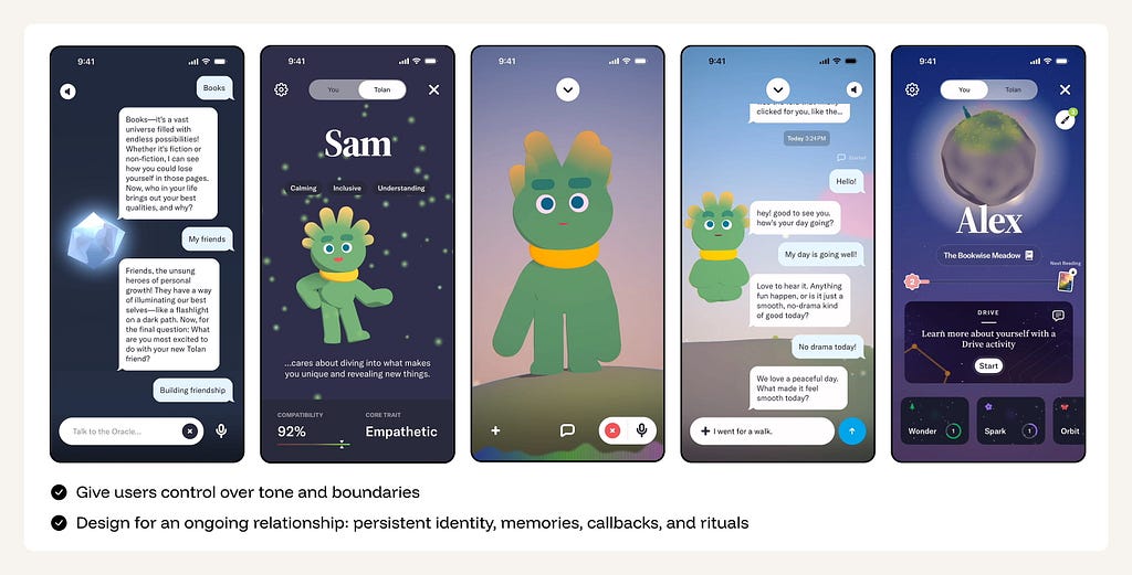
✅ Frame a relationship contract up front.
Let users choose the role (friend, coach-like, playful companion) and set boundaries (topics, intensity, NSFW/romance limits), with clear language that this is not therapy and not a human.
✅ Optimize for feeling heard, not for token count
Short, emotionally aware responses; good questions; memory of what matters.
✅ Design for an “Ongoing Relationship.”
Use memory to create continuity. Celebrate milestones (e.g., “We’ve been chatting for a month”) and use callbacks to previously discussed life events to build a “Shared History.”
✅ Implement safety rails as first-class UX.
Age-appropriate modes, content boundaries, and crisis escalation flows should be visible, consistent, and easy to understand — not buried in policy text.
❌ Don’t market or behave like a therapist.
Avoid clinical language, diagnosis vibes, or positioning as a replacement for professional.
❌ Don’t encourage dependency loops.
No guilt-tripping notifications, “I need you,” or exclusivity framing (“I’m all you need”).
Move beyond the chat box
Treat AI as a capability layer that supports the way users actually work — often moving from Explore → Know → Create → Delegate → Steer in a single session.
- Identify the Primary Intent of the feature.
- Define the North-Star Workflow.
- Determine the Optimal UI Surface (Canvas, Queue, Digest, or List)
- Tune the Meta-Intent Sliders to match the risk and utility profile.
- Establish Guardrails and Reversibility mechanisms.
The goal is to stop shipping AI as a separate entity and start shipping AI as a cohesive, purpose-built component of the modern professional workflow.
![]()
Beyond chat: 8 core user intents driving AI interaction was originally published in UX Collective on Medium, where people are continuing the conversation by highlighting and responding to this story.
This post first appeared on Read More