To retain website visitors, you have to make a great first impression. And as we know, you only get one chance to make a first impression. When it comes to websites, that one chance is your hero section. Get it wrong, and your visitors might abandon your site in less than 15 seconds.
Luckily, with the right tactics, such as a high-quality hero image, unique fonts, and a polished layout, you can create a hero section that keeps your visitors hooked.
In this post, I’ll show you how to design a hero section that makes a great first impression while expressing your product, service, or company. I’ll also be throwing in examples from websites that nailed their hero sections. But before we do all that, let’s explain what a hero section is.
Editor’s note, 11 April 2025: This article (last updated 26 December 2023) now has a companion video tutorial! Check out our tips on how to create hero section designs that actually work, with examples of good hero sections, bad hero sections, and a tutorial on how to turn a bad hero into a good one:
What is a hero section?
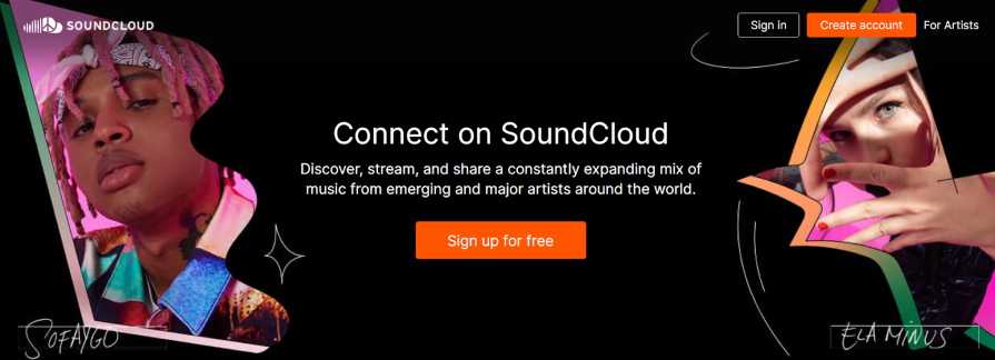
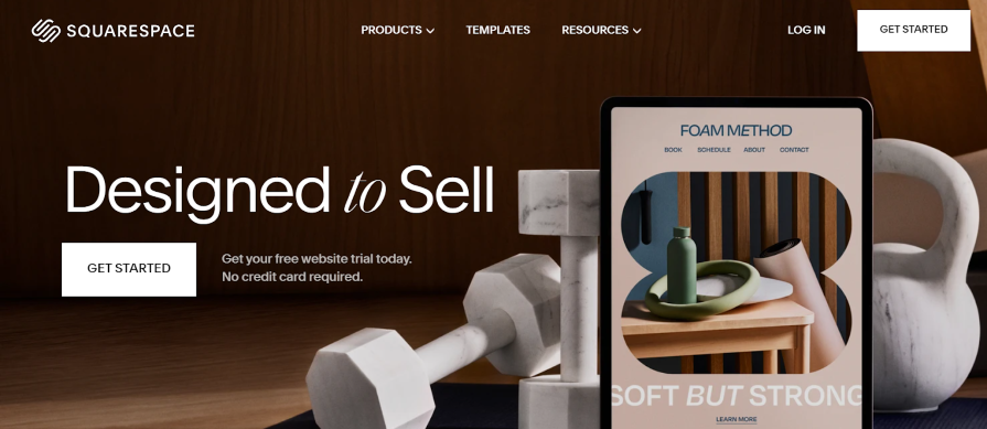
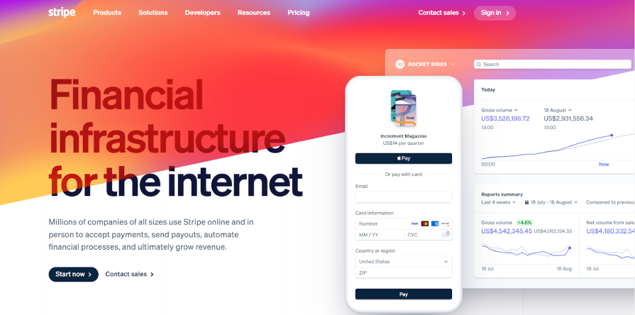
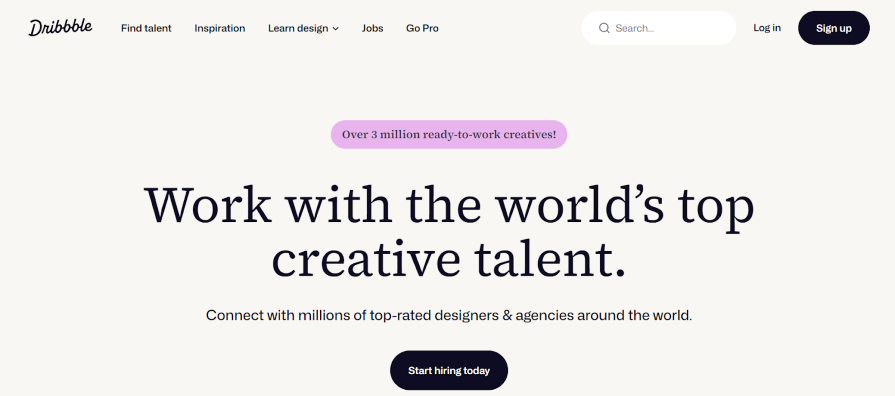
A website hero section is a large banner displayed above the fold of a website. It’s usually the first thing a visitor sees when they enter a website. Hero sections typically consist of a visually prominent image, video, or graphic, some text dedicated to grabbing the user’s attention, and a call to action.
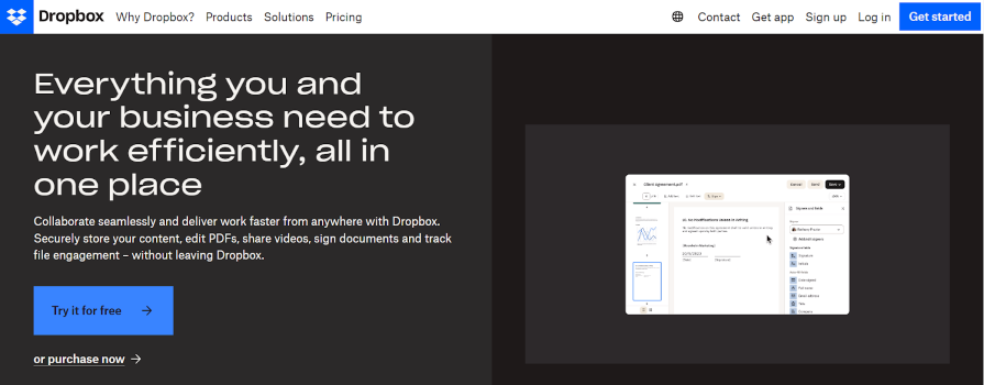
You’ve probably seen these everywhere
To better understand what a hero section is, let’s look at the anatomy of a typical website hero section.
The anatomy of a hero section
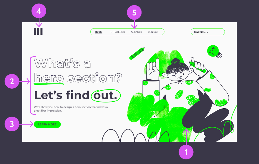
1. Hero image/graphic
The hero image is a central visual element, usually an image, illustration, graphic, or video, used to communicate the website’s key message at a glance. Ideally, the hero image should inform visitors about the website’s purpose.
2. Text block
The text block consists of two main parts: the headline and the description. The headline communicates the website’s core message or value proposition, while the description provides additional supporting text to give more context about the main message.
3. Call to action button
A button (or buttons) prompting visitors to take a specific action, such as “Sign up,” “Learn more,” or “Get started.” Depending on the website’s goal, there may be more than one CTA button.
4. Logo
This is the company or brand logo, typically placed at the top left of the page. In addition to communicating the brand, it also serves as a navigation tool, allowing users to return to the homepage from anywhere on the website.
5. Navigation menu
The navigation menu allows users to jump to other website sections from the homepage.
Having discussed what to include in a hero section, let’s explore how to incorporate these elements by discussing some best practices.
8 hero section best practices for a standout introduction
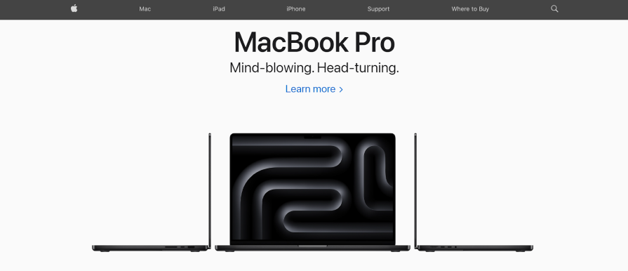
1. Use high-quality images
The hero image is usually the first thing visitors notice when they land on your page. Therefore, you need a high-quality image. Also, ensure that your hero image has an obvious meaning to your target audience instead of being abstract or purely decorative.
The ideal hero image captures the user’s attention and supports your value proposition. The most practiced designers perform exhaustive user research to understand their target audience and carefully consider how their images relate to their product or service.
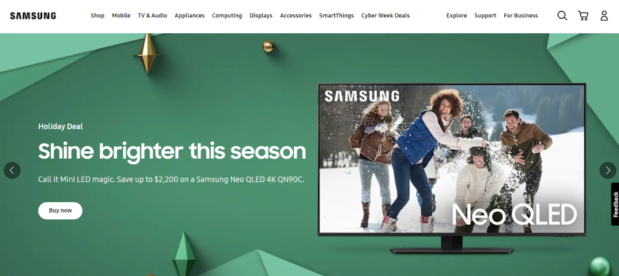
You should consider your goal for the hero image. Your goal can be to evoke an emotion, promote a product, or enhance your brand identity. Images can guide your users, too, with directional cues.
Depending on your conversion goal and budget, you can either create professional images or use stock photographs. To get free high-quality stock images, use platforms like Unsplash, Pexels, or Freepik, but only as a last resort. Users ignore some stock images, which is the opposite of what you want them to do with the most important section of your website.
2. Choose your words carefully
You don’t need to explain all your website features in your hero section. Simply highlighting what would benefit your target audience is a great way to hold your users’ attention.
Remember that prospects are coming to your website because they have a problem. By putting your value proposition front and center, you can offer them a solution to that problem in just a few words. This will keep them wanting to know more.
3. The call-to-action button should be visually prominent
The CTA button gives users a clear direction on which action to take. Therefore, it should be visually prominent and easy to locate.
Remember: because your CTA button prompts users to act, stick to clear, easily understood verbs for the labels. Verbs like “Join,” “Create,” “Sign up,” etc. are great for labels.
4. Don’t overuse call-to-action buttons
Ideally, you should have just one call to action button in the hero section, and this button should be connected to the main action you want users to take.
However, where you have two potential actions, prioritize the more important action as the primary button and designate the other as secondary. Ensure that both buttons have distinct visual weights to help users identify the key action.
5. Be mindful of space
Although hero sections should aim to grab users’ attention, they shouldn’t be a sensory overload. Therefore, be sure to maintain ample spacing between elements in your design, which we sometimes call negative space. You don’t need to fill up every space in the hero section.
Also, make sure you organize information in a way that’s approachable, logical, and easy to understand. This will reduce the cognitive load on your users.
6. Use legible fonts
You want your users to understand your message with ease. Therefore, you should use clear, legible fonts that complement your brand. Also, keep your use of font styles and weights to a minimum to avoid visual clutter.
7. Incorporate a video
Instead of an image, consider using a video in your hero section. This is a great way to capture users’ interest, given how limited people’s attention spans are. A short video demonstrating a product in action, showcasing a service, or even sharing a customer testimonial is a fun and quick way to convey information.

When incorporating videos, ensure they are high quality, relevant to your value proposition, and optimized for a great user experience.
8. Test your design decisions
And finally, don’t leave anything to chance. Testing different versions of your hero section design using A/B testing will help you determine what resonates with your audience.
This way, you can make informed decisions, refine your design, and ultimately create a hero section that captures and retains your users’ attention.
Wrapping up
A website’s hero section plays a pivotal role in making a lasting impression on visitors. Get it right and you can capture their attention within seconds. Luckily, by following some best practices like using high-quality images, keeping your text concise, and using a prominent CTA button, you can create a hero section that keeps users hooked.
Also, don’t forget to keep your design balanced and always test it with users rather than leaving things to chance. By employing these tactics, you can create a hero section that keeps your users hooked.
Header image source: IconScout
The post What is a website’s hero section? Best practices, tips, examples appeared first on LogRocket Blog.
This post first appeared on Read More