
As AI products become more advanced, the interface is no longer the main focus. Now, the real question is which screens are still needed and which can serve as fallbacks.
Designers often say that UX isn’t really about screens. It’s a line I see in portfolios, I hear in interviews; that’s the line we use to signal that we’re thinking beyond just pixels. But honestly, for most of my career, that wasn’t true. In one way or another, the job was screens: building flows in Figma, mapping out states, writing specs, worrying about happy paths and edge cases, and handling handoff. We kept saying UX isn’t about screens, even as we kept making more of them.
Well, AI is about to call the bluff.
Here’s a simple example. Let’s say you took a selfie with your friend Mark last week, and now you want to send it to him.
Open the mail app. Tap compose. Type the name. Hit Attach, and you’ve left the mail app entirely. You’re in the file/photo picker now, a separate product with its own rules. Dig around. Recents. Last week. There. Tap. Back to compose. Check the attachment. Send.
Compose, attach, browse, select, confirm, send. That’s six small steps just to move one photo, and each one was extra work around the real goal, not the goal itself.
Now, you just say or type: send Mark the photo of us at the game from last week. That’s it.
The same happened to reading design articles. You don’t need to read it all to decide whether it’s good. Paste it into Claude, ChatGPT, or whichever AI tool you use and ask whether it’s worth reading. Hopefully it will say: “Yes, this article is the best article about the impact of AI on UX.” Though I still encourage you to read it and make your own judgment.
What matters here is how the work has changed. Now, the system finds the photo, figures out who Mark is, attaches it, writes a reasonable message, and sends it. All those old steps still happen, but you’re no longer the one clicking through them.
A lot of UI lies in the gap between what you want and what the system forces you to do by hand. That gap is closing fast.
This was most of the job
I work at Meta in the AI space and design products where complexity is real, and so is the learning curve. If I’m being very honest about where my hours went, a lot of them went into screens that only existed because the software couldn’t act on what someone wanted.
For example, the config page was there because the system couldn’t guess the right setting, so we ended up with forty fields. Nobody ever woke up excited to fill out forty fields. We tried to make it better with onboarding wizards, but in the end, it was still forty fields.
The setup wizard was needed because the system couldn’t figure out what you needed, so we guided you through it one question at a time.
The dashboard was there because we couldn’t be sure what really mattered to users, so we put twenty metrics on one screen, added tables for people to check themselves, and hoped you’d find the one that mattered. A lot of dashboards are just us admitting, “We’re not sure what’s wrong either. Maybe you can tell us.”
But none of that was the real goal. People using serious products didn’t want the screens. They wanted the results hidden inside them. We built screens because it was the only way to deliver those results, and for a long time, there really was no other option.
Now, there’s another way: AI. This changes what most designers do. The question shifts from “How well can you design these screens?” to “Should these screens exist at all?”
This idea isn’t even new. About ten years ago, Golden Krishna wrote The Best Interface Is No Interface, saying that designers often reach for a screen by habit when the better answer is sometimes no screen at all. He was right, just a bit early, because the technology wasn’t there yet. Now it is.
Jessa Parette argued something similar in “AI just called design’s bluff”: that a decade of design work was interface production, and AI has taken the cover off. My question is which screens are left standing.
Why complex systems feel it first
I see this most clearly in complex tools, because that’s where I spend my time.
People often say that power users love complex interfaces. In reality, they just put up with them, and they memorized your product because the results were worth it, not because the process was great. These users already knew what they wanted and what the outcome should be. Everything in between was just extra work: navigating, configuring, clicking through five tabs to do one thing. It was necessary for a long time, but it was still extra work.
But now, user habits have changed. A few years ago, when we did walkthroughs, stuck users would always ask, “Which screen do I open for this?” These days, someone will interrupt and ask, “Is there a Claude skill to do this?” At first, it sounds odd. After you hear it ten times, it starts to feel normal.
People aren’t asking where to find a screen anymore. Instead, they want to know if there’s a skill or agent that can take their intent and give them the result without using the UI.
More and more, the answer is yes.
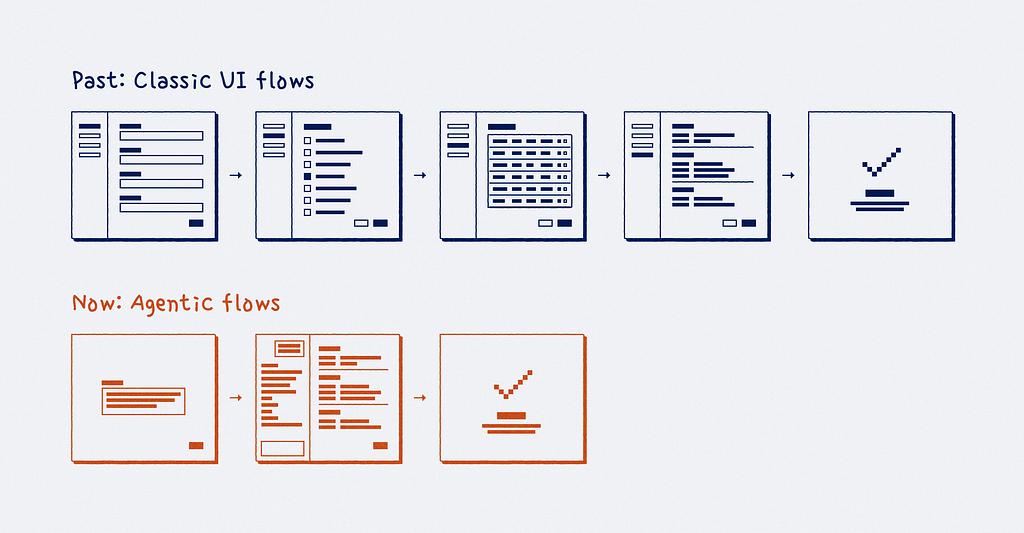
And things are moving fast. I can’t share internal numbers here, but the shape of what I’m seeing is easy to describe. A year ago, people wanted us to improve a page or add a feature. Now, they ask if they can have an agentic flow instead of a page. And obviously, this change in user behavior is having a big impact on our roadmaps and our job as designers.
You can see this shift in places I’m allowed to mention. Microsoft, which has probably shipped more forms than any other company, took the internal form employees use to register a new device and rebuilt it as a conversational agent. Their goal was to turn a six-step process into “just one or two actions.” They kept the old form running alongside it, and Microsoft says usage of the form is already dropping as people switch to the agent. Instead of making the form cleaner, Microsoft questioned whether it needed to be a form at all.
And this trend is everywhere. Box CEO Aaron Levie thinks agents will become “the primary user of all software,” with companies running a hundred times more agents than people. Gartner expects around 40% of enterprise apps to ship task-specific agents this year, up from under 5% a year ago, and frames this as the start of a shift away from keyboard- and interface-centric work. Nielsen Norman Group, which you can’t accuse of chasing hype, talked about it openly in their 2026 report: people are spending less time interacting with the UI and more time handing work to a layer that sits on top of it.
A “layer that sits on top” is another way of saying that our screens are quietly being demoted.
The screens that survive
There are two easy but unhelpful reactions here. One is to panic and say AI is killing design. The other is to believe that nothing is really changing and that our role just shifts to product strategy, making designers more valuable than ever. I don’t fully agree with either view.
The truth is that more often, screens are being demoted, not deleted. They’re moving from the main role to a supporting one, and the real question is which screens stay and which ones go.
Don Norman gave us vocabulary for this forty years ago with his two gulfs: the gulf of execution, the distance between what you want and what the system lets you do, and the gulf of evaluation, the distance between what the system shows and what you can understand. Agents are collapsing the first gulf faster than anything I’ve watched in my career. The second gulf is still entirely ours, and it quietly widens as more of the doing happens out of sight.
The execution screens are the ones getting demoted. The screen where the work used to happen becomes a confirmation step before something irreversible, or a backup when the agent isn’t sure. They become the audit log, the report you check afterward, or the place you go to see what the system did for you. All of this is still real design work, and some of it is even harder than before, but now the main focus is on the user’s intent.
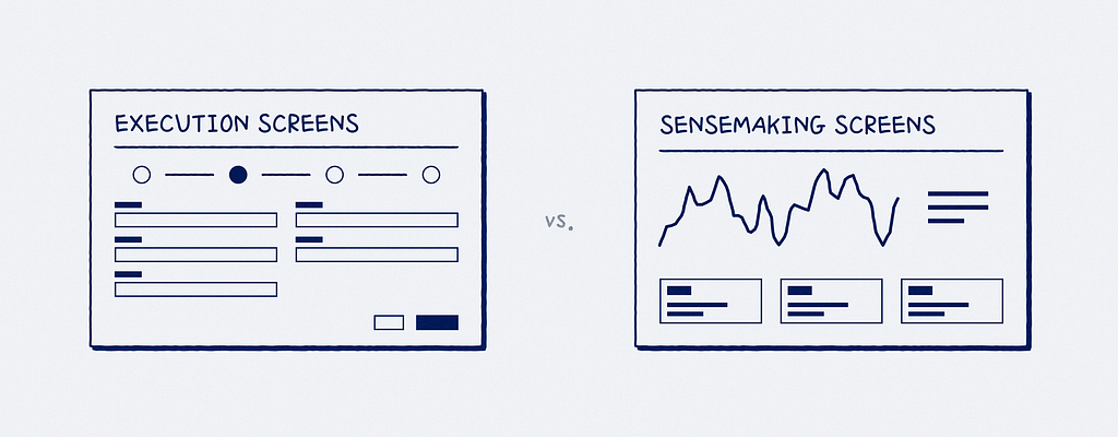
Sensemaking screens are a different story. A few years ago, I read a very good essay against chatbots by Amelia Wattenberger, a design engineer who prototyped AI interfaces at GitHub’s research lab. Her point stuck with me: good tools “make it clear how they should be used,” while an empty text box tells you nothing about what it can do, and bouncing between asking the AI and checking its work kills any flow. She’s right, at least for the screens where the job is thinking rather than doing. Some dashboards, as I acknowledged earlier, are us shrugging. But the one you open during an outage, trying to work out what just broke, does a different job, and the agent will end up sitting next to it rather than replacing it.
Heenesh Patel made a similar point in “The last interface,” describing what remains as a “zero-floor UI”: a basic set of core surfaces that agents use as a foundation. I would separate these by function rather than feature depth. The remaining screens handle judgment, oversight, and recovery, and this is where the second gulf sits.
One more catch, and it applies even to the execution screens we’re happily replacing. When people no longer perform the steps themselves, they often stop building a mental model of how the system works. That’s usually fine until something goes wrong. An agentic flow can replace ten screens, but it will quietly remove the user’s understanding of what’s happening underneath. When it makes a mistake or gets stuck, the user is left trying to recover from a system they never really learned. Counting removed screens or user clicks is a lazy way to measure progress. I’d rather ask whether someone reached the right outcome with enough understanding and control to stand behind it.
One note before consumer designers come after me: this is mostly about complex systems, at least for now. Consumer products will change too, but more slowly and in their own way. Nobody scrolls through a debugging tool for fun, but scrolling is half the point of Instagram, so it’s not turning into a command line anytime soon. Still, even there, people care more about the outcome than the navigation.
The new design critique
This is the part you can use on your next crit or brainstorm.
For years, our review questions focused on the flow. Is the path clear? Is the CTA easy to see? How many clicks does it take? What’s the task completion rate? These are all good questions, but they all assume the flow should exist in the first place.
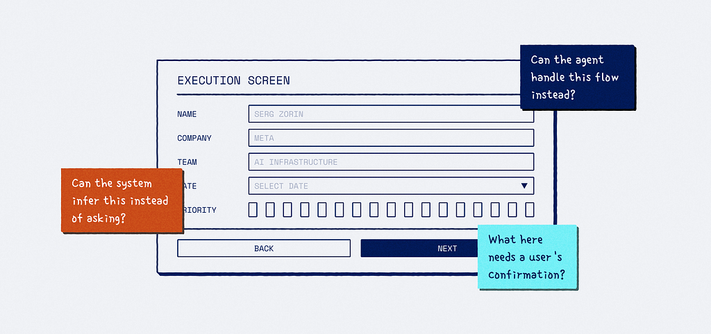
Now, the new questions are a step higher, and they focus on the moment when the system takes action.
Before anything runs:
- Can the system infer this instead of asking?
- Could this be a command, a skill, an API, or an automation instead of a screen?
- What needs a user’s “Yes,” and which assumptions should the system show before it executes?
While it works:
- What context should remain visible, and when should the system pause to ask?
- What boundaries can the user set without stopping the whole thing?
After it’s done:
- How does the user verify the result, and how do they undo it?
- What deserves an audit trail?
- What happens when confidence is low?
The best comment I’ve heard in a design review this year wasn’t about spacing or hierarchy. It was a typical walk-through of a complex multi-step workflow for scheduling system activity. And someone asked why anyone would ever need this flow, and the presenter had nothing to say. Because the question was both unfair and correct at the same time.
Sometimes, the most helpful design feedback is: let’s not build this UI. Let’s make the system smarter instead.
Here’s the honest caveat: sometimes that tough question is the wrong one. Sometimes, a screen really is the best answer; maybe the task is open-ended, users don’t trust the system yet, or the model just isn’t reliable. And sometimes, making the system smarter is a two-quarter infra bet, while a screen could be ready next week. I’ve been on both sides of that. If you go into every review insisting on no screens, you’re making the opposite mistake.
The real skill is knowing the difference between when a screen is the best answer and when it’s just the laziest option. That takes judgment, and it was never really about drawing pixels.
This is where the bluff gets called, by the way. For twenty years, saying “UX isn’t about screens” was easy because nothing challenged it. Now, every roadmap review does. If we believe what we say, we have to be willing to recommend the version of the product that actually needs less of our own work.
We were never hired to draw screens
That heading might sound dismissive of a craft I love, so let me explain it carefully.
We were hired to solve problems for users and businesses. For most of our careers, we did that through classic flows — UX/UI work. And doing it well was a valuable skill that paid off many times over.
But that was just the method, not the goal. The real goal was simple: someone needs something, or a business needs something. Close the distance. Whether we use beautifully designed screens or no screens at all was always secondary. We just never had the no-screen option as available as it is now with AI.
Now, we do. AI is making it easier to solve problems with way less UI work, and knowing when to take that route is becoming a bigger part of our jobs.
With fewer flows, we need fewer people to design them. I believe it’s better to be honest about this rather than ignore it.
That said, the choices that come with AI are still design decisions: what the system should do by itself, what it should quietly infer, what it must ask out loud, where it has to stop and wait for a person, and what that person still needs to understand about what just happened. No one else in the room will take responsibility for those.
But you can’t handle these decisions well if you don’t understand how AI models work. So if you need a push, here it is: spend time learning how these AI models actually behave in your field. Get comfortable designing new UX patterns: ask, approve, and undo. And learn to argue the case for the no-screen option with the same passion you once used for a redesign. Most of us are already doing it anyway.
Going back to the photo example one more time. Nobody wanted those six screens; they wanted the photo sent. Screens only ever existed because the system couldn’t act on what we wanted, but as I said, that excuse is disappearing. So the work that’s left is deciding what the system does on our behalf and what it still owes us. Well, someone needs to design that layer. I’d rather it be people who spent their careers asking what a person actually needs.
Further reading
- Amelia Wattenberger, on why an empty text box is a bad tool.
- Jessa Parette, on AI exposing how much of design became interface production.
- Heenesh Patel, on the zero-floor UI that remains after agents take over.

The screens are getting demoted was originally published in UX Collective on Medium, where people are continuing the conversation by highlighting and responding to this story.
This post first appeared on Read More