
It’s time to shake off the grip of the templated web and celebrate a world of Brand x Code
Thanks to a combination of Napster and my parents’ AOL account, I started designing websites when I was a teenager. And since then, I have been lucky enough to work for some of the best design companies and most loved brands in the world. All of that, I think, makes me qualified to say: websites are boring.
I don’t believe we made them boring on purpose. But they are. For those of us working in product, we tried to make the web more efficient: mobile-first, conversion-optimised, accessibility-compliant, and SEO-friendly. Every decision that we made was rational, logical, what the business required. We optimised websites to be found and to convert, which, sadly, has made them optimised to be forgotten.
As strategists, particularly ones in brand and design, one of the fundamentals we are taught is that differentiation is a key indicator of pricing power and future growth . And, as a recent McKinsey study points out , a strong and recognisable brand has returned to the number-one priority for leaders precisely because it acts as an anchor for trust. Yet, despite all of that, the web increasingly looks the same.
The rise of Shopify, Squarespace, and Webflow templates didn’t only make it easy to build functional websites; they made it almost impossible to build anything else. It is easy to understand why this happened; templates solved massive engineering headaches, offering speed, reliability, and cost-efficiency that businesses desperately needed. But the result? Mass homogenisation. Three-column heroes. Identical PDPs. Checkout flows copy-pasted between competitors. Entire categories look identical because they’re literally using the same 12 templates.
And while in some sectors there may be good excuses for this (regulation, global scale), overall it feels like the last decade has been one where we have sacrificed too many moments of differentiation at the altar of conversion. We chose click-through safety over the risk of brand presence because the tools made the path easy and proven. Now, with the rise of AI in all its different forms, unless we begin to think more critically about the true nature of brand experiences and the web, AI will reduce us even further to commodities. And this time, it’s going to be much worse than what has come before.
Voice and agentic search are just the visible edge of a broader shift in how people find and evaluate things. While we aren’t quite sure just yet what behaviour will win out, the new patterns are clear: we’re moving toward a different evaluation paradigm, turning to agents and LLMs for anything and everything.
The economics are predicted to be massive. Agentic commerce could generate $1 trillion in the US B2C retail market alone by 2030, with global projections reaching $3–5 trillion, moving faster than any previous commerce revolution. All of that is supported by some pretty shocking numbers. 58% of Gen Z and millennials trust an AI agent to compare prices and recommend options. In the UAE, 85% of consumers already use AI tools for shopping , and 93% feel AI makes online shopping easier. And just this week, The New York Times published an opinion piece highlighting that 60% of searches now end without a single click, “ compressing what used to be a meandering journey through the internet into an immediate arrival at your destination “.
We are trading the possibility of sensory-rich, interactive, and human-first brand experiences for the sterile, fluorescent aisles of a self-checkout warehouse. Yes, the warehouse is efficient. But nobody falls in love with a warehouse.
All of this demonstrates how AI is moving commerce from warm discovery — intention, exploration and resonance, where you don’t only land on a webpage to buy a product but to cross the threshold of a brand’s world — to cold efficiency — a sterile, highly optimised, and entirely transactional experience. And, with the creation of Google’s Universal Cart , this shift will only accelerate as the platform acts as both the starting gun and the finishing line, reducing websites to mere databases operating silently in the background.
Most people will argue that this shift presents us with a clear path: Your website is simply backend infrastructure, a machine-readable catalogue serviced through AI agents. But that path will lead to brutal price competition, hyper-efficiency, and ultimately, being forgotten.
There is another way. A necessary split. The bifurcated web, where we now must accept that websites have two completely different audiences.
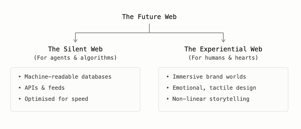
One is the machine: the agents, the LLMs, the bots and the scrapers. For them, we must build the “Silent Web”. A hyper-optimised, structured, machine-readable data feed. But the other audience? The living, breathing humans? Once we free our front-end from the burden of having to cater to both search and soul with the same rigid templates, we are finally free to build the “Experiential Web”. One that makes the experience unique, beautiful, and unforgettable once more.
To understand what this Experiential Web might actually look like, we can look to the lessons of the early web. As the internet first stepped out of its original “boring” Web 1.0 era, it did so by prioritising brand and design, using technology as the enabler to make the screen tactile, creating worlds with their own logic, energy, and perspective.
https://medium.com/media/46910b8eaff7f7da3c3db1b6ed1e6e5e/href
I still remember the first time I visited Nike Better World . The now iconic experience launched parallax scrolling to the world. But, the creation of the site did not start with the code, or a new novel technology that we were all desperate to show we had working in our favour. It started with storytelling, humans, and the brand.
“In our opinion, technologies are independent of concept. Our primary focus was on creating a great interactive storytelling experience.”
— W+K via Smashing Magazine
Nike weren’t the only ones to capitalise on brand and code working together.
Bellroy’s “Slim your Wallet” (a version of this is still live today!) used responsive HTML and CSS to create an interactive slide widget. As you dragged a slider to “add cards”, a simulated standard wallet visually ballooned into a massive, pocket-stretching brick, while the Bellroy wallet alongside it remained elegantly thin.
And, Bagigia focused on unique ways to sell a single, highly unusual, premium Italian leather bag by throwing out traditional vertical scroll mechanics. Using horizontal, scroll-triggered design, scrolling physically spun the bag 360 degrees in high definition. Hovering over different parts of the spinning bag activated call-outs detailing the premium stitching, custom zips, and leather grain.
All these experiences were commercial, conversion-driving, usable. But none of them were templatised, copy-pasted or duplicates of what had come before. And importantly, all used the technology to enhance the human experience of the brand, not just the commercial experience.
But if the old web used parallax, HTML5 and custom CSS to tell these stories, we have to ask: what is the equivalent today? It certainly isn’t a standard template.
The answer lies in what happens when we stop using AI as an automation tool and start treating it as a creative partner. When we use AI with genuine imagination, we can create spaces where brand and code work together to make something that feels deeply human.
We are seeing early shoots of this. Look at Tony’s Chocolonely’s FWA-winning AI Wrapper site, which lets users dynamically prompt and paint bespoke chocolate packaging on the fly. Or Google Creative Lab’s Infinite Wonderland project, where users click a sentence of a classic story and watch AI dynamically illustrate the page in real-time in a chosen artist’s unique style. Or a personal favourite, and a FWA Website of the Day, fitdrop.cc, a digital playground tracing 45 years of fashion, mapped onto virtual versions of the creator, Iain Tait, that you can toss, stack and drag to reveal their history. All of these experiences are joyous, beautiful, digital playgrounds, and impossible to copy-paste into a Shopify template.
Where does all of that leave the web we actually want to spend time on?
Today, brands are rushing to implement AI, agentic search, and LLM integrations out of sheer panic. We see generic chatbots slapped onto standard templates and labelled “innovation”. But technology without concept is just expensive plumbing. If your AI strategy is purely technological, you will simply automate your way into a deeper, colder form of commodity. When used correctly, AI shouldn’t be a generic automation tool strapped to a landing page. It should be, can be, magic.
If we let AI reduce our websites to mere databases, we aren’t only subcontracting conversion, we’re losing our brand world. After all, the best digital experiences have never been about the pipes. They’ve always been about the “ meandering journey through the internet”, replacing the predictable, robotic, click-to-buy-stream with moments of playfulness, friendly friction, exploration, and expression. Rather than executing a transaction, the best experiences are spaces where humans browse, stumble, and are drawn deeply into the shared universes we create.
So, feed the machines the raw structured data they want on the backend, but don’t let the order they require dictate your human design. Use your creative energy to build experiences that humans actually want to get lost in. Use AI how we once used code: with imagination. Make AI your new creative partner, a way to supercharge your storytelling and, importantly, to build the distinction and memorability we know drives growth. By doing so, we can revive the historic partnership of brand and code, modernising it for a bifurcated internet.
We once had a web that built unforgettable things at the intersection of brand and code. It’s time we got back to that.
Originally published at https://msbelt.substack.com.

Your website is boring (but that might just set it free) was originally published in UX Collective on Medium, where people are continuing the conversation by highlighting and responding to this story.
This post first appeared on Read More