
Style guide vs. design system: Why the difference matters
Although many designers use them interchangeably, style guides and design systems are two different tools with their own unique strengths and weaknesses. Misunderstanding the differences between the two can negatively affect the whole product design/development process and ultimately counteract the benefits they provide.

To help you understand them better, this article unpacks the differences between style guides and design systems by discussing them separately, identifying similarities and differences, and showing you how to optimally use them in product design and development scenarios.
What is a style guide?
In UI/UX design, a style guide refers to a document that presents guidelines for repetitive visual segments and content in product interfaces to manage consistency across every part of a software product. Product design teams create style guides based on company branding, design philosophy (e.g., minimalism, maximalism, etc.), and designer preferences to use as a foundation for styling product interfaces.
A generic style guide typically states guidelines for colors, typography, imagery, content, UI component states, logo usage, and any visual entity that requires consistency.
Using a style guide improves the overall UI/UX process by:
- Delivering high-quality product designs that help manage consistency
- Embedding company branding to represent the company through the product
- Eliminating unwanted meetings and confusions throughout the design process, increasing delivery efficiency
Using a style guide also improves the overall development process by:
- Helping developers create high-quality, consistent product interfaces based on prototype specifications by offering a centralized guideline document
- Smoothening the design handoff process by eliminating unnecessary meetings that focus on branding and UI consistency-related questions
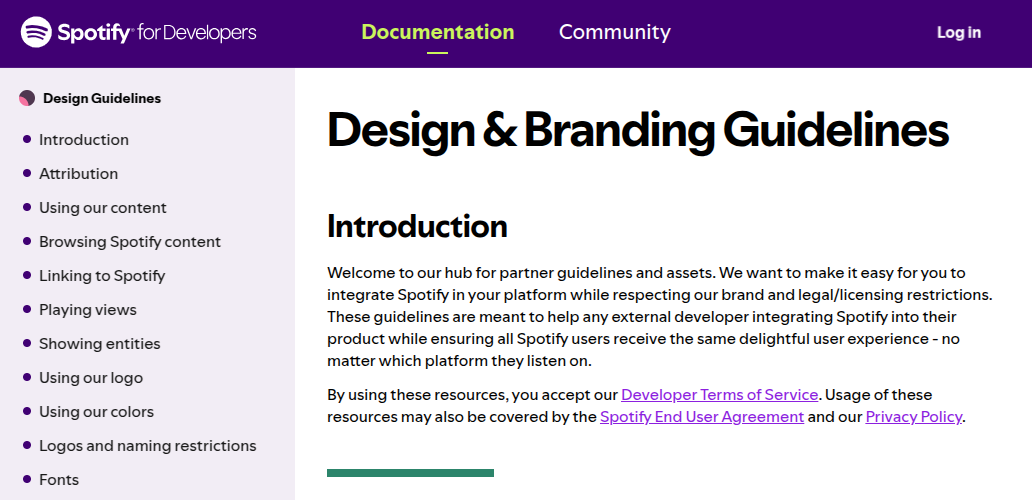
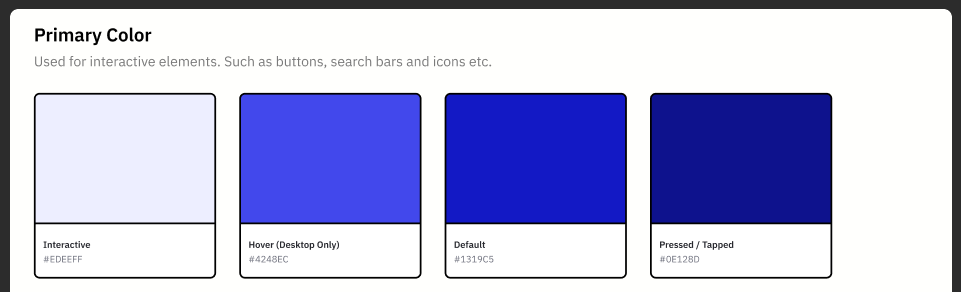
As an example, look at how Spotify structures its style guide documentation:
Key elements in a style guide
A style guide document guides you on how to apply consistent styles for every UI element in a product interface. Here are the key elements in a modern style guide document:
- Color palette — Specific colors for UI element foregrounds and backgrounds based on company branding and selected fundamental design philosophy
- Typography — Explains how to create consistent headings, paragraphs, labels, and any textual segment with suggested fonts, text styles, spacing, and letter case
- Branding details — Describes how you can use logos, colors, and branding content without altering the original company branding guidelines
- Imagery — Guides how designers should use suitable imagery (e.g., photos, illustrations, icons, diagrams, charts, etc.) under the selected design philosophy and recommended color schemes
- Core design guidelines — Dos and don’ts for taking fundamental design decisions (e.g., how to color and position dialog box buttons)
- Content guidelines — Recommends how to achieve consistency and control language tone in repetitive similar content segments (e.g., guidelines for error messages)
- Layout — Instructs how margins, paddings, and UI element flow can be structured with layouts, and how atomic UI elements can use spacing
- UI element states — Includes atomic UI elements’ states visualizations (e.g., states of a button element) that designers can use as the foundation for creating prototype components
Apart from these general elements, sometimes you might have to include unique design guidelines and facts based on initial product design decisions. Reusable components aren’t a part of a normal style guide document, but some designers extend their style guides by adding reusable components created with their favorite prototyping tools to speed up new product design.
How to create a style guide?
You can create a style guide to achieve consistency and streamline your design process by following these steps:
- Agree on the key facts in the company branding guide and how you can represent the company profile through the product. Determine characteristics in the selected design philosophy
- Identify the user base, their preferred product interface themes, and preferred language tones
- Outline the style guide based on the above findings and UI elements that the product interfaces include
- Create the style guide document using your prototyping tool and publish it in a place that the entire team can easily access
This comprehensive guide explains how you can create a style guide with Figma:
What is a design system?
In UI/UX design, a design system is a collection of building blocks and standards that help you efficiently create a wide range of consistent product interfaces. Product design and development teams create design systems by creating component libraries, pattern libraries, and design standards based on style guides. A design system usually presents available components, patterns (a group of components), design tutorials, and standards for designers and developers using a documentation website.
Using a design system effectively improves the overall UI/UX process by:
- Boosting product design and prototyping activities since you have reusable, pre-designed components and patterns
- Preserving company branding details through pre-designed elements and standards built using a foundational style guide
- Implementing a scalable, centralized design catalogue that the product team can use for building almost all product designs
Using a design system effectively also improves the overall development process by:
- Creating high-quality, consistent product interfaces that adhere to the company branding
- Eliminating time-consuming prototype inspections after the design handoff since pre-developed components and patterns already adhere to the prototype’s element specification
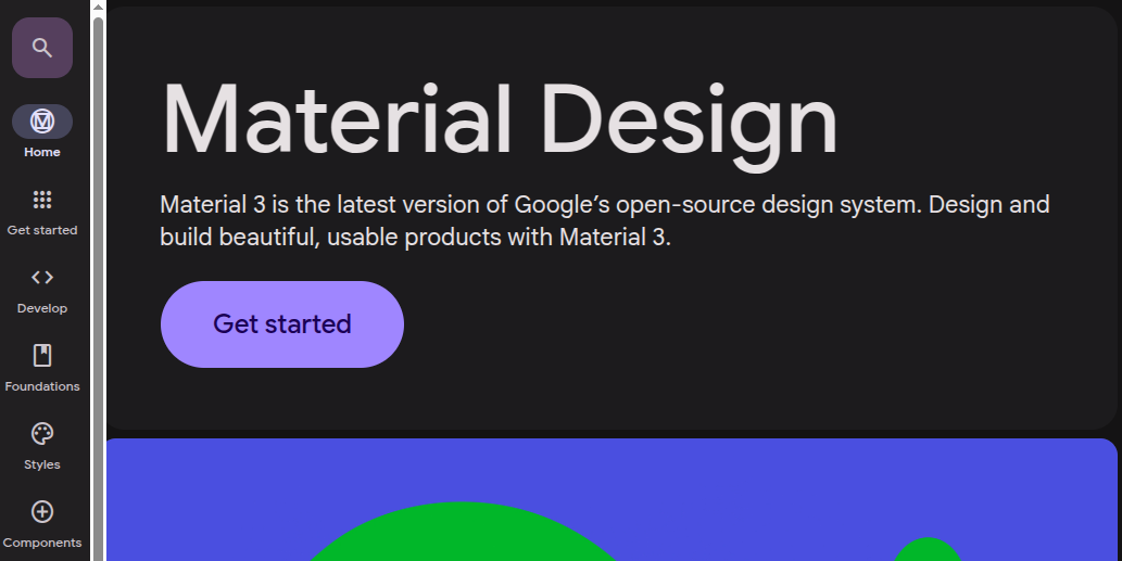
See how Google’s Material design system structures its documentation:
Key elements in a design system
A design system offers product design/development building blocks and standards by explaining how to create high-quality product interfaces. Key elements include:
- Style guide — A design system uses a style guide as the fundamental design document and presents it from the design system documentation
- Reusable components — Pre-made atomic components (e.g., buttons, drop downs, cards, accordions, etc.) that you can use for prototyping and developers can use for building the real digital product UIs
- Reusable patterns — A collection of atomic component arrangements that both designers and developers can instantly use with small adjustments (e.g., a generic navigation bar UI segment)
- Layout system — Guidelines for designers and a pre-made layout library for developers to construct the UI structure
- Design tokens — Pre-defined atomic values (colors, font sizes, paddings, etc.) according to the style guide for designers and developers
- Designer documentation — How to create product designs and prototypes using pre-made building blocks and standards
- Developer documentation — How to create real product interfaces using code components and patterns
- Asset libraries — Icons, illustrations, content segments, and other visual resource modules that designers and developers can import into their design/development environments
- Standards and practices — Best practices that designers and developers can follow to construct product interfaces by optimally using available pre-made resources
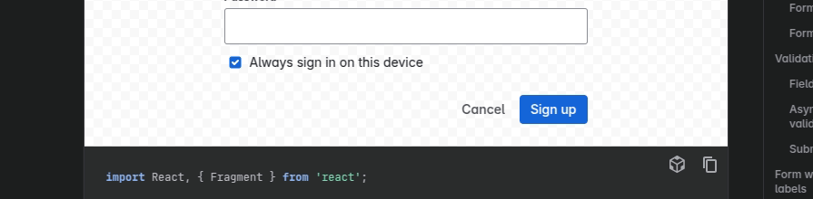
Apart from these general elements, some modern design systems implement live previews and interactive tutorials to improve design system learnability. For example, see how the Atlassian design system documentation lets developers see live previews and copy code snippets productively:
How to create a design system?
Product design and development teams create design systems to create a scalable solution for building consistent, high-quality products by following these steps:
- Stabilize a style guide document by carefully evaluating branding requirements, design philosophy, and designer preferences
- Outline the architecture of the design system and understand what should and what shouldn’t be included
- Start by creating atomic components, and then create patterns for designers using a suitable UI design tool like Figma
- Create reusable components and patterns for developers using a suitable frontend library/framework like React, Vue, Angular, or any preferred one based on your product’s platform
- Present all modules and standards from the documentation catalogue and make them available for the entire product development team
This comprehensive guide explains best practices for creating better design systems.
While some product teams create their own design systems based on their own style guides, others strive to save more time by extending or adhering to open-source design systems like Google’s Material.
Style guide vs. design system
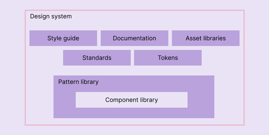
From a high-level view, you can see that a style guide document lives within a design system, as depicted in the following diagram:
Now, let’s go deeper into the comparison by identifying similarities and differences between a style guide and a design system.
Similarities
- Both help designers and developers to achieve consistency while creating repetitive UI segments by also improving efficiency and streamlining design process activities
- Both eventually present a well-structured documentation for designers and developers
Differences
- A style guide is a foundational document that states branding and low-level design guidelines. In comparison, a design system offers pre-made building blocks for designers and developers to create product prototypes and final product UIs
- A style guide focuses on low-level visual identity and branding details of a product, while a design system focuses on offering a comprehensive solution for high-level product design
- A style guide is directly connected with the company brand and selected design philosophy, but the design system is directly connected with a style guide and standards
When should you consider creating a style guide?
A style guide should be defined within UI design stages. Designers usually create real product-like designs during high-fidelity prototyping stages, so they should start creating a well-structured style guide while creating initial high-fidelity prototypes.
Even though a style guide is a foundational document, finalizing it before starting with high-fidelity prototypes isn’t practically possible, so the ideal approach is to work on your high-fidelity prototypes and the style guide side-by-side, updating the style guide based on new design requirements in high-fidelity prototype screens.
When should you consider creating a design system?
A design system implements a solution to boost product design and development speed with a comprehensive framework. You can decide to create a design system based on the following characteristics and signs:
- Your company manages multiple software products, and you seek a systematic framework to maintain brand and key design consistency
- Slow design and development process (e.g., designers and developers create similar UI segments from scratch over again)
- Improper design segment or code component sharing (e.g., designers and developers often copy-paste UI components from other prototypes and codebases for new ones)
- Product interfaces show signs of design debt
A design system offers building blocks for designing and developing products, so to create a design system, you need finalized UI elements and patterns. You usually need a stable, high-fidelity prototype or an early MVP (minimum viable product) version before creating a design system. However, you can also start creating a design system for a delivered, mature product if it shows signs of design debt.
If you wish to extend an existing design system or directly use a pre-made one, you can instantly start creating your first high-fidelity prototype with it.
Comparison summary
Style guides and design systems help you develop consistent, high-quality products efficiently, but they’re two different components. A style guide is a foundational document that states branding and low-level design guidelines, whereas a design system uses a style guide and provides building blocks and standards for creating consistent products efficiently.
The following table outlines the key differences between the two:
| Comparison factor | Style guide | Design system |
| Created based on | Company branding guidelines and design philosophy | Style guide and other design principles |
| Focus | Describing visual and content guidelines for consistency and branding | Providing building blocks and standards for consistent product design and development |
| Scope and depth | Low-level design elements like colors, spacing, typography | High-level design elements like components and patterns |
| Presentation method | Document | Document |
| Key elements | Color palette, typography, branding details, imagery, core design guidelines, content guidelines, layout, and UI element samples | Style guide, components, patterns, layout system, tokens, tutorials, asset libraries, and standards |
| Benefit for designers | Can create consistent UI elements using provided values and guidelines | Can create product interfaces using pre-designed components and patterns |
| Benefit for developers | Can develop consistent UIs by also participating in a smooth design handoff process | Can create product interfaces using pre-developed components and patterns |
| Suitable for | Any product development team that aims to build consistent products | Any product development team that aim to invest time for boosting efficiency beyond style guides |
| Examples | Spotify style guide, Payoneer style guide | Material, Atlassian design system |
Transitioning from a style guide to a design system
Creating a design system drastically improves your entire product development process, but it can be challenging and time-consuming. So, most product design and development teams usually start with a style guide and consider switching to a design system when they spot signs of design debt.
You can make the transition process smoother with the following tips:
- Evolve the style guide document with design system elements gradually into a design system and let designers/developers use it for new design/development tasks (e.g., publishing design tokens first)
- Clearly separate the style guide from the other parts of the design system to let designers/developers use the original style guide if needed
Final thoughts
A style guide and design system have similarities, so most design teams use them interchangeably without understanding their differences. Some designers extend style guides with key elements in design systems and still call it a style guide. Meanwhile, some designers create style guides and name them design systems.
However, using them incorrectly negatively affects the entire UI/UX and development process, so you should understand the difference between a style guide and a design system and use each optimally to improve your product design and development process.
The post Style guide vs. design system: Why the difference matters appeared first on LogRocket Blog.
This post first appeared on Read More