14 cognitive principles every UX designer should know
How did you learn the times table? Chances are, you didn’t memorize every answer; you learned patterns. Ten times any number is just an extra zero. Simple patterns like these formed our earliest mental models, and they still shape how we interact with systems today.

These mental models are shaped by cognitive principles — the fundamental patterns that guide how we think, learn, remember, and make decisions.
What does this mean for you as a designer? You can predict how people will interact with your designs by simply understanding the cognitive principles behind them. Let me show you what I mean.
The impact of cognitive principles on UX
Recently, I had an experience that illustrates just how strongly cognitive principles influence our digital interactions. I placed an order on a platform, and when the order summary appeared, there was a glaring error in the item description. But I missed it. My attention was locked on checking the prices to make sure I wasn’t being overcharged, as that had happened before.
When my order arrived, I kept wondering how I could’ve missed something so obvious. The answer? Selective attention — our brain’s way of focusing on what seems most important in the moment, while filtering out the rest.
Cognitive principles like selective attention shape every user interaction — what people notice, remember, learn, and even the mistakes they make. Apply them thoughtfully, and you can reduce mental effort, guide users’ attention, ease recall and retention, and even motivate users. Let’s explore how.
Reducing mental effort
Cognitive load theory
This theory states that our working memory can only handle a limited amount of information at any given time. To avoid cognitive overload, designs must stay within users’ natural processing limits. When crafting UX content and layout, you can reduce cognitive load by:
- Keeping interfaces simple
- Limiting decision points
- Using clear, concise copy
- Breaking complex tasks into manageable steps
Apple’s homepage demonstrates this perfectly — a few words, one image, and a single clear CTA guide users effortlessly to the next action:

Progressive disclosure
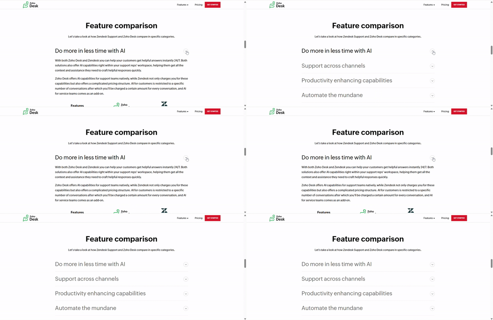
Progressive disclosure is a UX design technique that presents users with only the information or options they need at a given time, revealing more details gradually as they move forward or request them. Applying this principle in your design and content means doing the following:
- Using expandable sections
- Adding tooltips for contextual help
- Including microcopy like “Learn more” and “Show details” to keep interfaces clean while still offering depth when needed
For instance, Zendesk’s homepage uses accordion-style displays to let users access more information on demand without cluttering the page:
Hick’s law
Hick’s law states that the time it takes for a person to make a decision increases with the number and complexity of choices presented. Every extra choice makes them stop, think, and weigh their options before acting. To reduce decision time and drive action, use these techniques in your design and copy:
- Group related options logically, so users can navigate to relevant options quickly without manually scanning everything
- Write clear, action-focused CTAs that tell users exactly what happens next instead of vague copy that leaves them guessing
- Limit visible choices instead of presenting users with everything at once
Take Nike’s website, for example. Despite having thousands of products, it keeps things simple by spotlighting key categories like “Men”, “Women”, “Kids”, etc., so users know where to start:

Miller’s law
Miller’s law states that people can only hold about 7 (plus or minus 2) pieces of information in their working memory at once. Overloading users with more than that can cause confusion and slow decision-making. Here’s how you can leverage Miller’s law to reduce mental effort in your designs and content:
- Group related information together so users can process them as units, rather than individual pieces
- Break content into easily digestible chunks — short paragraphs, bullet points, and clear sections — instead of dense text blocks to enhance scannability
- Using white space and visual hierarchy to highlight what matters most
Zoho, for example, offers over 50 business apps, but highlights only five in its “Featured Apps” section. Users can explore more if they choose, but keeping the displayed options within their cognitive limit (5 – 9 items) helps prevent overwhelm:

Fitts’ Law
Fitts’ law states that the time it takes to get to a target depends on the target’s size and distance to the target. That is to say, large and close targets are easy to reach, while small and far targets are difficult to reach.
Here’s the challenge: the farther and smaller the target is, the more effort it takes to interact, slowing users down and increasing errors. Here’s how to make interactions easier:
- Make primary buttons large (at least 44x44px) on mobile, and easy to tap or click
- Provide enough space (at least 8px) between interactive elements to prevent misclicks
- Use clear, descriptive link text (e.g., “View our prices” instead of “Click here”)
Gmail’s Compose window positions the “Send” button directly below the message field, which is close to where the user finishes typing, making it easy to finalize their task:
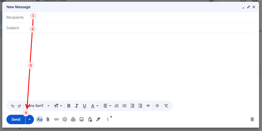
By minimizing physical effort (like cursor travel), Fitts’ law reduces users’ mental load. What’s interesting about this principle is that it can also subtly guide attention. Gmail’s “Send” button aligns with the users’ natural task flow by sitting close to where they typically finish their task (see image above), making it easy to spot.
Speaking of guiding attention, let’s look at some cognitive principles that excel at it.
Guiding attention
Selective attention
Selective attention refers to our brain’s tendency to focus on one thing while filtering out other information. When we concentrate deeply on a particular element, we often overlook surrounding details, even when they’re important. This is why banner blindness occurs: over time, users learn to filter out patterns that haven’t previously helped them achieve their goals.
In UX, writing and designing for selective attention is about guiding focus to what matters most. Here’s how you can achieve that:
- Reduce visual noise by removing unnecessary elements and incorporating white space strategically
- Use visual and content hierarchy to make primary actions and key information stand out
- Use visual and verbal cues to direct attention to what’s important on a page
- Maintain consistency across screens—tone, terminology, interaction patterns, etc.
Gestalt principles
Gestalt principles are a set of laws that describe how people perceive and organize visual elements. To make sense of what we see, our brains find patterns, group related elements, and even fill in missing information. Some well-known Gestalt principles include:
- Proximity — Objects located close to one another in proximity are perceived as belonging to the same group or category
- Similarity — Similar elements within a design are perceived as a unified whole, even when they’re physically separated or distinct from one another
- Common region — Elements located within a shared boundary or container are perceived as part of one group
- Closure — The mind naturally fills in missing details to form a complete, familiar shape or pattern
Here are some ways to apply Gestalt principles in UX design and writing:
- Keep copy (like error messages and helper text) close to their context so users can easily understand what information relates to what
- Place related elements (like product image, name, and price) close together so users can easily recognize them as a whole unit
- Structure content within sections or blocks to support visual grouping and enhance scannability.
In this example from Airbnb, you can easily tell that the property image, title, price, and rating belong together, even though there are no visible boundaries. That’s the law of proximity at work:
Von Restorff effect
The Von Restorff effect, also called the isolation effect, states that when several similar items appear together, the one that differs the most is more likely to stand out and be remembered. You can leverage the Von Restorff effect to draw attention to key actions or messages without overwhelming users. Here’s how:
- Use contrast (like color, size, or placement) to distinguish primary actions (e.g., sign-up buttons) from secondary ones
- Use visual cues for feedback messages (like red for error messages) to make outcomes easy to spot
- In a grid of similar patterns, make one visually distinct as a way to draw attention to key content
This example from Uizard’s pricing page uses the Von Restorff effect to make one plan stand out from the rest, drawing attention to the option they want users to notice first:

Easing recall and retention
Recognition vs. recall
Recognition is the ability to identify something as familiar, while recall is the ability to retrieve information from memory. In UX, recognition is favored because it’s easier for people to recognize things than remember them. When you design for recognition instead of recall, you make life easier for your users. Here’s how to do that:
- Help users pick up where they left off by showing previously used options like recent searches, past orders, or frequently used items
- Use navigation cues such as breadcrumbs to help users easily recognize where they are in the system, rather than forcing them to remember their path
- Offer drop-down menus with predefined options, where possible, instead of expecting users to enter details from memory
Expecting users to recall their country code when trying to sign in is quite an ask. Amazon solves this with a simple dropdown menu so users can recognize and select their code instead of trying to recall it:
Serial position effect
The serial position effect describes our tendency to remember the first and last items in a list more than those in the middle. When we’re presented with a series of items, the first items are stored in the long-term memory (the primacy effect), while the most recent ones remain in short-term memory (the recency effect).
Here’s how you can use this principle to enhance recall and retention:
- In multi-step tutorials and walkthroughs, place the most essential steps first and last in the sequence to help users retain them better
- Front-load and end-load information by placing the most critical parts at the start and end of a sentence, paragraph, or list
- When designing menus or lists, place the most important or frequently used items at the beginning or end — these positions are easiest for users to remember quickly
Take Spotify’s Security and Privacy menu as an example. The two most critical security actions — ‘Change password’ and ‘Sign out everywhere’ — sit right at the top and bottom. These are positions people remember best, making it easy to find these features quickly when they need to secure their account:

Zeigarnik effect
The Zeigarnik effect describes how we’re more likely to remember unfinished or interrupted tasks than those we’ve completed. This happens because incomplete tasks create a sense of mental tension that keeps them active in our memory until we finish them.
In UX design and writing, you can use the Zeigarnik effect to help users remember where they left off and encourage them to complete what they started. Here’s how:
- Use progress indicators and checklists to show users what’s left to do. This reminder of incompleteness makes them more likely to finish their tasks
- Use phrases like “Almost done” or “Just one step left” to heighten the tension of an almost-finished task. This makes users more likely to complete it
- Use copy like “You have 2 items waiting in your cart” to help users recall unfinished actions and encourage them to complete their purchase
This example from GOV.UK’s visa application process uses a progress indicator to help users recall where they left off. Even after days away from the application, users can remember they were ‘on step 2 of 6’ because the progress marker acts as a reminder:
Here’s another interesting aspect of the Zeigarnik effect: the closer you get to the finish line, the greater the mental tension. Being just one step away creates a greater sense of urgency than being halfway there. In this way, the Zeigarnik effect indirectly taps into motivation through incompleteness. But there are other cognitive principles that influence motivation more directly. Let’s explore some of them.
Motivating users
Goal-gradient effect
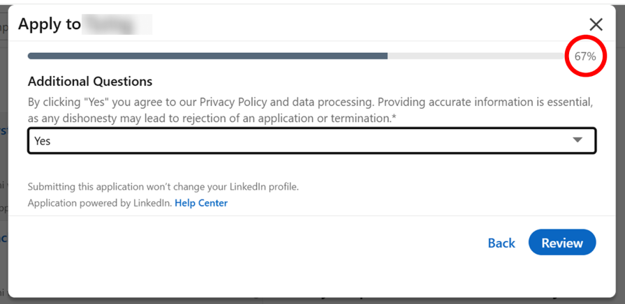
The goal-gradient effect describes how our motivation to achieve our goal increases as we get closer to completion. As we approach our goal, our sense of progress and accomplishment intensifies, driving us to put in more effort to complete the task. When designing and writing for interfaces, you can leverage the goal-gradient effect to tap into users’ natural motivation to finish what they’ve started. Here’s how:
- Use visual indicators like progress bars to show users how close they are to completing a task, whether they’re setting up a profile, filling out a form, or completing a purchase. The closer they are to the finish line, the more motivated they feel to complete it
- Show incremental rewards or milestones. For example, Fitbit awards badges for daily-step goals, with higher-ranked badges as users increase their step count
This example from LinkedIn shows users how far along they are in the job application process using percentage completion. A user at 80% completion is naturally more motivated to finish the application than they were at 20%:
Social proof
Social proof is our tendency to look to the behavior and opinions of others to guide our own actions and decisions. When something appears popular or desirable, we’re naturally more likely to find it appealing too.
In UX, you can leverage social proof by showcasing evidence of popularity, such as customer testimonials, reviews, or ratings, to build trust and encourage users to engage with confidence. Here’s how to apply this through copy and design:
- Display user testimonials with photos and credentials (customer names, job titles) to make them credible and relatable
- Write microcopy that references others’ actions, e.g., “75 customers bought this in the last hour”
- Use social signals like “Trending now” or “Most popular items” to guide attention and influence decisions
UX Pilot’s homepage does something interesting with social proof — they combine video and written testimonials from customers. This approach helps build trust by showing real people sharing their experiences:

Peak-end rule
The peak-end rule describes how we judge experiences. Instead of averaging everything that happened, we focus on two moments: the most intense point (the peak) and the final moment (the end). These two points shape how we remember the entire experience, whether good or bad. Given that users remember the peak and end moments of their interaction the most, make both count. Here’s how:
- Make task completions feel rewarding by adding animations, positive copy, or visual celebrations. Even small wins deserve recognition
- Don’t create boring empty states — use them as opportunities to nudge users into taking action
- Always end interactions on a high note. Whether it’s a simple thank you message, a helpful next step, or a reassuring confirmation, ensure the last touchpoint leaves users with a positive impression
This microcopy from Slack turns something as simple as having no unread DMs into a small, feel-good moment:

From principle to practice
Remember the order mix-up story I shared earlier? My experience of being overcharged primed me to focus on price rather than product details, which is equally important. This just shows how people’s cognitive biases can shape how they experience your products.
As UX designers and writers, our job is to anticipate these biases and design around them. Understanding cognitive principles helps you do exactly that — it gives you the ability to predict how users will think, decide, and behave within your interface.
Something as small as adding a visual cue — like placing a product image beside the item name — could have redirected my attention and prevented that mistake. That’s the power of applying cognitive principles in design — once you understand and apply them thoughtfully, your design process becomes a system grounded in proven psychology, not guesswork.
The post 14 cognitive principles every UX designer should know appeared first on LogRocket Blog.
This post first appeared on Read More


