How to create Liquid Glass effects with CSS and SVG
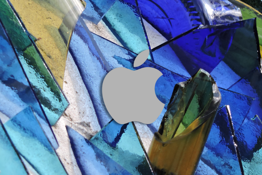
Apple’s Liquid Glass UI for iOS 26 is getting a lot of attention. Beyond the visual hype, it is also raising questions about accessibility and usability. Developers, however, are already trying to recreate the effect for the web and mobile interfaces.
On iOS, Liquid Glass is backed by a rendering engine designed to generate high-fidelity, physics-like glass patterns efficiently. Web browsers do not expose this kind of native abstraction, but we do have SVG filters, which are powerful enough to approximate the same effect.
In this tutorial, we will:
- Break down the core visual concepts behind Liquid Glass
- Build a reusable Liquid Glass button in React using SVG filters, Tailwind CSS, and minimal JavaScript
- Walk through how to author the supporting assets in Figma
- Discuss performance tradeoffs, browser support, and accessibility concerns
You should be comfortable with React, CSS, and basic SVG. Some familiarity with Figma will help when constructing the displacement and specular maps.
What is Liquid Glass?
Liquid Glass is a modern UI pattern introduced in iOS 26 that extends Glassmorphism with more physically plausible optical effects. At a high level, you can think of it as “glassmorphism plus refraction and reflection”:
- Glassmorphism uses translucent surfaces, frosted blur, and soft layering
- Liquid Glass adds light bending on curved edges, localized distortion, and specular highlights that respond to context
In Apple’s examples, widgets and buttons appear to bend and distort the background along their edges, similar to how real glass or fluid materials behave:
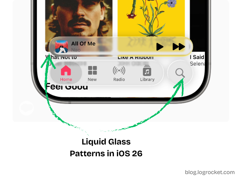
The primary visual cue is how the content behind a component appears subtly warped near its curved edges, as if light were passing through a material with a different index of refraction.
To recreate this effect in the browser, we lean on SVG filter primitives, layered composition, and some careful asset design.
Core principles behind Liquid Glass
Liquid Glass builds on two physical ideas:
- Refraction
- Reflection
Refraction
Refraction describes how light bends when passing through a medium such as glass, water, or acrylic. When you look at objects through a glass of water, the background appears shifted or distorted. That is the effect we want on the edges of our components.
In SVG, we can simulate refraction by:
- Generating a displacement map that encodes how pixels should shift
- Using
feDisplacementMapto warp the background through that map
Reflection
Reflection is the light that bounces off the surface of the material and reaches your eye. For glossy materials, this shows up as specular highlights along the edges or where light hits at a grazing angle.
In SVG, we can approximate this by:
- Painting a “specular rim” map around the edges of the shape
- Blurring and compositing this map with the displaced background
Together, refraction and reflection give the element a more realistic liquid glass appearance.
High-level architecture for the Liquid Glass button
We will implement Liquid Glass for a CTA button using:
- React and TypeScript for the component logic
- Tailwind CSS (v4-style
@themeusage) for layout and styling - SVG filter primitives for refraction and reflection
- Assets from Figma for displacement and specular maps
The basic structure is:
- A button element with fixed dimensions for consistent filter mapping
- A “filter layer” that receives the SVG filter via
backdrop-filter - A “content layer” that renders text and ensures legibility
- An inline
<svg>with<defs>that defines the filter pipeline
We will first scaffold the button and theme tokens, then wire in the filters.
Setting up Tailwind CSS theme tokens
We start by declaring some CSS custom properties using Tailwind’s @theme directive:
@theme {
  --btn-radius: 60px;
  --btn-content-bg: hsl(0 100% 100% / 15%);
  --btn-filters: blur(4px) brightness(150%);
}
These variables control:
--btn-radius: Corner radius for the button--btn-content-bg: Semi-opaque background for the content layer--btn-filters: Initial backdrop filter configuration
We will later replace the generic blur defined in --btn-filters with our Liquid Glass SVG filter.
Building the React button component
Next, we define our component props and structure. We want:
- All standard button attributes
- A
childrenprop for the button label - Support for forwarding a ref from parent components
// Type definition for component props
type LiquidGlassBtnProps = React.ButtonHTMLAttributes<HTMLButtonElement> & {
  children: React.ReactNode;
  ref?: React.Ref<HTMLButtonElement>;
};

const BTN_WIDTH = 300;
const BTN_HEIGHT = 56;

// The liquid glass button component
export default function LiquidGlassBtn({
  children,
  ref,
  ...props
}: LiquidGlassBtnProps) {
  return (
    <button
      ref={ref}
      className="relative overflow-hidden shadow-lg w-full rounded-[--btn-radius]"
      style={{
        maxWidth: `${BTN_WIDTH}px`,
        minHeight: `${BTN_HEIGHT}px`,
      }}
      {...props}
    >
      {/* Filter layer */}
      <div className="absolute inset-0 backdrop-filter-[--btn-filters]" />

      {/* Content layer */}
      <div className="absolute inset-0 inline-flex items-center justify-center font-bold text-white bg-[--btn-content-bg]">
        {children}
      </div>
    </button>
  );
}
This component:
- Fixes the logical dimensions using
BTN_WIDTHandBTN_HEIGHT - Applies radius, background, and filters via CSS custom properties
- Uses absolute positioning to stack the filter and content layers
- Keeps the content layer foreground so text remains readable
Piecing the structuring and styling together, you should get a button that looks like the following:
See the Pen
Liquid Glass Button Structure by Rahul (@rahuldotdev)
on CodePen.
The CodePen also adds drag-and-drop behavior to demonstrate how the button adapts to different backgrounds. That behavior is optional and independent of the core component.
SVG filter primitives: a quick primer
SVG filters are defined in an <svg> element inside a <defs> block:
<svg>
  <defs>
    <filter id="...">
      <!-- Filter primitives -->
    </filter>
  </defs>
</svg>
Each <filter>:
- Has an
idused later with CSSfilterorbackdrop-filter - Contains one or more filter primitives, such as
feGaussianBlur,feColorMatrix,feDisplacementMap,feImage,feBlend, andfeComposite - Passes intermediate results through
in,in2, andresultattributes, forming a small image processing pipeline
For example:
<svg>
  <defs>
    <filter id="blurred-and-saturated">
      <!-- Gaussian blur -->
      <feGaussianBlur
        in="SourceGraphic"
        stdDeviation="6"
        result="blurred"
      />

      <!-- Increase saturation -->
      <feColorMatrix
        in="blurred"
        type="saturate"
        values="5.4"
        result="saturated"
      />
    </filter>
  </defs>
</svg>
We will use the same pattern for Liquid Glass, combining:
- A blur of the source
- A displacement map for refraction
- A specular map for the reflective rim
- Compositing and blending steps to merge them
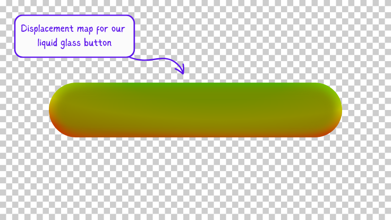
Designing the refraction map in Figma
The core of the refraction effect is feDisplacementMap. It warps pixels based on color channel values from a secondary image.
Key parameters:
in: Main source, oftenSourceGraphicor a blurred variantin2: Displacement map imagescale: Intensity of distortionxChannelSelector: Which channel (R, G, B, A) to use for horizontal displacementyChannelSelector: Which channel to use for vertical displacement
Color channels are interpreted in the range [0, 255]:
- Value
128is neutral (no displacement) - Values greater than
128shift pixels in a positive direction (right or down) - Values less than
128shift pixels in a negative direction (left or up)
To construct a usable displacement map:
- In Figma, create a rounded rectangle that matches your button dimensions (
BTN_WIDTH × BTN_HEIGHT). - Name it something like
Gradient bgand wrap it in a group calledDistortion. - Apply a radial gradient using red, green, and yellow. The exact colors and angle are up to you, but try to keep the central area closer to neutral and push more intense colors toward the edges.
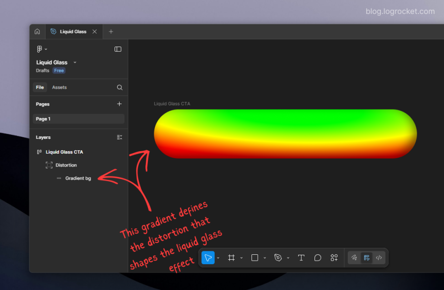
- On top of this gradient, add a stack of smaller rounded rectangles, each more blurred than the one above it, starting from a high blur value (for example, 32px) and decreasing as you go inward.
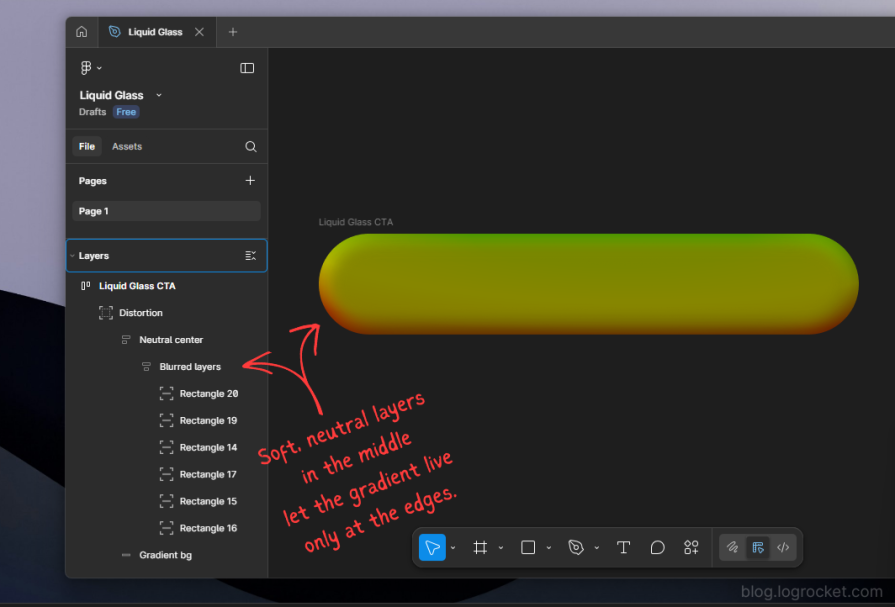
Export the entire Distortion group as a PNG. This asset becomes the displacement map, with a transparent background and a color gradient that encodes how pixels will warp:
If you are feeling lost, you can follow this Figma file, which contains all the graphical elements used in this effect.
Wiring the refraction filter in SVG
We now embed our SVG filter alongside the button component. We will:
- Blur the source graphic slightly
- Load the displacement map with
feImage - Apply
feDisplacementMapusing the blurred source and the map
function LiquidGlassBtn({
  children,
  ref,
  ...props
}: LiquidGlassBtnProps) {
  return (
    <>
      <button
        ref={ref}
        className="relative overflow-hidden shadow-lg w-full rounded-[--btn-radius]"
        style={{
          maxWidth: `${BTN_WIDTH}px`,
          minHeight: `${BTN_HEIGHT}px`,
        }}
        {...props}
      >
        {/* Filter layer */}
        <div className="absolute inset-0 backdrop-filter-[--btn-filters]" />

        {/* Content layer */}
        <div className="absolute inset-0 inline-flex items-center justify-center font-bold text-white bg-[--btn-content-bg]">
          {children}
        </div>
      </button>

      {/* Hidden SVG defining the liquid glass filter */}
      <svg style={{ display: "none" }}>
        <defs>
          <filter id="liquid-glass-button">
            {/* Slight blur of the source */}
            <feGaussianBlur
              in="SourceGraphic"
              stdDeviation="1"
              result="blurred_source"
            />

            {/* Displacement map image */}
            <feImage
              href="/path/to/displacement-map.png"
              x="0"
              y="0"
              width={BTN_WIDTH}
              height={BTN_HEIGHT}
              result="displacement_map"
            />

            {/* Apply displacement */}
            <feDisplacementMap
              in="blurred_source"
              in2="displacement_map"
              scale="55"
              xChannelSelector="R"
              yChannelSelector="G"
              result="displaced"
            />
          </filter>
        </defs>
      </svg>
    </>
  );
}
To apply this SVG filter as a backdrop filter, update your Tailwind theme:
@theme {
  /* Other settings... */

  --liquid-glass-filters: url(#liquid-glass-button) brightness(150%);
}
Then adjust the filter layer to use the new token:
<div className="absolute inset-0 backdrop-filter-[--liquid-glass-filters]" />
At this point, the button should start taking on a Liquid Glass character, especially when moved over complex backgrounds. You can see the refraction effect in action here:
See the Pen
Liquid Glass Refraction by Rahul (@c99rahul)
on CodePen.
Designing the reflection (specular rim) map
Refraction alone gives us edge distortion, but Liquid Glass is also defined by its reflective rim lighting.
To approximate this:
- In the same Figma file, create another rounded rectangle with the same dimensions.
- Remove the fill and add only a stroke, one or a few pixels wide.
- Give the stroke a gradient that corresponds to where you want light to appear strongest, such as brighter at the top-left and darker at the bottom-right.
- Reduce opacity to around 50 percent so it does not look harsh.
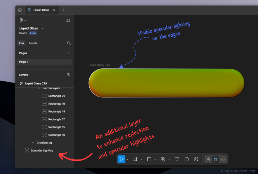
Export this as a PNG named something like specular.png. This image will be used as a mask that only affects the edges.
Applying reflection in the SVG filter
We extend the filter pipeline to include:
- A saturated version of the displaced result
- The specular rim image (
feImage) - A blur to soften the rim
- A composite to mask the saturated layer by the specular rim
- A blend to merge everything with the displaced layer
function LiquidGlassBtn({
  children,
  ref,
  ...props
}: LiquidGlassBtnProps) {
  return (
    <>
      <button
        ref={ref}
        className="relative overflow-hidden shadow-lg w-full rounded-[--btn-radius]"
        style={{
          maxWidth: `${BTN_WIDTH}px`,
          minHeight: `${BTN_HEIGHT}px`,
        }}
        {...props}
      >
        {/* Filter layer */}
        <div className="absolute inset-0 backdrop-filter-[--liquid-glass-filters]" />

        {/* Content layer */}
        <div className="absolute inset-0 inline-flex items-center justify-center font-bold text-white bg-[--btn-content-bg]">
          {children}
        </div>
      </button>

      <svg style={{ display: "none" }}>
        <defs>
          <filter id="liquid-glass-button">
            {/* Base blur */}
            <feGaussianBlur
              in="SourceGraphic"
              stdDeviation="1"
              result="blurred_source"
            />

            {/* Displacement map */}
            <feImage
              href="/path/to/displacement-map.png"
              x="0"
              y="0"
              width={BTN_WIDTH}
              height={BTN_HEIGHT}
              result="displacement_map"
            />

            {/* Refraction */}
            <feDisplacementMap
              in="blurred_source"
              in2="displacement_map"
              scale="55"
              xChannelSelector="R"
              yChannelSelector="G"
              result="displaced"
            />

            {/* Saturate the displaced layer */}
            <feColorMatrix
              in="displaced"
              type="saturate"
              values="50"
              result="displaced_saturated"
            />

            {/* Specular rim image */}
            <feImage
              href="/path/to/specular.png"
              x="0"
              y="0"
              width={BTN_WIDTH}
              height={BTN_HEIGHT}
              result="specular_layer"
            />

            {/* Soften the rim */}
            <feGaussianBlur
              in="specular_layer"
              stdDeviation="1"
              result="specular_layer_blurred"
            />

            {/* Mask saturated content by the blurred specular rim */}
            <feComposite
              in="displaced_saturated"
              in2="specular_layer_blurred"
              operator="in"
              result="specular_saturated"
            />

            {/* Final blend of refraction and reflection */}
            <feBlend
              in="specular_saturated"
              in2="displaced"
              mode="normal"
            />
          </filter>
        </defs>
      </svg>
    </>
  );
}
Summary of what is happening:
feImageandfeDisplacementMapcreate the warped background (refraction)feColorMatrixincreases saturation for a stronger visual impact- A second
feImageprovides the specular edge shape feGaussianBlursoftens the rim so it looks like glow rather than a hard linefeCompositeuses the rim as a mask on the saturated layerfeBlendmerges the specular layer with the displaced base
The result is a button that appears to be a piece of curved, glossy glass sitting on top of the page. You can see the full refraction plus reflection effect here:
See the Pen
Liquid Glass Refraction + Reflection by Rahul (@c99rahul)
on CodePen.
Designing Liquid Glass states and interactions
A static Liquid Glass button looks interesting, but state changes matter for usability. You can express hover, focus, and active states by slightly adjusting:
scaleinfeDisplacementMapfor more or less distortion- Blur radius via
stdDeviation - Overall brightness or saturation
- Button size or border radius
There are two common approaches:
- Pure SVG animations using
<animate>inside filter primitives - JavaScript-based animations, for example with GSAP, that animate CSS variables or inline styles and indirectly influence the filter
Because the filter graph is already fairly complex, many teams prefer using GSAP or similar libraries to keep timing and easing logic in one place while only mutating a handful of parameters, such as scale or a CSS custom property.
An implementation of animated Liquid Glass states with GSAP is shown in the following demo:
See the Pen
Animated Liquid Glass with GSAP by Rahul (@rahuldotdev)
on CodePen.
Existing Liquid Glass libraries
If you just need the aesthetic and do not care about customizing the underlying maps, you can reach for a library such as rdev’s Liquid Glass for React, which wraps similar ideas in a higher-level API for buttons and card components.
Tradeoffs include the following:
- Pros: Faster to integrate, minimal configuration, good for quick prototypes
- Cons: Less fine-grained control over refraction behavior, rim lighting, and edge detail
This tutorial focuses on the lower-level approach so you can tune the visuals to your brand and layout.
Performance and browser support
A key constraint when working with SVG and backdrop-filter is browser support and GPU behavior.
- Chromium-based browsers (Chrome, Edge, Brave, and others) currently support using SVG filters as inputs for
backdrop-filter. - Safari and Firefox do not support this combination yet. They rely heavily on GPU acceleration for
backdrop-filterand restrict it to built-in CSS filter functions to avoid instability and excessive GPU usage.
Implications include:
- Heavy use of SVG
backdrop-filtercan be expensive, especially on low-power devices. Each filter instance reserves GPU and compositing resources. - Applying complex SVG filters to large or many elements can lead to frame drops or visible jank on scroll.
- For production interfaces, you typically want to restrict Liquid Glass to a small number of floating UI elements such as toolbars, modals, navigation bars, and primary CTAs rather than the entire layout.
From a progressive enhancement perspective, it is useful to:
- Feature-detect support for the specific combination you rely on
- Provide a fallback style such as a static gradient, simple blur, or solid background for unsupported browsers
Accessibility considerations
Liquid Glass can be visually appealing but also risky if misused. To keep it accessible:
- Use it sparingly. Apply Liquid Glass to a small set of floating, high-value elements such as toolbars, navigation bars, or key CTAs. Avoid covering dense content regions or long forms.
- Prioritize legibility over aesthetics. Ensure text contrast remains high. A darker or more uniform base behind the glass often improves readability more than increasing blur.
- Avoid over-diversifying shapes and sizes. Each unique size ideally needs its own displacement and specular maps. Reusing a single map for many differently sized elements can create visual artifacts and makes maintenance harder.
- Be careful with dynamic sizing. Liquid Glass filters typically assume fixed dimensions such as
BTN_WIDTHandBTN_HEIGHT. Applying the same map to elements whose size changes constantly is difficult to manage and may break the visual illusion. - Account for browser diversity. If a significant portion of your audience is on Safari or Firefox, treat Liquid Glass as an enhancement rather than a core part of the UI.
- Preserve semantics for assistive technologies. Screen readers do not interpret visuals, so ensure all interactive elements still expose proper semantics and ARIA attributes. A button with heavy visual decoration must still be a semantic
<button>with appropriate labeling and roles.
Conclusion
In this guide, we decomposed Apple’s Liquid Glass UI into a set of composable web primitives:
- SVG filters such as
feGaussianBlur,feDisplacementMap,feImage,feColorMatrix,feComposite, andfeBlend - Tailwind CSS theme tokens and layered layout
- Figma-authored displacement and specular maps
We used these building blocks to implement a reusable Liquid Glass button in React, complete with refraction and reflection, and discussed how to animate it and integrate it responsibly into a production interface.
Liquid Glass is visually striking, but it comes with performance and accessibility costs. Restrict it to high-impact, limited surface areas, and always preserve readable content and semantic structure beneath the effect.
From here, you can:
- Extend the same patterns to cards, floating panels, or navigation bars
- Experiment with different map designs to create distinctive brand signatures
- Explore the UX implications of Liquid Glass and evaluate when it genuinely improves an interface versus when it is purely ornamental
The post How to create Liquid Glass effects with CSS and SVG appeared first on LogRocket Blog.
This post first appeared on Read More