
Designing better advanced search UIs: UX best practices
Search is the lifeline that enables efficient navigation in software products. The basic search that takes a single parameter — typically a search term — is usually sufficient for small-scale websites and apps to let users find what they seek, but how can you offer a better UX if your complex software product renders numerous data records?

To enable efficiency and precision for complex searching scenarios, we can allow users to refine their queries by implementing advanced search functionality with multiple search result filters.
Let’s learn how to create user-friendly, productive UIs with advanced search features.
Editor’s note — This blog was last updated on 14 April 2025 to include clearer definitions, practical UX guidelines, and modern examples to better help you build advanced search experiences. Whether you’re designing faceted filters for an ecommerce site or integrating query logic into a complex UI, this guide now includes updated best practices, more visuals, and a stronger focus on usability and accessibility.
What is advanced search?
Advanced search is a UI feature that allows users to refine the content they’re seeing by narrowing down the search criteria. A generic advanced search section uses filtering elements (i.e., tags, dropdown lists, multiple selectors) or implements the modern faceted filtering feature to let users narrow down search results based on various parameters.
A software product usually implements a primary minimal searching feature to set the searching context and then allows users to apply more filters via the advanced search section to filter elements based on attributes. For example, A hotel booking website usually filters hotels based on location first and then offers advanced filtering to refine the resultant hotels based on rates, stars, user rating, etc..
How advanced search UIs enhance UX
Having only a simple search box and category-based filtering with many data records often causes user frustration since they can’t quickly find information by narrowing down the results based on parameters they prefer to use. Advanced search UIs boost user productivity and increase overall user satisfaction with your product by letting them find information faster with optimal filters, e.g., users can construct the “brown or black leather wallets under $50” query with an advanced search UI in ecommerce apps in seconds.
Faceted filtering in advanced search UIs further improves user engagement and productivity by instantly updating results based on filter updates and showing the results count near facets (filter options).
When should you use advanced search?
Many interfaces rely on the advanced search functionality to empower their users to retrieve relevant results. Using an advanced search feature can be recommended if the search results satisfy the following criteria:
- The data source contains so many records, usually thousands, but the user is interested only in a specific record set
- Data records contain multiple common parameters/attributes that can be used for filtering
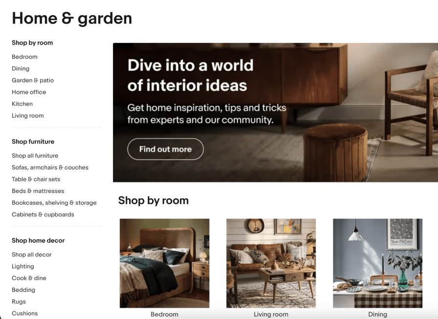
This feature is common on ecommerce sites, helping future customers to locate their desired products; job portals, assisting prospective applicants in finding suitable listings; educational platforms and learning management systems (LMS), enabling students to shortlist specific courses or resources; and much more.
Despite its widespread use, it’s worth noting that advanced search is a complex feature that places a lot of responsibility on the user. Even a well-designed experience can cause confusion, so a good rule of thumb is to implement advanced search only if the design scenario satisfies the above criteria.
Design considerations for advanced search UI
At the heart of this complex feature is a regular search bar, which is where the journey originates. All the general usability principles for search, such as predictive search or autocomplete, apply here.
But unlike the basic search, the real power of this advanced feature comes from the opportunity to define additional search parameters, so let’s dive in:
Where to display additional search parameters
The first decision you will need to make is whether to display or hide the filters by default. Each approach has pros and cons, as they often take up a sizable proportion of the screen real estate and risk distracting users from the main content, but they can easily be missed if their whereabouts aren’t obvious.
While the options for how to display the search parameters are only limited by the designer’s imagination, most modern-day interfaces use a variation of the following four patterns:
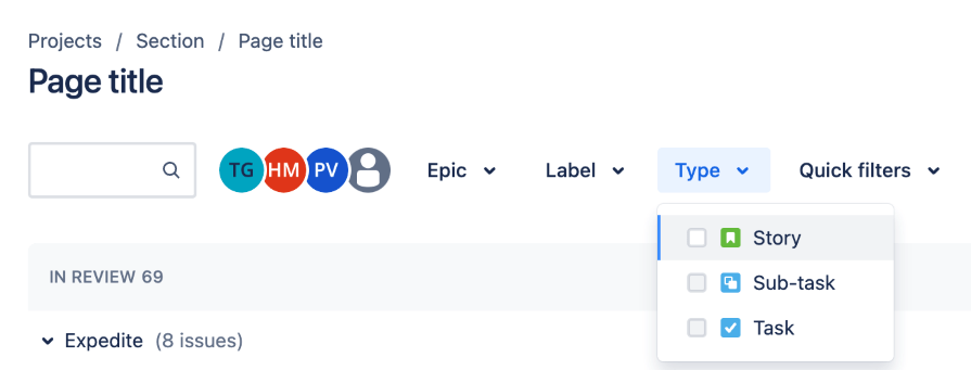
- Filters in a top bar — This solution is popular since it makes the filters instantly visible while taking up a minimum amount of space. It’s used by Jira and LinkedIn job listings pages:

Jira displays data filtering options after the search box to narrow down the results. 
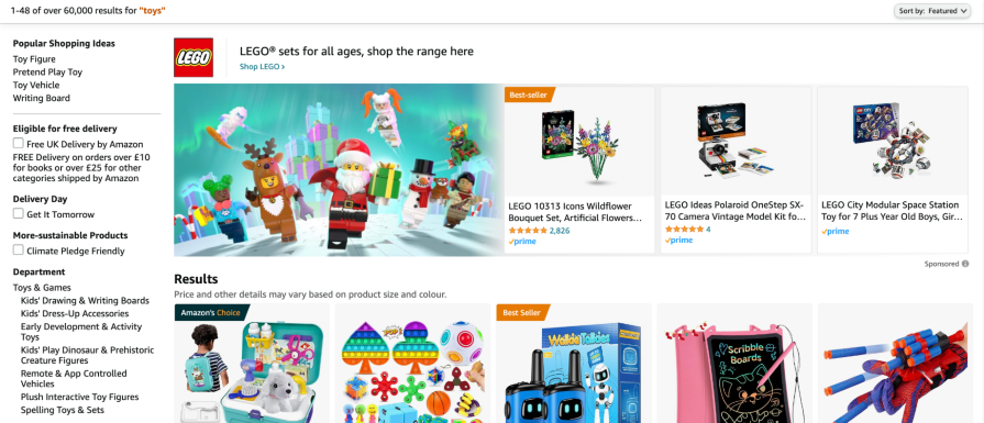
LinkedIn displays advanced search options in a long vertical section after the header. - Filters in a side panel — This option is favored by many ecommerce platforms like Amazon and eBay, since it enables users to immediately start refining their search results, increasing the chances of them quickly finding a product they are willing to buy:

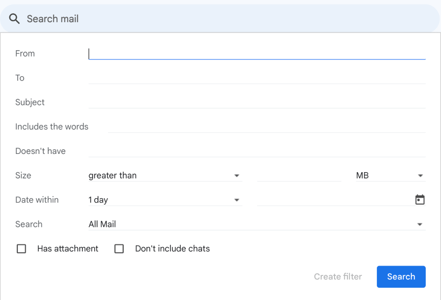
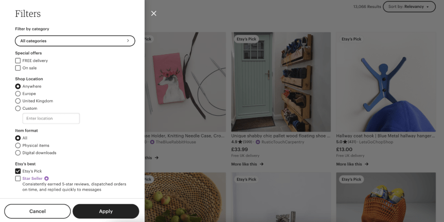
Amazon implements product filtering features on the left sidebar. - Expandable panel — In this approach, a panel typically anchored to the search bar expands to reveal additional filters. This is a great way to declutter the interface, but it often gets missed, can be confused with navigation, and has some major accessibility risks. It’s successfully used by many email providers, most notably Gmail:

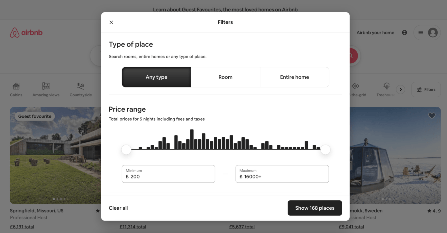
Gmail’s search box component opens advanced search options in an expandable panel. - Modal — Another space-saving alternative, this solution is used by platforms like Airbnb. Its main limitation is the lack of instant feedback and the increased risk of losing unsaved changes if the user accidentally clicks away from the modal:

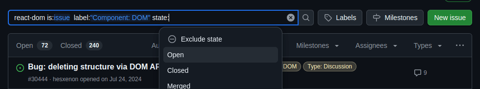
The Airbnb website displays advanced search options within a pop-up window with a primary action button. - Query syntax-based search — This advanced searching feature is implemented entirely inside the search box and requires no additional UI elements outside the primary search box. It allows users to define search parameters by applying specific syntax to the search term itself productively, but it relies on extensive prior knowledge and typically does very poorly when it comes to feedback and error prevention:

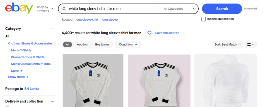
GitHub implements advanced search within the search box with a special query syntax. - Natural language search — This modern search trend also implements an advanced search feature within the primary search box, similar to the query syntax-based approach, but uses natural language for querying. Digital products implement natural language search, usually using text search algorithms and machine learning techniques to support natural language queries like “red trousers under $50,” “leather wallets with a metal badge,” etc., and display suggestions, related queries, and perform spelling correction for better UX:

eBay supports complex natural language search queries and displays related search queries.

What input format to use for different search parameters
Once you have settled on the overall placement of the search parameters, you will need to make a set of decisions about the most appropriate input format for each one of them. Again, the decision will consider the unique context of the interface you’re designing, but here are some of the most commonly used input formats:
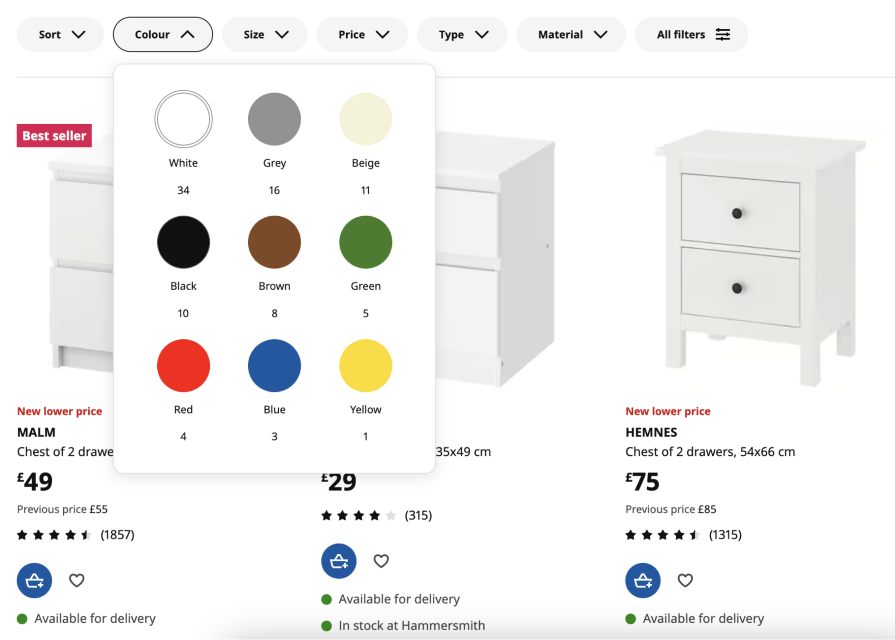
- Selectors — These can come in the form of dropdown menus, radio buttons, checkbox lists, date pickers, sliders, and so on, and allow users to select one or more values from a predefined list of options, such as category, type, size, etc. Consider listing the most common answers at the top. Otherwise, order the items alphabetically or in ascending order:

The Booking.com website displays filter options with suitable element ordering. 
The IKEA website displays well-ordered accessible selectors in a vertical section. It’s not uncommon to customize the default selectors, for example, by adding swatches to a color picker or icons to text labels. These visual cues can greatly aid usability, but make sure to follow accessibility guidelines and provide ARIA labels for all visual elements.
- Text fields — If the list of possible values is too large or infinite, like first name or city, the user must manually enter the value. To reduce the error rate, consider adding guidance on the format (for example, whether the field can take multiple values and what the correct syntax is for entering them) with placeholders, autocompletes, or masked input elements:

- Links — This solution is especially common on ecommerce platforms, where the content categories often mirror the site architecture. Instead of selectors, platforms like Amazon present content categories as links, allowing users to narrow down the search to a specific department:

eBay uses category links in the filtering region to offer quick navigation.
There is no rule defining the optimum number of search parameters, so strive for a balanced approach that offers enough control without overwhelming the user. Test this feature extensively to get the balance just right!
How to apply the search parameters
There are two options for applying the search parameters, each with its advantages and drawbacks:
- Dynamic filtering — The list of results gets updated every time the user interacts with the filters. This offers a great benefit of immediate feedback, which comes at a cost, since constantly reloading the results can significantly affect the search process if the user wishes to apply multiple filters quickly, e.g, choosing three colors to filter products. This approach is the fundamental design fact behind the faceted filtering in ecommerce solutions
- Batch filtering — The user adjusts and applies all the parameters in bulk. This usually offers a quicker and smoother experience with less context switching, but it’s much harder to “fine-tune” the filters without the feedback on how each of them affects the search results
As a compromise between the two solutions, consider grouping the search parameters into broader categories. This reduces the number of content reloads while offering the user intermittent feedback.
As a general rule of thumb, none of the filters should be applied when the user first engages with the search, allowing them to begin from the full list of results and narrow it down step by step based on their filtering preferences. There are some exceptions, for instance, when inactive or disabled items are hidden by default, but make sure that the user can easily see and undo this.
Best practices for displaying the search results
Once you implement your advanced search feature, carefully deciding the advanced search location, parameters, filter input formats, and behavior, you can display results in a user-friendly way based on the following best practices:
- Use a well-structured layout — Display results in a well-organized layout using row or grid layouts. Adhering to the Gestalt grouping principles is an effective way to create well-structured results pages
- Implement UI feedback — Feedback is crucial to interaction design (IxD). Let users know the loading state with loading animations or skeleton loading based on your design preferences
- Don’t overwhelm users with more results — Instantly displaying many items in the results page increases user cognitive load and affects rendering performance. Consider implementing pagination or modern infinite loading to display items on demand
- Display a summary — Depending on the layout and complexity of the search parameters, it’s a good practice to provide a summary alongside the list of results. For example, Most ecommerce platforms usually show the search query and all applied filters as tags above the search results. This feature allows the user to quickly review, edit, and clear the filters, as well as save them for future use
- Create a better no-results page — No results state is a search feature’s edge case that designers should carefully handle without reducing user engagement factors. Create an engaging no-results page with a clear heading, alternative actions, and show related items to continue using the product even if the user couldn’t find what they expected from an advanced filter setup
Examples of great advanced search UIs
Let’s evaluate well-designed advanced search UIs of several popular digital products to understand practical advanced search design aspects further:
Case study 1: Walmart
Walmart is the largest multinational supercenter chain in the world. The official Walmart website offers a productive, user-friendly online shopping experience for everyone with a well-designed UI. The website improves the product searching experience with a simple, faceted, advanced search feature within the left sidebar, as shown in the following preview:
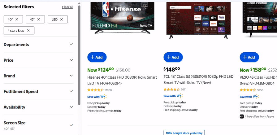
Here is how this advanced search UI offers a better UX:
- Displays filter options within expandable regions and displays only popular filter options first, also with a “Show More” option to implement a minimalistic advanced search UI
- Displays all selected filters as tags on top of the sidebar and lets the user remove specific ones instantly
- Shows a dynamically updated item count along with each filter option to let users get an idea about expected results before filtering items
- Let’s users quickly clear all filters or clear only the options of a single attribute filter with “Clear” and “Clear all” actions within expandable item headers
- Uses the modern skeleton loading animation with traditional pagination to render the updated results when the user updates filters
- Implements a compact version of the advanced search with mostly used product attributes before the results section, i.e., price, brand, and availability
Overall, Walmart implements a minimal, productive advanced search UI by effectively using expandable components.
Case study 2: Google Drive
Google Drive is a popular cloud file hosting and management solution. The Google Drive desktop website implements two advanced search UI components: a compact version in a vertical segment below the primary search box and a detailed advanced search form in a pop-up:
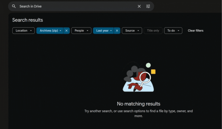
Drive implements a better advanced search experience for users with the following design facts:
Compact advanced search bar:
- Uses an innovative design element, a dropdown tag to let users select filter options and clear activated filters productively from one UI element
- Displays appropriate icons within dropdown items to boost the user’s visual perception
- Offers a quick action to clear all filters quickly and displays an illustration in the no-results section to fix the user’s mood
Detailed advanced search popup:
- Syncs filters accordingly with the compact advanced search component
- Implements a simple, two-column form with self-explanatory UI elements and labels to be consistent with the Drive’s design characteristics
- Selectors/dropdowns show simple, less-specific options first and offer an option at the end for specific selections, e.g., Date range filter first lists “anytime”, “today”, .., “last 30 days”, etc, and lists the “Custom” option at the end
- Describes each text field with placeholders and displays a link to documentation to learn more about the advanced search pop-up UI
Overall, the Drive desktop website offers a fully-featured but minimal advanced search by decomposing the whole advanced search feature into two advanced search components: a simple vertical filtering bar and a detailed pop-up.
Case study 3: Wayfair
Wayfair is a popular American ecommerce platform that lets users purchase household and furniture products. The Wayfair website implements a fully-featured, detailed, faceted-filtering-based advanced search sidebar to let users narrow down search results based on their exact requirements:
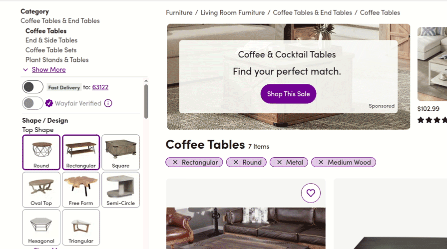
The website implements a somewhat complex but not overwhelming advanced search UI using the following techniques:
- Shows categories as links for quick navigation among preferred product categories
- Effectively uses imagery with product filtering options to let users access filter options easily, since the advanced search sidebar is somewhat complex
- Doesn’t show the available number of items within the filter options, but disables filter options if they lead to the no-results page
- Uses minimal summary content by showing category name, search results count, and active filters as tags
- Uses both skeleton loading and loading animations to indicate the loading state
- Strictly validates text inputs and implements action buttons near text-box-based range input groups (i.e., price, width, length, and height) to prevent unwanted data refresh
Overall, the Wayfair online store implements a detailed, fully-featured advanced search feature by managing complexity with various UI/UX design techniques.
Final thoughts on advanced search UI design
In this article, we learned how to design user-friendly, productive, and suitable advanced search UIs for your digital products by discussing theoretical design aspects and practical techniques with several case studies.
Understanding the context in which the search is performed is crucial for designing truly user-centric experiences. Modern interfaces can detect the user’s language and location, analyze their past behavior, and use natural language processing to gain insights into their intent in an attempt to provide more relevant search results. This personalized approach is often welcomed by users browsing social media, choosing a takeaway to order or a movie to watch, but it can be extremely problematic if applied to news media, financial services, healthcare, and so on.
Creating a user-centric advanced search UI based on the product domain and user base by carefully considering accessibility, usability, productivity, and user-friendliness is the best way to integrate a better advanced search for your product!
The post Designing better advanced search UIs: UX best practices appeared first on LogRocket Blog.
This post first appeared on Read More