Applying the UX honeycomb for a modern website
UX is more than good design. It’s how products create value for users. At its core, UX helps teams build products that are useful, usable, and meaningful — so users can accomplish what they need without frustration or friction.

The UX honeycomb is a foundational framework in product design. It breaks the user experience into seven key facets: useful, usable, desirable, findable, accessible, credible, and valuable. These principles act as a shared language for product teams, helping align design decisions with both user needs and business goals — whether you’re working on a website, an app, or a digital service.
In this article, I’ll break down the seven facets of the UX honeycomb and show how each one can guide better decision-making in product design.
Editor’s note — This post was updated on April 30, 2025, to include clearer definitions of the UX honeycomb’s seven facets and a more practical guide for applying the framework. We also added a comparison table and refreshed the tone for clarity.
What is the UX honeycomb?
The UX honeycomb is a foundational framework that outlines the key qualities that make a product or experience truly user-centered.
Developed by Peter Morville, president of Semantic Studios — a consultancy focused on information architecture and UX — the honeycomb helps designers think beyond just usability. Morville introduced the model to highlight the many overlapping dimensions of user experience and to give teams a shared language for evaluating product decisions.
7 facets of the UX honeycomb
The UX honeycomb framework consists of seven main components that should be factored into modern website designs:
- Useful — The design must serve a clear purpose, addressing the needs of the users and offering solutions to their problems
- Usable — The product must be easy to use, with intuitive navigation and interactions that require minimal effort from the user
- Desirable — The design should appeal to users emotionally, with engaging aesthetics and an enjoyable experience that resonates with their preferences
- Findable — Information must be easy to locate, ensuring users can quickly find what they’re looking for through clear structure and navigation
- Accessible — The product must be inclusive, ensuring all users, including those with disabilities, can access and use it effectively
- Credible — The design should build trust, with reliable information, professional presentation, and a sense of security in the product’s reliability
- Valuable — The product must provide value to the user, delivering a meaningful experience that meets both their needs and expectations
Designers can refer to these components as guiding principles to deliver a positive user experience. The UX honeycomb also surfaces the conversation of priorities.
Depending on the context, business objectives, and user needs, designers should identify which components of the framework are the highest priority and make necessary tradeoffs.
How the UX honeycomb components work together
While the UX honeycomb aims to achieve balance across its seven components, you should consider the relationships that each plays in your website’s design.
In theory, it would be great to optimize your website in all facets, but in reality, progress takes time. Stakeholders will have different opinions on what can be done and what should be done to improve the website.
Therefore, it is essential to collaborate to establish priorities and make informed trade-offs based on your business objectives and user needs. For example, a banking website might prioritize being credible over desirable, as trust could be a more significant factor to their business than visual appeal. If their users care more about having their personal data secure than the aesthetic of the website, then it makes sense to make that tradeoff.
Another example is the relationship between accessibility and usability. These two components are closely related, as one could argue that an inaccessible website is also unusable for many people. However, depending on the context, either component could be prioritized over the other.
A government website might put more emphasis on accessibility to avoid potential fines or lawsuits. On the other hand, an e-commerce website might prioritize usability to create a seamless checkout experience and optimize its conversion rate.
When designing a holistic experience for your website, it’s essential to consider each component of the UX honeycomb. However, it’s the relationships between them that elevate the user experience, as they influence and impact one another.
Examples of the UX honeycomb applied to modern websites
Now, let’s talk about what each of these components means in terms of UX design and some practical ways to apply each of them to your website:
1. Useful
When designing your website, ask yourself if it successfully meets the needs of your users. Your website should be useful and practical.
People visit websites for a specific reason, whether they are seeking information, entertainment, or to book a reservation. By addressing your users’ needs, solving their problems, or helping them achieve their goals, your website becomes a valuable resource for many people.
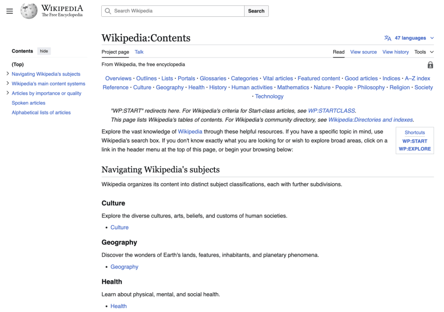
For example, Wikipedia offers a clear purpose in UX design — providing a digital library of knowledge that users can easily access to learn about any topic. The site is designed to ensure that users can quickly find accurate, well-organized information through search functionality, clear content layout, and an intuitive interface:
2. Usable
Your website should be easy to use. Users demand simple but effective interfaces that they don’t have to spend hours adjusting to. Imagine trying out a new mobile app where you have to jump through hoops to figure out how to use it — you’d probably delete that app within minutes. The same goes for websites.
Facebook’s website has continuously evolved its design over the years, making noticeable improvements to its profile page:
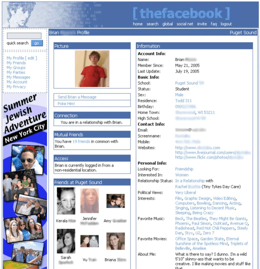
By decluttering the interface and incorporating a visual hierarchy into the design, the website’s usability has improved significantly, making it easier to locate content and navigate the site:

3. Desirable
Desirability comes down to understanding your users’ emotions. What makes a website desirable or attractive to users? It’s not enough to just design for your users’ needs, but to learn how your users feel and respond in different scenarios when using your website.
People are emotional by nature and will judge your website based on their first impressions, then while using it, and finally, after reflecting on it. These responses are the three levels of emotional design — visceral, behavioral, and reflective.
Creating a customer journey map can help you understand your users’ emotions throughout each stage of their journey while using your website. This can be used to identify user frustrations and gaps in your website’s current experience that can be improved. Designers can reference journey maps to help make design decisions that cater to their users’ emotional responses.
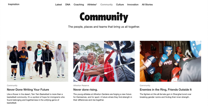
For instance, Nike’s website utilizes the power of storytelling to evoke emotions in its users. From its striking images to its captivating stories, Nike knows how to hook its users and inspire them, regardless of their athletic abilities:
4. Findable
Your website’s content should be easy to navigate. Users shouldn’t have to bend over backward to find the content that they’re looking for.
This means creating your website with an information architecture (IA) that aligns with your users’ mental models. A good method to understand this is by conducting a card sorting activity that reveals how users categorize groups of content.
This component also covers implementing a navigation system that enables discoverability, such as incorporating a prominent search function and menus that align with your users’ expectations. These systems make it easy for users to find what they’re looking for and prevent them from getting lost, frustrated, and abandoning your website.
For example, Costco’s navigation system breaks down its website’s content into several main categories, which are laid out in a primary navigation menu across the top. Each category menu opens into a secondary menu, further breaking down into subcategories, which helps narrow down users’ searches into more specific pages:

5. Accessible
Everyone should be able to use your website, regardless of their abilities or disabilities. Accessibility is about creating fair and equal access to the same experiences for everyone. Disabilities can be:
- Permanent, like deafness or blindness
- Temporary, like a broken arm or a concussion, or
- Situational, like being in a loud environment or a dark room
Taking the step to make your website accessible not only expands the size of your potential user group but also enhances the experience for existing users.
HubSpot’s website features a high-contrast toggle switch in its header to accommodate individuals with low vision or visual impairments:

When switched on, the orange color used for its primary and secondary buttons changes to a vibrant blue, enhancing the color contrast for these important calls to action and making them more noticeable to users.
6. Credible
How can you make your website seem trusted? Users are more likely to bounce from your website if it doesn’t seem reliable or secure. Trust fosters loyalty, which is essential in building a large user base.
Visual aesthetics tend to lend themselves to credibility, as users inherently believe that attractive interfaces are more usable. This is known as the Aesthetic-Usability Effect and can help a website seem more trusted.
Users also tend to use products or services that others have vetted. This can be demonstrated through testimonials or reviews. Hearing positive opinions from others or being endorsed by a celebrity can boost the credibility of your website to otherwise skeptical users.
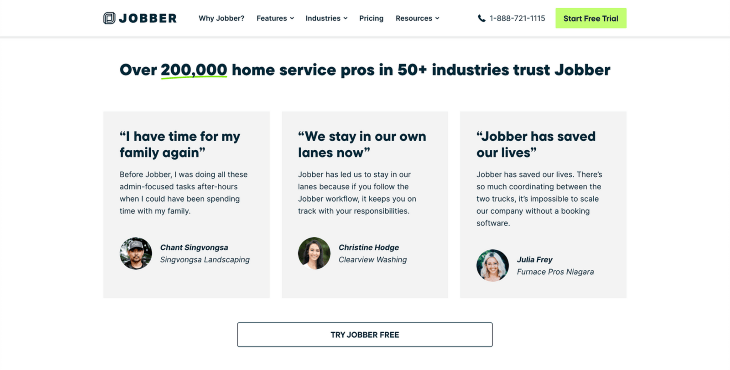
Field service management app Jobber boasts its credentials on its website, including the number of home service professionals and industries that use and trust its services:
7. Valuable
Your website should ultimately create value for your users and your business. Think about what your value proposition is. What makes your website unique and why should users use it? Perhaps it helps users find specific information about a topic or saves them time completing a task.
Focus on the benefits you can provide rather than the features you can develop. This way, your website will create value by addressing a user’s needs or solving a problem. The bigger the problem you aim to solve, the higher your chances are of attracting more users.
Shopify’s website effectively communicates the benefits that users can expect from using their solutions, including generating new leads, engaging with customers, and gaining valuable customer insights:

When to use the UX honeycomb
The UX honeycomb is super helpful at various points in the design process. It works great during discovery, design critiques, and heuristic reviews, helping you ensure that all key aspects of the user experience are covered. Here’s how it can come into play:
- Discovery — At the start of a project, the UX honeycomb helps your team understand user needs and goals. It’s a solid checklist to make sure you’re considering all the important aspects of the experience, from accessibility to usability
- Design critiques — When reviewing designs, the honeycomb gives you a clear way to check if you’re hitting all the right notes — usefulness, accessibility, desirability, and more. It helps pinpoint areas that could use some love or adjustments
- Heuristic reviews — The honeycomb can also guide you during heuristic reviews. It’s a handy tool for identifying usability issues or gaps in the user journey, ensuring the design is functional, engaging, and easy to use
- Evaluating and improving website performance — As part of the ongoing, iterative nature of design, the honeycomb framework helps you evaluate your website’s performance over time. By gathering both qualitative and quantitative data through user interviews and analytics, you can identify which components of the user experience need improvement. For example, if users express frustration with navigation (findability) or if analytics show a high cart abandonment rate (indicating usability issues), the honeycomb can help you focus on improving those specific areas, ensuring you make informed design decisions that enhance the overall experience
How it complements other UX frameworks
The UX honeycomb works well alongside other popular frameworks, like Nielsen’s heuristics and design thinking:
- Nielsen heuristics — While Nielsen’s heuristics are focused on core usability principles, the UX honeycomb broadens the picture. It adds things like desirability, credibility, and value, making sure you’re not just checking the functional boxes but also delivering a great emotional experience
- Design thinking — The honeycomb also complements design thinking, which revolves around empathy, ideation, and prototyping. Where design thinking aids the creative process, the UX honeycomb offers a strategic framework to ensure the end result meets both user needs and business goals
Comparison with other models
There are several frameworks out there to help guide great UX — but each brings something different to the table.
The UX honeycomb stands out for its holistic view of user experience, but how does it compare to other popular models like Nielsen’s heuristics or the double diamond? Here’s a quick breakdown to help you see how they align and differ:
| Model | Focus | How it relates to UX honeycomb |
| User-centered design (UCD) | Focuses on iteration, testing, and gathering user feedback to enhance design | UX honeycomb ensures that you’re addressing both the functional and emotional aspects of the user experience, while UCD emphasizes user feedback loops and iterative development. The honeycomb provides a more holistic framework to guide design decisions |
| Double diamond | Focuses on problem exploration and solution definition, utilizing both divergent and convergent thinking | The double diamond shares a similar focus on discovering and defining user needs, but the honeycomb adds depth by covering emotional, functional, and accessibility facets of UX |
FAQs about the UX honeycomb
What is the UX honeycomb?
The UX honeycomb is a framework that outlines seven key facets of a positive user experience. It helps designers ensure digital products are usable, useful, and valuable to users.
Who created the UX honeycomb model?
The model was created by Peter Morville, a pioneer in the field of information architecture and user experience design.
What are the 7 facets of the UX honeycomb?
The seven facets are: Useful, Usable, Desirable, Findable, Accessible, Credible, and Valuable.
How is the UX honeycomb used in design?
Designers use the honeycomb as a checklist or evaluation tool during various design phases — like research, wireframing, and critiques — to make sure all essential aspects of the user experience are addressed.
Is the UX honeycomb still relevant today?
Yes, the UX honeycomb remains highly relevant. It provides a timeless, user-centered lens that complements modern design practices and frameworks, such as design thinking and usability heuristics.
Conclusion
The UX honeycomb framework is a valuable tool for communicating the different components that shape a holistic user experience. While each facet contributes something unique, they’re deeply interconnected — strengthening or weakening each other depending on how they’re applied.
By collaborating with cross-functional team members and utilizing this framework as a guide, designers can more effectively prioritize user experience throughout the entire website journey. When we ground our design decisions in real user needs, goals, and pain points, we’re more likely to create experiences that are not just functional — but meaningful.
Quick recap – the 7 facets of the UX honeycomb:
- Useful — meets a real user need or solves a specific problem
- Usable — easy to use and navigate without confusion
- Desirable — visually and emotionally engaging
- Findable — content and features are easy to locate
- Accessible — inclusive of people with diverse abilities
- Credible — trustworthy, reliable, and consistent
- Valuable — delivers benefit to both users and the business
By keeping these principles top of mind, you’ll be better equipped to build website experiences that users genuinely appreciate — and keep coming back to.
The post Applying the UX honeycomb for a modern website appeared first on LogRocket Blog.
This post first appeared on Read More