
Using CSS breakpoints for fluid, future-proof layouts
Building websites that deliver a seamless experience across diverse devices is a core challenge in modern web development. CSS breakpoints address this by defining specific viewport widths where layouts adjust dynamically to accommodate different screen sizes. Leveraging breakpoints in responsive design allows developers to tailor UI components and styles efficiently, ensuring optimal usability and performance regardless of device or resolution.
So, what is the modern breakpoint for responsive CSS? Instead of targeting fixed device widths, modern breakpoints focus on content-driven thresholds — points where the layout needs adjustment. Combined with fluid layouts and new CSS features like container queries, this approach creates more flexible, future-proof designs.
In this blog, we’ll cover the evolution of responsive design — from media queries and classic breakpoints to modern CSS features like Grid, container queries, and fluid breakpoints. I’ll show you how to choose breakpoints smartly and build flexible, future-ready layouts.
Editor’s note: The current update to the post, made in June 2025, clarifies key concepts more clearly, and includes a table of common breakpoints from popular frameworks. We’ve also covered modern best practices like fluid breakpoints, foldable phones, and large tablets. The previous update, by Shalitha Suranga in May 2024, added responsive breakpoint testing, practical examples for creating breakpoints, and refreshed outdated information.
TL;DR: Quick definitions
-
CSS breakpoints — Specific viewport widths where a website’s layout changes to improve usability on different devices
-
Viewport — The visible area of a webpage on a device screen
-
Responsive design — A design approach that makes web layouts adapt smoothly to various screen sizes and resolutions
-
Media queries — CSS rules that apply styles based on device characteristics like screen width
-
Content-driven breakpoints — Breakpoints chosen based on where the design or content needs to adjust, not just device sizes
-
Container queries — A modern CSS feature that allows styles to adapt based on the size of a container element, enabling more granular responsiveness
-
Fluid layouts — Layouts that scale smoothly across screen sizes, often using relative units like percentages or
reminstead of fixed pixels -
Clamp() — A CSS function that sets a value within a defined range, useful for scalable typography and spacing
The basics of responsive design
HTML is inherently somewhat responsive — when you resize a browser window, the text adjusts to fit the viewport. However, this basic responsiveness isn’t enough to ensure a polished experience across all devices.
For instance, very long lines can strain readability on wide screens, while adding margins or columns to fix this can cause content to feel cramped on smaller devices. To address these challenges, designers need to adapt styles thoughtfully based on screen size and content layout.
Before the rise of responsive design, developers often created separate website versions for desktop and mobile, increasing complexity and maintenance overhead.
The term “responsive design”, coined by Ethan Marcotte in 2010, introduced a flexible approach using fluid grids, scalable images, and media queries — CSS rules that adjust styles based on viewport characteristics. Initially, this involved using floats for layouts and media queries to target specific screen widths known as breakpoints.
A breakpoint is a designated viewport width where a site’s layout shifts to optimize usability. Common breakpoints, like 768px, differentiate tablet from desktop layouts. Frameworks such as Bootstrap gained popularity by providing grid systems with predefined breakpoints, streamlining responsive development.
While most frameworks rely on widely accepted breakpoint ranges to maintain consistency and speed up development, they also allow you to define fully custom breakpoints tailored to your unique content and design goals.
What are the most common CSS breakpoints?
| Size | Screen width range (px) | Common breakpoint width (px) | Notes |
|---|---|---|---|
| Small (sm) | 576px and up | 576 | Designed for mobile phones and small devices |
| Medium (md) | 768px and up | 768 | Targets tablets and smaller laptops |
| Large (lg) | 992px and up | 992 | Used for laptops and small desktop screens |
| Extra large (xl) | 1200px and up | 1200 | Intended for large desktop monitors and TVs |
These breakpoints serve as a starting point — not hard rules. With modern CSS tools and techniques, you can define breakpoints that respond to your actual content, not just the screen width.
Modern CSS for modern devices
Modern CSS capabilities like Flexbox and Grid inherently support responsiveness, reducing reliance on rigid breakpoints. Additionally, newer features — including the clamp() function for scalable typography, container queries for component-based responsiveness, and logical properties for language-aware spacing — offer more dynamic control.
This evolution in tooling also mirrors a shift in design mindset. With the rise of foldable phones, ultra-wide monitors, and large tablets like newer iPads, fixed pixel-based breakpoints are starting to feel limiting. Many designers now favor a more fluid approach — setting breakpoints where the layout needs to adapt, not where a device dictates. This content-driven strategy is more flexible, resilient, and better suited to an ever-expanding device landscape.
While CSS continues to evolve, media query breakpoints remain foundational and accessible for implementing responsive designs.
Before diving deeper into breakpoints, let’s first explore how media queries work.
What are media queries?
Media queries are useful when you want to modify the layout or appearance of your site depending on specific system or browser characteristics such as the screen resolution of the device or the browser viewport width/height.
A media query definition is composed of four segments:
- The
@mediaat-rule that defines a media query - An optional media type defines a broad category of devices to which the media query applies:
all,print, orscreen. This type is optional; it is assumed to beallif omitted. Logical type operators,onlyandnot, are supported before the media type - Any number of media features describing a specific characteristic of the user agent, output device, or environment. Examples are:
hover,prefers-reduced-motion, andwidth - Media query operators (
and,or, andnot) that connect media query features to build up media query expressions
The common syntax for a CSS media query is as follows:
@media <type> <operator> (feature) <operator> (feature) {
  /* CSS rules */
}
The logical operators not, and, only, and or can be used to compose a complex media query.
For responsive design, min-width and max-width are the most commonly used media features. They help web designers create responsive breakpoints based on specific width ranges of the viewport. For example, the following CSS code will apply styles only if the browser’s viewport width is equal to or less than 80em:
@media (max-width: 80em) {
  /* CSS rules */
}
You can also use height (height, min-height, and max-height), aspect-ratio, resolution, and orientation in media feature expressions to deal with the viewport’s dimensions and different aspects of the screen.
The Media Queries Level 4 specification includes some syntax improvements to make media features that have a less verbose “range” type, e.g., width. With this syntax improvement, our previous max-width example could be written like so:
@media (width <= 80em) {
  /* CSS rules *
}
The above syntax works on all popular browser versions released after 2023. See full browser support details for the media query range syntax here.
Basic media query examples
You’ve seen how media queries can be structured and some syntax variations that modern browsers support. Now, let’s look at a simple, practical example of a media query in action — this will help you visualize how CSS changes based on viewport size:
 /* Basic media query example */
@media (max-width: 600px) {
body {
background-color: lightblue;
}
}
In this example, when the viewport width is 600 pixels or less, the background color of the page changes to light blue.
Next, here’s a more detailed example showing how you can set different styles for mobile, tablet, and desktop using common breakpoint ranges:
 /* Example breakpoints for mobile, tablet, and desktop */
@media (max-width: 600px) {
/* Mobile styles */
body {
font-size: 14px;
}
}

@media (min-width: 601px) and (max-width: 900px) {
/* Tablet styles */
body {
font-size: 16px;
}
}

@media (min-width: 901px) {
/* Desktop styles */
body {
font-size: 18px;
}
}
Using media queries like these is a fundamental step in making your website responsive and ensuring a great user experience across devices.
How do you decide on responsive breakpoints?
As we defined earlier, a breakpoint is the point at which a webpage’s style is adapted in a particular way to provide the best user experience.
There are two broad approaches when choosing CSS breakpoints: one is based on devices and the other is based on content. Let’s take a look.
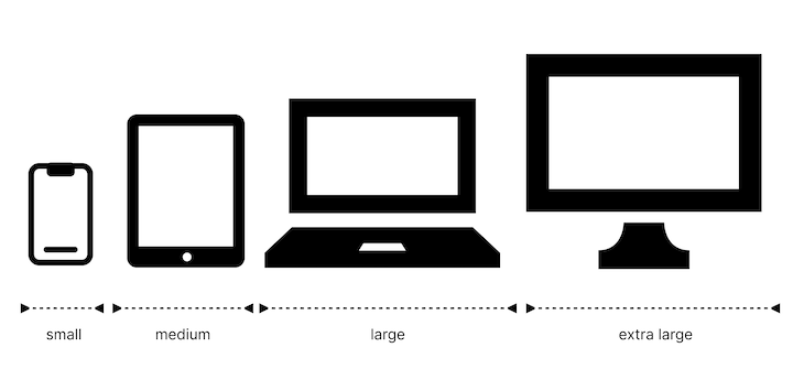
Breakpoints based on devices
You can target and produce a different design for specific screen sizes. A design may work across multiple screen sizes, but, the content may be narrower when less space is available.
With the breadth and variety of devices available, determining breakpoints based on screen sizes is challenging. This approach is really not feasible to maintain:
To simplify this approach, web designers tend to loosely group devices based on a range of sizes. It’s up to you to choose the groupings and specific breakpoints. The most common way is to group devices based on form factor (e.g., mobile devices, tablets, laptops, etc.):
Here is some data you could use to arrive at this decision:
- Worldwide stats for the most common screen resolutions
- Data analytics from your website
- Breakpoints selected by CSS frameworks (we’ll discuss this further in the next section). For example, the popular Bootstrap CSS framework classifies all available screen sizes into six device classes
There is no strict rule or standard to define responsive breakpoints because there are so many different screen sizes. Creating more device breakpoints offers the best results but it increases web design time and delays product delivery. On the other hand, creating fewer breakpoints boosts responsive design time but generates fewer layout variations affecting usability. So, selecting breakpoints based on your design and team preference is undoubtedly a good idea.
Let’s check several common breakpoints that most websites nowadays use. The following CSS snippet uses four breakpoints with a mobile-first design strategy (the default style is for the smallest screen group):
/* Default: Extra-small devices such as small phones (less than 640px) */

/* Small devices such as large phones (640px and up) */
@media only screen and (min-width: 640px) {...}

/* Medium devices such as tablets (768px and up) */
@media only screen and (min-width: 768px) {...}

/* Large devices such as laptops (1024px and up) */
@media only screen and (min-width: 1024px) {...}

/* Largest devices such as desktops (1280px and up) */
@media only screen and (min-width: 1280px) {...}
Here is another example CSS snippet that only defines two breakpoints with a desktop-first design strategy (the default style is for the largest screen group):
/* Default: Large devices such as laptops, computers (greater than 1024px) *

/* Medium devices such as tablets (1024px or lesser) */
@media only screen and (max-width: 1024px) {...}

/* Small devices such as phones (768px or lesser) */
@media only screen and (max-width: 768px) {...}
Now, let’s create a simple responsive login form that uses the above breakpoints setup:
<!DOCTYPE html>
<html lang="en">
  <head>
    <meta charset="UTF-8" />
    <meta name="viewport" content="width=device-width, initial-scale=1.0" />
    <meta http-equiv="X-UA-Compatible" content="ie=edge" />
    <title>Responsive design breakpoints example</title>
    <style>
      * {
        margin: 0;
        padding: 0;
        box-sizing: border-box;
      }
      .form-box {
        display: flex;
        justify-content: flex-end;
        gap: 8px;
        padding: 8px;
        background-color: #333;
        text-align: center;
      }
      .form-box input,
      .form-box button {
        padding: 8px;
        margin-right: 4px;
        font-size: 14px;
      }
      .form-box input {
        outline: none;
        border: none;
      }
      .form-box button {
        border: none;
        background-color: #edae39;
      }

      @media only screen and (max-width: 1024px) {
        .form-box input,
        .form-box button {
          display: block;
          width: 100%;
          font-size: 16px;
        }
      }

      @media only screen and (max-width: 768px) {
        .form-box {
          flex-direction: column;
        }
        .form-box input,
        .form-box button {
          display: block;
          width: 100%;
          font-size: 20px;
        }
      }
    </style>
  </head>

  <body>
    <div class="form-box">
      <input type="text" value="Username" />
      <input type="password" value="Password" />
      <button>Login</button>
    </div>
  </body>
</html>
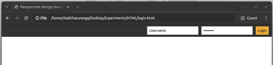
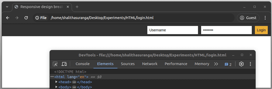
The above code snippet renders a responsive login section for desktop, tablet, and mobile screens, as shown in this preview:
Breakpoints based on content
This next approach is based on changing the design at the point where the content starts to break in some way. If the line lengths become too long, or if a section becomes too squashed, that’s where you need to consider changing the style. In other words, that’s the point where you want to use a media query or container query to change the design.
The responsive mode in browser developer tools (Responsive Design Mode in Firefox DevTools and Device Mode in Chrome DevTools) is very useful for working out where your breakpoints should go. You can easily make the viewport smaller or larger to see where the content style could be improved.
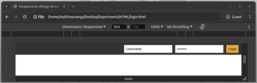
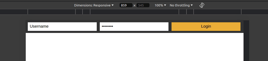
Remove all media query segments of the sample HTML code that I used to demonstrate device breakpoints. Open it in your web browser, open developer tools, and activate the responsive design mode. Next, start increasing/decreasing the page width to identify possible breakpoints, as shown in the following preview:
Here, the login form is not correctly getting rendered when the width is less than 486px, so we can create a breakpoint with a 458px pixel value (because we use max-width) as follows to improve responsiveness:
@media only screen and (max-width: 485px) {
  .form-box {
    flex-direction: column;
  }
  .form-box input,
  .form-box button {
    display: block;
    width: 100%;
  }
}
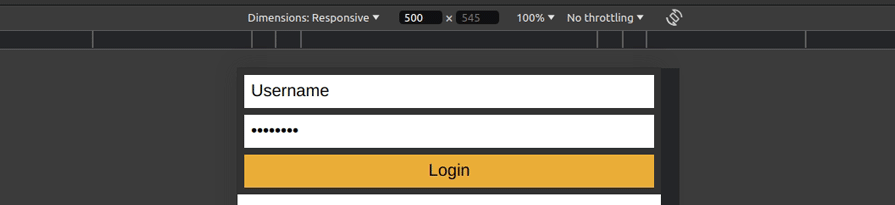
The above custom breakpoint makes the login form look better on small screen sizes, as demonstrated in the following preview:
You can also use CSS container queries to implement these responsive features.
Which approach should you follow?
There’s no one-size-fits-all answer here. Instead of locking yourself into device-specific breakpoints, focus on how your content uses the available space.
Media queries will still matter — especially for viewport-dependent elements like navigation and footers — but their role is shrinking. Meanwhile, container queries let your content adapt fluidly to its container, making layouts more flexible and resilient.
Having a defined set of breakpoints can help you debug and maintain your design, whether you choose standard ones or create them through interface testing. But don’t feel obligated to tweak styles at every breakpoint — aim for minimal adjustments and let your content do the heavy lifting.
What breakpoints do popular CSS frameworks use?
We can design websites by wrapping styles with device or custom breakpoints, as we discussed in previous practical examples. Also, we can create our own column-based layout system (also known as a responsive grid system) by developing several utility classes. However, most modern web designers now prefer using CSS frameworks and skip writing CSS breakpoints themselves.
Every CSS framework typically offers a row-column-based layout by offering two pre-developed CSS class types:
- A class to define a row, i.e.,
row - Several classes to define columns for various screen groups based on a pre-defined number of columns, i.e.,
column-mobile-1(1/12 of row width only on mobile screens),column-desktop-6(6/12 of row width on desktop screens)
For example, the following HTML snippet renders a 25%-width column on desktop screens, a 50%-width column on tablet screens, and a 100%-width column on mobile screens:
<div class="row">
  <div class="column-desktop-3 column-tablet-2 column-mobile-12"></div>
</div>
Most CSS frameworks follow this 12-column responsive layout with device breakpoints with various CSS class names. i.e., Bootstrap column classes are like col-md-12, col-sm-4, col-lg-3, etc.
According to the State of CSS 2023 survey, the most popular CSS frameworks (ordered in terms of usage) are:
- Bootstrap
- Tailwind CSS
- Materialize CSS
- Foundation
- Ant Design
- Bulma
- PureCSS
- Semantic UI
- UIKit
- Open Props
Let’s look at the responsive device breakpoints of these popular CSS frameworks.
You can see the default breakpoints for Bootstrap below:
| Breakpoint identifier | Media query | Minimum width breakpoint |
|---|---|---|
| None (default/smallest) | N/A | < 576px |
sm |
@media (min-width: 576px) |
≥ 576px |
md |
@media (min-width: 768px) |
≥ 768px |
lg |
@media (min-width: 992px) |
≥ 992px |
xl |
@media (min-width: 1200px) |
≥ 1200px |
xxl |
@media (min-width: 1400px) |
≥ 1400px |
Tailwind has five default breakpoints that are inspired by common device resolutions:
| Breakpoint identifier | Media query | Minimum width breakpoint |
|---|---|---|
| None (default/smallest) | N/A | < 640px |
sm |
@media (min-width: 640px) |
≥ 640px |
md |
@media (min-width: 768px) |
≥ 768px |
lg |
@media (min-width: 1024px) |
≥ 1024px |
xl |
@media (min-width: 1280px) |
≥ 1280px |
2xl |
@media (min-width: 1536px) |
≥ 1536px |
Here’s a summary of breakpoints for some of the other popular CSS frameworks:
| CSS framework | Breakpoints |
|---|---|
| Materialize CSS | <600px, ≥600px, ≥992px, and ≥1200px |
| Foundation | <640px, ≥640px, ≥1024px |
| Ant Design | <576px, ≥576px, ≥768px, ≥992px, ≥1200px, and ≥1600px |
| Bulma | <769px, ≥769px, ≥1024px, ≥1216px, and ≥1408px |
| Pure CSS | <568px, ≥568px, ≥768px, ≥1024px, ≥1280px, ≥1920px, ≥2560px, and ≥3840px |
| Semantic UI | <768px, ≥768px, ≥992px, ≥1400px, ≥1920px |
| UIKit | <480px, ≥480px, ≥768px, ≥960px, ≥1200px |
| Open Props | <240px, ≥240px, ≥360px, ≥480px, ≥768px, ≥1024px, ≥1440px, and ≥1920px |
A few CSS frameworks offer breakpoints for very small devices like smartwatches and several frameworks motivate designers to implement dynamic layouts for huge screens by offering high breakpoint width values. Overall, every framework generally motivates designers to implement different layouts for mobiles, tablets, and desktop screens.
Best practices for creating CSS breakpoints
When designing responsive layouts, choosing the right breakpoints isn’t just about following popular device sizes — it’s about finding what works best for your content and user base. Here are some best practices to guide you:
- Choose a breakpoint strategy that fits your content — Don’t default to device-based breakpoints just because everyone else is doing it. Instead, study your layout and consider where the design naturally needs to adapt. Content-based breakpoints often lead to cleaner, more flexible designs — and they can boost your team’s productivity
- Start with a mobile-first approach — Around half of all web traffic comes from mobile devices, so it makes sense to design for small screens first. Starting with mobile forces you to focus on the essentials and solve layout constraints early. Once your mobile layout works well, scale up for tablets and desktops. (That said, if your workflow benefits more from a desktop-first approach, that’s okay too — pick what suits your team best)
- Avoid awkward breakpoint ranges — Breakpoints that are too broad can cause layout issues on common devices. For example, many frameworks set 768px as the starting point for tablets because of the original iPad’s resolution (768×1024px). Avoid setting breakpoints that land in between widely-used screen sizes unless you have a good reason. Use framework defaults as a guide or research real device data if you’re unsure
- Use media and container queries wisely — Media queries are perfect for adjusting your layout based on the overall viewport size. Container queries, on the other hand, let components adapt based on their own size — great for modular, component-based design systems. You don’t have to choose one over the other — combining both gives you more flexibility and control
Testing responsive breakpoints
In the past, web designers typically tested responsive breakpoints just by resizing the browser window. Now, every popular browser offers an inbuilt responsive testing mode, and cloud-based website testing tools let developers use real devices for testing responsive websites. Moreover, designers nowadays can use simulators/emulators if they target specific devices. Most designers use the built-in browser responsive mode for testing responsive breakpoints.
Chrome DevTools offers the device mode feature that simulates device resolution, device orientation, and user agent string with various pre-defined device profiles. It also offers a way to simulate slow devices by throttling CPU and network speeds. Let’s check how to test responsive breakpoints with Chrome’s design mode.
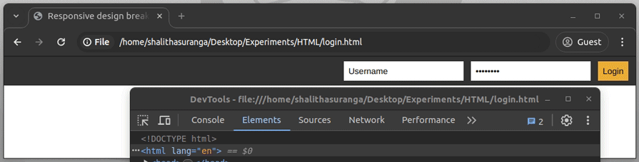
First, open a webpage that has responsive breakpoints. For this demonstration, I’ll use the sample login form we used previously to demonstrate device breakpoints. Next, open the Chrome device mode as follows:
Make sure the dimensions select box has the responsive option selected. Enter each breakpoint value and check whether the layout renders as expected by also increasing and decreasing the screen width as follows:
You can also do this testing by resizing the responsive screen container width, using inbuilt breakpoint templates, or selecting a device profile, as shown in the following preview:
Firefox offers Responsive Design Mode to test CSS responsive breakpoints. Some cloud apps like BrowserStack offer web-based responsive testing with real devices.
Do you really need breakpoints?
Some emerging techniques allow elements to scale proportionally and fluidly without using breakpoints. Sometimes this is referred to as fluid design.
Many fluid design techniques use mathematical functions available in CSS, such as clamp(), min(), and max(), along with dynamic units based on the viewport, such as vh and vw, to create expressions that will scale elements. If you would like to learn more about this, here’s an article on flexible layouts without media queries.
One systematic approach to fluid design is Utopia. Utopia advocates for designers and developers to share a systematic approach to fluidity in responsive design. Instead of designing for any particular number of arbitrary breakpoints, you design a system within which elements scale proportionally and fluidly. This can help you to:
- Design and code minimally and elegantly
- Streamline collaboration between design and development roles
- Ensure visual harmony and consistency
Utopia is like a fancy calculator that will spit out some CSS. Just input some dimensions and a preferred scale to determine the range of values.
For example, this is how the fluid space calculator looks:
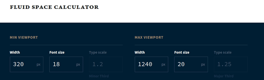
If you use clamp() in Utopia’s calculator, it will generate the following CSS snippet:
/* @link https://utopia.fyi/space/calculator?c=320,18,1.2,1240,20,1.25,5,2,&s=0.75|0.5,1.5|2|3|4|6,s-l&g=s,l,xl,12 */

:root {
  --space-2xs: clamp(0.5625rem, 0.5408rem + 0.1087vi, 0.625rem);
  --space-xs: clamp(0.875rem, 0.8533rem + 0.1087vi, 0.9375rem);
  --space-s: clamp(1.125rem, 1.0815rem + 0.2174vi, 1.25rem);
  --space-m: clamp(1.6875rem, 1.6223rem + 0.3261vi, 1.875rem);
  --space-l: clamp(2.25rem, 2.163rem + 0.4348vi, 2.5rem);
  --space-xl: clamp(3.375rem, 3.2446rem + 0.6522vi, 3.75rem);
  --space-2xl: clamp(4.5rem, 4.3261rem + 0.8696vi, 5rem);
  --space-3xl: clamp(6.75rem, 6.4891rem + 1.3043vi, 7.5rem);

  /* One-up pairs */
  --space-2xs-xs: clamp(0.5625rem, 0.4321rem + 0.6522vi, 0.9375rem);
  --space-xs-s: clamp(0.875rem, 0.7446rem + 0.6522vi, 1.25rem);
  --space-s-m: clamp(1.125rem, 0.8641rem + 1.3043vi, 1.875rem);
  --space-m-l: clamp(1.6875rem, 1.4049rem + 1.413vi, 2.5rem);
  --space-l-xl: clamp(2.25rem, 1.7283rem + 2.6087vi, 3.75rem);
  --space-xl-2xl: clamp(3.375rem, 2.8098rem + 2.8261vi, 5rem);
  --space-2xl-3xl: clamp(4.5rem, 3.4565rem + 5.2174vi, 7.5rem);

  /* Custom pairs */
  --space-s-l: clamp(1.125rem, 0.6467rem + 2.3913vi, 2.5rem);
}
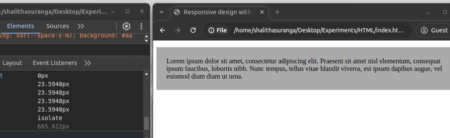
No media query is required here. You can use these CSS variables in your padding and margins to create proportional spacing between elements throughout your website. Look at the following sample HTML code snippet:
<p style="padding: var(--space-s-m); background: #aaa">
  Lorem ipsum dolor sit amet, consectetur adipiscing elit. Praesent sit amet nisl elementum,
  consequat ipsum faucibus, lobortis nibh. Nunc tempus, tellus vitae blandit viverra,
  est ipsum dapibus augue, vel euismod diam diam ut urna.
</p>
The above code snippet renders a dynamic padding for the paragraph without using media queries, as shown in the following preview:
You can achieve fluidity with typography, spacing, and grid-based layouts. However, this may not be enough to make a completely responsive website and may look complex for some web designers. Read more about fluid design principles from the Utopia design concept documentation.
Final thoughts
Responsive design keeps evolving, and in 2025, it’s all about fluidity and adaptability over rigid breakpoints. Modern CSS tools empower you to create layouts that respond intelligently to content and context — not just screen size.
While breakpoints are no longer just fixed pixels, understanding when and how to use them remains critical. Whether leveraging media queries or the newer container queries, you can tailor your design to real-world devices — including foldables and ultra-wide screens.
Ultimately, mastering this flexible, content-driven approach will help you build resilient, future-proof experiences that work seamlessly across today’s diverse device landscape.
The post Using CSS breakpoints for fluid, future-proof layouts appeared first on LogRocket Blog.
This post first appeared on Read More