
Neo-Brutalism: breaking rules, loudly
So bad it’s good — on purpose.
In a web full of soft gradients, rounded corners, and pixel-perfect templates, a new wave of designers is going in the exact opposite direction — on purpose. They’re embracing harsh lines, clashing colors, raw HTML, and layouts that feel like they’re yelling at you. It’s called Neo-Brutalism, and it started to appear everywhere in digital design.
Since we’re calling it Neo-Brutalism, it only makes sense to look at where Brutalism began. And for that, we have to go way back.

First of All, Where Did “Brutalism” Come From?
Honesty of Materials
Over 70 years ago, in the aftermath of World War II, Europe was dealing with material shortages, housing crises, and economic strain. Concrete emerged as a practical solution: cheap, durable, and flexible in form. The renowned French-Swiss architect Le Corbusier saw not just practicality, but potential — for large-scale housing and a new kind of architectural expression.
For Le Corbusier, concrete wasn’t just utilitarian. He believed in showing materials as they are — no decoration, no pretense. This idea aligned with the Modernist movement, which emphasized clarity, function, and what he called “honesty of materials.”

From Béton Brut to Brutalism
Raw concrete — béton brut — became Le Corbusier’s signature. His buildings embraced exposed textures, visible imperfections, and structural boldness. The look was striking — and it caught on.
In 1949, Swedish architect Hans Asplund jokingly described a rough concrete house as “brutalist,” and the term stuck. British architects Alison and Peter Smithson later embraced it seriously. Then in 1955, architecture critic Reyner Banham gave it formal definition in The New Brutalism, framing it as a movement rooted in structural clarity and raw expression.
From Modernism to Postmodernism — And Brutalism Along with It
Why Not Be Loud?
Brutalism was born out of Modernist ideals — truth, function, clarity — but it didn’t stay there. By the 1970s and ’80s, designers began to push back against Modernism’s seriousness and its overemphasis on order.
Postmodernism emerged as a rebellion. It welcomed contradiction, irony, ornament, and chaos. It asked: Why not be weird? Why not be loud? Why follow the rules at all?
One of the founding voices of Postmodernism, Robert Venturi, famously challenged Modernist dogma with his now-iconic line: “Less is a bore.”

The Memphis Group: Where Things Got Loud
That rebellious energy didn’t stay in architecture. It spread across disciplines — and one of the clearest examples was the rise of the Memphis Group in the 1980s. Founded by Italian designer Ettore Sottsass, Memphis rejected Modernist “good taste” and embraced clashing colors, wild patterns, and cartoonish geometry.
Like Venturi, Memphis threw out the rulebook, questioned function, and leaned into discomfort — on purpose. And that chaotic, expressive attitude? It’s alive and well in today’s digital Neo-Brutalism.

When Web Brutalism First Emerged
Before Neo-Brutalism hit the spotlight, a quieter Brutalist moment had already taken hold on the web — starting in the mid-2010s. Sites like Craigslist, Drudge Report, or LingsCars weren’t trying to be stylish — they just were what they were: function-first, often considered ugly.
Then came websites that turned that rawness into a statement. BrutalistWebsites.com, launched in 2014, began curating a wave of digital spaces that embraced HTML as-is — unstyled links, harsh boxes, system fonts, and unapologetically misaligned layouts.
This early wave of web Brutalism wasn’t a trend — it was a reaction. For a younger generation of designers, reframing these raw, unrefined sites as Brutalist felt almost fresh —used as an inspiration for a rebellion against the growing sameness of the modern web.

The Modern Web Got Boring
Everything Started Looking the Same
As digital design matured, it also got… safe. Standardized grids. Rounded corners with soft shadows. “Clean” UI kits. “Friendly” sans-serifs. Everything started to look like a slightly different shade of LinkedIn.
Among designers, fatigue set in. Some moved toward physical products or more experimental, art-driven work. Even users felt it: the web had lost its edge.
Be Loud — With Intention
Neo-Brutalism pushes back. Like Modernism gave way to Postmodernism, Brutalism has been transformed into something louder, more exaggerated, and self-aware.
Neo-Brutalism mocks polish. It’s not trying to be smooth — it plays with discomfort, even if that appears to be messy and ugly to some. But “ugly” or rule-breaking alone doesn’t define Neo-Brutalism. Unlike antidesign, which can thrive on disorientation for its own sake, Neo-Brutalism still has rules — it just chooses to break them loudly.
Breaking the Rules Oddly Made Design Accessible
Part of its appeal? Neo-Brutalism makes design feel more accessible to non-designers. Forget perfect padding and pixel math — feel ok to throw down raw elements and chunky, mismatched decorations, as long as they stay true to the core message they’re trying to convey. This liberation from rigid, overdone rules empowers even non-designers to create — but to break the rules effectively, you still need to understand them.
How Do You Spot Neo-Brutalism?
Neo-Brutalism might seem random or chaotic on the surface, but it actually relies on a set of recognizable visual moves.
1. Fun Remix of Default Elements
Neo-Brutalism strips away overly polished, modern styling and embraces raw HTML basics — default buttons, checkboxes, and links. But instead of leaving them untouched, it exaggerates their roughness with thick borders, high-contrast colors, or oversized spacing. The “default” becomes the aesthetic — not the limitation.

2. Oversized and Loud Typography
Typography is the main character. Neo-Brutalist type is often massive, mono-spaced, grotesque, or all-caps — demanding attention through sheer scale and weight.

3. Bright Colors, High Contrast, and Minimal Styling
Neo-Brutalism thrives on ultra-contrast: black and white paired with neon accents or clashing primaries. It avoids harmony on purpose — no soft gradients, no subtle blends. If gradients are used, they’re bold and declarative, not polished.

4. Bold Borders and Stark Drop Shadows
Instead of gentle blurs or gradients, Neo-Brutalism relies on thick outlines, solid containers, and harsh drop shadows to make elements pop. The result feels physical — like wireframe cut-outs or early desktop window UIs. Every message or interaction is sharply framed, making it impossible to miss.

5. Geometric Shapes and Visual Noise
Symbolic blobs, rigid rectangles, and jarring circles appear often. In Neo-Brutalism, these shapes interrupt the flow on purpose, drawing attention through playful forms and clashing colors.
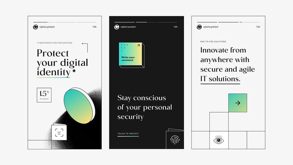
6. Intentional Discomfort
Neo-Brutalism leans into friction. Weird scrolling, awkward spacing, broken alignment, or hover states that surprise — it’s not here to soothe you. It’s here to shout.

What Neo-Brutalism Offers — And What It’s Becoming
Neo-Brutalism Is Becoming… the New Template
Here’s the twist: even no-design needs design sensitivity. You can break the rules, because you know the rules. The best Neo-Brutalist sites may look chaotic, but there’s always structure beneath the mess.
Ironically, in its rise to popularity, Neo-Brutalism has developed its own formula — its own kind of sameness: massive type, mono fonts, clashing colors, and overused grids.
Neo-Brutalism was born to fight sameness. But now, like all design trends, it risks becoming the very thing it was trying to disrupt.
So maybe the next wave won’t be brutal — or pretty.
Maybe it’ll reject trends altogether.
Or maybe — just maybe — it’ll remind us why we started breaking the rules in the first place.
The references:
Neobrutalism: Definition and Best Practices | Nielsen Norman Group
How the Memphis Design Movement Made a Comeback | The New York Times
![]()
Neo-Brutalism: breaking rules, loudly was originally published in UX Collective on Medium, where people are continuing the conversation by highlighting and responding to this story.
This post first appeared on Read More